Dark Horse Presents Annual 1997 (February 1998)

285968.jpg
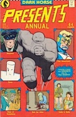
For a Presents annual (or oversized special), this one has a lot of solid work.

Pearson’s Body Bags is a fun diversion. The art’s great and the story moves. It gets a little visually confusing, but it’s good.

And Verheiden (with Marrinan) finally produces a decent installment of The American. It’s a thoughtful story, very well written.

Arcudi and Musgrove’s The Oven Traveler is dumb. It’s a one page story dragged to four.

Aliens (from Smith and Morrow) is atrocious. It’s Aliens meets Westworld. If it weren’t terrible, it’d be an interesting genre mix—plus, Morrow can’t draw the aliens. They look awkward and goofy, not at all frightening.

Jillette and French’s Rheumy Peepers and Chunky Highlights is overwritten but mildly diverting….

Stephens and Allred’s The Stiff is decent, if too silly.

Then there’s a decent Pope finish. It’s a talking heads story, which seems like a waste of Pope.

CREDITS

Body Bags; story and art by Jason Pearson. The American, The Big Deal; story by Mark Verheiden; art by Chris Marrinan; lettering by Sean Konot. The Oven Traveler; story by John Arcudi; art by Scott Musgrove. Aliens, Tourist Season; story by Beau Smith; art by Gray Morrow; lettering by John Costanza; edited by Bob Schreck. The Adventures of Rheumy Peepers and Chunky Highlights; story by Penn Jillette; art by Renée French. The Stiff, Disappearing Act; story, inks and lettering by Jay Stephens; pencils by Mike Allred. Four Cats; story and art by Paul Pope. Edited by Jamie S Rich.

Dark Horse Presents Fifth Anniversary Special (April 1991)

35927.jpg
This special is far from an accurate representation of Dark Horse Presents. Everything looks very professional.

The Aerialist and Heartbreakers installments are both long needed establishments of the series’ ground situation.

I even liked the Heartbreakers one (Bennett’s writing is far stronger from the clones’ perspective, versus their creator).

There’s also lots of disposable stuff–Concrete, The American and Black Cross are all weak, though Warner’s art is better on Cross than I’ve ever seen it. Chadwick and Verheiden use their stories to blather about American culture.

Of the two Miller’s–Give Me Liberty and Sin City–I almost prefer Sin City. Liberty‘s a little overbearing, though the Gibbons art is nice.

Prosser and Janson do a great adaptation of an Andrew Vachss. The Roachmill, Aliens and Aliens vs. Predator entries are all fantastic.

I’m a little peeved Bob the Alien is on the cover but not in the issue.

CREDITS

Give Me Liberty, Martha Washington’s War Diary: April 16, 2012; story by Frank Miller; art by Dave Gibbons. Concrete, Objects of Value; story and art by Paul Chadwick; lettering by Bill Spicer. Aliens; story by John Arcudi; art by Simon Bisley. The American; story by Mark Verheiden; pencils by Dougie Braithwaite; inks by Robert Campanella; lettering by Pat Brosseau. Roachmill; story and art by Rich Hedden and Tom McWeeney. Placebo; script by Jerry Prosser, based on a story by Andrew Vachss; art by Klaus Janson; lettering by Michael Heisler. Black Cross; story and art by Chris Warner; lettering by Jim Massara. The Aerialist, Part Three; story and art by Matt Wagner; lettering by Kurt Hathaway. Heartbreakers, The Prologue; story by Anina Bennet; art by Paul Guinan; lettering by Willie Schubert. Aliens vs. Predator; story by Randy Stradley; art by Phill Norwood; lettering by Brosseau. Sin City, Episode One; story and art by Frank Miller. Edited by Stradley.

Dark Horse Presents 32 (August 1989)

35843.jpg
Ugh, another “annual.” Sixty-four pages of Dark Horse Presents tends to be a little much.

The American is a little long here–it’s very passive and not at all dramatic. On the other hand, Peterson shows he used to be a lot more interesting of an artist.

The Wacky Squirrel strip from publisher Richardson is dumb.

Davis’s Delia & Celia is a complete bore, big shock. He manages to make a pterodactyl boring.

The longer than usual Bob the Alien just shows with more space Rice does an even better story. It’s funny and touching

The Concrete story is better than usual–Concrete’s jealous over girls–and Chadwick puts in three unanswered questions. Two are crime related, one personal. It works.

Bacchus is great. Campbell gets more into his eight pages than anyone ever has in one of these issues.

As usual, Zone is passable, Race of Scorpions is lame.

CREDITS

The American, My Dinner with the American; story by Mark Verheiden; pencils by Brandon Peterson; inks by Randy Emberlin; lettering by David Jackson. Wacky Squirrel; story by Mike Richardson; art by Jim Bradrick; lettering by David Jackson. Delia & Celia, Down, Down and Down; story, art and lettering by Gary Davis. Bob the Alien, Bob, the alien, Steppin’ Out; story, art and lettering by Rich Rice. Concrete, Visible Breath; story and art by Paul Chadwick; lettering by Bill Spicer. Bacchus, A God and His Dog; story, art and lettering by Eddie Campbell. Zone; story, art and lettering by Michael Kraiger. Race of Scorpions, The Rusty Soldier; story and art by Leopoldo Durañona; lettering by Laura Davis. Edited by Randy Stradley.

The Amazing Spider-Man (1963) #259

Asm259

Lot of Ditko homage on the last pages, even with the filmic–especially for the eighties–pacing of Peter suiting up in the red and blue.

It’s sort of a weak finish to a great issue. Most of the issue–except some ill-advised attention on Hobgoblin (providing the action)–is Mary Jane telling Peter all about her life.

DeFalco does an amazing job with the Mary Jane stuff. It’s this heart-wrenching confession–as Mary Jane assesses herself and her past actions–mixed with Peter’s internal reaction. It might be one of the most touching comics I’ve read about a major property, just because it’s so delicate. It doesn’t even with Peter and Mary Jane heading off to the altar–far from it. DeFalco seems to be aware if he went that route, it’d flush the story’s value.

Frenz does an excellent job (albeit within his abilities) here too.

The Amazing Spider-Man (1963) #258

Asm258

I knew I liked these eighties Spider-Man issues. It just took DeFalco a while to bring it around (though it could all be the nostalgia talking).

What’s important about this issue isn’t the beginning, which cops out of the previous cliffhanger and then strangely sends Black Cat off to Neverland instead of resolving a new situation with her… but the end.

The majority of the issue is spent getting the black costume tested by Reed Richards and then taken off Spidey. There’s some funny stuff with the Torch–it’s amazing how much better DeFalco does when he’s writing Spider-Man around other superheroes instead of trying to handle his Peter Parker stuff–and a couple nice Ditko homages.

But the ending–Mary Jane shows up to talk to Peter. I didn’t think she would show up… figured DeFalco would draw it out.

He doesn’t and it’s a lovely move.

The Amazing Spider-Man (1963) #257

Asm257

What a cliffhanger! Mary Jane reveals to Peter she knows he’s Spider-Man! All with some weak Ron Frenz faces. I actually liked most of Frenz’s work this issue, when he was doing the action stuff–the fight between Puma and Spider-Man had some nice moves and it worked. But when Peter gets back to Mary Jane for a talking heads scene?

Ick.

Frenz can’t keep the faces constant from panel to panel on the same page.

He seems to get the hair right though, on both of them. I guess hair’s something.

It’s a somewhat boring, contrived issue–with the exception of the long fight scene. Black Cat bitches and moans–in thought balloons–about how common Peter Parker lives. She’s such an unsympathetic character. They should have killed her off at this point. Mary Jane shows up to annoy Peter, then reveals the secret.

Still, not atrocious.

The Amazing Spider-Man (1963) #256

Asm256

Why have a Native American superhero when you can have a Native American supervillain!

The politics of Puma (this issue is his first appearance) are fantastic–successful Native Americans use their special abilities to become assassins for hire. It’s great. You’d never see this kind of thing today.

Maybe Jason Aaron can do a Puma MAX series, after he’s done with Scalped.

Otherwise, it’s a fine enough eighties Spider-Man costume. Frenz isn’t great, but he’s enthusiastic and he works–most pages have nine panels–and his Peter Parker looks like a grown up Ditko Peter Parker. There’s a nostalgic appeal to it.

The writing’s pretty lazy. DeFalco repeats the same expository revelation two pages after the first mention. Then there’s the when he comments on the Black Cat and her “colorful” namesake. Pretty sure a black cat is monotone.

There’s nothing particularly good about it, but nothing bad either.

The Amazing Spider-Man (1963) #255

Asm255

It’s a perfectly decent done-in-one.

The issue opens with the Black Fox (I thought he was the Black Cat’s father, but maybe not) and he introduces the issue’s main story, the Red Ghost wanting to rob a bunch of stores so he can afford to build his death ray (or whatever it’s called). There’s some painful dialogue until that conversation, but then it gets amusing–the supervillain in hiding, needing to resort to breaking and entering to fund his devious device.

It’s funny.

The Spider-Man stuff is awkward. Most of the Peter Parker scenes are spent going over all the events of previous crossover titles. Then the black costume takes him out for a day and keeps him unconscious (which he doesn’t know yet, of course).

It’s a breezy read and Ron Frenz does a good job of the action. He gives Spidey some needed physical levity.

The Amazing Spider-Man (1963) #254

Asm254

Here’s my issue… yes, Spider-Man has lots of human problems–his aunt’s pissed at him, he’s got girlfriend trouble, he’s got job trouble. He’s apparently the only superhero in New York when there’s a superpowered terrorist blowing up toy stores. The list goes on and on.

But let’s look at these problems.

Aunt May’s pissed he dropped out of college. How contrived. She’s not even a character. It’s unbelievable her beau would even have lunch with her.

His girlfriend trouble–the Black Cat. She’s a moron and a flake and written by everyone in that manner. She even tells Peter she doesn’t like him, only the costume.

The job trouble–he’s taking boring pictures. Considering he got his start faking exciting pictures, Peter’s just being lazy.

He’s not very sympathetic here.

But the Leonardi art is good on all the superhero adventuring. Not so much on the faces though.

The Amazing Spider-Man (1963) #253

Asm253

Where to start… I’m tempted to start with Rick Leonardi, who comes up with these great layered panels (or maybe Bill Anderson inked them to make them layered), but simply cannot keep any consistency when drawing people. Maybe he does all right when he’s got football helmets on them–it’s a football corruption story, luckily Peter was assigned to the sports department this issue.

DeFalco manages to overwrite and underwrite at the same time. He’s pushing everything he can into the issue to get an emotional response–the football player throwing games, his disappointed kid brother, Aunt May being mad at Peter for dropping out of college. He even ends the issue with Peter being compared to the football player, they’re both throwing it all away.

But there’s almost no Spider-Man stuff in the issue. Some swinging around, some black costume stuff. There’s no focus on the character though.