• Stray Bullets 17 (November 1998)

    Stray Bullets #17Something is changing in Lapham’s art. His figures and faces are getting more streamlined, less thorough and there are a lot of almost all black panels.

    Perhaps he’s rushing. But only on the art.

    He’s still working hard on the story. This issue has a woman whose drunk husband comes home, followed by a bunch of acquaintances from the bar looking for money. Most of the issue is this oddly dangerous situation, since the acquaintances are drunk cops.

    These characters might tie in to previous issues, but I can’t remember. Lapham gives the married couple a lot of back story; he handles it really well in the dialogue and I’m hoping he doesn’t waste the time doing an issue on it.

    As the strange evening progresses, there are plot developments, characters bonding, characters not bonding. It’s a really great issue. The hopefulness even matches the streamlined, rounder faces Lapham draws.

    A 

    CREDITS

    While Ricky Fish Was Sleeping…; writer, artist, and letterer, David Lapham; editor, Deborah Dragovic; publisher, El Capitán Books.

  • Satellite Sam 8 (May 2014)

    Satellite Sam #8It's a strange issue. There are a couple big things going on, one with Mike at the LeMonde Christmas party and getting in a fight with Kara. The other one is the more historical story line with the new TV star with a big secret. It's an unexpected secret too; good stuff on that story line.

    But the other one… Fraction's pushing it. There's a lot of expository dialogue reminding the reader of previous events and scenes and Fraction only needs them because he's let them go too long. Lots of characters too, all in one place, not really doing anything except moving along this story line. The emphasis on character is gone. It's a shame.

    The worst is how Chaykin's got the responsibility of doing visual cues to move big revelations along. Chaykin doesn't differentiate between faces well enough for that responsibility.

    It's a surprising stumble of an issue.

    B 

    CREDITS

    Cinecittà; writer, Matt Fraction; artist, Howard Chaykin; letterer, Ken Bruzenak; editor, Thomas K.; publisher, Image Comics.

  • Adventure Into Fear 16 (September 1973)

    Fear #16Sal Trapani inks Mayerik fairly well. Everyone looks a little too Marvel house style for it to be a horror comic, but it’s good art. There’s a lot of action in the issue, with Man-Thing getting involved with these Native American kids who decide to attack an industrialist destroying the swamp. They do it in costume, which gives the book an odd feel.

    It’s modern, but then you’ve got these Native Americans in the swamp and it feels like a Western comic or something. Like the cowboy gets lost in the swamp.

    No one gets lost here.

    Gerber keeps his supporting cast around, even after the vague closure of their last appearance. It gives the setting a good feel–they show up in a crowd scene and Gerber focuses on them–and the familiarity is nice.

    Plus, Gerber writes the Man-Thing narration well. It’s confused, just like him.

    A- 

    CREDITS

    Cry of the Native; writer, Steve Gerber; penciller, Val Mayerik; inker, Sal Trapani; colorist, Petra Goldberg; letterer, Artie Simek; editor, Roy Thomas; publisher, Marvel Comics.

  • Nailbiter (2014) #1

    Nailbiter  1

    The parts of Nailbiter work better, for the first issue anyway, than the whole. Writer Joshua Williamson introduces the very silly idea of an epicenter of serial killers; while the Pacific Northwest does (or did) produce the most serial killers, Williamson localizes it to one very strange town.

    He's able to make it work thanks to artist Mike Henderson. Henderson makes the creepiness work, but also the stranger in a strange land thing work. The lead character is a disgraced Army cop who's in town looking for his buddy. His buddy is another cop of some kind researching the place. The buddy's one of the issue's problems. Williamson doesn't show enough to sell the relationship.

    But it doesn't matter because the Army cop is such a strong character. And the setting's great.

    Williamson closes it with a big reveal–Nailbiter's really goofy premise. Not just the town, but even more.

  • Suicide Risk 13 (May 2014)

    Suicide Risk #13And I’m done. While it’s obvious Carey isn’t done with all his reveals on Suicide Risk, he’s also gotten to the point of no return. When you start aping Back to the Future, okay! it’s just for a joke and it works all right… But Carey reveals his superhero universe to be based on Highlander II: The Quickening and there’s no excuse for it.

    This revelation comes in the middle of the flashback to Requiem’s trial and explains everyone. It’s an uncomfortable mix of sci-fi, fantasy and superhero stuff. It’s been so long since Carey’s had any successful ideas on the comic and the whole trial thing is just terrible. And it gets worse as it goes on.

    Then the cliffhanger is confusing; it requires a visual reference only Casagrande isn’t distinctive enough on the art. It should be a stunning moment, instead it’s painfully obvious.

    Risk is toast.

    C- 

    CREDITS

    Seven Walls and a Pit Trap, Part Three; writer, Mike Carey; penciller, Elena Casagrande; inkers, Casagrande and Michele Pasta; colorist, Andrew Elder; letterer, Ed Dukeshire; editors, Dafna Pleban and Matt Gagnon; publisher, Boom! Studios..

  • Stray Bullets 16 (August 1998)

    Stray Bullets #16Lapham starts fresh this issue, set a few years before the Virginia and Beth storyline; this time the protagonist is a hen-pecked husband who breaks down and kills someone. The experience proves a boon for his ego and he changes his life. Actually, he mostly starts drinking, sleeping with some other guy’s wife, hangs out at strip clubs, romances a stripper with a heart of gold.

    It’s almost really good in a lot of ways, but some of them seem mutually exclusive–at least how Lapham’s structured the narrative. For example, it could be a great story about a cheating husband whose plans fall through, but there’s the murder thing at the open. And the character doesn’t exhibit confidence in any way other than the philandering. Maybe there just needs to be more of it.

    Also, Lapham rushes the second half of the issue or so. The first half’s gold though.

    B 

    CREDITS

    Two-Week Vacation; writer, artist, and letterer, David Lapham; editor, Deborah Dragovic; publisher, El Capitán Books.

  • Nailbiter #1The parts of Nailbiter work better, for the first issue anyway, than the whole. Writer Joshua Williamson introduces the very silly idea of an epicenter of serial killers; while the Pacific Northwest does (or did) produce the most serial killers, Williamson localizes it to one very strange town.

    He's able to make it work thanks to artist Mike Henderson. Henderson makes the creepiness work, but also the stranger in a strange land thing work. The lead character is a disgraced Army cop who's in town looking for his buddy. His buddy is another cop of some kind researching the place. The buddy's one of the issue's problems. Williamson doesn't show enough to sell the relationship.

    But it doesn't matter because the Army cop is such a strong character. And the setting's great.

    Williamson closes it with a big reveal–Nailbiter's really goofy premise. Not just the town, but even more.

    CREDITS

    There Will Be Blood; writer, Joshua Williamson; artist, Mike Henderson; colorist, Adam Guzowski; letterer, John J. Hill; editor, Rob Levin; publisher, Image Comics.

  • Adventure Into Fear 15 (August 1973)

    Fear #14Gerber writes the heck out of the first feature length Man-Thing story. There’s a lot of new information introduced, with Gerber doing a lengthy flashback. The flashback–to Atlantis and an explanation of something the present–takes the place of a backup story. But put as a second chapter, it relieves a lot of drama. Not too much, just about right.

    One really different thing is how Gerber has his cult out to save the world from demons; they’re the good guys. Don’t see good cults often.

    Everything moves real fast. The world’s in chaos, the supporting cast gets together and finds Man-Thing, flashback, resolution. But Gerber makes sure each section is filled. Not so much with Man-Thing, who’s backseat to the girl, Jennifer (especially after she magically gets a risqué outfit). She’s also related to the flashback.

    Depressing ending too.

    It’s a good, well-executed issue.

    B+ 

    CREDITS

    From Here to Infinity!; writer, Steve Gerber; penciller, Val Mayerik; inker, Frank McLaughlin; colorist, Petra Goldberg; letterer, Artie Simek; editor, Roy Thomas; publisher, Marvel Comics.

  • Red Team 3 (June 2013)

    Red Team #3Ennis pulls Red Team up a notch with this issue. He’s got a lot on the killer cops, but they’re after a pedophile priest–and Ennis manages to restrain himself when they’re all talking about the Catholic Church too. It’s impressive.

    But that sequence is actually awkward. It goes on too long, since the protagonist is doing the actual killing. So there’s got to be something special about it because this guy’s better rendered than his partners. Until the end, when the guy is talking to his partner–the single lady detective–at the bar and he’s whining about his life and so on. There’s nothing about the main plot; these two cops killing criminals in their off-time doesn’t figure in, it’s just a good scene.

    And it’s the best scene in the series so far, because if Ennis is developing the main plot with it, he’s not showing his cards.

    Very solid.

    B+ 

    CREDITS

    The God Squad; writer, Garth Ennis; artist, Craig Cermak; colorist, Adriano Honorato Lucas; letterer, Rob Steen; editor, Joe Rybandt; publisher, Dynamite Entertainment.

  • Stray Bullets 15 (July 1998)

    Stray Bullets #15It’s another great issue. Lapham’s uneven overall, but when he does a great issue, it’s truly great.

    No surprise, Virginia is the center of the issue. Lapham sets it a year later than the previous issue with its cliffhanger, with Virginia and Beth living in California. Beth’s trying to make deals, usually with guys, upsetting Virginia. Lapham writes the narration like Virginia’s doing a journal entry, but with lapses in reality.

    It’s great.

    What’s even better–and where Lapham does make Stray Bullets into a cohesive series–is how Virginia has changed. There’s new depth when she’s bullying some kid, just like she was bullied back in her first appearance. It does sort of make her actions confusing if one hasn’t read it all, but Lapham’s not going for new readers.

    Then the second half of the issue or so is a madcap action sequence, funny and disturbing.

    Phenomenal issue.

    A 

    CREDITS

    Sex and Violence (Part 1); writer, artist, and letterer, David Lapham; editor, Deborah Dragovic; publisher, El Capitán Books.

  • Red Team 2 (March 2013)

    Red Team #2So Ennis is going to go through various interrogations, which surprised me. I sort of figured there’d be a big shoot out at the end, Reservoir Dogs style. Maybe he’s still got time.

    Cermak still has issues with depth. His faces are all very detailed, maybe too much–they almost looks an etching sometimes–but they seem taped onto their background. This issue it’s slightly better, maybe because he doesn’t do so many close-ups.

    Ennis continues the story, very rationally laying out the rules for the titular Red Team when they go out and kill people. There’s a really lame subplot for the good cop, who has a wife suffering multiple miscarriages and so on. Again, Ennis isn’t trying here. Some of his plotting seems straight out of a daytime soap. Not even a night-time one.

    But the dialogue’s quite good and the issue works out well enough.

    B 

    CREDITS

    The Rules; writer, Garth Ennis; artist, Craig Cermak; colorist, Adriano Honorato Lucas; letterer, Rob Steen; editor, Joe Rybandt; publisher, Dynamite Entertainment.

  • Adventure Into Fear 14 (June 1973)

    Adventures Into Fear #14The Man-Thing feature is pretty good. Gerber starts clarifying the nexus in the swamp and also the real villains behind the story. They’re not the most original villains–demons from hell–but the way Gerber sets it up is strong. While there’s a forward-thinking element to the top story with the kids hanging out with Man-Thing, the demons are gloriously aged.

    They’re basically Romans with pointy ears and Gerber doesn’t go for any humor with them. Loosing Man-Thing in this environment is ludicrous but it works out. The incongruity probably helps.

    Chic Stone’s inks aren’t the best for Mayerick but the art’s still good. Gerber seems oddly detached from Man-Thing’s story this time around though. He’s occasionally cruel to the creature in the expository narration.

    Then the fifties backup is this awesome story from Paul Reinman. Great art, great story. Very impressive.

    This issue’s outstanding.

    B+ 

    CREDITS

    Man-Thing, The Demon Plague; writer, Steve Gerber; penciller, Val Mayerik; inker, Chic Stone; colorist, Stan Goldberg; letterer, Artie Simek. Listen, You Fool; artist, Paul Reinman. Editor, Roy Thomas; publisher, Marvel Comics.

  • The Earth, the Way I Left It (2013, Jeff Pinilla)

    Oh, good grief. I really wanted to start out with the positives about The Earth, the Way I Left It put director Pinilla goes out on such an unbelievably saccharine note–after being way too obvious a minute or two before–I just can't.

    Pinilla's got some very good composition chops. But Earth just keeps on biting off more than it can deliver. It's set in 1962. Why? Why not. Because 1962 is the only time kids can like astronauts, apparently. And then there's a 8mm camera, so Pinilla can fill us in on the situation through flashbacks. But not real ones because the dead brother (sorry, it's about some girl who's visited by her dead brother's ghost dressed up as an astronaut) disappears from the footage for emphasis.

    Then there's some weird thing with the parents not speaking English.

    It's all over the place.

    Earth needs to be insightful; it's trite.

    1/3Not Recommended

    CREDITS

    Edited and directed by Jeff Pinilla; written and produced by Pinilla and Matthew Pourviseh; director of photography, Justin Simpson.

    Starring Amelia Osborne (Alexandria).


    RELATED

  • Red Team 1 (February 2013)

    Red Team #1Garth Ennis must have really wanted to write for “The Shield”. Or maybe Dynamite asked him to do something ready for Hollywood and not too expensive so he came up with Red Team.

    An elite unit of cops decides to kill a bad guy. There’s one reluctant member and he apparently lives through the series because he’s getting interrogated. Not the most original narrative structure for this kind of thing, but Ennis is on auto-pilot. While there’s some decent talking heads stuff and good little moments throughout, Ennis isn’t going for anything special.

    As a formula cop thing? It’s all right. Depending on the cast, I’d probably watch the show. He seems to be gearing it towards a mini-series sale–it’s weird to think independent comics weren’t always so desperate for the movie or TV option. Especially not a guy like Ennis.

    Craig Cermak’s art detailed but shallow.

    B- 

    CREDITS

    The First-Timers; writer, Garth Ennis; artist, Craig Cermak; colorist, Adriano Honorato Lucas; letterer, Rob Steen; editor, Joe Rybandt; publisher, Dynamite Entertainment.

  • Stray Bullets 14 (August 1997)

    Stray Bullets #14A lot of stuff comes to a head this issue, which is double-sized, and even has some backstory on how the characters ended up in Seaside. Maybe it was during that first party issue. At least it seems to be the result of it. I think. If it’s so important, Lapham should have included CliffsNotes.

    Otherwise, besides the issue being way too full, it’s pretty good. It’s definitely exciting as about half of it is a chase sequence. Orson, the current male lead, is on the run from the bad guys from the early issues. Beth and Virginia don’t get much to do. Too bad as they’re the best characters. Except Lapham does give Rose a lot for her cameo, revealing far more depth than expected.

    The Seaside supporting cast figures in a lot, not very well. They’re backseat to the returning guest stars.

    Rushed art too.

    But okay.

    B- 

    CREDITS

    You’ve Come A Long Way, Baby; writer, artist, and letterer, David Lapham; editor, Deborah Purcell; publisher, El Capitán Books.

  • Genesis (April 2014)

    GenesisPlease excuse the colloquial expression, but what a piece of utter crap. Did anyone read Nathan Edmondson's script? Maybe it's just me. Maybe I don't like terrible plays from twelve-year olds, so I don't like Edmondson's script for Genesis. I can't even imagine if I'd paid seven dollars for this tripe.

    It's about a minister who can't save people so he tries to kill himself and one of the guys from Blue Man Group tells him he isn't dead and he's got all sorts of powers. He can refigure reality. Edmondson goes on and on about it. It's a long comic and about half of it is back and forth with the protagonist.

    Except, Edmondson doesn't do anything with the religious stuff. He's not thinking about it from that angle; the plot's inane and possible there facilitate artist Alison Sampson's drawing desires.

    It's an exceptional comic. The script's indescribably bad.

    F 

    CREDITS

    Writer, Nathan Edmondson; artist, Alison Sampson; colorist, Jason Wordie; letterer, Jon Babcock; publisher, Image Comics.

  • Mr. Bean’s Holiday (2007, Steve Bendelack)

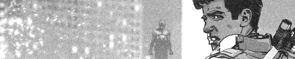
    From start to finish, Mr. Bean’s Holiday proves a constant delight. Hamish McColl and Robin Driscoll’s plot is simple–send Rowan Atkinson’s constantly aloof and impossibly unlucky Mr. Bean to France on a holiday. There’s an immediate scene establishing the travel route and then Atkinson gets in trouble at every point along the way.

    He eventually gains a young sidekick in Max Baldry, a nemesis in Willem Dafoe and a lady friend in Emma de Caunes. Of course, Atkinson doesn’t talk much and Baldry speaks Russian and de Caunes speaks French. So no one can understand each other, except when Dafoe’s screaming (in English). There’s a whole connection with Cannes Film Festival, but it never feels too forced; the way the film introduces Dafoe (as a pretentious director) is brilliant. The script sets it up passively in one set piece, then brings it up later. It’s such a memorable establishing scene, however, it needs time to fully ripen.

    Part of the story involves Atkinson videotaping everything on a camcorder. Director Bendelack nicely mixes the footage in, sometimes utilizing the camcorder footage to further the main plot. It’s a great device for the film, particularly since the camcorder is the plot catalyst.

    Beautiful photography from Baz Irvine and a great score from Howard Goodall, don’t want to forget those.

    The three principal costars are great–Dafoe, de Caunes, Baldry–and they have great chemistry with the phenomenal Atkinson.

    Aside from some slight pacing issues, Holiday is masterful comedy. It’s short, simple and near perfect.

    3.5/4★★★½

    CREDITS

    Directed by Steve Bendelack; screenplay by Hamish McColl and Robin Driscoll, based on a story by Simon McBurney and a character created by Rowan Atkinson and Richard Curtis; director of photography, Baz Irvine; edited by Tony Cranstoun; music by Howard Goodall; production designer, Michael Carlin; produced by Peter Bennett-Jones, Tim Bevan and Eric Fellner; released by Universal Pictures.

    Starring Rowan Atkinson (Mr. Bean), Emma de Caunes (Sabine), Max Baldry (Stepan), Willem Dafoe (Carson Clay), Jean Rochefort (Maitre’D), Karel Roden (Emil) and Steve Pemberton (Vicar).


    RELATED

  • Island of Lost Souls (1932, Erle C. Kenton)

    What’s so incredible about Island of Lost Souls is how Charles Laughton doesn’t overpower the entire picture. Laughton’s take on the mad scientist role–playful, gleeful, callous, cruel–is a joy to watch and it definitely contributes but it doesn’t make Souls. Even with Laughton, Kenton’s direction is still a must, as are the performances of Richard Arlen and Arthur Hohl.

    Arlen’s an unlucky shipwrecked man who ends up on Laughton’s island, Hohl’s Laughton’s assistant but also the guy who helped save Arlen. Waldemar Young and Philip Wylie’s script gives Hohl a lot of time to establish himself before revealing his profession. The big things in the film–Laughton, the island, the enormous action sequences–are all hidden at the beginning. It could very well just be the story of a man shipwrecked and tempted by a Polynesian native girl, a riff on a Maugham South Seas outing. And then things get very strange.

    There’s no big standoff between Arlen and Laughton; Laughton’s not exactly an antagonist throughout the entire film. Instead, Laughton leads into the next antagonists… only they’re the most sympathetic characters in the film. The film moves fast and demands the viewer keep up pace. There are occasional humor payoffs, but things eventually just stay rough.

    Kenton and cinematographer Karl Struss do these wonderful one shots of Laughton being evil. Laughton takes such a joy in the role, frequently smiling at himself.

    Great supporting turn from Bela Lugosi. Maybe his best work.

    Souls is an excellent picture.

    3/4★★★

    CREDITS

    Directed by Erle C. Kenton; screenplay by Waldemar Young and Philip Wylie, based on a novel by H.G. Wells; director of photography, Karl Struss; released by Paramount Pictures.

    Starring Charles Laughton (Dr. Moreau), Richard Arlen (Edward Parker), Arthur Hohl (Montgomery), Leila Hyams (Ruth Thomas), Kathleen Burke (Lota), Stanley Fields (Captain Davies), Paul Hurst (Donahue), Hans Steinke (Ouran), Tetsu Komai (M’ling), George Irving (The Consul) and Bela Lugosi (Sayer of the Law).


    RELATED

  • The Invisible Man (1933, James Whale)

    The Invisible Man is a filmmaking marvel. First off, R.C. Sherriff’s screenplay sets things up speedily and without much exposition. The film introduces Claude Rains’s character through everyone else’s point of view–first the strangers he meets, then his familiars–all while Rains is front and center in the film. Even though he is, after all, invisible.

    Rains is another marvel. The script is excellent, Whale does a peerless job directing (more on his contributions in a bit), but Rains makes the whole thing possible. With him, Invisible isn’t some horror picture or a sci-fi one, it’s a very simple, very tragic story of a man going mad. It doesn’t need the special effects, it just needs Rains. Everything else is a bonus. It’s an outstanding performance.

    The whole cast is great–Gloria Stuart has to sell the idea Rains was once a lovable guy, so goes Henry Travers for instance. William Harrigan gets to be a sleaze bag but a decent enough minded one.

    Now for Whale. Many of the special effects in The Invisible Man are unbelievable. Even the ones where they obviously used some kind of matte decades are sort of unbelievable, but the practical effects–where the bandages must have been suspended by wire–those are astonishing. And Whale knows, early on, to wow the audience. But he never lets up with it; it’s one wow after another.

    The Invisible Man gets better on every viewing. The work from Whale, Rains and Sherriff is singular.

  • Memoirs of an Invisible Man (1992, John Carpenter)

    Memoirs of an Invisible Man is pointless. Most of its problems stem from the film’s lack of focus–in some ways, given Chevy Chase is a stockbroker and leads a life of extreme comfort, it ought to be an examination of eighties yuppies. Only a few years late. Except it’s obvious director Carpenter doesn’t want to do that story; he’s less engaged in those scenes than any of the others.

    Carpenter does surprisingly well with the romantic comedy angle. The sequence where Chase meets Daryl Hannah is beautifully shot.

    The film’s also not about Chase being disconnected from the world before he becomes invisible–that aspect comes up in some terrible dialogue, very poorly presented by Sam Neill. Neill plays the film’s villain, a ruthless CIA operative who has a gang of poorly defined sidekicks and an asinine boss (Stephen Tobolowsky). If it weren’t for Tobolowsky’s terrible performance, Neill would give the worst one in the film.

    A lot of Memoirs relies on Chase’s charm and, in some ways, he does deliver. Not often enough and not with enough quantity, however. The script’s really bad when it comes to defining his character; the first act is a particularly mess, then though Rosalind Chao is excellent as his secretary for two minutes.

    Michael McKean plays his friend. He’s ineffectual, but not bad.

    Another big problem is the narration. Memoirs is desperate for Fletch appeal; it doesn’t have it.

    It moves quickly, the special effects are great, but it’s a stinker otherwise.

  • Adventure Into Fear 13 (April 1973)

    Adventure Into Fear #13Oh, very good news–Val Mayerik is on the pencils (with Frank Bolle in inks). From the first couple pages of Man-Thing, it's clear the art is going to be a lot better. It shouldn't be particularly obvious, as it's a Man-Thing story and Mayerik doesn't illustrate him until later in the story but the way Mayerik draws the supporting cast is enough to show things have turned around.

    Gerber fleshes out that supporting cast more here, he shows how the local girl is somehow linked to Man-Thing, for instance. But he's also got a better grip on how to write Man-Thing himself. While Gerber does fall back on Man-Thing's human side getting dialogue, the sequence is effective and doesn't seem forced.

    Maybe because it's in the second act, not the third. Anyway, good feature.

    The sixties backup has indistinct Gene Colan art. The Lieber and Lee story's distinctively crappy though.

    B 

    CREDITS

    Man-Thing, Where Worlds Collide!; writer, Steve Gerber; penciller, Val Mayerik; inker, Frank Bolle; colorist, Ben Hunt; letterer, Artie Simek. Mister Black; writers, Stan Lee and Larry Lieber; artist, Gene Colan. Editors, Lee and Roy Thomas; publisher, Marvel Comics.

  • Batman: The Deal (November 2013)

    Batman: The DealThanks to the Internet, unofficial, fan-made productions can get a lot of exposure. Why people haven’t been doing more unofficial superhero comics is beyond me. It makes great senses but you don’t hear about many.

    I read about The Deal because of the artist, Daniel Bayliss, and tracked down the comic. Bayliss uses a finer line, Paul Pope type style. The story is just Batman and the Joker and he doesn’t do either of their faces well, but the movement of the bodies is fantastic. The detailed scenery is awesome.

    As for Gerardo Preciado’s script… it’s predictable. Except maybe the lengthy quote at the end, which is a good quote, but doesn’t belong. Preciado tries to work out the problems between Batman and the Joker and flubs it. He goes way too far, way too obvious.

    But the absurdity gives Bayliss the chance to show off his compositional skills.

    D 

    CREDITS

    Writer, Gerardo Preciado; artist, Daniel Bayliss; publisher, Moonhead Press.

  • Stray Bullets 13 (April 1997)

    Stray Bullets #13Lapham does integrate Virginia (who called her Ginny, I can't remember) into the Seaside cast. And all of a sudden, if it weren't for the meth heads or whatever they are trying to rape a thirteen year-old girl (they're the comic relief, actually), Stray Bullets would be almost a sitcom. A quirky one, sure, but a sitcom nonetheless.

    While there's still the aforementioned actual danger, Lapham's very upbeat about life in this one. Virginia bonds with Nina, Beth's friend who somehow got them all in trouble. Then there's lovable Nick. And darn if Orson and Beth aren't the cutest odd couple.

    But it works too. Lapham pretty much pulls it off. He makes a good comic, even though he's got Virginia writing in her diary as the exposition and his story behind the Seaside town makes everything sillier. Against the odds, it works.

    Lapham's just forcing the quirky too much.

    B 

    CREDITS

    Farewell, Fair Cow!; writer, artist, and letterer, David Lapham; editor, Deborah Purcell; publisher, El Capitán Books.

  • Tales of Honor 2 (April 2014)

    Tales of Honor #2Something about Hawkins's presentation of facts–the way he uses his protagonist to narrate her past from her present, it makes Tales of Honor very palatable. There are a lot of absurd details, like how the protagonist has the psychic cat who she keeps with her. And takes with her on diplomatic meetings.

    But Hawkins sells it, because the comic never refers to other sci-fi. It's always set in its own thing, which is probably a benefit to being an adaptation not just of a novel, but a series of novels. Hawkins can work in the texture.

    Speaking of texture, it's amazing I read this comic not just because I don't read complicated sci-fi, but because I loathe the art from Sang-Il Jeong. Either in an attempt to seem futuristic or just save on traditional artist, the whole thing is CGI. The figures are atrocious, animals worse.

    Still, it works out.

    B- 

    CREDITS

    On Basilisk Station, Part Two; writer, Matt Hawkins; artists, Sang-Il Jeong and Linda Sejic; letterer, Troy Peteri; editor, Besty Gonia; publisher, Top Cow Productions.

  • Star Trek 5 (August 1980)

    Star Trek #5This issue's better than the last, with Spock kidnapped by Klingons and Kirk trying to figure out how to resolve the situations. No Dracula appearance–maybe Mike W. Barr didn't like that idea either (or maybe Wolfman always insisted)–but there are still a bunch of dumb monsters showing up.

    Barr has the formula down for a "Star Trek" story, complete with Spock and Bones bickering at the end, but he doesn't seem to have the best ideas for the plot. Though less silly than the previous issue, there's still no good reason for these earth nightmare monsters in space. Barr explains it fine, he's just explaining the reasoning behind a bad story.

    Also distressing is his lack of story for the characters. Spock gets a bunch of time to himself and Barr writes those scenes well, but Kirk doesn't make any impression. The balance needs work.

    A lot needs work.

    C+ 

    CREDITS

    The Haunting of the Enterprise!; writer, Mike W. Barr; penciller, Dave Cockrum; inker, Klaus Janson; colorist, Carl Gafford; letterer, John Costanza; editors, Denny O’Neil and Louise Jones; publisher, Marvel Comics.

  • Furious 4 (April 2014)

    Furious #4Glass brings in something I don’t think I realized the comic was missing–the Jim Gordon character. Some kind of person for Furious to have a conversation with about things, even if it’s brief.

    It totally changes the tone of the comic, though the plot for the issue also changes things up a bit. Furious attends a press conference in her honor–the idea is to appeal to the public–while the villain is out there causing lots of trouble still. Glass starts to explain the villain, but the full resolution is undoubtedly next issue. Hopefully after the hard cliffhanger gets a resolution.

    So it’s kind of a talking heads book with this cop talking Furious down while she’s trying to beat a confession out of someone. Then there’s a lot of talking at the news conference. It doesn’t feel bridging though, Glass is still building story with the scenes.

    B+ 

    CREDITS

    Fallen Star, Part Four, Fame Is a Fickle Mistress; writer, Bryan J.L. Glass; artist, Victor Santos; letterer, Nate Piekos; editors, Spencer Cushing and Jim Gibbons; publisher, Dark Horse Comics.

  • Stray Bullets 12 (January 1997)

    Stray Bullets #12Ginny finally gets to Seaside and truly meets the cast there. Havoc ensues. Madcap havoc. There’s violence and there’s a little bit of evil, but Lapham plays it all for humor. Not even surreal humor. He’s got a cast of supporting characters he mocks and mock them he does.

    The evil comes in the form of the local sheriff. He presents what seems to be a serious threat, what with him willing to attack kids in front of hundreds of witnesses. He also has his gun out and shoots at lots of things. Between him and the comically creepy guys patrolling the fair for girls, Lapham lets Bullets become farce.

    It’s not bad as farce. Lapham still has enough good will on Beth for her to get through the issue all right and Ginny introducing herself as “Amy” is worth a smile. The story’s just a little too slight overall.

    B 

    CREDITS

    Hugs, Not Drugs or Hugs on Drugs; writer, artist, and letterer, David Lapham; editor, Deborah Purcell; publisher, El Capitán Books.

  • Loki: Ragnarok and Roll 3 (April 2014)

    Loki: Ragnarok and Roll #3There’s a lot to like about this issue. There’s a fantastic twist at the end, but all of a sudden it made me wonder if Esquivel might have tried pitching this series as a Marvel movie. Not because of anything in the issue itself, but how perfectly the twist works. It overshadows everything else in the comic.

    But what else is there in the comic? Gaylord’s art is good and he has a great time illustrating all the various gods in Asgard attacking Odin. He has a good time with Loki fighting Hercules or whoever. The comic is definitely a good time.

    And then it ends. There’s a shouting match Loki and one of his humans and then the twist ending. Not much else. Esquivel and Gaylord get a whole bunch of mileage out of their setup for the comic and don’t really build anything. Loki’s clever instead of thoughtful.

    C+ 

    CREDITS

    Writer, Eric M. Esquivel; penciller, Jerry Gaylord; inkers, Jerry Gaylord and Penelope Gaylord; colorist, Gabriel Cassata; letterer, Ryan Ferrier; editors, Chris Rosa and Ian Brill; publisher, Boom! Studios.

  • Star Trek 4 (July 1980)

    Star Trek #4With the limitless possibilities of a comic book, Wolfman goes instead with the Enterprise encountering some kind of haunted house in space. It’s bewildering, but somehow appropriate–it certainly feels like an episode out of the television show, what with the budget and everything.

    The issue itself doesn’t leave much impression. Cockrum and Janson’s art is decent; their renditions of the crew, save Kirk, often have problems. They can’t do age well. It’s too much. They need to hint at it sometimes, but go too far.

    The issue’s best scenes are early, before the goofiness starts. Wolfman writes an interesting couple guest stars, though Cockrum bases one of them too much on the monster from Alien.

    I had hoped it would be a done in one; the cliffhanger promises a different type of issue as a followup. Assuming there are no more Dracula cameos, it should be an improvement.

    C+ 

    CREDITS

    The Haunting of Thallus!; writer and editor, Marv Wolfman; penciller, Dave Cockrum; inker, Klaus Janson; colorist, Carl Gafford; letterer, Jim Novak; publisher, Marvel Comics.

  • Clockwork Angels 2 (April 2014)

    Clockwork Angels #2Again, there’s nothing so much wrong with Clockwork Angels as there’s nothing particularly right about it. Gorgeous art from Robles–sort of a gentle steampunk. There’s nothing dangerous but there’s lots of pretty technology and architecture. There’s no mood.

    The problem’s the protagonist. If there was an era where a writer could get away with a generic white kid who’s just too much of a dreamer for his small hometown, Anderson is writing this comic about two eras removed from that one. If there ever was such an era.

    This issue features the lead coming across a circus and a girl at said circus. Both will apparently be more important as things move along. Robles renders both precisely and beautifully, with the trapeze walking girl flying at one point. Looks magical, except it’s missing soul.

    The comic’s about the protagonist’s wonderment and Anderson’s script is shockingly absent any of it.

    B- 

    CREDITS

    Writers, Neil Peart and Kevin J. Anderson; artist, Nick Robles; letterer, Ed Dukeshire; editors, Jasmine Amiri and Ian Brill; publisher, Boom! Studios.