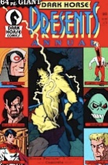
Dark Horse Presents (1986) #26

Dhp26

Arcudi has sort of taken reality and chucked it out the window of Homicide. I mean, I assume he’s basing the story about the assassin who eats his victims’ eyes on a real case… but it’s not believable the same detectives who had the cannibal case are going to have this one. And he’s done nothing to give them any personality, it’s all caricature.

The Race of Scorpions, allegedly in its penultimate chapter here, is a little better than usual. The exposition does a better job establishing where the characters are situated in relation to each other and there’s no much action. Duranona’s still not using any shading, so the whole thing lacks any depth. It looks like pre-Renaissance line drawing. But, hey, better than usual and it’s almost done.

In The Twilight of Langdarro, Davis totally ignores showing the passage of time, making it confusing… but who cares?

Dark Horse Presents (1986) #25

Dhp25

Duranona has something like two action scenes this part of Race of Scorpions. Two completely incomprehensible action scenes. Did the editor see something different or did they really get this material in and think it’d look good? At least this installment doesn’t rip off Star Wars.

Speaking of incomprehensible, Davis is back with a new story–The Twilight of Langdarro. I guess he’s not so much incomprehensible just really, really boring. He loves writing exposition. He probably writes four hundred words a story of exposition. And he still hasn’t gotten any better at getting his people down. His faces and figures are still a mess.

The Homicide story–featuring some of Mahnke’s first work–wins best story of the issue by default. It’s barely a story–the lead characters go and get into a bar fight to protect an informant. Mahnke’s not particularly good.

The series’s back in its rut.

Dark Horse Presents 26 (January 1989)

skitched-20101209-202405.jpg
Arcudi has sort of taken reality and chucked it out the window of Homicide. I mean, I assume he’s basing the story about the assassin who eats his victims’ eyes on a real case… but it’s not believable the same detectives who had the cannibal case are going to have this one. And he’s done nothing to give them any personality, it’s all caricature.

The Race of Scorpions, allegedly in its penultimate chapter here, is a little better than usual. The exposition does a better job establishing where the characters are situated in relation to each other and there’s no much action. Duranona’s still not using any shading, so the whole thing lacks any depth. It looks like pre-Renaissance line drawing. But, hey, better than usual and it’s almost done.

In The Twilight of Langdarro, Davis totally ignores showing the passage of time, making it confusing… but who cares?

CREDITS

The Twilight of Langdarro; story, art and lettering by Gary Davis. Race of Scorpions; story and art by Leopoldo Durañona; lettering by Tim Harkins. Homicide, Second Sight; story by John Arcudi; art by Doug Mahnke; lettering by Pat Brosseau. Edited by Randy Stradley.

Dark Horse Presents 25 (December 1988)

35836.jpg
Duranona has something like two action scenes this part of Race of Scorpions. Two completely incomprehensible action scenes. Did the editor see something different or did they really get this material in and think it’d look good? At least this installment doesn’t rip off Star Wars.

Speaking of incomprehensible, Davis is back with a new story–The Twilight of Langdarro. I guess he’s not so much incomprehensible just really, really boring. He loves writing exposition. He probably writes four hundred words a story of exposition. And he still hasn’t gotten any better at getting his people down. His faces and figures are still a mess.

The Homicide story–featuring some of Mahnke’s first work–wins best story of the issue by default. It’s barely a story–the lead characters go and get into a bar fight to protect an informant. Mahnke’s not particularly good.

The series’s back in its rut.

CREDITS

Race of Scorpions; story and art by Leopoldo Durañona; lettering by Tim Harkins. The Twilight of Langdarro; story, art and lettering by Gary Davis. Homicide, Give and Take; story by John Arcudi; art by Doug Mahnke; lettering by Pat Brosseau. Edited by Randy Stradley.

Dark Horse Presents (1986) #21

Dhp21

I hate to say it, but Ron Randall’s gotten better. Not as a writer, of course; Trekker has actually gotten to be worse written since Dark Horse Presents started. The story this issue is practically unintelligible. On the other hand, Randall’s inking has gotten a lot better. The art’s still not so great, but the inking… inking’s improved.

The Mask finishes up here with Badger killing a CIA agent. His second or fourth. Overall, the series has been sometimes decent, sometimes good–usually the best thing in the issue (this one has a lot of misspellings for some reason). Anyway, it’d probably work better in color as a single sitting read. The pace gets lost, especially given how weird it gets.

Delia & Celia either ends with the protagonists in some magical inner earth or with them stuck in a canyon. It’s impossible to tell from Davis’s art. But who cares?

Dark Horse Presents 21 (August 1988)

35832.jpg
I hate to say it, but Ron Randall’s gotten better. Not as a writer, of course; Trekker has actually gotten to be worse written since Dark Horse Presents started. The story this issue is practically unintelligible. On the other hand, Randall’s inking has gotten a lot better. The art’s still not so great, but the inking… inking’s improved.

The Mask finishes up here with Badger killing a CIA agent. His second or fourth. Overall, the series has been sometimes decent, sometimes good–usually the best thing in the issue (this one has a lot of misspellings for some reason). Anyway, it’d probably work better in color as a single sitting read. The pace gets lost, especially given how weird it gets.

Delia & Celia either ends with the protagonists in some magical inner earth or with them stuck in a canyon. It’s impossible to tell from Davis’s art. But who cares?

CREDITS

The Mask; story and art by Mark Badger; lettering by Tim Harkins. Trekker, Vincent’s Share, Part Two; story and art by Ron Randall; lettering by Ken Bruzenak. Delia & Celia, Under Tiltannon; story, art and lettering by Gary Davis. Edited by Randy Stradley.

Dark Horse Presents (1986) #20

Dhp20

This issue is a sixty-four page giant–only most of the extra is filler. They could have gotten away with a lot less pages.

The Mr. Monster story is real short (and lame). Gary Davis has a short space alien story showing he’s read some Arthur C. Clarke (it’s long, wordless filler).

Rick Geary’s got a nice two page story, which is filler but really excellent filler.

Then there’s the start of a Trekker serial. It’s incomprehensible if you haven’t read the Trekker series and probably even if you have.

Doug Potter has an excellent story about homelessness.

Oh, I missed Bob Burden’s Mystery Men and Flaming Carrot two page filler.

Then a real Mask story, which seems to be wrapping up. The narrative’s a little pat dramatically, but I’m not sure Badger cared.

Bob the Alien and Mindwalk have stories. Bob‘s hilarious, Mindwalk‘s weak.

Finally, even more filler.

Dark Horse Presents 20 (August 1988)

35831.jpg
This issue is a sixty-four page giant–only most of the extra is filler. They could have gotten away with a lot less pages.

The Mr. Monster story is real short (and lame). Gary Davis has a short space alien story showing he’s read some Arthur C. Clarke (it’s long, wordless filler).

Rick Geary’s got a nice two page story, which is filler but really excellent filler.

Then there’s the start of a Trekker serial. It’s incomprehensible if you haven’t read the Trekker series and probably even if you have.

Doug Potter has an excellent story about homelessness.

Oh, I missed Bob Burden’s Mystery Men and Flaming Carrot two page filler.

Then a real Mask story, which seems to be wrapping up. The narrative’s a little pat dramatically, but I’m not sure Badger cared.

Bob the Alien and Mindwalk have stories. Bob‘s hilarious, Mindwalk‘s weak.

Finally, even more filler.

CREDITS

<

p style=”font-size:11px;”>Mr. Monster, The Thing in Stiff Alley!; story by Chuck Gamble and Michael T. Gilbert; pencils by Gamble, Gilbert and Chuck Wacome; inks by Gilbert; lettering by Ken Bruzenak. Anomaly; story, art and lettering by Gary Davis. A Mother’s Tragedy; story, art and lettering by Rick Geary. Trekker, Vincent’s Share; story and art by Ron Randall; lettering by Ken Bruzenak. The Mystery Men!; story and art by Bob Burden; lettering by Roxanne Starr. The Visit; story, art and lettering by Douglas C. Potter. The Mask; story and art by Mark Badger; lettering by David Jackson. Concrete, Watching a Sunset; story and art by Paul Chadwick; lettering by Bill Spicer. Bob the Alien, Bob, the alien, Goes Birddogging; story, art and lettering by Rich Rice. Mindwalk; story by Randy Stradley; art by Randy Emberlin; lettering by Willie Schubert. Wacky Squirrel, Mixed Results; story, art and lettering by Jim Bradrick. Black Cross; story and art by Chris Warner. Edited by Randy Stradley.

Dark Horse Presents (1986) #16

Dhp16

Wow, what an issue.

Chadwick uses Concrete to bookend a short story. Or he uses double bookends to frame a story. It’s kind of pointless, so it fits with the other Concrete stories… At least the story’s mostly about people, so Chadwick’s art is strong. Strong enough. It really feels like something he had in the drawer and threw Concrete in to get it printed.

Captain Crusader limps to the finish. There are some art issues, but Martin’s idiotic writing is the problem. I think he wanted people to talk about how the story ends. I can’t imagine anyone talking about anything but his bad writing.

Then there’s Paleolove, which I’d been looking forward to reading for some reason. Silly me. Davis’s art is very precious and very problematic. His figures lack any consistent realistic proportions and his faces are weak. Not to mention Davis’s writing being way too descriptive.

Dark Horse Presents 16 (March 1988)

dhp16.jpg
Wow, what an issue.

Chadwick uses Concrete to bookend a short story. Or he uses double bookends to frame a story. It’s kind of pointless, so it fits with the other Concrete stories… At least the story’s mostly about people, so Chadwick’s art is strong. Strong enough. It really feels like something he had in the drawer and threw Concrete in to get it printed.

Captain Crusader limps to the finish. There are some art issues, but Martin’s idiotic writing is the problem. I think he wanted people to talk about how the story ends. I can’t imagine anyone talking about anything but his bad writing.

Then there’s Paleolove, which I’d been looking forward to reading for some reason. Silly me. Davis’s art is very precious and very problematic. His figures lack any consistent realistic proportions and his faces are weak. Not to mention Davis’s writing being way too descriptive.

CREDITS

Concrete’s Sky of Heads, With a Whimper; story and art by Paul Chadwick; lettering by Bill Spicer. Captain Crusader; story by Gary Martin; art by Martin, Ernie Colon, Howard Simpson and Paul Gulacy. Paleolove, When the Old World Was New; story, art and lettering by Gary Davis. Edited by Randy Stradley.