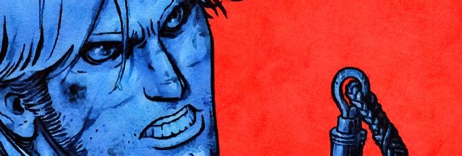
Rob Thomas loves the "Veronica Mars" television show fans. He must. He pretty much wastes the first act of the feature film (also titled Veronica Mars) thanking them for funding the film's production through Kickstarter. It's worse for star Kristen Bell than the film–both recover, but the film first–as the script's moving her around like a marionette. She doesn't get to do anything for way too long. Instead, she's an entirely passive, narrating protagonist.
Luckily, a lot of Thomas's fan service is amusing. So it allows Mars to coast–something Thomas's direction unfortunately can't do (he's mediocre until the second half)–and the acting is mostly strong. Even when the characters are just there to take up running time.
But coasting isn't enough; Thomas seems to know it because he brings erstwhile leading man (and don in distress) Jason Dohring. The script gives Dohring all the drama and all the layers it doesn't give Bell. Dohring excels. It's in his scenes where Bell starts getting better.
And then, all of a sudden, Mars sheds the dead leaves and starts growing organically. The film still calls back to elements from the show, but Thomas and co-writer Diane Ruggiero give Bell a role to act. They finally let her engage with the story instead of just visiting old friends. Problem solved.
Fine supporting turns from Enrico Colantoni, Ryan Hanson and Gaby Hoffmann. Tina Majorino looks completely lost.
Mars succeeds–almost everything with Bell opposite Dohring or Colantoni is spectacular stuff. It's just rough going at the start.
 ★★½
★★½
CREDITS
Directed by Rob Thomas; screenplay by Thomas and Diane Ruggiero, based on a story by Thomas; director of photography, Ben Kutchins; edited by Daniel Gabbe; music by Josh Kramon; production designer, Jeff Schoen; produced by Thomas, Danielle Stokdyk and Dan Etheridge; released by Warner Bros.
Starring Kristen Bell (Veronica Mars), Jason Dohring (Logan Echolls), Krysten Ritter (Gia Goodman), Ryan Hansen (Dick Casablancas), Francis Capra (Eli ‘Weevil’ Navarro), Percy Daggs III (Wallace Fennel), Gaby Hoffmann (Ruby Jetson), Chris Lowell (Stosh ‘Piz’ Piznarski), Tina Majorino (Cindy ‘Mac’ Mackenzie), Jerry O’Connell (Sheriff Dan Lamb), Martin Starr (Lou ‘Cobb’ Cobbler), Ken Marino (Vinnie Van Lowe), Max Greenfield (Leo D’Amato), Eddie Jemison (JC Borden), Jamie Lee Curtis (Gayle Buckley) and Enrico Colantoni (Keith Mars).
RELATED

 I remember worrying about whether or not Wilson would be able to maintain the first issue’s level of quality as Ms. Marvel went on. Apparently I didn’t need to concern myself, because not only is the second issue just as good, Wilson starts to show her hand.
 I don’t tend to go on at length about bad art. Well, maybe I do sometimes. But not often.
 Gianfelice’s art stands out this issue. Maybe it’s because everything Williamson does–Jackson is being held hostage–needs to be a surprise. There’s the villains taunting him so their taunts need to be visually rendered, there’s the allies doing a surprise attack, the surprise needs to be rendered. Even though there aren’t any huge set piece fights (I think they average three or four panels), the art’s essential.
 Trick is okay. I’m a little surprised, since he sort of ominously disappeared for a bit last issue. He’s in sidekick role, self-proclaimed dirty old man to Jackson’s more sympathetic narrator.
 Okay, the structure confuses me. I think the issue opens and then goes back to an early time and stays there but it also seems like maybe it continues the time from the open. I don’t know.
 There’s no nice way to phrase this observation so I’m going to just go ahead–Jones gives his female characters, in particular the New York paralegal or whatever she is, way too much credit. Unless he reveals her to be a trained law enforcement officer (like most of his strong female members), it’s just absurd. She can track Banner on the run, she carries night vision binoculars, she’s cool when confronted with Creel possessing a little kid… she’s practically Rambo.
 Ah, a young man, unhappy with the life predetermined for him, sets out on his own to find adventure but instead makes discovers to shake the foundation of his understanding. Never been done before.
 Oh, good, Davide Gianfelice is a new artist on Ghosted. I was a little confused as the style is so different from the first arc. I thought it could be the same guy, just because Williamson’s doing such different things right off with this issue.
 I didn't really think Minimum Wage could ever be as good as this issue turns out. Fingerman has a single adventure for alter ego Rob. He gets dumped and fills in on a public access television puppet show and meets his childhood crush, the fetching ranger woman.
 Here's Jones's problem, at least with this arc–he can't tell this story with the Hulk. So far it has little or nothing to do with the bigger conspiracy story, it's just about Bruce Banner getting involved with the Absorbing Man's ingenious plan to free himself and kill a bunch of innocent people in the process.
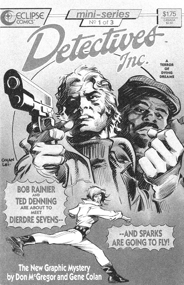
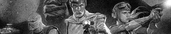
 This issue feels very much like a Star Wars approach to Trek. Not storytelling, but franchise stuff. Apparently there's a new character in the Into Darkness movie who has no memorable lines and isn't a familiar actor, but he's got an amazing story and the comic gets to reveal it.
 Well, Dusk’s personal story arc for this series sure doesn’t go anywhere expected. Maybe it’s because McGregor didn’t set him up for enough development or maybe it’s because almost a fourth of the double-sized issue is wasted on a poorly paced resolution to last issue’s cliffhanger.
 What do you do if your comic is so late not just your primary artist is behind but apparently your backup artist is behind too?
 Much as I enjoy Fernandez's art with setting and people, he's not a good Hulk artist. The Hulk has very, very awkward proportions. Pudgy almost. Muscularly pudgy.
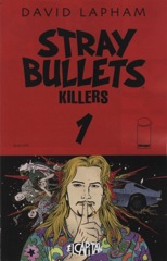 With this first issue of Stray Bullets: The Killers, David Lapham reminds everyone why they should feel bad about themselves for not missing Stray Bullets more. It's a new story, but it hits all the best beats the series used to hit and nothing else has hit since.
 McGregor gets to a lot of revelations this issue. Well, more like two. But they’re big ones. One involves the case, one involves Dusk’s involvement with his dead girlfriend’s kids. The case one is particularly interesting because McGregor does it without much emotion. McGregor isn’t unenthusiastic, he’s just measured–both for the comic (it’s not the big reveal) and for the character. This type of thing isn’t something to get Dusk emotional. He’s disconnected from it.

 After some unimaginative issues, The Star Wars definitely feels a lot more on track this time around. Even with some way too static art from Mayhew. He has lots of problems with Princess Leia react shots. She looks completely nonplussed by the chaos around here; it's not a one time thing, it's every time she's in a panel.
 Leandro Fernandez to the rescue! Not just regular Leandro Fernandez either, but doing a walking and talking scene through Central Park at twilight. It’s a gorgeous issue.
 It's a decent enough issue but the opening scene resolving the previous cliffhanger goes on way too long. There's also no science–though there's the hint of it–and the science stuff in Manifest Destiny is always cool.

 The second issue has a lot of action. The issues are double-sized and McGregor plots them quite well. There are three, maybe four, big action sequences in this one, along with a bunch of scenes involving the case itself, but there’s still time for the character work. McGregor always makes sure to work some of it into the investigation-related scenes too.
 Good grief, what a depressing issue. Aguirre-Sacasa definitely knows how to construct an effective story. He even mini-apes the dog issue of Hawkeye, only he does it here to greater success. Archie might be where he can have zombie attacks and make very adult observations about Archie Comics, but it’s also got an air of sincerity. Aguirre-Sacasa uses the Archie trappings as a tap into the readers’ nostalgia and familiarity to make the issue all the more devastating.
 And here’s that double-issue long Hulk fight Jones has never done before and now it’s clear why… Because he’s no good at it. Jones and Deodato have a rhythm to the fight. There’s the fight, there’s the side action (sometimes the Abomination’s wife, sometimes the bad guys in a helicopter). Those are usually six panel pages. So you get little panels for big fight moments. Or there’s the half double-page spread device, which Deodato uses a lot.
 Ed Brisson takes over Sons of Anarchy with a good pulpy story about a guy investigating the death of a friend's junkie son. I assume the guy and the friend are on the show, but since I haven't seen the show, it's just a guy and his friend.
 For Nathaniel Dusk II, Gene Colan’s pencils go without inks. However, they go with Tom Ziuko’s colors. Ziuko’s a familiar name as a colorist but I was still a little surprised with his work here. He takes Colan’s pencils and turns them into a painted comic. The colors are muted, but still lush. There are some fabulous skies in this one and Colan probably only contributed the cloud outlines.
 I have one quibble with Tales of Honor is how Jung-Geun Yoon draws the wildlife. Yoon’s sequential art is very stylized, digital painting, which works great for space battles and not too bad for the people. The conversations are mostly in medium shots so no too static faces delivering dialogue. But the protagonist has a pet cat (it’s not just a pet, it’s a soul-bonded thing but who cares) and Yoon can’t draw that cat. It looks like an Egyptian statue.