Quiz Show is a story about pride and envy. The film’s main plot is about the quiz show scandals in the fifties–big media taking the American public for a ride–and I suppose it could be seen as a loss of innocence thing. But it isn’t.
It’s about pride and envy.
John Turturro’s working class Jewish guy doesn’t have much pride (though he’s gloriously proud of it) and he’s got lots of envy. But not so much for the WASPs, but for more successful Jewish guys. So Rob Morrow’s middle class Jewish guy. Morrow’s character has pride and envy; in this case, it’s envy for the WASPs. Like Ralph Fiennes, who’s got not so much pride but envy. In his case, it’s for his dad–Paul Scofield in a wonderful performance.
There’s a lot about class, there’s a lot about masculinity (the women get what’s going on and try to get their husbands to recognize it to disappointment), there’s a lot about the time period. And screenwriter Paul Attanasio brings it all together beautifully. Quiz Show has an incredibly complex structure, something director Redford and editor Stu Linder fully embrace. Even in its stillest moments, the film is always in motion.
Gorgeous Michael Ballhaus photography too.
The leads–Turturro, Morrow and Fiennes–are all excellent. Nice support from David Paymer, Hank Azaria and Allan Rich. Ditto Johann Carlo and Mira Sorvino. Redford’s use of prominent actors and filmmakers in cameo roles works great.
Quiz Show is a phenomenal film.
 ★★★★
★★★★
CREDITS
Directed by Robert Redford; screenplay by Paul Attanasio, based on a book by Richard N. Goodwin; director of photography, Michael Ballhaus; edited by Stu Linder; music by Mark Isham; production designer, Jon Hutman; produced by Michael Jacobs, Julian Krainin, Michael Nozik and Redford; released by Hollywood Pictures.
Starring John Turturro (Herbie Stempel), Rob Morrow (Dick Goodwin), Ralph Fiennes (Charles Van Doren), David Paymer (Dan Enright), Christopher McDonald (Jack Barry), Elizabeth Wilson (Dorothy Van Doren), Paul Scofield (Mark Van Doren), Hank Azaria (Albert Freedman), Mira Sorvino (Sandra Goodwin), Johann Carlo (Toby Stempel) and Allan Rich (Robert Kintner).
RELATED
 For the first time in ten issues or so, Lazarus doesn’t sit well.


 The first issue of Curb Stomp had a lot of promise, the second issue implied maybe it didn’t… the third shows Ferrier and Neogi are going to do even better than that initial promise. It’s an outstanding comic book with a masterful control of the plotting. And some of Neogi’s best art–there are a lot of rituals in this issue (as the gangs negotiate) and Neogi has a visual theme for each different kind of ritual. It’s awesome.
 It’s a bridging issue. But, since it’s Brubaker, he feels the need to do it to bridge his arcs together. To give that trade paperback an extended cliffhanger, not just each issue in the trade.
 I like how Mark Millar has gotten to the point I don’t even bother forming an opinion on his first issue. Take Chrononauts. Good–but surprisingly not great–art from Sean Murphy. Of course, Millar often works with good artists.
 Okay, Laci’s art isn’t working out for Ghosted, especially not this issue. It’s talking heads–with one important bit of unexpected actions and one hinted one; so it’s mostly talking. And Laci can’t do it. His art works on a macro creepy level, but he doesn’t get into expressions enough for the characters to “perform” their fear and discomfort.
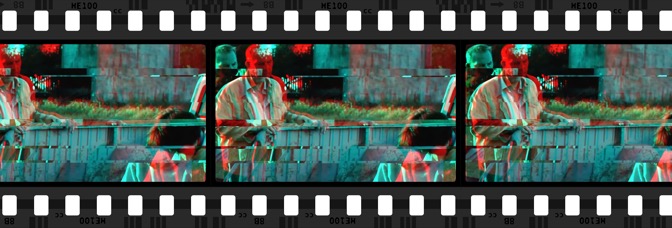


 The cynic in me hopes they do the Big Man Plans TV show well. I’m also hopeful for it, because if it gets a TV show, it’ll probably get another series. This series is only four issues and I can already tell I’m going to want more.


 Well. Soule jumps three months ahead in Letter 44 and entirely skips anything with the regular President. The former President (you know, Bush) is running the war against America from Europe, which is kind of funny. Wonder if he eats Freedom Fries. It’s kind of bad, kind of not. Soule is using up all his stockpiled good will, especially since Alburquerque’s art has somehow gotten worse.
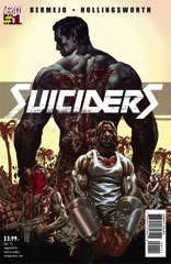 Because no one remembers Escape From L.A., it’s time for Suiciders. But people do remember Mad Max Beyond Thunderdome–or at least the Thunderdome. Writer and artist Lee Bermejo rips off one of those movies, or just any other movie where post-apocalyptic guys fight in an arena to do the death for the enjoyment of the masses. Wasn’t it in a Zorro too?

 The protagonist of the second issue of Sabrina–Aguirre-Sacasa doesn’t actually go with Sabrina, but her new (unknown to her) nemesis–is so disturbing, once the story does get back to Sabrina and company, as creepy as they are, they’re welcoming.

 D4VE is the traditional American story of the disaffected middle aged office worker, the one whose wife doesn’t find him attractive anymore, the one who has a terrible relationship with his kid.

 Ferrier’s second issue as writer is better than his first, but it’s still got a lot of problems. He gives the SAMCRO club a nemesis in this dopey little punk, who Bergara draws like an Archie character. It’s weird.

 Lemire sure does know his sci-fi–this issue of Descender continues the A.I. vibe while throwing in some Outland. He also knows how to go straight for the heartstrings, which he does with a bunch of flashbacks to Tim–21 (he’s the android protagonist) in happier days.


 Criminal’s back for a one-shot and, wow, it certainly does do a good job reminding of when Ed Brubaker and Sean Phillips are hitting the high notes on the comic.
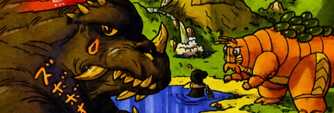

 My friend summed up Kaijumax for me before I read it. Monster Island is a maximum security prison. Ultraman is the guard. He neglected to tell me there was bickering between classes of monster, silly cameos from an Aliens alien and a whole bunch of Mecha-Godzillas. Because Zander Cannon loves this stuff. It’s clear. He loves it.
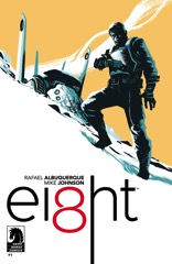 What is Ei8ht?