The Savage Hawkman 3 (January 2012)

2096856v3_super-1.jpeg
There’s a childlike quality to Hawkman. Sure, it’s because Daniel’s writing is from an unimaginative fourth grader, but it sounded like a compliment when you first read it, right?

This comic is so silly, it’s almost impossible to think about. I guess the implication no one knows Hawkman exists is kind of interesting. Daniel doesn’t do anything with it. The plot is very simple. Carter Hall investigates then fights bad guys. Oh, I forgot all the alien threat stuff. It’s really stupid.

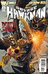
Tan keeps up his “style” for the series–Hawkman is painted, everything else is drawn, both have really weird eyes. The style still doesn’t make sense in the context of the story.

I actually did like some of the comic. Tan’s composition on some of the Hawkman flight panels is excellent. It’s all silhouette and Tan can’t screw up city skylines.

It’s absurdly bad. Daniel’s writing is hilarious.

CREDITS

Razing Kane; writer, Tony S. Daniel; artist, Philip Tan; colorist, Sunny Gho; letterer, Travis Lanham; editors, Rickey Purdin and Rachel Gluckstern; publisher, DC Comics.

The Savage Hawkman 2 (December 2011)

hawkmancover.jpg
Tony Daniel sure does come up with interesting character names! I wonder if someone told him dumb, unbelievable character names made him a good writer.

Hawkman might be a little better this time, but only because it’s got a lot more stuff to mock.

First, Daniel’s dialogue is awful.

Second, Tan does his painted Hawkman panels and then his sketchy regular panels. Colorist Sunny Gho sticks so much to greys, it actually hurts Tan’s art. And Tan’s art is terrible, so for a colorist to hurt it… well, the colorist can’t be very good.

The comic reads like a spy story, not a superhero one. Carter Hall and his secrets. Of course, Daniel hasn’t made the new DC Universe Carter Hall at all interesting. Except he appears to have an enormous apartment… and can’t pay his rent. Making him the second (third?) post-relaunch character with this dilemma.

Still garbage.

CREDITS

Wings of Darkness; writer, Tony S. Daniel; artist, Philip Tan; colorist, Sunny Gho; letterer, Travis Lanham; editor, Janelle Asselin; publisher, DC Comics.

The Savage Hawkman 1 (November 2011)

Savage-Hawkman_Full_1-665x1024.jpg
An adult came up with the name Morphicius? Or does Tony Daniel have some really dimwitted nine year olds working for him? Writing his dialogue, coming up with his logic… no, I imagine a nine year old dimwit would do better.

I didn’t realize Hawkman was Daniel. Right away, the terrible writing started cluing me in. As for the art, the terrible painted style confused me—than I checked the cover and saw it was Philip Tan. In Tan-land, no one has eyeballs, just empty sockets. It’s clearly a style thing.

Hawkman is kind of funny because it’s not just crap, it’s derivative crap.

Imagine Hawkman mixed with Spider-Man’s alien costume and you’ll be on the right track. I guess Daniel felt bad he missed out on “Venom-Island” or whatever the Spider-Man Venom crossover was called. Because he’s got lots of Venoms here.

Hawkman’s putrid garbage.

CREDITS

Hawkman Rising; writer, Tony S. Daniel; artist, Philip Tan; colorist, Sunny Gho; letterer, Travis Lanham; editor, Janelle Asselin; publisher, DC Comics.

Batman and Robin (2009) #6

Bmr6

I do love this issue for Robin calling the flamboyantly gay South American toreador gay.

Or whatever Morrison named his second original villain for the series.

The rest?

Not wild about it.

Batman and Robin get their butts kicked, again. Morrison gets in some meta-textual references to Jason Todd’s resurrection (nothing about Bucky though) as it compares to the soon-to-be resurrected Bruce Wayne. It’s not particularly useful and is painfully obvious.

I’m also a little confused about Robin heading back to a Lazarus pit for his medical treatment (he got shot five times in the back). If he can just get resurrected over and over, what’s the point in putting him in dangerous situations?

And if Tan’s art was bad before, it’s really awful this time. It was so ugly I had to check the credits, because it’s beyond the banal mainstream he’d done the last issues.

Batman and Robin (2009) #5

Bmr 5

Ok, what? I’m a little groggy or whatever, but why can Jason Todd’s untrained sidekick beat up Damian? Wasn’t he trained by the League of Assassins? It just seems silly.

This issue is the first one in the series where it doesn’t feel like Morrison’s got a hold of what he’s doing–Batman and Robin is supposed to be a quality mainstream book. With the Tan art, it feels mainstream all right, but there’s not so much in the way of quality. The writing’s fine, but it’s all soulless.

Take, for example, the Jason Todd and sidekick breather scene. What does Jason Todd look like out of costume? Some broken down bad guy. Morrison portrays him as completely nuts, the sidekick too, which makes them really boring when it becomes to the dramatics. The Penguin’s far more interesting….

Having the Red Hood be internet-savvy doesn’t make everything all right.

Batman and Robin (2009) #4

Bmr4

Philip Tan’s an interesting choice for Batman and Robin. He’s absent any personality, which actually doesn’t hurt the book during the Red Hood’s scenes. Morrison’s characterization of Jason Todd is as a complete nutjob lamer, which works pretty well. He also seems like he’s ready to get creepy with his underage sidekick.

There are two excellent things in this issue. First is Dick Grayson trying to play Bruce Wayne at a charity function. It’s endearing and entertaining (though I wish Morrison had let Damian a little more lose amongst the society types). The second thing is Batman and Robin on stakeout together. Again, endearing and entertaining, without losing the edge Morrison’s established for the series.

The rest of the issue is either action, crime boss talk (which offers some hints at the first arc’s secret villain) and the Red Hood. Those scenes don’t matter too much. They’re epical, not sublime.