• The Field 1 (April 2014)

    The Field #1I have a very simple problem with stories where someone’s hallucinating or living the virtual reality or caught in a time warp and gets to repeat the same day over and over again. These stories are about the gimmick. They can run that gimmick out and be about something after it, but most don’t.

    Will Ed Brisson have a real story with The Field after he reveals the mystery of it? Who knows. With Simon Roy on the art–my favorite image has to be this small corner of one panel of the protagonist running in his underoos–the comic will at least look good and Brisson’s writing is fine. It’s just about how he’s going to reveal the solution to his mystery.

    There are undoubtedly clues this issue to the truth, but the way he layers the contradictions is more engaging. He’ll solve the mystery for the reader anyway.

    B 

    CREDITS

    Writer and letterer, Ed Brisson; artist, Simon Roy; colorist, Simon Gough; publisher, Image Comics.

  • Stray Bullets 5 (August 1995)

    Stray Bullets #5Lapham goes for mood a lot this issue. Only, he doesn’t do it with the art, he does it with the lettering. He does it with the “sound” going around, the dialogue. It’s a fantastic sequence. It takes place during a party, which is sort of confusing as many of the guests seem to be the same as the other party from a previous issue. But it’s definitely a different party.

    Probably.

    Doesn’t matter.

    The protagonist of the issue is a teenager who witnesses a car accident. He falls in with an older woman who knows Spanish Scott and Monster (we later learn) but mostly the story is the kid’s. He’s got an overbearing mom, a rebellious younger sister, an ineffectual dad. Lapham does a great job showing his frustration at his inability to take control of his life.

    The ending, which is problematic, is also awesome. Lapham really scores.

    B+ 

    CREDITS

    Backin’ Up the Truck; writer, artist, and letterer, David Lapham; editor, Deborah Purcell; publisher, El Capitán Books.

  • Five Weapons 8 (April 2014)

    Five Weapons #8I almost feel like I need to go back and read Encyclopedia Brown to see if that series is where Robinson is getting his cliffhanger approach from. If so, I’ll bet Five Weapons reads great in a trade.

    Besides the cliffhanger, which frustrates instead of intrigues (as usual), it’s an excellent issue. Enrique is investigating who poisoned the nurse and spends a lot of the issue all by himself, sneaking around the school, seeing stuff. Robinson has managed to turn the comic into a mystery book; it’s nice to see he can do things with different genres in it, though there’s always a mystery element when it comes to Enrique’s solutions, I suppose.

    The opening, where Enrique talks himself out of trouble with the archery teacher, at first seems overlong. It’s a lot of talking and bad jokes. But Robinson backs them up with a good flashback.

    Strong issue.

    B+ 

    CREDITS

    Tyler’s Revenge, Part Three; writer, artist and letterer, Jimmie Robinson; colorist, Paul Little; editor, Laura Tavishati; publisher, Image Comics.

  • Atari Force #13So for his last issue, Conway sort of destroys the world. At least, he destroys the world of Atari Force he has been establishing for twelve issues. And he lets Joey Cavalieri write the script for it. Eduardo Barreto takes over the pencils and does a great job with everything except full page spreads. He can’t do those for whatever reason.

    Cavalieri manages a few decent moments, mostly with the supporting cast, as Martin–the series’s lead at this point–dukes it out with the big villain. Lousy fight dialogue on that one. Luckily those other scenes make up for it somewhat.

    The ending might have more gravity if it weren’t just thirteen issues into the series. It’s hard to care too much about it, even at a macro level. Cavalieri (and Conway) don’t earn the concern.

    There is a nice backup from Paul Kupperberg, Dave Manak and Giffen, however.

    C- 

    CREDITS

    The End; writers, Gerry Conway and Joey Cavalieri; penciller, Eduardo Barreto; inker, Ricardo Villagran; colorist, Tom Ziuko; letterer, Bob Lappan; editor, Andy Helfer; publisher, DC Comics.

  • Translucid 1 (April 2014)

    Translucid #1I'm confused, did the world really need an exceptionally pretentious superhero comic without anything to say? Because writers Chondra Echert and Claudio Sanchez don't do much so far with Translucid except lay out a superhero versus supervillain and, oh, if they aren't just alter egos (or at least one of them thinks they are). It's like Batman and the Joker… or not. Maybe Spider-Man and Doctor Octopus? No, not really.

    It's actually a lot like Baphomet and Batman because Daniel Bayliss's design for the villain is a knight's chess piece and the two look similar. The less said about the hero's design, the better.

    But everything else Bayliss does in the comic is fantastic. Even the bad designs are rendered well. Echert and Sanchez aren't going for a lot of realism, but they get it with Bayliss.

    So does the world need the series? No. But yes to Bayliss's art.

    C 

    CREDITS

    Wild Horses; writers, Chondra Echert and Claudio Sanchez; artist, Daniel Bayliss; letterer, Ed Dukeshire; editors, Jasmine Amiri and Ian Brill; publisher, Boom! Studios.

  • Stray Bullets 4 (June 1995)

    Stray Bullets #4So, with this issue, Lapham does two things. First, he resurrects a previously presumed dead character and fills in, through exposition, the year between stories. But then he also spends the entire issue teasing danger for the character, only to go for a somewhat black, but still comedic relief finish for the issue.

    It’s kind of a cop out. Not because there can’t be okay people in the world–or at least people who aren’t complete monsters–but because Lapham spends the whole issue twisting the reader’s perspective. The issue’s a road trip, not a scenic one, but a road trip; only Lapham’s taking the reader for that ride.

    There’s some strong character work on the returning character and not so good character work on the new cast member. Lapham is intentionally deceptive. It’s hard to build a character while tricking the reader.

    Cop out or not, it’s masterfully done.

    B 

    CREDITS

    Bonnie and Clyde; writer, artist, and letterer, David Lapham; editor, Deborah Purcell; publisher, El Capitán Books.

  • Minimum Wage 4 (April 2014)

    Minimum Wage #4Fingerman finds a nice calm with this issue of Wage. He doesn’t try for much–most of the issue involves protagonist Rob and his two friends out for a night on the town and running into awkward situations. None of the situations are uproarious, but all of them are pleasing enough.

    The first part of the issue deals with moving things along plot-wise. New job, new apartment. Rob has so many different friends it’s hard to imagine how the guy has time to do any work whatsoever; Fingerman really likes drawing scenes in dining establishments.

    As I said, the calm is nice–there’s a definite lack of ambition to it. The story can’t do too much with Rob doing nothing but talking to his buddies and Fingerman never puts them on high adventures together.

    Hopefully next issue will have more activity, but it’s unclear how much comic really needs.

    CREDITS

    Writer and artist, Bob Fingerman; publisher, Image Comics.

  • Bean (1997, Mel Smith)

    I’m trying to imagine how Bean would play to someone unfamiliar with the television show. Depending on one’s tolerance for bland family comedy-dramas, it might actually play better. Because Bean, the movie, removes a lot of Bean, Rowan Atkinson’s character, and instead fills the time with Peter MacNicol and his problems.

    His job is on the line and his wife of presumably sixteen plus years has decided their marriage is on the rocks because of those problems with his job. Pamela Reed plays the wife and she’s exceptionally unsympathetic in her anger. Screenwriters Richard Curtis and Robin Driscoll don’t just do a hatch job with the characterizations, they keep it going and going.

    Some of the problem is director Mel Smith. He resists ever shooting the film from Atkinson’s perspective, except in the longer slapstick sequences, but he also doesn’t direct the film around him well. Harris Yulin especially stumbles around looking for direction. The supporting cast is mostly indistinct, though Burt Reynolds gets a smile or two and Larry Drake gets an actual laugh.

    With all the celebrity cameos, Bean should feel bigger. But Smith doesn’t know how to direct it big. Or small. Until the ludicrous finish, the script’s tolerable. Tepid, but tolerable. The finish is atrocious though.

    So why’s Bean all right, even with the finish? Because Atkinson is really, really funny and he never acts like there’s anything wrong with the film. He’s fully committed, even though his character’s constantly changing.

    The film shamefully fails him.

    2/4★★

    CREDITS

    Directed by Mel Smith; screenplay by Richard Curtis and Robin Driscoll, based on characters created by Rowan Atkinson and Curtis; director of photography, Francis Kenny; edited by Chris Blunden; music by Howard Goodall; production designer, Peter S. Larkin; produced by Peter Bennett-Jones, Tim Bevan and Eric Fellner; released by Polygram Filmed Entertainment.

    Starring Rowan Atkinson (Mr. Bean), Peter MacNicol (David Langley), Pamela Reed (Alison Langley), Harris Yulin (George Grierson), Burt Reynolds (General Newton), Larry Drake (Elmer), Chris Ellis (Det. Butler), Johnny Galecki (Stingo Wheelie), Richard Gant (Lt. Brutus), Danny Goldring (Security Buck), Andrew Lawrence (Kevin Langley), Tom McGowan (Walter Merchandise), Sandra Oh (Bernice Schimmel), Tricia Vessey (Jennifer Langley) and John Mills (Chairman).


    RELATED

  • The Comics Fondle Podcast – 1×10
    It’s almost time for C2E2; we’re ready, are you? This episode Vernon and I talk about what’s going on with Comics Fondle: The Podcast at C2E2 and some new comics. Then Vernon ropes me into a lengthy discussion about Comixology, Amazon, and the future of comic books.

    WHERE TO LISTEN

    Apple Podcasts
    Spotify
    Stitcher
    RSS
  • Sorcerer (1977, William Friedkin)

    It’s incredible how much concern director William Friedkin is able to get for his characters in Sorcerer. Now, the film’s really kind of like four or five movies in one–there are four prologues, with very full ones for Bruno Cremer and Roy Scheider, then there’s the story of Cremer, Scheider and Amidou (who also gets a prologue, just not a substantial one) in South America, then there’s the story of Ramon Bieri and his American oil company and how it affects the local South American population, then there’s the story of these four guys who have to drive dangerous chemicals to an oil well fire.

    Sorcerer is packed.

    The “real” movie, the actual drive across dangerous terrain, starts almost halfway into the film. It’s amazing stuff. The film’s beautifully edited by Bud S. Smith; he and Friedkin create impossibly tense situations. The success is even more impressive because none of the characters, save Cremer to some degree, are likable. Scheider’s a bit of a jerk, a bit of a moron.

    But for about seventy-five percent of its run time, Sorcerer is glorious. Friedkin aims high and hits every note just right. Then things fall apart. There’s a lengthy, silly hallucination sequence. There’s odd characterizations, there’s too emphatic Tangerine Dream (who Friedkin usually let take a back seat to the great sound design). Sorcerer unravels in the home stretch.

    The good stuff and the great stuff still makes the film worthwhile. It’s masterful work from Friedkin and Smith.

    Bad finish though.

  • Atari Force #12I think the problem is simpler than I would have thought–by problem I mean why Conway’s not as on the ball with the series anymore. He’s not even taking the time to script, just plot. Andy Helfer’s got the inglorious task of scripting. It’s hard to hold the issue against Helfer, the series’s breaking.

    Atari Force works when it’s about the characters and García-Lopez’s approach to sci-fi. There’s a lot of villain stuff–it’s just Bond villainy at an intergalactic level. Maybe with some Road Warrior thrown in. Boring.

    Worse, the character stuff this issue is tepid. Dart being patient with Blackjak isn’t engaging, especially not with Helfer’s very calm, almost feminist approach to his betrayal. And surfer boy’s trial scene is really weak.

    There’s a lovely Keith Giffen backup with surfer boy’s pet though, just lovely. It’s kind of a parable.

    Hopefully the series will improve.

    C+ 

    CREDITS

    Revelations!; writers, Gerry Conway and Andy Helfer; penciller, José Luis García-López; inker, Bob Smith; colorist, Tom Ziuko; letterer, Bob Lappan; editor, Helfer; publisher, DC Comics.

  • The Strange Woman (1946, Edgar G. Ulmer)

    The Strange Woman opens with Dennis Hoey as a drunken widower and Jo Ann Marlowe as his evil little daughter. Herb Meadow's script is real bad in this opening, but it's nineteenth century kids playing and one of them is a psychopath, how good is the script going to be? But then it jumps forward to Hedy Lamarr playing the daughter, presumably as a young woman just of marrying age, and Hoey's contemporaries lusting after his kid.

    The principal luster is Gene Lockhart, who schemes–aided by Lamarr's manipulations of her situation–to get her into his house and bed. In other words, there's no one particularly likable in Woman. When Lockhart's son, played by Louis Hayward, gets home from university, Lamarr's trying to seduce him too. He forgot how she once tried to kill him, obviously.

    The film actually moves really well for the first forty or fifty minutes because it's a turgid, sensational melodrama without any likable characters. There's no investment. Lamarr's terrible, Hayward's terrible, the script's terrible. It's not like director Ulmer does much interesting–the film mostly takes place in boring houses or in front of them–but it does move.

    Then George Sanders finally shows up as the latest man Lamarr must have–only he's not a dirty old man like Lockhart or a lust-crazed fop like Hayward, he's the story's first honest major character. Fifty minutes in is too late to introduce the protagonist.

    The ending is really dumb, but it doesn't matter. So's the rest of the picture.

    0/4ⓏⒺⓇⓄ

    CREDITS

    Directed by Edgar G. Ulmer; screenplay by Herb Meadow, based on the novel by Ben Ames Williams; director of photography, Lucien N. Andriot; edited by John M. Foley and Richard G. Wray; music by Carmen Dragon; production designer, Nicolai Remisoff; produced by Jack Chertok and Eugen Schüfftan; released by United Artists.

    Starring Hedy Lamarr (Jenny Hager), George Sanders (John Evered), Louis Hayward (Ephraim Poster), Gene Lockhart (Isaiah Poster), Hillary Brooke (Meg Saladine), Rhys Williams (Deacon Adams), June Storey (Lena Tempest), Moroni Olsen (Rev. Thatcher), Olive Blakeney (Mrs. Hollis), Kathleen Lockhart (Mrs. Partridge), Alan Napier (Judge Henry Saladine) and Dennis Hoey (Tim Hager).


    RELATED

  • Sinestro #1You know, Dale Eaglesham does do a great job on Sinestro. I wouldn’t subject my brain to another issue of this prattling, but Eaglesham’s art is really good.

    Writer Cullen Bunn has the task of bringing Sinestro back from a self-imposed exile. For all the endless expository narration from Sinestro, I’m unclear why exactly he’s in exile. It’s kind of hard to care too, because Bunn doesn’t make him a particularly interesting lead. He fights lions or tigers, talks to some inexplicably scantily clad lady with writing on her and then they go off and have a space adventure.

    Apparently the comic’s supposed to be engaging because Sinestro’s an anti-hero–he only saves people of his planet from being killed, not the other people he could also save.

    So he’s a bastard, who cares? Maybe if Bunn put him in an interesting situation, but he doesn’t.

    It’s tripe.

    D 

    CREDITS

    Blackest Day, Brightest Night; writer, Cullen Bunn; artist, Dale Eaglesham; colorist, Jason Wright; letterer, Dezi Sienty; editors, Chris D. Conroy and Matt Idelson; publisher, DC Comics.

  • Stray Bullets 3 (May 1995)

    Stray Bullets #3Being interconnected can be a real problem when it’s all you’re going for. This issue, Lapham brings in characters from the previous issues at different times in their lives, showing where they’ve gone or showing how they ended up where they’re going. For the most part, they’re supporting cast, which is good.

    The problem is Lapham doesn’t have anything going on for his lead characters this issue. It’s a couple young, dumb, small time crooks who throw a party. The whole issue revolves around the party and the party isn’t interesting. Lapham goes for non sequitur surprises with some of the party moments; good approach, but not great moments.

    He’s got a problem–his little criminals aren’t sympathetic characters and they aren’t compelling ones either. Why care about their problems? Their stories for the issue don’t grab. Lapham seems to know it too, using cheap stunts more often than not.

    C 

    CREDITS

    The Party; writer, artist, and letterer, David Lapham; editor, Deborah Purcell; publisher, El Capitán Books.

  • Ms. Marvel 3 (June 2014)

    Ms. Marvel #3Wilson does some really cool stuff this issue–having Kamala not just deal with the possibilities of her superpowers, but also what the ability to shape shift means for her identity–but she also gets way too after school special melodramatic. She’s mixing too many subplots together.

    And she goes for a really cheap hard cliffhanger. It’s an effective one, sure, but in a cheap way, especially given all the complicated connotations of it given the overdone subplot combination.

    Alphona’s art is particularly good this issue, something I don’t want to forget to mention either. The superhero stuff almost feels like a dream. Ms. Marvel is definitely not the standard Marvel comic.

    What Wilson does best, at least for this issue, is give her plot gravitas while focusing on Kamala. One really sees the story from her perspective, even when there are diversions with other cast.

    It’s just too complicated.

    B 

    CREDITS

    Side Entrance; writer, G. Willow Wilson; artist, Adrian Alphona; colorist, Ian Henning; letterer, Joe Caramagna; editors, Devin Lewis and Sana Amanat; publisher, Marvel Comics.

  • Atari Force #11There’s very little personality to this issue. About the most of it comes from Babe–the rock creature–who apologizes at one point. It shows something going on besides the main plots, which are three.

    First, there’s the deception on the team. It’s all really predictable and Conway doesn’t spend any time trying to make it palatable because it’s not. It’s too obvious and Conway can’t focus on it without making the characters seem too dumb.

    Second, there’s surfer dude in captivity and the people around him. Again, not very engaging stuff because it’s a bunch of supporting cast members talking about a main cast member and the main cast member not doing anything.

    Finally, there’s the bad guy. The Atari in Atari Force really comes through a few times because a lot of his dialogue sounds like terrible video game boss dialogue.

    The issue’s not awful, just excruciatingly rote.

    C 

    CREDITS

    Betrayal; writer, Gerry Conway; penciller, José Luis García-López; inker, Bob Smith; colorist, Tom Ziuko; letterer, Bob Lappan; editor, Andy Helfer; publisher, DC Comics.

  • The Auteur 2 (April 2014)

    The Auteur #2I'm hesitant, but I'm pretty sure The Auteur is reprehensible. Gloriously so, of course, but just completely reprehensible. Spears sends his Hollywood producer to court to defend a serial killer–so the serial killer can consult on a horror movie, natch–and comes up with this great argument about how a serial killer represents a natural predator in the human ecosystem.

    Then there's this hilarious blaming of the victim and it's terrible, of course, since the victim was brutally murdered. But Spears has some great details. And he's not just making jokes at the expense of the squares, he's also got some great ones at the expense of his protagonist. The protagonist's a hilarious, awful human being, so it's fun to laugh at him too.

    This issue might be the series's peak and it's a peak Spears and Callahan should be proud of surmounting.

    It has a great pace too. Just great.

    CREDITS

    Presidents Day, Part 2 of 5: Survival of the Fittest; writer and letterer, Rick Spears; artist, James Callahan; colorist, Luigi Anderson; editor, Charlie Chu; publisher, Oni Press.

  • Stray Bullets 2 (April 1995)

    Stray Bullets #2There’s an odd thing to this issue of Stray Bullets. Even though Lapham never suggests things are going to go all right at all, even though he takes the reader through various intense situations and they always get worse, he creates a hopefulness. It’s a useless one, of course, but it’s there.

    The reality of the comic starts with the Star Wars banter and carries over into the family relationship. The lead is a middle school girl who witnesses a murder and breaks down. Lapham handles all of the relationships perfectly; people are selfish and self-serving. Not a single moment is off. It’s astoundingly depressing.

    It’s not just good because it’s depressing. It’s great because Lapham perfectly constructs this situation and setting and the inevitability of it all. He has opportunities to foreshadow a happy ending, but skips them.

    He’s trying to ruin the reader’s day. He does.

    A 

    CREDITS

    Victimology; writer, artist, and letterer, David Lapham; editor, Deborah Purcell; publisher, El Capitán Books.

  • The Star Wars 7 (April 2014)

    The Star Wars #7
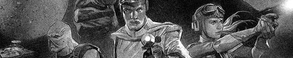
This issue isn't bad. It's got some of Mayhew's best art on the series–though not his giant Wookie battle, but the moments before those scenes–and Rinzler keeps the action going. But the comparisons to the original films, particularly Return of the Jedi, reveal just how much texture Rinzler has sacrificed to fit this comic into eight issues.

    For example, there are these attempts at banter between Annikin and Artwo and they're incredibly forced–it's as though Rinzler remembered at the last minute Artwo could talk here and had to get something in.

    The issue is preparation for the Wookie battle, which includes the introduction of Chewbacca and his single dialogue exchange with Han Solo (who's just around to give Luke Starkiller someone to talk exposition with), the huge Wookie battle, kids getting kidnapped, Darth Vader interrogating, Annikan infiltrating the Death Star stand-in.

    Too bad Dark Horse couldn't give Rinzler twelve issues.

    B- 

    CREDITS

    Writer, J.W. Rinzler; artist, Mike Mayhew; colorist, Rain Beredo; letterer, Michael Heisler; editors, Freddye Lins and Randy Stradley; publisher, Dark Horse Comics.

  • Atari Force #10Interesting tidbit in the letter pages this issue–maybe there have been more and I missed them, but the book is intended to be an ongoing with a twelve-part opening story arc. It gives Conway some more leeway with bringing in all this exposition–there isn’t much this issue, actually–because it’s at such an awkward part in a maxi-series. Doesn’t the problems with too much exposition, but it’s intentional anyway.

    This issue has Dart’s lover coming back and he’s got a story for her about their escape. After a conjugal visit. Conway likes to shock with this one, apparently. Even more is when the guy–Blackjak–includes a nasty detail in his story. He takes advantage of one of García-López’s cute aliens. It’s a mean, harsh sequence.

    The issue’s mostly Dart and her guy’s flashback and then surfer dude on the New Earth planet. Conway writes at a great pace; the cliffhanger’s pleasantly sudden.

    B 

    CREDITS

    Home Is the Hero; writer, Gerry Conway; penciller, José Luis García-López; inker, Ed Barreto; colorist, Tom Ziuko; letterer, Bob Lappan; editor, Andy Helfer; publisher, DC Comics.

  • A Voice in the Dark 6 (April 2014)

    A Voice in the Dark #6Taylor's been setting up a murder for so long I can't even remember how many people get killed in it. The format's the same every issue; he opens in the present, with Zoey cleaning up after the murder, and then flashes back.

    This issue concentrates solely on Zoey as she prepares to commit the murder. Or a murder. Part of Dark's charm is how Taylor is able to build a lot of backstory in his issues, even though there's not a lot of exposition lately. There's usually a talking heads scene or two–this issue has one–and it's enough to move things along. It's like there are whole b and c plots happening off panel, with Taylor ready to bring them in once they've percolated enough.

    The story continues to be engaging–with Zoey getting a love interest now–but this arc's getting a little too long. Hopefully it'll wrap sooner than later.

    B 

    CREDITS

    Killing Game, Part Four; writer, artist and letterer, Larime Taylor; editor, Duncan Eagleson; publisher, Image Comics.

  • Stray Bullets 1 (March 1995)

    Stray Bullets #1With a very strange sense of humor, you could call the first issue of Stray Bullets a comedy of errors. Two guys working for a crime boss (it’s never too clear, which is nice) have a simple task. They have to dispose of a body. Unfortunately, they have a flat.

    Then it turns out one of the guys isn’t all there, mentally. David Lapham takes the story from bad to worse, dragging the reader not just into the world view of the mentally disabled guy, but into the distorted world view of his partner. And once Lapham has the reader in that mindset, he doesn’t let up until the end. He controls the reader through a lengthy, packed story–lots of panels on lots of pages.

    The ending’s a bit of a letdown as Lapham lets everyone breath. It’s like he pauses to admire his craftsmanship a little much.

    But still….

    A- 

    CREDITS

    The Look of Love; writer, artist, and letterer, David Lapham; editor, Deborah Purcell; publisher, El Capitán Books.

  • All-New Doop 1 (June 2014)

    Doop #1Oops, was I supposed to read “Battle of the Atom” first? Even though I never read writer Peter Milligan’s X-Force, I figured Doop was from there and he finally got his own series. Given the mass crossover just in this issue–X-Men of all eras–I was able to guess some of the series’s intent.

    Only, if it’s just Doop’s side adventures to this crossover, it’s unclear what kind of mileage Milligan will be able to get out of it. There’s some funny bickering with the various Iceman incarnations, but nothing to make the issue itself worthwhile.

    Similarly, the David LaFuente art is pretty good, both for the action and the comedy, but it’s not enough on its own to recommend the comic.

    The concept’s a fine enough idea–a side sequel to a big Marvel mutant event–it just doesn’t have much to offer except to diehards.

    C 

    CREDITS

    The Real Battle of the Atom; writer, Peter Milligan; artist, David Lafuente; colorist, Laura Allred; letterer, Clayton Cowles; editors, Devin Lewis and Nick Lowe; publisher, Marvel Comics.

  • Atari Force #9First observation–Conway and García-Lopez are aware they’re stocking the team with adorable, mischievous space aliens. It’s kind of weird. Must be a way to make the comic more likable at a glance.

    This issue, nine issues into the second series, recaps events from the first series. Pertinent events. Surfer boy has gone back to New Earth to talk to people–hopefully he’ll bring the team back some fresh food and toilet paper–and besides a bonding session with his shrink, it’s all back story.

    The art in the rest of the comic makes up for the rush job on the flashback. Conway checks in with some of the rest of the cast and treads a bit of water preparing for the surfer to get back. The likability helps the treading go smoothly.

    It’s a slight issue and Conway overdoes the flashbacks but he’s got the series firmly footed.

    B- 

    CREDITS

    Memory Lane; writer, Gerry Conway; penciller, José Luis García-López; inker, Bob Smith; colorist, Tom Ziuko; letterer, Bob Lappan; editor, Andy Helfer; publisher, DC Comics.

  • Shutter 1 (April 2014)

    Shutter #1
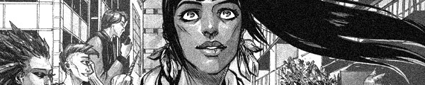
Shutter needs to take a breath. Between Leila Del Duca’s frantic, detailed art and Joe Keatinge’s hip, artificial plotting and dialogue, it’s an adventure comic without any sense of adventure. When the lead complains life is boring, even though there are mythical creatures living among humans and some kind of futuristic steampunk thing going on… it makes sense. Shutter is actually pretty boring so why wouldn’t the protagonist be bored too.

    It’s odd in some ways too how Keatinge pays lip service to it being post-gender–the lead follows in her father’s footsteps, who follows in his mother’s, etc–but then his details for the protagonist are generic single woman stuff.

    More odd is the first backup–there are two, neither good, but the first one opens with the mother of all curse words. After a very YA appropriate feature. Guess they don’t actually want crossover audience.

    Shutter misfires.

    C- 

    CREDITS

    Writer, Joe Keatinge; artist, Leila Del Duca; colorist, Owen Gieni; letterer, Ed Brisson. Mungore; writer and artist, Ryan Alexander-Tanner; colorist, Catherine Peach. Tiger Lawyer, Sidebar; writer, Ryan Ferrier; artist, Felipe Torrent. Publisher, Image Comics.

  • The Incredible Hulk 76 (October 2004)

    The Incredible Hulk #76It’s hard to feel bad about Doc Samson getting his butt kicked after he just lectured the Hulk on the importance of corporal punishment for children.

    Did Jones even think about what he was writing? Did his editors read the scripts?

    Braithwaite and Reinhold are back on art. Sometimes they’re a little better than usual, but Braithwaite’s Hulk is still awful.

    I guess Jones’s wrap-up of his huge conspiracy story line makes “sense.” It’s not a good wrap-up, but it’s better than where he tries to leave Bruce Banner at the end of it. Maybe the closing line–with someone being real mean in a Hulk description–calls back to an earlier comic. I hope so, because, otherwise, it’s just a crappy line.

    Jones leaves the comic much in the place he started it. He wipes the slate clean and leaves Bruce Banner far less a character than he started out with.

    F 

    CREDITS

    Shattered; writer, Bruce Jones; penciller, Dougie Braithwaite; inker, Bill Reinhold; colorist, Raul Trevino; letterer, Randy Gentile; editors, Cory Sedlmeier and Axel Alonso; publisher, Marvel Comics.

  • Flash Gordon 1 (April 2014)

    Flash Gordon #1Another Flash Gordon? Hasn’t this license well been long tapped dry? Based on this first issue, maybe not. Oh, it’s got problems–the soft cliffhanger is a disaster, turning the residents of Arboria into Ewoks (so far), and writer Jeff Parker digs himself a hole with the narration structure–half the issue in the past, half in the present, all the big invasion events in expository dialogue–but it’s not bad. A lot of it’s pretty good.

    The past stuff sets up the characters in the modern context, which is both good and bad. The scenes are fine, they just don’t really introduce the characters, only the changes Parker has made bringing them into the twenty-first century.

    The good stuff comes once Flash, Dale and Zarkov are on the run on Mongo. Parker writes their character interactions well.

    Decent art from Evan Shaner–great scenery.

    It’s problematic but okay.

    B- 

    CREDITS

    The Man From Earth; writer, Jeff Parker; artist, Evan Shaner; colorist, Jordie Bellaire; letterer, Simon Bowland; editor, Nate Cosby; publisher, Dynamite Entertainment.

  • Rocky and Bullwinkle (2014) #2

    Rocky and Bullwinkle  Rocky  Bullwinkle  2

    Something is amiss in Frostbite Falls.

    Evanier keeps his structure from the first issue–first part of Rocky and Bullwinkle, Dudley Do-Right, then the second part of Rocky. Only this time, the first part of the feature is weak. It feels tired, down to all the references to post-smartphone soullessness. Rocky and Bullwinkle come across a magician who can’t get a job anymore and, dang, if it’s not all apps and CGI’s fault.

    The cliffhanger’s too deliberate and then the Dudley Do-Right tries too hard for a single laugh. It gets two but the first is mostly because of goodwill. By the end, the goodwill’s gone.

    Then the second half of the feature is even worse than the first. Evanier reduces Rocky to an almost dialogue-free part in the feature and the narration is terrible.

    Langridge doesn’t bother mustering much enthusiasm.

    It’s a pedestrian licensed comic, which the first issue wasn’t.

  • Atari Force #8
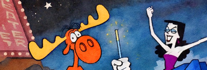
Given Atari Force is Conway’s series, it’s too bad the best issue so far isn’t one he writes. He plotted for Andy Helfer and gave him a choice issue. It’s a done-in-one, the first of the series, and it manages to be both gritty and affable.

    Babe, the sentient mountain baby–who’s basically just a huge egg with a lot of power and no anger–gets stranded on a planet. He’s got the Hukka (the adorable sort of pet who fills some of the R2-D2 cuteness) but he’s lost.

    Helfer juxtaposes Babe’s trials against the team’s. They’re going through lots of drama; even those concerned for the missing Babe don’t realize he apparently can’t be hurt. Babe’s in the middle of a planetary invasion, it turns out.

    The art’s lovely, the story’s gentle without ever being condescending. It’s an impressive issue, raising the bar for the series.

    A 

    CREDITS

    Babe’s Story; writers, Gerry Conway and Andy Helfer; penciller, José Luis García-López; inker, Ricardo Villagran; colorist, Tom Ziuko; letterer, Bob Lappan; editor, Helfer; publisher, DC Comics.

  • Rocky and Bullwinkle #2Something is amiss in Frostbite Falls.

    Evanier keeps his structure from the first issue–first part of Rocky and Bullwinkle, Dudley Do-Right, then the second part of Rocky. Only this time, the first part of the feature is weak. It feels tired, down to all the references to post-smartphone soullessness. Rocky and Bullwinkle come across a magician who can’t get a job anymore and, dang, if it’s not all apps and CGI’s fault.

    The cliffhanger’s too deliberate and then the Dudley Do-Right tries too hard for a single laugh. It gets two but the first is mostly because of goodwill. By the end, the goodwill’s gone.

    Then the second half of the feature is even worse than the first. Evanier reduces Rocky to an almost dialogue-free part in the feature and the narration is terrible.

    Langridge doesn’t bother mustering much enthusiasm.

    It’s a pedestrian licensed comic, which the first issue wasn’t.

    C 

    CREDITS

    Writer, Mark Evanier; artist and letterer, Roger Langridge; colorist, Jeremy Colwell; editor, Sarah Gaydos; publisher, IDW Publishing.