As the dangerous mind in the title (Confessions of a Dangerous Mind), Sam Rockwell should be entirely unsympathetic. The film spends its first act mocking Rockwell and inviting the viewer to participate. With the exception of his chemistry with Drew Barrymore’s saintly character, there’s nothing redeeming about Rockwell’s character. Yet he’s tragically endearing.
The film is based on Chuck Barris’s autobiography, where the game show host says he worked as an assassin for the CIA. Charlie Kaufman’s script–and Clooney’s direction of that script–never really raises a question about it. Even though there are real entertainment people giving interviews (it opens with Dick Clark’s recollections of Barris), Clooney approaches the spy stuff straightforward. It’s the story of a successful showbiz guy who was a spy.
The conflicts caused by that absurd contradiction are where Confessions devastates. The relationship between Rockwell and Barrymore, which is a third plot line, separate from both the spy stuff and the TV stuff, doesn’t actually give the film its humanity, it gives it its emotional veracity. Rockwell, who’s phenomenal throughout, has a lot more acting hurdles to jump in the spy stuff–the TV stuff is almost straight comedy. The romance with Barrymore is a period piece but is intricately tied to the reality of the film.
It’s great. Clooney and Rockwell do a great job. Rockwell’s breathtaking, Barrymore’s good, Clooney’s got a small part, Julia Roberts has a small part–they’re both really good.
Confessions is flashy and noisy and precise and singular.
 ★★★★
★★★★
CREDITS
Directed by George Clooney; screenplay by Charlie Kaufman, based on the book by Chuck Barris; director of photography, Newton Thomas Sigel; edited by Stephen Mirrione; music by Alex Wurman; production designer, James D. Bissell; produced by Andrew Lazar; released by Miramax Films.
Starring Sam Rockwell (Chuck Barris), Drew Barrymore (Penny Pacino), George Clooney (Jim Byrd), Julia Roberts (Patricia Watson) and Rutger Hauer (Keeler).
RELATED


 Who would have thought Crossed + One Hundred wouldn’t just be good, but would be some really strong mainstream stuff from Alan Moore. He gets to create a language–future English–which undoubtedly gave him a lot to think about (since the language also shows how the world has changed since the apocalypse and what’s important and what’s not). And he gets to imagine a future civilization.
 There’s a somewhat pointless plot twist at the end of this issue. It’s sensational, when the writers haven’t actually set up a point for it. They aren’t asking profound questions or making profound statements, they’re actually just making fun of their villain.
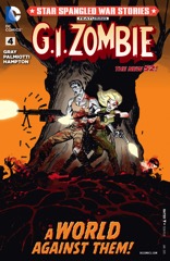 Okay, so G.I. Zombie is kind of lame when he’s on his own. Not the comic, but the character. When he’s running around this issue, talking to himself, it’s really lame. If Gray and Palmiotti want to have some reason he speaks to himself in expository dialogue, they should introduce it. His origin is still in question… if he’s a motormouth, so be it. But establish it.
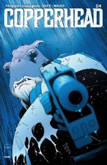 This issue of Copperhead returns the series to its previous level of quality, which is fantastic, because I really wanted to love this comic and it looks like I still can.
 I still don’t know why I like Star Spangled War Stories so much. Maybe it’s because of Gray and Palmiotti’s pace. This comic–featuring the cast of “Duck Dynasty” unleashing a zombie plague on the United States (the rural United States)–moves at a breakneck pace. About the only time it calms down for a moment is when G.I. Zombie’s partner, whose name I don’t remember, stops at a diner and there’s character development between her and a domestic terrorist whose organization she’s infiltrated.
 Bettin’s art is a little broad for the finish, which has Sally in a “normal” future environment. She and Tommy make it into safe hands, a huge underground society started by the college professors who knew nuclear war was coming.
 It’s almost a great issue of Dredd. The opening story, with Wagner and Grant sending Dredd into the Cursed Earth (no longer called Mutieland) with a bunch of cadets for a test, is awesome. Smith’s art is good, the story has a nice flow and the supporting cast of cadets is good. It’s probably the best mix of narrative and Wagner wanting to expound on the judges’ rigorous training.
 The last issue reveals Wool doesn’t just have a pacing problem or a perspective problem, it has a scale problem. Palmiotti and Gray never make the silo society seem real enough. They never show the silo in a way to make one believe anyone besides the cast lives there.


 It’s an uneven issue. Except the art, of course. Smith does a great job on the art. And Wagner and Grant do have some highs. The issue opens with the low–and the only time there’s a lot of forced symbolism about Dredd and the law. I think it comes up later, but the writers actually counter it.
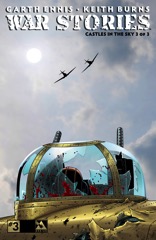 If Ennis had just started out with the story he finishes telling in this issue, it would have been a much more satisfying story arc. He doesn’t want to seem too sentimental, I guess. But he starts narrating it in the past tense, directly referring to the war being over, so his protagonist clearly makes it.
 There’s a lot of imaginative Ron Smith art this issue. He does an excellent job mixing action with setting detail, especially since all of Wagner’s stories have something to do with Mega-City One, whether with the block architecture or with the people.
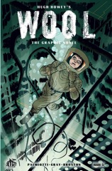 Wool is a frustrating comic. Presumably to stick with the narrative structure of the source novel, Gray and Palmiotti constantly waste time and pass up opportunities for a better structure.
 Smith handles the art on both stories.


 It’s a particularly interesting issue because Williamson never talks about the big secret–the big gimmick, the big deception, the big unknown. There’s stuff related to it, but he never identifies why he’s on these topics. It would be a bad jumping on issue.
 The Apocalypse War saga ends. There’s some silliness–like Wagner and Grant referring to Dredd’s “Apocalypse Squad”–but most of the comic works out, at least as far as narrative.
 The issue starts with the protagonist narrating. The fourth issue and Gray and Palmiotti have finally settled on having the protagonist. And on having her narrate. Only she doesn’t narrate for long and the focus soon shifts back to the subplots.
 From the start, Ezquerra’s art is off. His figures are weak, his composition is worse. Maybe he just burned out on all the war stuff–there are constant empty backgrounds, like he’s trying to do less work. It actually feels like someone doing an Ezquerra impression and and a rushed one.
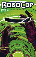 It’s a bridging issue. An undercover cop goes after Killian–in one of Williamson’s most unexpected moves, the character (who everyone is accusing of being an undercover cop) turns out to be an undercover cop just in time for the cliffhanger. Robocop gets beat up by the new ED–209, which has a silly name I can’t remember. And Anne Lewis gets into a yelling match about how she’s not going to back down from her job (with another female detective).
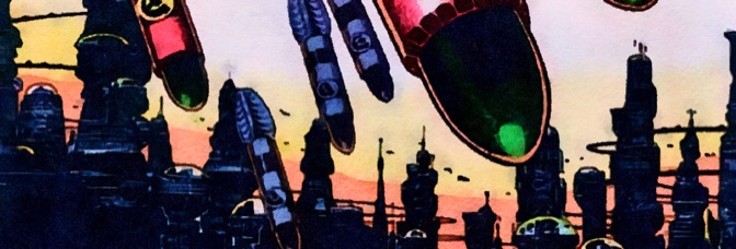
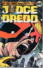 It’s the war comic I’ve been expecting from Wagner for a while now. Dredd and the judges with him have a mission and they try to carry it through. There are changes, but minor ones. It’s just a war comic, even during the bewildering sequence where the judges have to knock down the supports on a giant highway system to stop the invasion.
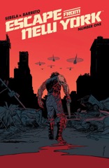 I’m trying to figure out how to describe Escape from New York to those unfamiliar with the movie. You wouldn’t buy the comic on a whim, without a familiarity, because if you paged through it, you’d be immediately lost. Writer Christopher Sebela doesn’t really do an introduction, he does a direct sequel to the movie… then immediately invalidates it.
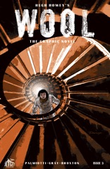 It’s almost like Wool, the comic book, is meant to inspire the reader to instead go read Wool, the novel, in order to understand the character motivations. Because Gray and Palmiotti try for intense scenes, montage sequences, all sorts of things they can’t get done because they haven’t set up the characters well.
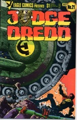 There are some amusing disconnects with Ezquerra’s art and Wagner’s script. It’s like Ezquerra didn’t get the jokes… or if he did, he paced them wrong. Or maybe there’s just no easy way to illustrate jokes amid a story about a nuclear attack.