Dark Horse Presents 18 (June 1988)

35829.jpg
Badger’s ink washes on The Mask are real nice, but they’re so much easier to comprehend than his regular art, I almost wish he’d done the whole thing with that process. It’d be worth the wait. With the ink washes, when he does something crazy, it just works better. Maybe because it feels realer when the Mask appears and reality splits.

Chadwick uses his Concrete spot for some more old stuff–in the letter column, the editor reveals these “Sky of Heads” stories are nothing but old Chadwick material from a drawer, which I said the first time. The story in the story in the story is all right. Chadwick’s a lot meaner than usual. It’s not as sappy as Concrete.

Bob the Alien is kind of funny. Rice’s art is a little rough even for a strip, but it’s consistently amusing.

It’s an okay issue, nothing terrible, which helps.

CREDITS

Concrete’s Sky of Heads, Quality Time; story and art by Paul Chadwick; lettering by Bill Spicer. The Mask; story and art by Mark Badger; lettering by Tim Harkins. Bob the Alien, Bob, the alien’s, First College Party; story, art and lettering by Rich Rice. Edited by Randy Stradley.
Dark Horse Presents 15 (February 1988)

dhp15.jpg
I’m so glad they put The Mask in the middle. I’m not sure the issue would have been tolerable if it hadn’t been at the center.

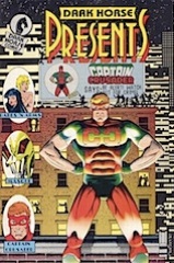
The issue opens with another bad episode of Captain Crusader. The only nice thing I have to say about the story is Martin draws brick walls well. Not people, not figures, not regular backgrounds, just brick walls. The real world superhero gets beat up again.

The issue ends with Babes ‘n Arms, which is slightly better than before thanks to Stradley’s writing. Unfortunately, it’s still completely awful. I can’t believe Dark Horse took the time to have this story illustrated.

The Mask story is confusing and Badger hints at revealing things, but never really does. Badger opens the story with a big discussion of art, but continues using his regular Mask style for the story. It works. The opening is almost cute, but not.

CREDITS

Captain Crusader; writer and artist, Gary Martin; letterer, David Jackson. The Mask; writer and artist, Mark Badger; letterer, Tim Harkins. Babes ‘n Arms; writer, Randy Stradley; artist, Michael Ebert; letterer, David Jackson. Editor, Randy Stradley; publisher, Dark Horse Comics.

Dark Horse Presents 14 (January 1988)

dhp14.jpg
Reading Mr. Monster, I thought a lot about how much I love Will Eisner’s Spirit in black and white. Not because Gilbert’s art in any way reminds of Eisner, but because it doesn’t. Because instead of publishing wonderful black and white comics, Dark Horse Presents is publishing Gilbert’s Mr. Monster and it looks like pencils run through the photocopier to darken it. Art aside, it’s still atrocious.

The Concrete story is completely depressing. While visiting his parents’ grave, Concrete contemplates his future. It’s bleak. Chadwick’s art isn’t particularly special here (why is Concrete the one thing he doesn’t draw well), but it’s one heck of a lovely downer.

Badger’s Mask story is just a filler, maybe announcing Badger’s leaving or maybe not. It’s hard to tell.

Nelson has a one page Dinosaur Tales, which is more design than anything else, but still nice.

That Mr. Monster story was really awful.

CREDITS

Concrete, Now is Now; writer and artist, Paul Chadwick; letterer, Bill Spicer. The Mask, Gone Fishing!; writer and artist, Mark Badger; letterer, David Jackson. Mr. Monster, His World; writer and artist, Michael T. Gilbert; letterer, Ken Bruzenak. Dinosaur Tales; writer and artist, Mark A. Nelson. Editor, Randy Stradley; publisher, Dark Horse Comics.

Dark Horse Presents 13 (December 1987)

dhp13.jpg
At least there’s a Mask story this issue because the rest of it is just atrocious. Since I’ve already started with The Mask, I’ll finish it up. Badger doesn’t write as strongly here and his meta approaches to the storytelling, bookending the story, don’t help. But it’s still compelling and solid.

However, I don’t even know where to start with Babes ‘n Arms, which appears to be Dark Horse’s attempt to do an unfunny manga with girls in bikinis. Sure, they seem stupid, but they’re the only ones who can take down a rampaging giant robot. Dark Horse owns the property–according to the indicia–which I found interesting.

Captain Crusader finishes the issue. It’s this painfully mediocre “real life” superhero thing. Guy runs around New York in lycra as a publicity stunt, ends up getting beat up. All “reality” goes out the window when it opens with him hopping roof tops.

CREDITS

Babes ‘n Arms; writer, Jon Lee; penciller, Michael Ebert; inker, Robert Caracol; letterer, Pat Brosseau. The Mask; writer and artist, Mark Badger; letterer, Tim Harkins. Captain Crusader; writer and artist, Gary Martin; letterer, David Jackson. Editor, Randy Stradley; publisher, Dark Horse Comics.

Dark Horse Presents (1986) #12

Dhp12

Okay, The Mask is supposed to be incomprehensible. Badger’s first line in the story is about it being incomprehensible. In a lot of ways, it’s the best continuing serial in Dark Horse Presents so far. I can’t understand it, not with Badger’s art purposely intended to confuse, but at least the writing is ambitious. It’s ambitious in a really, really small way–this issue it’s showing realistic dialogue at a party–but Badger’s definitely trying something.

On the other hand, this issue’s Concrete is pretty tired. Chadwick’s showing how lonely it is when you’re stuck in an enormous alien, stone body. He could have done something akin to Chekhov’s Misery, but doesn’t because he’s got to keep the comic relatively upbeat. Nice art at the beginning though.

Nelson’s contribution is a five page time travel story. The plot’s decent if predictable and familiar, but the art is exquisite and beautiful.

Dark Horse Presents 12 (November 1987)

35823.jpg
Okay, The Mask is supposed to be incomprehensible. Badger’s first line in the story is about it being incomprehensible. In a lot of ways, it’s the best continuing serial in Dark Horse Presents so far. I can’t understand it, not with Badger’s art purposely intended to confuse, but at least the writing is ambitious. It’s ambitious in a really, really small way–this issue it’s showing realistic dialogue at a party–but Badger’s definitely trying something.

On the other hand, this issue’s Concrete is pretty tired. Chadwick’s showing how lonely it is when you’re stuck in an enormous alien, stone body. He could have done something akin to Chekhov’s Misery, but doesn’t because he’s got to keep the comic relatively upbeat. Nice art at the beginning though.

Nelson’s contribution is a five page time travel story. The plot’s decent if predictable and familiar, but the art is exquisite and beautiful.

CREDITS

Concrete, Next Best; writer and artist, Paul Chadwick; letterer, Bill Spicer. The Portheus Project; writer and artist, Mark A. Nelson. The Mask; writer and artist, Mark Badger; letterer, Tim Harkins. Editor, Randy Stradley; publisher, Dark Horse Comics.

Dark Horse Presents (1986) #11

Dhp11

Is The Mask supposed to be understandable? Badger’s writing seems straightforward enough–two CIA agents are trying to find a Cuban priest who’s in New York City, but his art makes it completely incomprehensible. And it’s hard to imagine how the titular Mask (Masque) is going to figure into the priest’s story. I also can’t figure out if it’s supposed to be pro-Cuba or anti-Cuba.

West writes a little history lesson about the Battle of the Somme. Moiseiwitsch’s art is more like etchings and the text is set to them and somewhat related. It’s unsuccessful but not ambitious either.

Roma limps to its finish. Some nice art from Workman but the writing’s incredibly weak. He’s also basically only doing closeups now, which is odd since the story’s got a big finish.

The best thing in the issue–by far–are Nelson’s two Dinosaur Tales pages. Absolutely wondrous art.

Dark Horse Presents (1986) #10

Dhp10

This issue Concrete gets into a fight with a bear and nearly loses. In some ways, since Chadwick isn’t going for the saccharine, it works better than any other Concrete story so far. Except it’s basically a reluctant superhero story, so it’s not the traditional Concrete story.

Again, somewhat weak art from Chadwick.

It’s hard to judge Badger’s art on The Mask (spelled Masque here) since it’s supposed to be nuts. The story is only somewhat successful, since nothing happens. It’s an action scene where the bad guys we just met get killed. I guess it’s interesting the bad guys are federal agents, but not really.

The last story, from Stradley and Salmons, is a space alien marooned story. Salmons must like those. The art is, as usual for Salmons, a little too confusing to effectively tell the story. It’s decent enough, but far from spectacular–it’s way too slight.

Dark Horse Presents 11 (October 1987)

35822.jpg
Is The Mask supposed to be understandable? Badger’s writing seems straightforward enough–two CIA agents are trying to find a Cuban priest who’s in New York City, but his art makes it completely incomprehensible. And it’s hard to imagine how the titular Mask (Masque) is going to figure into the priest’s story. I also can’t figure out if it’s supposed to be pro-Cuba or anti-Cuba.

West writes a little history lesson about the Battle of the Somme. Moiseiwitsch’s art is more like etchings and the text is set to them and somewhat related. It’s unsuccessful but not ambitious either.

Roma limps to its finish. Some nice art from Workman but the writing’s incredibly weak. He’s also basically only doing closeups now, which is odd since the story’s got a big finish.

The best thing in the issue–by far–are Nelson’s two Dinosaur Tales pages. Absolutely wondrous art.

CREDITS

The Mask; writer and artist, Mark Badger; letterer, Tim Harkins. Forgotten; writer, Ross Evan West; artist, Carel Moiseiwitsch. Roma; writer, artist and letterer, John Workman. Dinosaur Tales; writer, artist and letterer, Mark A. Nelson. Editor, Randy Stradley; publisher, Dark Horse Comics.

Dark Horse Presents (1986) #8

Dhp08

I can’t believe I missed Concrete–well, actually, I can, given Vitruvian Man is in here, but I can’t believe I was “looking forward” to it. This issue’s story is… it’s hard to describe. Chadwick’s writing is kind of like if you took “Seinfeld” and made the characters care about other people’s feelings. This time, Concrete mouths off to some crappy little kids then gets so upset he has to apologize. Big whoop.

Chadwick’s art’s a little lazy here, so there’s not even that benefit.

Vitruvian Man is about an annoying jerk becoming superhuman. It’s of some note because the protagonist’s sister is deaf and Mattsson’s trying to convey that detail without ever specifically saying it. It’s lame, but it moves and the artwork from Badger and Nichols isn’t bad.

Roma, on the other hand, is lame and doesn’t move. Workman’s hit a wall on his Love and Rockets “homage.”