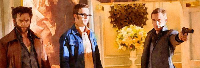
Given its ninety minute length and having Jane Fonda perform the comically explicit narration, it might be easy to dismiss–or just describe–Better Living Through Chemistry as a genial amusement. Certainly lead Sam Rockwell can do this role in his sleep. He's a small town pharmacist in a bad marriage (Michelle Monaghan is great as the controlling wife); his father-in-law runs his life, his teenage son is starting the awkward years, no one takes him seriously.
Except unhappily married trophy wife Olivia Wilde.
What actually makes Chemistry so different is how writers-directors Moore and Posamentier seem to have no idea what they're doing. There are all sorts of tangents the film goes on, all sorts of great little moments between Rockwell and Monaghan then later Rockwell and Harrison Holzer (as his son). It's all over the place, with the affair between Rockwell and Wilde ostensibly the foundation of the narrative.
Only it's not. It's a device to go into a series of rapid comic set pieces–as Rockwell tumbles out of control, only everything turns out to be regimented. All of these set pieces go well, thanks to Rockwell and his abilities in both physical comedy and just lovably obnoxious. There's no heavy lifting for the actors in Chemistry, except maybe Holzer, but strong, assured performances in a well-written, if unambitious picture, isn't a bad thing at all.
Nice supporting work from Norbert Leo Butz and Ken Howard rounds things off.
Chemistry is controlled and it's calculated and it pays off well.
 ★★½
★★½
CREDITS
Written and directed by Geoff Moore and David Posamentier; director of photography, Tim Suhrstedt; edited by Jonathan Alberts; music by John Nau and Andrew Feltenstein; production designer, Heidi Adams; produced by Joe Neurauter and Felipe Marino; released by Samuel Goldwyn Films.
Starring Sam Rockwell (Doug Varney), Olivia Wilde (Elizabeth Roberts), Michelle Monaghan (Kara Varney), Norbert Leo Butz (Agent Andrew Carp), Ben Schwartz (Noah), Ken Howard (Walter Bishop), Jenn Harris (Janet), Peter Jacobson (Dr. Roth), Harrison Holzer (Ethan Varney), Ray Liotta (Jack Roberts) and Jane Fonda (Jane Fonda).
RELATED

 My only hesitation with this issue is how Brisson ends it. For almost six issues, it seems like the comic has been on a frantic pace with the dissenting girl–who started out as the protagonist but she’s really not anymore (the series doesn’t have one–on the run from the other kids.
 And here we have the issue where a couple drunk male friends fool around and it doesn’t just ruin their friendship, one of them goes insane and kills the other one.
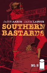 One of these months, there’s going to be a kick ass issue of Southern Bastards. Maybe next month, maybe the issue after. Because Aaron shows his hand a little here–Bastards is kind of like Rambo V, only in the South. It’s a little like Frank Castle goes country, it’s a little like Gran Torino only an action movie.


 Enter the Russian and Ennis bringing in another weak villain, but one he can try to use for humor. Why use him for humor? Apparently there’s not enough comedy with the Punisher caring about his neighbors. The scenes with the neighbors are all soft, sensitive scenes. I thought Frank was going to tell the overweight guy to eat healthy.
 I don't know where to start. I'm not sure about the epilogue. It's a very cute and nice epilogue, but Glass has just got done dragging the reader through a very rough opening action sequence and then an extremely taut issue. With Furious, Glass has always made sure to keep the series's reality very dangerous. So anything can happen.
 Here’s another example of Lapham slacking off. And it’s on a Virginia issue too, which is upsetting because he usually treats her better.
 If the letters pages didn’t swear Rinzler was sticking to the original rough draft, I don’t think I’d believe it. Because this issue–adapted from a script written in the early seventies–has the standard modern action movie third act thing going on. When they attack the Death Star (it’s called something else, I think), Annikin and Leia are still on the station. They’re fighting to get away.
 It’s kind of a talking heads issue. There’s some action with Frank having to save Dave and he bonds a little with Joan. Ennis has problems working Frank into the humor. He’s the Punisher is the punch line to too many of Ennis’s jokes.
 I think they must have wanted to sell it to cable. Ennis does a great season one finish. Not, you know, like a good narrative finish or something. But a good commercial one. You can just see it on the TV screen.
 Lapham hasn’t just run out of ideas, he’s now doing reruns. This issue of Stray Bullets reminds of a few others, but in bits and pieces. So less a rerun, I guess, and more a remix.
 I read this entire issue without paying attention to the story arc title on the cover. I'm glad I ignored it.
 Should I call this a bridging issue or maybe I should call it a highway interchange issue because Ennis is bringing so much together. This subplot meets this other subplot and leads into the connection to the next subplot. It goes on and on.
 It’s a bad issue. Ennis rushes through the entire thing, only gets in a single moment of personality. I guess he tries to open with personality, with the female cop apparently doing a mock eulogy for a terrible cop. But it’s way too forced. It’s Ennis on a soapbox and one he doesn’t care about. Red Team is not a deep rumination on the NYPD or police officers. Not sure why Ennis feels the need to pretend here.
 Lapham does some really tight art this issue. I don’t think his figures have ever been so precise. It’s a shame the story’s not there.
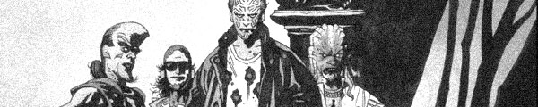
 What just happened here? In this comic book running approximately twenty-two pages? Nothing, not a dang thing. Unless a couple unsubstantial characters are actually going to be the protagonists of the comic, which seems difficult since they seem to be living in different time periods.

 The issue starts so much better than it ends. It opens with everyone but the Punisher and the serial killer priest. There’s a little with Frank thinking about how he needs to move and some comedy with his neighbors, but not a lot. Ennis almost makes it seem like he’s switching over during that comedy and then pulls away again. The two cops are getting a lot more important.
 It’s so bland. Why am I reading it? It’s so bland. Even the ending is bland. It’s sort of an all-ages Daredevil comic written for adults. And Samnee is the perfect artist for that tone. But it doesn’t have to be so bland–Waid doesn’t have anything going under the surface here. Foggy popping in from witness protection is just Foggy being so darned lovable again.
 Here’s the thing I love about Stray Bullets–and it’s been kind of hard to love the comic lately, due to Lapham’s scurry into exploitation (intentionally or not)–even when he’s being cheap, Lapham has created a number of such excellent characters the cheapness can’t hurt the comic.
 Busy, busy issue. Very busy. So busy Williamson can kill people off without it resonating just because there’s so much other stuff going on. And a lot of it goes on at the end; this issue has two cliffhangers, one hard, one soft. Very busy.
 Ennis develops Frank this issue and it’s unexpected. He’s fully aware of his mental state. He knows he kills criminals to feel a little better, a little more in control, whatever. He’s even mad at Giuliani for lowering crime in New York.
 Williamson gets away with a lot of exposition. Jackson and the kidnapped, possessed girl are on the run through the jungle of ghost animals–which turns out to be somewhat cute, in an amusing turn–and the girl just talks and talks. But the way Williamson paces out the conversation, it works great. There’s danger and tension and the dialogue fits between. Very nicely done.
 Ugh. Really, there’s no other word for it. Ugh. Lapham’s colliding of all his story lines and characters continues with Roger the detective–the one who had such a cool dating issue–hunting down Monster to find Virginia. Only Lapham has always used Monster as a force of nature, so having him go up against very real cops is kind of like a horror movie.
 Taylor finishes up the arc and he doesn’t shy away from the murders. He’s still working in the severely layered timeline–going back and rereading the arc and understanding how the past and present move through would probably be an interesting experience. I’m sure it reads a little different.