• Nightworld 3 (October 2014)

    Nightworld #3It’s an all-action issue, with McGovern giving way too many pop culture lines to the hipster demon. It gets annoying on the first page the character shows up; by the end of the issue, it’s practically intolerable. McGovern doesn’t have anything for the character–at least the protagonist and antagonist have some kind of back story and the humans are sympathetic human characters… a sidekick, good demon? No story. Just annoying.

    For the action, which is mostly the two good demons fighting bad demons, Leandri does rather well. Nightworld is a good looking comic and it moves well, it’s just really shallow. And McGovern doesn’t try to go any deeper with it, which is nice.

    However, when there’s not much to it, any little thing hurts–like confusion during the humans in distress scene and especially the annoying demon. Facebook references are too much.

    But it still works out.

    B 

    CREDITS

    One Hundred Demons; writer, Adam McGovern; artist and letterer, Paolo Leandri; colorist, Dominic Regan; publisher, Image Comics.

  • Nailbiter (2014) #7

    Nailbiter  7

    Williamson does a Powers homage, with Brian Michael Bendis guest starring as himself. I think the Warren Ellis Powers issue is number seven too (yep, thanks Google). Bendis is in town researching a book and Williamson uses him as the protagonist. It’s a way to delay a return to norm for the comic–only the epilogue has the FBI agent back in lead–and also for Williamson to have some fun.

    However, the looser issue–it’s basically a comic relief issue in a series where there’s no real comic relief–feels somewhat self-indulgent. Like Williamson is having a second helping of chocolate cake where the frosting’s real good, but it’s not actually filling.

    The cuteness aside, there’s a lot of fluff–like Bendis and the Nailbiter talking about comics–and it’s well-written fluff. It just seems like a holding pattern.

    Still, not bad; nice art from Henderson throughout.

  • Nailbiter (2014) #6

    Nailbiter  6

    All of a sudden, Nailbiter is something different. Williamson changes protagonists and gives the issue a narrator in Alice, the teenager (or slightly older) possible future serial killer. She teams up with the sheriff to track down some crazy woman.

    It feels very distinct and separate from everything else in the series so far–even though the characters continue, the former protagonist isn’t in the issue. His story line isn’t continued or really even referenced. Instead of the serial killers in town being so important, the town becomes important. It’s a very nice issue.

    Williamson’s writing of Alice is excellent, especially with her rash behavior. He has a great way of making the behavior changes flow, while still being visible and concerning.

    There’s some fantastic art from Henderson this issue.

    Regardless if it’s just a done-in-one or a new direction, Williamson’s definitely got lots of space with Nailbiter.

  • Nailbiter #7Williamson does a Powers homage, with Brian Michael Bendis guest starring as himself. I think the Warren Ellis Powers issue is number seven too (yep, thanks Google). Bendis is in town researching a book and Williamson uses him as the protagonist. It’s a way to delay a return to norm for the comic–only the epilogue has the FBI agent back in lead–and also for Williamson to have some fun.

    However, the looser issue–it’s basically a comic relief issue in a series where there’s no real comic relief–feels somewhat self-indulgent. Like Williamson is having a second helping of chocolate cake where the frosting’s real good, but it’s not actually filling.

    The cuteness aside, there’s a lot of fluff–like Bendis and the Nailbiter talking about comics–and it’s well-written fluff. It just seems like a holding pattern.

    Still, not bad; nice art from Henderson throughout.

    CREDITS

    Writer, Joshua Williamson; artist, Mike Henderson; colorist, Adam Guzowski; letterer, John J. Hill; editor, Rob Levin; publisher, Image Comics.

  • Nailbiter #6All of a sudden, Nailbiter is something different. Williamson changes protagonists and gives the issue a narrator in Alice, the teenager (or slightly older) possible future serial killer. She teams up with the sheriff to track down some crazy woman.

    It feels very distinct and separate from everything else in the series so far–even though the characters continue, the former protagonist isn’t in the issue. His story line isn’t continued or really even referenced. Instead of the serial killers in town being so important, the town becomes important. It’s a very nice issue.

    Williamson’s writing of Alice is excellent, especially with her rash behavior. He has a great way of making the behavior changes flow, while still being visible and concerning.

    There’s some fantastic art from Henderson this issue.

    Regardless if it’s just a done-in-one or a new direction, Williamson’s definitely got lots of space with Nailbiter.

    CREDITS

    Writer, Joshua Williamson; artist, Mike Henderson; colorist, Adam Guzowski; letterer, John J. Hill; editor, Rob Levin; publisher, Image Comics.

  • Judge Dredd 3 (January 1984)

    Judge Dredd #3It’s an awesome issue with Judge Death getting freed. The story has clear chapters, from the original 2000 AD progs, but the way Wagner brings it together–the changing focus on the first few–the both awesome and lackluster finish… it works out beautifully.

    The issue also brings back Anderson, after her brush with Judge Death, and gives her and Dredd a rather amusing reunion. There’s no tenderness to it, which just makes it all the better. Wagner does get in some tenderness–not really towards one another, but Dredd letting his guard down for a moment–towards the end.

    The cohesive story–the lackey breaking Death out, the revelation of the rest of the villains, the revelation of their plan. Wagner does really well with his plotting. He never rushes, never tries too hard.

    And the Bolland art is gorgeous; both futuristic and horrific. It’s a great comic book.

    A 

    CREDITS

    Writer, John Wagner; artist, Brian Bolland; colorist, John Burns; letterers, Tom Frame and Tony Jacob; editor, Nick Landau; publisher, Eagle Comics.

  • Moonshadow 4 (December 1994)

    Moonshadow #4This issue has Moonshadow and Ira getting forced into military service. It’s an intergalactic war, which gives Muth a lot of great stuff to draw. Moonshadow is conceptually low-tech and almost junky in how it shows extraterrestrial civilization, but Muth does find occasion for some really beautiful details. Space travel through individual bubbles, for example, is breathtaking.

    DeMatteis has a lot about war, which he always tells from Moon’s romanticized point of view, even when Moon doesn’t think he’s being romantic. There’s a great little subplot for Ira too. DeMatteis tells it over a page or two–Moonshadow is told in summary, with short emphasized scenes. DeMatteis sometimes focuses these well, sometimes poorly. This issue he focuses them well throughout.

    The most affecting part of the issue takes place in flashback, one of Moon’s mother’s memories. DeMatteis forces this flashback (as he does them all) but the content’s strong.

    B+ 

    CREDITS

    The Crying of the Wind; writer, J.M. DeMatteis; artist, Jon J. Muth; letterer, Kevin Nowlan; editors, Shelly Bond, Laurie Sutton and Archie Goodwin; publisher, Vertigo.

  • Judge Dredd 2 (December 1983)

    Judge Dredd #2This issue has stories where Dredd is stationed on the moon. There’s a bit too much of the Wild West mentality to it–which early 2000 A.D. progs often did with Americans in the future, so I guess it fits; the cowboy hats are still annoying.

    The first story has Dredd dealing with a disaster caused by some bank robberies. Their comeuppance is a little lackluster–Wagner really likes the dry humor in this issue’s four stories. He goes too far with it most of the time.

    In a two-part story, Wagner compares televised athletics and war on the moon–it’s supposed to be more humane, of course. Dredd keeping his helmet on while in a soldier uniform is goofy, but it’s okay.

    Even the best story–Dredd’s robot gets a romantic interest–has its problems.

    The last story’s a predictable, if amusing, bank robbery one.

    Great art throughout.

    B 

    CREDITS

    Writer, John Wagner; artist, Brian Bolland; colorist, John Burns; letterers, Tom Frame and Tony Jacob; editor, Nick Landau; publisher, Eagle Comics.

  • Moonshadow 3 (November 1994)

    Moonshadow #3Things get a little too slow this issue, with Moon stuck in an asylum and Ira, his combination sidekick and antagonist, has to break him out. Why? Because Ira needs Moon to work odd jobs to support them. In the meantime, Moon has some encounters with his fellow inmates and there’s a lovely sequence when he plays the flute for them.

    Muth’s art for that sequence is gorgeous. It flows, which is sort of strange, since the second half of the issue has a lot of action and a lot of examples of Muth not flowing. He does straight action scenes, very realistic painted panels. They’re technically good, but a little too static. It doesn’t help DeMatteis’s script kind of runs around in a circle too.

    If there had been something along the way, something significant for Moon, it would’ve worked out a whole lot better. Instead, it’s gorgeous, troubled.

    B 

    CREDITS

    The Crying of the Wind; writer, J.M. DeMatteis; artist, Jon J. Muth; letterer, Kevin Nowlan; editors, Shelly Bond, Laurie Sutton and Archie Goodwin; publisher, Vertigo.

  • Judge Dredd 1 (November 1983)

    Judge Dredd #1Of the three stories in this issue–this Judge Dredd series being a reprint series, the first one is the best, but the third one has the best writing from John Wagner.

    The first story introduces Judge Death. With Brian Bolland on the art–for all the stories–Judge Death is extremely detailed, extremely realistic, extremely creepy. The story takes an interesting turn at the end, with Wagner deftly letting Judges Dredd and Anderson in on something the reader (and everyone else) finds out later. Wagner just doesn’t do the “Dredd coda” well.

    The second story is a futuristic murder mystery/conspiracy thing. It’s perfectly fine, with some nice art from Bolland. It just isn’t memorable past some of the future details.

    The final story–Dredd versus a street gang–has Wagner presenting the series’s mindset beautifully. And he scores with the “Dredd coda,” the stories’ capstone on the law.

    B+ 

    CREDITS

    Writer, John Wagner; artist, Brian Bolland; colorist, John Burns; letterer, Tom Frame; editor, Nick Landau; publisher, Eagle Comics.

  • The Sandman: Master of Dreams (1989) #6

    Sandman  6

    The issue takes place over a day at a diner. Doctor Destiny is trying to bring about the end of the world and he traps a bunch of people in the diner and slowly drives them mad. Or not slowly.

    Gaiman makes the characters distinct, horrific, pitiable. He doesn’t have time to establish them as sympathetic so he doesn’t even try. Some of them he plays for laughs, others for shock value. Dringenberg takes over the pencils; he doesn’t do a particularly good job. There’s no personality to the art, especially not in the horrific scenes. Some of the talking heads stuff is decent.

    The issue feels so derivative, so manipulative, it starts to get boring before the halfway point. Gaiman’s using sensational human suffering. Even when he writes a good scene, it’s still just a cheap trick in a bridging issue.

    All to avoid giving Doctor Destiny a personality.

  • The Sandman: Master of Dreams (1989) #4

    Sandman  4

    Dream goes to Hell, which requires the Demon as a guest star. Gaiman doesn’t have anything for him to do, past rhyme a little for the protagonist and cause some mischief. It’s a pointless cameo, though Kieth and Dringenberg do fine on the Demon. They don’t do so well later, when they have to draw every demon in Hell. Actually, they do fine on the demons… they lose their hold on Dream at that point. He feels too out of place.

    The issue has maybe the most narration from Dream so far and it gets tedious. He needs to outwit the demons of Hell with riddles and so on. Intentionally or not, Gaiman’s so sincere he doesn’t have any wit. It’s all very heavy and very boring.

    Just when things should pick up in the second half, the comic slows, getting more tedious. So far, Dream’s boring as a lead.

  • Kinski 1 (May 2013)

    Kinski #1Kinski is a strange comic. The content–a business guy on the road doing a pitch and finding a lost dog–is strange. It’s even stranger given Gabriel Hardman’s stark, realistic black and white art. Hardman’s writing also ignores the quirky nature of the story and goes for realism. The awkwardness of the protagonist, now obsessed with the dog, is both off-putting and tragic.

    The comic reads rather fast–besides a montage sequence in the middle of the comic, most of the issue is when the guy finds the dog and then asks other people if they know the dog. That scene ends with animal control setting up and Kinski getting even stranger.

    By the end of the comic, Hardman has introduced a few suggestions of danger, some immediate, some just under the surface. But while the protagonist is often difficult to sympathize with, the comic itself isn’t disagreeable.

    A 

    CREDITS

    Writer and artist, Gabriel Hardman; publisher, Monkeybrain Comics.

  • The Sandman: Master of Dreams #8Either the reader is going to buy into Gaiman’s setup for this issue or the reader is going to reject it. Even before Gaiman gets into the “meat” of the issue, which is basically a lengthy monologue from Dream about the importance of Death. Both as a natural event and as Dream’s sister.

    The issue opens with them seeing each other for the first time after Dream’s escape from captivity and his quest. Gaiman goes really far on the self-aware dialogue, using Death to expound on the comic book and on its protagonist.

    He also goes with an inanely cheap ending; many of Sandman’s worst moments are just ones cribbed from Alan Moore’s Swamp Thing (without any of the context).

    Once again, Gaiman does a montage of regular people who he doesn’t care about. It’s slightly less tedious than the overdone immortal sibling dialogue.

    Dringenberg’s art annoys too.

    C- 

    CREDITS

    The Sound of Her Wings; writer, Neil Gaiman; penciller, Mike Dringenberg; inker, Malcolm Jones III; colorist, Robbie Busch; letterer, Todd Klein; editors, Art Young and Karen Berger; publisher, DC Comics.

  • The Sandman: Master of Dreams #7Ah, the big fight issue. Doctor Destiny versus Dream for control of the Dreamworld. Or whatever it’s called. After the two stand-off in the diner, after some glimpses of the world going mad, Doctor Destiny has a trippy dream he’s Caesar and then the big fight. It’s the two of them against a white background. Not the most visceral setting for a comic book fight scene.

    Gaiman has a lot of problems trying to make this issue work as a comic. He’s so wrapped up in traditions, he doesn’t just not do anything new, he doesn’t do anything worthwhile. The glimpses to the world gone mad don’t create concern, they create distance.

    Dringenberg’s pencils don’t help things. The awkwardly proportioned figures change throughout, without rhyme or reason. Sandman gives the pretense of thoughtfulness and depth, but it’s generic.

    There’s no sense of scale or character. Gaiman avoids writing Dream.

    C 

    CREDITS

    Sound and Fury; writer, Neil Gaiman; penciller, Mike Dringenberg; inker, Malcolm Jones III; colorist, Robbie Busch; letterer, Todd Klein; editors, Art Young and Karen Berger; publisher, DC Comics.

  • The Sandman: Master of Dreams #6The issue takes place over a day at a diner. Doctor Destiny is trying to bring about the end of the world and he traps a bunch of people in the diner and slowly drives them mad. Or not slowly.

    Gaiman makes the characters distinct, horrific, pitiable. He doesn’t have time to establish them as sympathetic so he doesn’t even try. Some of them he plays for laughs, others for shock value. Dringenberg takes over the pencils; he doesn’t do a particularly good job. There’s no personality to the art, especially not in the horrific scenes. Some of the talking heads stuff is decent.

    The issue feels so derivative, so manipulative, it starts to get boring before the halfway point. Gaiman’s using sensational human suffering. Even when he writes a good scene, it’s still just a cheap trick in a bridging issue.

    All to avoid giving Doctor Destiny a personality.

    C 

    CREDITS

    24 Hours Diner; writer, Neil Gaiman; penciller, Mike Dringenberg; inker, Malcolm Jones III; colorist, Robbie Busch; letterer, Todd Klein; editors, Art Young and Karen Berger; publisher, DC Comics.

  • The Sandman: Master of Dreams #5Gaiman’s strings show a little too much this issue. The Justice League guest stars–well, just Martian Manhunter and Mister Miracle. Turns out while Dream was away, someone became a supervillain with one of his gadgets. It ties things into the DC universe a little too much. There’s a great bit where Mister Miracle is dreaming of Apokolips and Kieth and Malcolm Jones III do a fantastic Kirby homage.

    But most of the issue is this supervillain kidnapping a housewife and having her drive him to the location of this gadget. It’s in Justice League storage, which is just a storage unit somewhere. No security. It’s idiotic, but fits the issue, where Gaiman goes the predictable route every time.

    He does have a handle on the humor. And, oddly enough, Dream barely narrates. It’s like Gaiman doesn’t want him to distract from the winks back to previous comics.

    Too bad.

    C+ 

    CREDITS

    Passengers; writer, Neil Gaiman; penciller, Sam Kieth; inker, Malcolm Jones III; colorist, Robbie Busch; letterer, Todd Klein; editors, Art Young and Karen Berger; publisher, DC Comics.

  • The Sandman: Master of Dreams #4Dream goes to Hell, which requires the Demon as a guest star. Gaiman doesn’t have anything for him to do, past rhyme a little for the protagonist and cause some mischief. It’s a pointless cameo, though Kieth and Dringenberg do fine on the Demon. They don’t do so well later, when they have to draw every demon in Hell. Actually, they do fine on the demons… they lose their hold on Dream at that point. He feels too out of place.

    The issue has maybe the most narration from Dream so far and it gets tedious. He needs to outwit the demons of Hell with riddles and so on. Intentionally or not, Gaiman’s so sincere he doesn’t have any wit. It’s all very heavy and very boring.

    Just when things should pick up in the second half, the comic slows, getting more tedious. So far, Dream’s boring as a lead.

    C 

    CREDITS

    A Hope in Hell; writer, Neil Gaiman; pencillers, Sam Kieth and Mike Dringenberg; inker, Dringenberg; colorist, Robbie Busch; letterer, Todd Klein; editors, Art Young and Karen Berger; publisher, DC Comics.

  • An Alan Smithee Film: Burn Hollywood Burn (1997, Arthur Hiller)

    Besides being generally awful, the most annoying thing about An Alan Smithee Film: Burn Hollywood Burn is how it never fluctuates. Once the director–Arthur Hiller took his name off, amusingly not as a publicity stunt but because of writer Joe Eszterhas–and Eszterhas’s script establish the rather paltry quality of the plot and the jokes, it never changes. It’s unrelentingly misguided, mean-spirited, misogynistic (but Eszterhas identifies all the females–except Whoopi Goldberg–as feminists, so it must be all right) and not funny.

    Poor Sylvester Stallone is actually amusing, while Goldberg comes off as a punchline parody of herself. Jackie Chan’s playing a moronic, stereotypical Asian guy. But the regular cast–those three figure into the movie within a movie–is even more uneven. Ryan O’Neal tries but it’s obvious he knows he’s doing tripe. During one scene, as the film’s a mock documentary (apparently Eszterhas has never seen an actual documentary), O’Neal is visibly surprised at the level of bad acting from Richard Jeni.

    Jeni gets some of the film’s worst material. Still, he’s real bad.

    As for the titular director, Eric Idle’s also real bad. Ezsterhas’s approach–the documentary–could be seen as a way to save money (instead of telling the actual story) but it also appears he doesn’t have much of a story to tell. Even within a story.

    So there are crappy cameos and stunt casting.

    Even when the scenes are supposed to be sincere, either the actors flop or the script immediately discredits the idea of sincerity.

    It’s a terrible film.

  • The Sandman: Master of Dreams #3Dream’s quest brings him into a John Constantine story–and with Constantine comes a return of Kieth’s improbably proportions for people’s legs–but it’s the strongest issue so far. Gaiman writes Constantine really well, with enough nods to his adventures and the DC universe but never to the point he’s just filling in.

    And having Constantine and Dream team-up gives the reader a somewhat human perspective on the fantastical things in the issue–especially since Constantine doesn’t know about Dream. He’s experiencing these things for the first time too.

    It’s also nice how Gaiman doesn’t go too far outside the issue’s narrative. He doesn’t work on subplots, just the particular quest experience for Dream and Constantine’s strange encounter. It feels more cohesive, but it also feels a lot more organic. Gaiman’s not trying too hard.

    Other than the stumpy legs, Kieth and Dringenberg do really well on the art.

    B+ 

    CREDITS

    Dream a Little Dream of Me; writer, Neil Gaiman; pencillers, Sam Kieth and Mike Dringenberg; inker, Dringenberg; colorist, Robbie Busch; letterer, Todd Klein; editors, Art Young and Karen Berger; publisher, DC Comics.

  • The Sandman: Master of Dreams #2For the second issue, with Dream ending up needing help from Cain and Abel–who appropriately bookend the tale–Gaiman doesn’t do a lot except continue to setup Dream’s eventual quest. He needs to regain his talismans or whatnot; all the exposition about what’s happened to his world in his absence is secondary.

    Until the end of the issue, at least, because there’s where Gaiman introduces the next steps Dream may take. It’s a promised tour of the DC supernatural universe–with Constantine–but also the superheroes. There’s a Batman connection, including an Arkham Asylum visit.

    The result is Gaiman doesn’t really do anything to establish the series, which is fine, but he also has a floundering Dream. For a protagonist, in a second issue, it doesn’t help. It leaves the series–and the reader–without footing when relying on the lead.

    Nicely, the art’s consistently strong throughout the issue.

    B 

    CREDITS

    Imperfect Hosts; writer, Neil Gaiman; penciller, Sam Kieth; inker, Mike Dringenberg; colorist, Robbie Busch; letterer, Todd Klein; editors, Art Young and Karen Berger; publisher, DC Comics.

  • The Sandman: Master of Dreams #1Neil Gaiman starts Sandman with the world changing. Except it’s in flashback, so it’s entirely possible the reader has been living in this changed world without realizing it. Except it’s sort of in DC continuity–the Golden Age Sandman shows up–so the reader isn’t really in that world anyway. Gaiman plays with the ideas a little, but doesn’t go particularly far with them.

    Sam Keith and Mike Dringenberg’s art is fantastic for these parts of the issue. Creepy, gory, but never overboard with it. They find the exact balance–and retain some physical humor in the art. It’s great.

    Then the titular character comes in and, all of a sudden, Keith can’t draw figures in the right proportion anymore. And Gaiman’s narrating from Dream’s perspective (he doesn’t get named yet but still), but only from the second half of the issue or later.

    It’s disjointed overall, but pretty good.

    B 

    CREDITS

    Sleep of the Just; writer, Neil Gaiman; penciller, Sam Kieth; inker, Mike Dringenberg; colorist, Robbie Busch; letterer, Todd Klein; editors, Art Young and Karen Berger; publisher, DC Comics.

  • The Comics Fondle Podcast – 1×18
    We’re nearly on time this month with a lot of comics talk. Vernon and I go over the latest comics–the latest news from DC and, to some extent, Marvel–and even have time to talk trade paperbacks. Give it a listen.

    WHERE TO LISTEN

    Apple Podcasts
    Spotify
    Stitcher
    RSS
  • The Devil’s Backbone (2001, Guillermo del Toro)

    The Devil’s Backbone takes place at an orphanage during the Spanish Civil War (in Spain, obviously). The film follows Fernando Tielve as he arrives and has conflicts with the other boys, before everything gets worked out. For about half the film, one of the other boys, Íñigo Garcés, is the antagonist. But everything with the boys is basically a misunderstanding and, in the second half, the film introduces the real villain.

    There’s also a ghost, some political unrest, unrequited love between the school doctor and the headmistress, lust, greed and an unexploded bomb. Director del Toro goes overboard with the symbolism; for much of the film, it works too. He tries to be way too tidy in the end, however, and it doesn’t work. He refocuses the story away from Tielve and Garcés and the other boys–greed and lust are the (literal) apple here–but the boys have nothing to do with them. They lose their story.

    It’s too bad, but there’s still a lot of great work in the film. del Toro’s direction, Guillermo Navarro’s photography and Javier Navarrete’s music are all phenomenal. Luis de la Madrid’s editing hangs a little, but usually for symbolism’s sake, which might be del Toro’s fault.

    Tielve and Garcés are both excellent. As the adults, Federico Luppi and Marisa Paredes are great. In the film’s most difficult role–an orphan grown-up and returned–Eduardo Noriega does okay, but better when it matters.

    Backbone’s almost an excellent film. Very, very close.

    2.5/4★★½

    CREDITS

    Directed by Guillermo del Toro; written by del Toro, Antonio Trashorras and David Muñoz; director of photography, Guillermo Navarro; edited by Luis de la Madrid; music by Javier Navarrete; production designer, César Macarrón; produced by Agustín Almodóvar and Bertha Navarro; released by Sony Pictures Classics.

    Starring Fernando Tielve (Carlos), Íñigo Garcés (Jaime), Marisa Paredes (Carmen), Eduardo Noriega (Jacinto), Federico Luppi (Dr. Casares), Irene Visedo (Conchita) and Adrián Lamana (Gálvez).


    RELATED

  • Velvet (2013) #8

    Velvet  8

    I guess Brubaker has seen The Rock. Maybe he’s hoping no one else remembers it….

    It’s a bridging issue, which I suppose is to be expected–it is midway through an arc after all–but the places where one would expect Brubaker to excel, he fumbles. He wraps a flashback into the narrative and switches perspective to surprise the reader–the reader who hasn’t seen The Rock–but all those tricks don’t make up for him flubbing the one non-action scene in the book.

    Velvet meets up with her former boss in a peculiar situation and every few panels it seems like Brubaker might do some character work or at least a good talking heads scene. But he never does. It’s just exposition about her status as a rogue agent. It’s really too bad.

    Still, the Epting art on the action throughout is fantastic.

    While derivative, Velvet works fine.

  • Velvet #8I guess Brubaker has seen The Rock. Maybe he’s hoping no one else remembers it….

    It’s a bridging issue, which I suppose is to be expected–it is midway through an arc after all–but the places where one would expect Brubaker to excel, he fumbles. He wraps a flashback into the narrative and switches perspective to surprise the reader–the reader who hasn’t seen The Rock–but all those tricks don’t make up for him flubbing the one non-action scene in the book.

    Velvet meets up with her former boss in a peculiar situation and every few panels it seems like Brubaker might do some character work or at least a good talking heads scene. But he never does. It’s just exposition about her status as a rogue agent. It’s really too bad.

    Still, the Epting art on the action throughout is fantastic.

    While derivative, Velvet works fine.

    B 

    CREDITS

    The Secret Lives of Dead Men, Part Three; writer, Ed Brubaker; artist, Steve Epting; colorist, Elizabeth Breitweiser; letterer, Chris Eliopoulos; editor; Eric Stephenson; publisher, Image Comics.

  • Robocop 5 (November 2015)

    Robocop #5
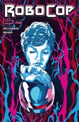
Once again, there are occasional moments where this issue of Robocop feels a little bit too much like Robocop 2. Not even the action, but the way Williamson is moving things along for Murphy. The evil OCP conspiracy, him having to get fixed. In terms of action, however, there is an ED–209 fight and Murphy having a super-nightstick instead of a gun.

    Also, Robocop not getting a gun feels a little too much like Robocop 2 as well.

    I hate bringing up those comparisons, but Williamson was setting Robocop the comic up to be something different. Magno’s art is still gritty (though really problematic in this issue) so some of the details really don’t play.

    But there’s good character work on Lewis, if her dialogue gets a little too much towards the end of her scenes. And some nice small parts from familiar movie characters.

    Not bad stuff.

    B- 

    CREDITS

    Writer, Joshua Williamson; artist, Carlos Magno; colorist, Marissa Louise; letterer, Ed Dukeshire; editors, Alex Galer and Ian Brill; publisher, Boom! Studios.

  • Nailbiter (2014) #5

    Nailbiter  5

    It’s the best issue of Nailbiter in a while as Williamson wraps up his first arc. He’s set up the series now–Finch, the visitor, isn’t just staying but now there’s new shocking new information about him. Williamson, for better or worse, seems to be positioning the series–with its variety of characters but relatively few locations–for a TV series option.

    There’s some rather good art from Henderson in the issue. He doesn’t do particularly well with the action sequences, but those missteps might be due to the silliness (the latest serial killer is dressed as some kind of Neolithic warrior); but the regular talking scenes are quite good.

    There’s foreshadowing, there’s fake resolution (for every window Williamson closes he opens a couple doors) and there’s the titular nail biting serial killer playing hero. It’s entirely artificial, but so well executed it doesn’t matter. Williamson pulls the strings well.

  • Nailbiter #5It’s the best issue of Nailbiter in a while as Williamson wraps up his first arc. He’s set up the series now–Finch, the visitor, isn’t just staying but now there’s new shocking new information about him. Williamson, for better or worse, seems to be positioning the series–with its variety of characters but relatively few locations–for a TV series option.

    There’s some rather good art from Henderson in the issue. He doesn’t do particularly well with the action sequences, but those missteps might be due to the silliness (the latest serial killer is dressed as some kind of Neolithic warrior); but the regular talking scenes are quite good.

    There’s foreshadowing, there’s fake resolution (for every window Williamson closes he opens a couple doors) and there’s the titular nail biting serial killer playing hero. It’s entirely artificial, but so well executed it doesn’t matter. Williamson pulls the strings well.

    B 

    CREDITS

    Writer, Joshua Williamson; artist, Mike Henderson; colorist, Adam Guzowski; letterer, John J. Hill; editor, Rob Levin; publisher, Image Comics.

  • Birthright (2014) #2

    Birthright  2

    The first half or so of this issue is worrisome. Williamson brings in a whole bunch of fantasy world vocabulary for a flashback–the structure is fairly simple, present day on Earth with Conan grown-up, the fantasy world in flashback when he’s still an Earth kid adjusting. And while Bressan’s art is fine–his action is better–there’s not much one can do with a fantasy world anymore. They’re standard, thanks to comics, movies, video games and television.

    The first half also has the pained meeting between brothers–the younger brother now much older (and Conan). Williamson’s sincere in the scene, but it doesn’t offer anything new.

    Luckily, the finale has something also not new, but still awesome. Conan breaks free in the police station and it’s the Terminator only with a magical warrior. Good character work in the sequence too. It pulls the issue around just in time.