Even though Jack Nicholson gets top billing and the most bombastic role in The Last Detail, Otis Young has the harder job. He’s got to temper Nicholson, both for the sake of the audience and of the narrative. The film introduces the two men simultaneously–Robert Towne’s script almost immediately establishes an unspoken bond between the two, even though it takes them well through the first act to get to know each other.
The Last Detail is an atypical buddy picture for many reasons, with the two buddies getting thrown together being one of the more immediate ones. But more, the film is practically a parenting outing. Nicholson’s the crazy, fun dad, Young’s the responsible mother (who you don’t want to cross) and Randy Quaid’s the kid. Of course, Nicholson and Young are escorting Quaid to the stockade.
Along the way, Nicholson and Young do not go on an odyssey of self discovery. Their efforts in humanizing Quaid don’t lead to big momentous changes in their lives. Towne is reserved, saving the expository character development scenes for when Quaid’s doing something else (sometimes just napping); it makes those scenes, with Nicholson calm as opposed to manic and Young not fretting as much, rather special.
Director Ashby and editor Robert C. Jones create a tranquil, quiet quality for the film, using fades to guide the viewer’s attention. Great photography from Michael Chapman and a rather good score from Johnny Mandel.
All the acting’s great. Detail is muted, precise and often devastating.
 ★★★★
★★★★
CREDITS
Directed by Hal Ashby; screenplay by Robert Towne, based on the novel by Darryl Ponicsan; director of photography, Michael Chapman; edited by Robert C. Jones; music by Johnny Mandel; production designer, Michael D. Haller; produced by Gerald Ayres; released by Columbia Pictures.
Starring Jack Nicholson (Buddusky), Otis Young (Mulhall), Randy Quaid (Meadows), Clifton James (M.A.A.), Carol Kane (Young Prostitute) and Michael Moriarty (Marine O.D.).
RELATED
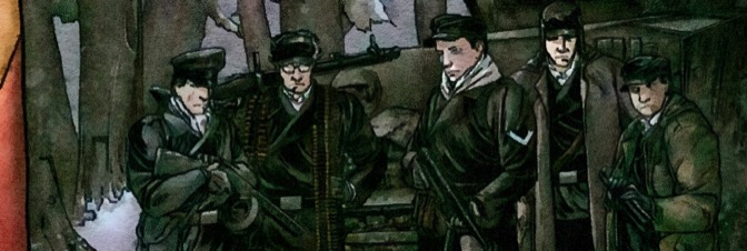


 This issue of War Stories, with Ennis exploring the dynamics of the German tankies and their civilian charges while hiding from Russians invading Germany, it’s essential war comics reading. Ennis’s characterizations, how he paces the issue, how he relieves and creates tension–it’s all top-notch writing. The dialogue’s great, so’s Ennis’s plotting of the scenes and their action.
 Everything changes in this issue of Rat God. And not just because the coloring looks more traditionally Corben. It changes because Corben makes his rube of a lead, Elwood Clark, the protagonist of the series. Only took three issues but it’s worth the wait.


 I resent this issue of Copperhead being so good. It’s an all-action issue, it probably reads in four or five minutes. Clara goes on a date, it gets interrupted by bad guys. Boo is in trouble. There’s some setup–with Faerber maybe even implying Clara’s ex-husband is in a maximum security prison somewhere–and then it’s just the date.
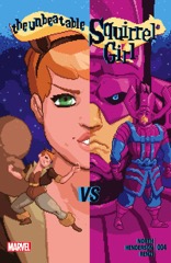 Writer North understands the lunacy of Squirrel Girl fighting Galactus but he’s also writing a comic called The Unbeatable Squirrel Girl so he’s got to come up with something good. And he does. He doesn’t take the comic too seriously, which helps because Squirrel Girl doesn’t need to be realistic, it needs to obey internal logic and amuse.

 It’s too soon to say I’m worried about Birthright, but I guess I’m starting to get concerned. Or maybe I wasn’t concerned but this issue is concerning.

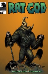 It’s a weird issue of Rat God, which is also a lot of Corben’s point. He isn’t mixing genres, but he is throwing Lovecraft alongside some Native American folklore and just plain old wives tales. And who better to illustrate it than Corben himself.

 In this issue, Moore drops Future and company in a Muslim settlement (the only religious community in the world… AFAWK). Future’s got a thing going with the archivist there, giving Moore and Andrade a chance to mix talking head Crossed history in with a sex scene. There’s some stuff with the Crossed in the issue–the tape, finding out the Crossed can breed (for me anyway)–but it’s Future’s romantic interlude is the action standout.

 This issue of Red One is far superior to the first one, just because Dorison’s made most of his sexist jokes. This time he tries to go the other way and mock the fascist fundamentalist Christians out to attack gays and fails miserably. For what’s supposed to be a period piece–think Boogie Nights with less story–Dorison doesn’t get any details right.
 The first half of the issue is a whole lot better than the second half. The second half has our hero–called Big Man in the letter pages–enduring a whole bunch of torture. Page after page of it. Powell goes from drawing five or six panels a page to three. He doesn’t do backgrounds. He’s going for emphasis.
 I’m really hoping the monkey isn’t just a tease in The Surface. It seems like it’s not going to be a tease. The comic really needs a smart monkey.

 Brisson picks a really weird place to do a cliffhanger this issue. It’s the most predictable spot–so predictable, it doesn’t even constitute an actual cliffhanger anymore. He spends the entire issue counting down to a plot point and then ends with that plot point. Literally counting down.


 Even though this issue is Sam Hain Mystery zero, most of the comic is spent on Harry the Alien’s backstory. How did he change from duplicated bills to bills he could use without raising suspicion. Why did he even come to Earth in the first place. Is he believable as a town doctor.
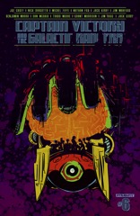 I wish Joe Casey loved Jack Kirby a little less. Captain Victory ends with the origin of Captain Victory (as the young version sees it unfold). What’s it like? Well, there are nods to Darkseid, the New Gods, probably something from Marvel, whatever. It’s a bunch of Kirby homage and it’s all in summary and none of it’s in scene.
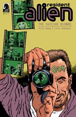 Hogan manages to find a sensational but also completely not finish to Suicide Blonde. The resolution of the mystery is genial, even as the suspect recounts a somewhat salacious story. Harry’s just too good of a guy for it to be anything but genial.
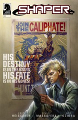 Eric Heisserer turns in a perfectly serviceable script for Shaper. Kid graduating high school (or the future, interplanetary equivalent) from a bad home, can’t get a prime gig, finds out he’s a magical war creature and that his favorite teacher’s been lying to him and she’s his mom.
