

In his foreword, writer and publisher Bruce Jones talks about his goals for Somerset Holmes. It’s a lot of text and a lot of ego, but I think the point is he wanted to go to Hollywood and thanks to Brent Anderson’s amazing artwork, he was able to get there on Somerset Holmes. Though I’m sure, given the ego, there’s a lot about his writing and publishing.
And Jones isn’t wrong. Somerset Holmes is pretty awesome. It gets long in places, but once Jones has established his style–even if the comic is supposed to be cinematic, his narrative plotting is so episodic each episode has a different guest star, you can wait it out. You can just look at the art a little more. You can wonder who had the forethought to put the little bowl under the leaky stop valve in the scummy small town bar where the pig bartender wouldn’t lend the distressed lead a dime to make a phone call.
Because there’s always at least two things going on with Somerset Holmes–Anderson’s exceptionally thoughtful artwork; Jones might think it’s cinematic or whatever but it’s beyond cinema, it’s comics, it’s sight gags, it’s understanding how a reader processes information. And it’s raw. Anderson’s experimenting, often because Jones has such “movie” moments, so he has to change the visual tone immediately. It’s awesome.
The other thing always going on is how every guy in Somerset Holmes is kind of a complete scumbag. Or insane. Because the introduction of the book isn’t the eventual action thriller it becomes, it’s a psychological horror thriller. In the context of a comic book issue, it might seem a little less weird–Somerset Holmes originally had an Al Williamson serial backup, which maybe sort of could affect how the feature reads after a certain reveal–but in the Graphic Album? It’s relentless. Jones is positively cruel with how naively he portrays the protagonist; even her daredevil prowess, which saves her life multiple times, is derided. The supporting cast treats it like a disability. It’s heavy.
Because the book is called Somerset Holmes. Okay, it’s called Somerset Holmes: The Graphic Album, which is appropriate, because it’s see Brent Anderson draw Somerset Holmes. Occasionally too much of her because it’s an early eighties Bruce Jones production and there’s going to be some cheesecake only it gets to be a little much in the collected setting. Especially after the bisexual prostitute she ends up partnering with scopes her out. Somerset Holmes passes Bechdel with flying colors, only it then turns around to be really homophobic but in a “sexy” way since it’s ladies after all.
And then they walk some of that back and they get away with it because Brent Anderson. And also because, even though there are literally men speaking exposition all the time–some of it just dangerous nonsense (Somerset Holmes would be great if Jones weren’t just a pragmatic writer)–Jones does work on Somerset’s character development. It’s “on page” but it never gets the dialogue time it deserves because there are all these dudes explaining, lying, or apologizing. Usually the same dude. The sidekick.
Somerset. Okay. Let’s talk about Somerset first, then deal with the sidekick situation.
The comic opens with a woman getting hit by a car. She’s walking down the road, gets hit by a car. Beautiful art, setting expectations high for what Anderson is going to do. The comic becomes about whether or not it’s always going to look so amazing, as well as Somerset. The two things are tied, especially since Anderson is so careful with her presentation. She’s the visual star of the book, even when the dudes are talking. She’s navigating through their noise. And word balloons.
Over the course of the story, there are all sorts of revelations–including some where Jones doesn’t even slow down to look at the connotations (though it turns out the Graphic Album isn’t a full reprinting of the six issues, so maybe things got cut)–and it turns out Somerset’s a great protagonist. Jones basically uses her like a Technicolor Hitchcock damsel only she’s an active lead. She’s not waiting for her manly sidekick to rescue her, which is good for a couple reasons. He’s a dope and he also tries to rape her the first time they meet.
But in a playful, wrestling sort of way.
And I just now realized how gross it turns out to be when you factor in the later revelations. Jones’s lack of character continuity is a problem. It’s more a problem with his writing in general than anything in Somerset Holmes because to mess up Brett Anderson’s art on this book, you’d have to be intentionally malicious. And Jones isn’t malicious, he’s just not interested enough. Not in making the characters have internal logic, not in the flow of the story. Maybe it reads better in the floppies, but collected, it’s start and stop, start and stop.
But it doesn’t really matter, because Brett Anderson.
So the dude sidekick is a gross, rapist, early eighties cheeseball. Turns out he’s even worse. But he’s still her sidekick who ostensibly is helpful in Somerset’s attempts to find herself.
I forgot to mention she has amnesia, didn’t I? Sorry. She has amnesia.
The other sidekick, the bisexual prostitute turned Somerset stan–is so much better. Jones’s handling over everything is so exploitative, but it’s still better than “if she’s not wearing a wedding ring, she must want it” man. Somerset Holmes is kind of jaw dropping in how messed up it gets just because Jones is so disinterested in writing it well as opposed to packaging it right for Anderson. But the female sidekick is at least nice. She’s at least a nice character to have in the comic. Once she forces herself on a sleeping Somerset… well, okay. She at least apologizes. She gets a lot better after that turn. The dude sidekick just keeps explaining, lying, and apologizing.
So. It’s problematic. Somerset Holmes is a problematic, exceptional piece of work. Jones mixes a bunch of genre elements, bunch of genres, throws it all to Anderson, who makes that mess visually seamless. And, despite his other problems, Jones does give Anderson all the right material to make Somerset Holmes a captivating experience.
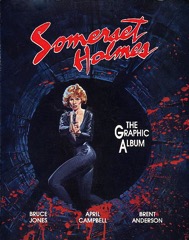 In his foreword, writer and publisher Bruce Jones talks about his goals for Somerset Holmes. It’s a lot of text and a lot of ego, but I think the point is he wanted to go to Hollywood and thanks to Brent Anderson’s amazing artwork, he was able to get there on Somerset Holmes. Though I’m sure, given the ego, there’s a lot about his writing and publishing.


 Bickering. Jones concludes the series with Bruce and Logan bickering. Why are they bickering? Because Wolverine first appeared in a Hulk comic and Jones is trying to tie into their long history together? Who knows–Wolverine sure isn’t remembered for his Hulk appearance.
 Jones maintains a great pace through Six Hours. He’s got his four plot lines going–Bruce and Logan, the villain (the Shredder, because apparently Eastman and Laird don’t know how to copyright), the captive pilot and the missing boy’s parents back in Florida. It moves really well; Jones doesn’t cover a lot of time, but he does spend just the right amount on each characters’ experiences.
 Kolins goes more into detail this issue than he did in the first. The exterior Canadian mountains are precise and intense; it makes Six Hours a distinct-looking comic, even when Kolins occasionally has problems. He doesn’t deal with movement particularly well.
 Writer Bruce Jones takes great care plotting out this first issue. He reveals the significance of the Six Hours title towards the middle of the issue, during the first intense, action set piece. There are a couple of those set pieces, with the beginning of the issue instead dedicated to setting up the supporting cast.
 It’s hard to feel bad about Doc Samson getting his butt kicked after he just lectured the Hulk on the importance of corporal punishment for children.
 Here I thought Darick Robertson and Tom Palmer on the art would help….
 I don’t like finishing a comic wondering what the heck I’ve just read. Getting through this issue of Hulk isn’t just troublesome because of the incredibly uneven art–Braithwaite and Reinhold spend the least amount of time on the big fight between Hulk and Iron Man–but through the constant stupidity.
 Watching Braithwaite try to do depth in panels gets painful fast. Bruce is pointing at Tony Stark in one panel and the hand is at exactly the same depth as his body. Maybe it’s Bill Reinhold’s inks, but there’s something definitely off with the art.