
There’s a lot to be said about this issue, but the “highlight” has got to be when writer Steve Englehart describes Batman as the “pensive prince of shadows.” This line comes just before Batman goes to the Batcave and yells, “I’m the goddamn Batman,” to himself as a positive self-reinforcement.
I’m only slightly exaggerating; Englehart writes Detective Comics with a boisterous, entirely unwarranted enthusiasm. Unfortunately, he’s incredibly thoughtless too. The first big swing is Batman stops a jewel heist and, while beating up the crook, tells the villain he’s just defending his municipality of residence and, as a citizen, it’s his right to be a vigilante.
Just then, a process server shows up and hands Batman a subpoena for a grand jury. Gotham’s regular folks have had enough of Batman. The issue implies there’s something shady about these elected officials out for Batman, which makes sense—they’re shitty rich white guys just like… oh, wait, just like Bruce Wayne.
And even if Batman thinks they’re corrupt, shouldn’t he have proved it at some point instead of going rogue? Or letting them operate for decades. So no, “your feast is nearly over” here. But he’s now been duly, lawfully told he needs to knock off the vigilante shit, and his response is exactly what you’d expect from a mega-rich white guy.
Englehart writes Batman as an asshole fascist in Detective, but, you know, for kids. Except when Silver St. Cloud shows up, Bruce forgets about his “I’m Bat-Man, and I don’t like girls” monologue. Then Bruce turns on the sultry seventies predatory charm.
Amid all the nonsense, Batman fights Dr. Phosphorus. The story’s title is The Master Plan of Dr. Phosphorus! but he literally just gases people at a stadium. There’s not much master planning to it. Otherwise, he’s waiting around for Batman to show up and kick his ass. Englehart’s Batman’s a killer too.
Seriously, the whole thing reads like a potentially better Val Kilmer and Joel Schumacher Batman movie. It feels like a pseudo-gritty riff on “Batman: The TV Show.”
Either I’m acclimated to Al Milgrom inking Walt Simonson, or the art’s a little better. Simonson and Milgrom’s costumed Batman art is very, very silly—which the exposition sometimes exaggerates, like when Batman “stands motionless” for seven minutes after being served his subpoena. On the other hand, there’s a little more regular people talking this issue; they’re fine with the Bruce and Silver stuff. Not great, but fine.
The Dr. Phosphorus fight’s weak sauce, though, both writing and art.
What a weird, bad comic.


 Is Josh Bayer the right person to write Bullwhip? It’s about a seventies female superhero who fights bad guys named “The Misogynist” and time traveling space vampires who are also misogynists. There are enough misogyny “jokes,” one might even think Frank Miller wrote this thing. So, no, he’s not the right person. He goes overboard with the joke and lacks any humanism in his portrayal of Bullwhip. She’s the butt of various jokes and action setpieces, but she’s hardly the lead in the comic. It also has time traveling vampires, which is fine, though it’s all ripped off from popular media (save the vampire aspect). At least Ben Marra and Al Milgrom’s art is all right.
 What a bad comic. Whether it’s Mantlo’s rhyming of adjectives and nouns, the lamebrain fight scene, Bev’s silly way of resolving her situation–it’s all bad. It’s all bewilderingly disconnected, not just from the series, but from the other elements of the comic. It’s like Mantlo can’t even figure out how to move these characters in relation to one another.
 Al Milgrom inking Gene Colan. And it’s not bad. It looks like Milgrom does a lot of work on Howard’s face–his lines are smoother than everything else–but otherwise, it’s not a bad job inking at all.
 It’s a pointlessly double-sized issue. The extra pages give Conway time to get in fight scenes between Firestorm and both villains–and the art on the fight with the Hyena does have a great double page spread–without having to sacrifice the character development.
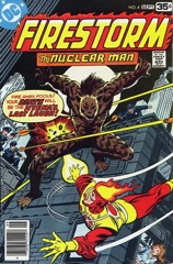 The issue opens with a lengthy recap of the previous one’s events and Conway’s found a great way to do exposition in the series. Ronnie and Professor Stein just talk about it naturally.
 I don’t know how best to make the remark without it sounding like a slight but McLeod inks the heck out of Milgrom’s pencils this issue. There are maybe two questionable panels, otherwise the art is first-rate.
 I don’t want to spend time griping about Milgrom’s pencils. If his composition were better, I might even let it pass, but the composition–and how he handles the costumed stuff–is a real problem. Conway gets in a lot of scenes and Milgrom handles the transitions awkwardly. His figures in superhero motion are really awkward, especially the flying. Superman guest stars too so lots of flying.