• Stray Bullets 11 (October 1996)

    Stray Bullets #11It’s back to reality, but Lapham keeps his new formula for figuring in interconnected exposition. Maybe Beth and her friend are the girls from the night of the first party. I kind of hope not, because it makes her meeting Orson–who thankfully doesn’t appear this issue–way too contrived.

    The issue has Beth and the friend out swimming, only they end up fighting because they’re both going crazy on the run. Then Beth has this crazy adventure with a movie star and her odd entourage. The end brings everything together with devastating result. It’s like Lapham took a while to figure out what stories to do–and how uncomfortable to make things. He’s got a great balance this story.

    He’s finally turning Beth into a decent character. She was one note as Orson’s angry girlfriend but Lapham hasn’t given her room to stretch until now. It works out well.

    B+ 

    CREDITS

    The Supportive Friend; writer, artist, and letterer, David Lapham; editor, Deborah Purcell; publisher, El Capitán Books.

  • Southern Bastards 1 (April 2014)

    Southern Bastards #1I’m getting tired of the pilot issue. What about a nice story, instead of something establishing tone or the ground situation or whatever. It’s a strange thing to want something more standard–even a small resolution would be nice–because Jason Aaron has lots of opportunity in Southern Bastards and he doesn’t utilize any of it. Instead, it feels like an adaption of a novel or something. There’s just enough information, but no enthusiasm.

    Bastards is Southern exploitation and good exploitation. It shares details with the old Walking Tall movies and it’s definitely got personality. Jason Latour does outstanding work on the art. He brings depth to the setting, depth to the characters. His panic-stricken characters are amazing.

    But it’s just an old man action hero story. Aaron has already established that genre for it, already boxed it in. There are lots of those stories these days. Why another?

    B 

    CREDITS

    Here Was a Man, Part One; writer, Jason Aaron; artist, Jason Latour; colorists, Latour and Rico Renzi; letterer, Jared K. Fletcher; editor, Sebastian Girner; publisher, Image Comics.

  • Fargo (1996, Joel Coen)

    Much–probably most–of Fargo is exceptional. The Coens take over half an hour to bring their protagonist into the movie. They spend that first half hour with the villains, even having time to make said villains simultaneously lovable and even more dangerous. William H. Macy isn’t just some loser who schemes to rip off his father-in-law, he’s a dangerous sociopath. It’s amazing what the Coens can fit behind those goofy accents and the folky talk.

    And those levels of Fargo are what make it so fantastic. Frances McDormand isn’t playing a silly sheriff, she’s playing this incredible investigator who just happens to sound like she lives in a waffle commercial. All of the police work in the film is thoroughly executed; the cops aren’t of the Keystone variety.

    But the Coens don’t engage with this situation. They don’t force the viewer. They don’t even acknowledge it. They’re playing it straight.

    Until the end. McDormand stumbles across the bad guys by accident. Even worse, there was a plot point earlier to set up an actual investigatory discovery of the bad guys and the Coens skip it. Very disappointing.

    Otherwise, the film is fantastic. Great photography from Roger Deakins, wonderful score from Carter Burwell. Fargo speeds along too. There’s never a slow moment.

    The supporting cast–Steve Buscemi, Harve Presnell, Peter Stormare, John Carroll Lynch–is great. Buscemi has some exceptional rants throughout.

    McDormand and Macy are both excellent. McDormand even manages to sell the questionable stuff at the end.

  • Adventure Into Fear 12 (February 1973)

    Adventure Into Fear #12Gerber does the stupid second person narration, but not a lot of it. Most of the Man-Thing story he does a close third person for Man-Thing; it works a lot better. Especially he confirms Man-Thing has no mouth.

    Instead, Man-Thing listens a lot. He makes a new friend, a black guy on the run from a racist white sheriff. Gerber doesn’t shy away from the race issues. Gerber even takes it further, working race preconceptions into the surprise ending. He’s also turning Man-Thing into a real character, even if he can’t talk and doesn’t get any thought balloons.

    Jim Starlin has a really fun time on the pencils. There are some really emotive pages. Buckler inks him well enough.

    The fifties back-up, from Stan Lee and Russ Heath, has an interesting visual style but Stan must have been trying to impress his editor with how many words he could use.

    B 

    CREDITS

    Man-Thing, No Choice of Colors!; writer, Steve Gerber; penciller, Jim Starlin; inker, Rich Buckler; letterer, John Costanza. The Face of Horror; writer, Stan Lee; artist, Russ Heath. Editor, Roy Thomas; publisher, Marvel Comics.

  • Daredevil 2 (June 2014)

    Daredevil #2Really, it’s necessary to do a Batman wink? It’s not necessary. It’s pointless given neither Waid nor Samnee are identified with Batman. So maybe it’s a DC jab. Eh, who cares.

    Daredevil is fine. Waid writes a good Matt Murdock, though I suppose I question his friends. The girlfriend remains unestablished and the idea of Daredevil as the official superhero of San Francisco seems odd. Waid and Samnee aren’t going for high concept or realism, so bringing in both those elements makes for an awkward read.

    Waid tries too hard. He doesn’t need to sell the concept. Between his Matt characterization and Samnee’s art, Daredevil is an entertaining read. It doesn’t try hard as far as the plot, so why try on the new ground situation. It’s digestible. Better to be digestible than not.

    Samnee gets to do a variety of different scenes. The fight’s cool, but so’s the comedy.

    B 

    CREDITS

    Writer, Mark Waid; artist, Chris Samnee; colorist, Javier Rodriguez; letterer, Joe Caramagna; editor, Ellie Pyle; publisher, Marvel Comics.

  • Stray Bullets 10 (August 1996)

    Stray Bullets #10It’s the best issue of Stray Bullets so far and it’s an Amy Racecar issue. I’ll pause for a moment and let that situation sink in. The fictional character of one of Lapham’s fictional characters has the best issue in ten.

    Okay, here we go. Amy, or little Ginny, ends up in Seaside. Seaside is that truck stop-centered place from the last issue. Luckily, none of the regular cast appears–for a few pages, I was worried Lapham was having Ginny project Amy Racecar around her–except Spanish Scott. Of course, he’s called something else because Ginny never found out his name. This issue is her still disturbed from what she witnessed–and all the crazy stuff following it (and predating it, turns out her mom’s always been a nutter).

    There’s action, there’s comedy, there’s great writing and great art. Lapham keeps piling it on and he keeps on selling it through.

    Phenomenal.

    A+ 

    CREDITS

    Here Comes the Circus; writer, artist, and letterer, David Lapham; editor, Deborah Purcell; publisher, El Capitán Books.

  • Star Trek 32 (April 2014)

    Star Trek #32Lots of drama this issue. There’s some comedy too, from McCoy and Scotty, but there’s also running around.

    Last issue the Enterprise became sentient and grew itself a humanoid body. This issue… well, let’s see, Johnson seems to rip off sections from Star Trek: The Motion Picture and maybe one of the “Next Generation” movie. Not doing connections to them or tie-ins, just ripping off details. The comic’s so disconnected, it doesn’t matter much.

    Johnson refuses the let Kirk be the main character and his focus on the events surrounding this android make the issue read too fast. Johnson is cutting from scene to scene without any room for the reader to breath or enjoy.

    Farjar’s art is some of his best on the series. Well, some of it. Some of it is really lame, but some of it isn’t bad.

    Star Trek remains a series of unfulfilled potential.

    C 

    CREDITS

    I, Enterprise, Part Two; writer, Mike Johnson; penciller, Erfan Fajar; inkers, Fajar and Yulian Ardhi; colorists, Sakti Yuwono and Ifansyah Noor; letterer, Neil Uyetake; editor, Sarah Gaydos; publisher, IDW Publishing.

  • Lazarus (2013) #8

    Lazarus  8

    Rucka shows all the subplots coming together at the end of the issue for the soft cliffhanger. It’s not particularly dramatic stuff; the connection is contrived, which is okay because Lazarus is kind of a big soap opera. The kids hating their rich father is enough to make it a soap opera. Through in an “adopted” genetically engineered sibling and it’s even bigger.

    There are some problems with how long this arc is going. Hopefully it’s only another issue. A lot has happened but most of the events just rearranged things. Rucka’s still coasting on some of the more effective events, kind of zooming downhill on that momentum to get him to the finale.

    Nothing much happens. It’s filler, except the linking of the story lines. But it’s still good enough. Even with Lark’s art falling off a bit, especially on faces. They look way too hurried.

    But steady on.

  • Stray Bullets (1995) #9

    Stray Bullets  9

    I don't know if I'd say Bullets is back on track, as Lapham's been relatively uneven so it's hard to know what kind of track he's trying to keep the series on. But this issue's definitely an improvement, just in terms with how tightly he tells the story.

    It's set in the trailer park from the previous issue, but following around a new character, a local loser who takes Orson out to the nearby truck stop. There's nothing else to do but hang out at the truck stop. The issue's protagonist is an unlikable bully (though Lapham never gives the reader the satisfaction of Orson going off on him) and his adventures, set over a day, are mostly comical.

    The end is a little bit of a surprise, not so much the last page, which Lapham goes for humor, but the bully's big moment.

    It's a solid, if unremarkable, issue.

  • Star Trek 3 (June 1980)

    Star Trek #3Unfortunately, the final issue of Wolfman and Cockrum's Star Trek: The Motion Picture compounds all the problems they had in the second issue. While they're skilled at densely packing scenes with characters and dialogue, Wolfman apparently can't cut back on the events enough to give the issue a good flow.

    He really needs another one, especially considering how little science fiction spectacular Cockrum gets to illustrate. Most of the really visual space scenes are restricted to a small panel, something quick before all the talking starts again.

    Wolfman does make some big changes to the movie to streamline the story. Some of it is shifting the dialogue around, but there's also a part where he throws Kirk into a scene where he not just isn't in during the movie, but doesn't serve any purpose. It's like William Shatner's ego influenced the comics adaptation.

    It's not terrible, but it started stronger.

    C 

    CREDITS

    Evolutions; writer and editor, Marv Wolfman; penciller, Dave Cockrum; inker, Klaus Janson; colorist, Marie Severin; letterer, John Costanza; publisher, Marvel Comics.

  • The Eltingville Club (2014) #1

    The Eltingville Club  1

    Evan Dorkin’s sense of humor on The Eltingville Club is nowhere near as peculiar as his plotting on the comic. There’s some peculiarities to it since Dorkin mocks every single character to some degree or another and his protagonist is one of the more reprehensible characters in there comic.

    The constant comedic assault both kills the momentum and gives the book a significant reading time. Since Dorkin’s mocking his characters once every couple panels, and he’s got the situational comedy and sight gags, the issue is always on. If you don’t like one joke, there’s another one in just a moment.

    Until the ending. Dorkin goes a somewhat unexpected route, turning a workplace situational into gently absurdist. It reminds a little of “The Simpsons”, just for how the cause and effect work. I guess it’s hard to plot for unlikable characters.

    Still, Dorkin builds anticipation for the next one.

  • Lazarus #8Rucka shows all the subplots coming together at the end of the issue for the soft cliffhanger. It’s not particularly dramatic stuff; the connection is contrived, which is okay because Lazarus is kind of a big soap opera. The kids hating their rich father is enough to make it a soap opera. Through in an “adopted” genetically engineered sibling and it’s even bigger.

    There are some problems with how long this arc is going. Hopefully it’s only another issue. A lot has happened but most of the events just rearranged things. Rucka’s still coasting on some of the more effective events, kind of zooming downhill on that momentum to get him to the finale.

    Nothing much happens. It’s filler, except the linking of the story lines. But it’s still good enough. Even with Lark’s art falling off a bit, especially on faces. They look way too hurried.

    But steady on.

    B 

    CREDITS

    Lift, Part Four; writer, Greg Rucka; artists and letterers, Michael Lark and Brian Level; colorist, Santiago Arcas; editor, David Brothers; publisher, Image Comics

  • Stray Bullets #9I don't know if I'd say Bullets is back on track, as Lapham's been relatively uneven so it's hard to know what kind of track he's trying to keep the series on. But this issue's definitely an improvement, just in terms with how tightly he tells the story.

    It's set in the trailer park from the previous issue, but following around a new character, a local loser who takes Orson out to the nearby truck stop. There's nothing else to do but hang out at the truck stop. The issue's protagonist is an unlikable bully (though Lapham never gives the reader the satisfaction of Orson going off on him) and his adventures, set over a day, are mostly comical.

    The end is a little bit of a surprise, not so much the last page, which Lapham goes for humor, but the bully's big moment.

    It's a solid, if unremarkable, issue.

    B 

    CREDITS

    Twenty-Eight Guys Named Nick; writer, artist, and letterer, David Lapham; editor, Deborah Purcell; publisher, El Capitán Books.

  • The Eltingville Club #1Evan Dorkin’s sense of humor on The Eltingville Club is nowhere near as peculiar as his plotting on the comic. There’s some peculiarities to it since Dorkin mocks every single character to some degree or another and his protagonist is one of the more reprehensible characters in there comic.

    The constant comedic assault both kills the momentum and gives the book a significant reading time. Since Dorkin’s mocking his characters once every couple panels, and he’s got the situational comedy and sight gags, the issue is always on. If you don’t like one joke, there’s another one in just a moment.

    Until the ending. Dorkin goes a somewhat unexpected route, turning a workplace situational into gently absurdist. It reminds a little of “The Simpsons”, just for how the cause and effect work. I guess it’s hard to plot for unlikable characters.

    Still, Dorkin builds anticipation for the next one.

    B 

    CREDITS

    Writer and artist, Evan Dorkin; colorist, Sarah Dyer; editors, Daniel Chabon and Scott Allie; publisher, Dark Horse Comics.

  • Jaws 3-D (1983, Joe Alves)

    Jaws 3-D is one part advertisement for Sea World, one part disaster movie, one part monster movie, then figure the rest is character stuff. It does really well as the Sea World ad, not so well as a disaster movie, a little better as a monster movie… and shockingly well on the character stuff.

    Alves’s direction of the big shark attack stuff is nowhere near as good as his character moments. Obviously, there’s time in the script to develop these relationships between the cast members–there’s a great slight moment with Bess Armstrong and Louis Gossett Jr. who otherwise barely interact. And it’s just better for Armstrong and Dennis Quaid. Jaws 3-D is a silly movie about a giant shark but Armstrong and Quaid are always sincere.

    So’s Gossett and, to some degree, Simon MacCorkindale. He’s not good, but he does try. As his manservant, P.H. Moriarty is terrible. John Putch plays Quaid’s visiting little brother who romances Lea Thompson. They’re both fine, they just don’t have anything to do except to quickly make Quaid and Armstrong more likable. The movie’s far from art, but screenwriters Richard Mathewson and Carl Gottlieb know how to make it work.

    There are some good effects towards the end. Great music from Alan Parker. Alves does an adequate job throughout but he does have his moments. The way he stages some of the non-shark action sequences is fantastic and he always takes time for the actors.

    It’s not bad at all.

  • The Comics Fondle Podcast – 1×12

    Episode 12 | C2E2 2014 Saturday The Comics Fondle Podcast

    And what did we do on Saturday? Besides less walking? We spent money. And talked to a lot of people–Chris Samnee, Lee Weeks, Joshua Williamson, Andrew Pepoy, Bryan J.L. Glass, Mark Brooks–and listened to a funny panel. We talk about it all on here a bit.

    WHERE TO LISTEN

    Apple Podcasts
    Spotify
    Stitcher
    RSS
  • The Comics Fondle Podcast – 1×11

    Episode 11 | C2E2 2014 Friday The Comics Fondle Podcast

    Did you take the time to listen to the C2E2 podcasts as they happened? Vernon and I left out all the good stuff about walking around and getting lost in McCormick Place… Maybe we’ll have to do a bigger recap episode. Friday was a lot of walking around and a lot of looking at stuff. Heck, I can’t remember. Listen to the compilation of the mini-episodes.

    WHERE TO LISTEN

    Apple Podcasts
    Spotify
    Stitcher
    RSS
  • Star Trek 2 (May 1980)

    Star Trek #2There’s a really impressive scene with a lots of dialogue and Cockrum having to fit something around seven people into a small panel. Cockrum and Wolfman occasionally do some masterful adaptation in this issue. It’s nice enough to make up for the bad moments.

    The worst moment–there are a handful of shaky ones–has to be when Spock arrives. Wolfman deviates from the movie (perhaps he had a different version of the script) and neither he nor Cockrum give Kirk or McCoy any time. They come off as jerks, with McCoy appearing downright mean-spirited.

    Also unfortunate is Cockrum’s handling of the space stuff. There’s the giant cloud in space and every shot is from the rear of the Enterprise. Maybe it was just an easier way to draw it.

    The aforementioned impressive scene comes towards the end, which sends the issue out on a high note, but there are clearly problems.

    B- 

    CREDITS

    V’ger; writer and editor, Marv Wolfman; penciller, Dave Cockrum; inker, Klaus Janson; colorist, Marie Severin; letterer, John Costanza; publisher, Marvel Comics.

  • Empire of the Dead #4Romero is still setting things up. At least there’s not too much with the vampires this issue and the SWAT zombie making friends with a little runaway is kind of cool. There’s a lot of time spent on new supporting cast members, some rednecks who are in town to start trouble; they’re weak characters. Not to mention the woman’s a rip-off of Frank Miller’s neo-Nazi gal from Dark Knight.

    But even as Romero fills out the cast, it feels like Empire is starting to wind down. There’s too many characters, too much going on. The script is starting to feel too oriented towards a movie and not enough to a comic. Maleev draws a whole bunch of pointless montage sequences and they don’t play to his strengths.

    Zombies and vampires and New York City–maybe there isn’t much mileage anyone could get out of the combination. Nice art though.

    C 

    CREDITS

    Writer, George A. Romero; artist, Alex Maleev; colorist, Matt Hollingsworth; letterer, Cory Petit; editors, Jake Thomas and Bill Rosemann; publisher, Marvel Comics.

  • Stray Bullets 8 (February 1996)

    Stray Bullets #8The interconnected thing is exhausting because Lapham has to take time out from the story to fill the reader in on the connection. For example, Orson the high school kid is now on the run with the girl he met at the end of his first issue for stealing coke from crime boss Harry. At least I think she’s the girl from the end of that issue. Anyway, it probably takes Lapham three pages to get that information out of the way.

    Is three pages too much? Well, when it’s split between panels throughout the whole issue, yes, yes it is too much.

    It turns out the whole issue is actually about Orson and the girl having relationship problems. They resolve them at the end of the issue after a crazy public outburst, but it’s supposed to be cute.

    The whole thing’s kind of cute. Stray Bullets cute is ugly.

    C 

    CREDITS

    Lucky To Have Her; writer, artist, and letterer, David Lapham; editor, Deborah Purcell; publisher, El Capitán Books.

  • Sheltered 8 (April 2014)

    Sheltered #8Brisson has hit a plateau with Sheltered. He’s already established he’s willing to have the kids be awful, he’s already established there aren’t many limits, so where’s there to go? The story can’t leave the compound–though this issue has a bit of a field trip from it–and he’s also not getting rid of any of the main characters yet.

    This issue doesn’t feel like a bridging issue, even though the soft cliffhanger promises another big shoot out soon, and there’s some definite progress with the supporting cast. The progress just feels like more of the same. Brisson has started developing the supporting players a little more, which is sort of predictable. Limited cast, you do closer looks at them.

    Yawn.

    It’s a good enough comic and Christmas’s art is really solid throughout, but the story is starting to run out of fuel. The gimmick might be run out.

    B 

    CREDITS

    Writer and letterer, Ed Brisson; artist, Johnnie Christmas; colorist, Shari Chankhamma; editor, Paul Allor; publisher, Image Comics.

  • Star Trek 1 (April 1980)

    Star Trek #1It’s going to be difficult to talk about this one. Not because there’s anything particularly wrong with this first issue of Marvel’s adaptation of Star Trek: The Motion Picture. In fact, there might not be anything wrong with it at all. I suppose the art could be better, but Dave Cockrum and Klaus Janson do all right. Cockrum loves doing some of the space panels.

    Then there’s how they draw William Shatner. As opposed to drawing him like it’s really the Kirk of the movie, they draw him more like the Kirk of the TV show. It’s kind of cool.

    This issue came out some time after the movie came out and Marv Wolfman’s script almost exclusively uses dialogue from the film itself. It plays less like a promotional material and more like something for a movie fan to take home since sell-through VHS wasn’t around yet.

    It’s perfectly fine.

    B 

    CREDITS

    Star Trek: The Motion Picture; writer and editor, Marv Wolfman; penciller, Dave Cockrum; inker, Klaus Janson; colorist, Marie Severin; letterer, John Costanza; publisher, Marvel Comics.

  • Empire of the Dead #3Not much happens this issue; the smart zombie gets away at the end, there are other smart zombies out there, lots of dumb vampires doing stuff to get themselves found out. While he was hiding the vampires, Romero used them sparingly. This issue it’s different. They’re everywhere. The human characters from the first couple issues are practically just cameos.

    The big problem with the vampires is they’re boring visually. Romero doesn’t do much with them. They attack some girl, then dump her body. Twice in one issue. The girl’s not even a character. Maleev can’t make anything exciting out of such a bland event. Worse, Romero’s doing lots of politics stuff with the other vampires.

    How exciting, vampires running for mayor. It’s like “Spin City” only with vampires and not funny at all. Or even interesting.

    The art and some of Romero’s ideas keep it going, but just barely enough.

    C+ 

    CREDITS

    Writer, George A. Romero; artist, Alex Maleev; colorist, Matt Hollingsworth; letterer, Cory Petit; editors, Jake Thomas and Bill Rosemann; publisher, Marvel Comics.

  • Stray Bullets 7 (November 1995)

    Stray Bullets #7
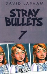
It’s more adventures of Ginny, the girl with the terrible mother–not like “ha ha” terrible, but like abused one. Her dad gets cancer. Her dad who literally has to protect her from her mother and her sister. So the scary part is his leaving her, which Lapham sort of ignores.

    Instead, he goes through day after day of the father getting worse and Ginny watching from the hallway. She’s totally inactive in the second half of the comic–I’m also confused about the passage of time, but whatever. It’s a wrenching experience as one goes through it, even if Lapham never tries to get it to add up.

    It appears Amy Racecar would be a story Ginny writes, though Lapham never draws too much attention to it.

    It’s like Lapham’s toying with giving Stray Bullets a main character. It might not be the best idea. Ginny’s sympathetic, but thin.

    B 

    CREDITS

    Freedom!; writer, artist, and letterer, David Lapham; editor, Deborah Purcell; publisher, El Capitán Books.

  • Stray Bullets: Killers 2 (April 2014)

    Stray Bullets: Killers #2Lapham calls back big time to the original Stray Bullets this issue. He works it in as background, very, very discreet background. His expository dialogue is good enough a new reader could walk right in. The neat part of not going overboard with a callback is it doesn’t make the comic seem too forced. It feels far more organic.

    The story concerns a teenage runaway who stops in with her aunt. The aunt’s got some problems going on, the runaway’s got some problems going on, but there’s this wonderful sense of history between the two women. Lapham infers it all, both through his composition and the dialogue.

    There are complications–the girl meets a boy, the uncle is nearly catatonic–and Lapham does work his way to a sensational finale. But the things along the way are even better. He’s writing these fabulous scenes between his characters; good plotting is just gravy.

    A 

    CREDITS

    Sweet Jane; writer, artist and letterer, David Lapham; editors, Karen Hoyt and Maria Lapham; publisher, Image Comics.

  • Adventure Into Fear 11 (December 1972)

    Adventure Into Fear #11Steve Gerber writes the entire Man-Thing feature with second person narration. Everything thing is the narration talking to Man-Thing, who can’t respond as he doesn’t speak. And because it’s the narration. But if he had talked back to the narrator, the story would be better.

    Because otherwise there’s not a lot of personality to it. A couple kids bring a demon from the other side, then go to the movies and the demon wrecks havoc. Without Man-Thing, the demon might have eaten the one summoning him. There’s a lot of activity, something Gerber’s narration amplifies, but nothing really going on.

    Gerber does get a little mileage out of the narration, but it’s uneven and not enough. The Rich Buckler and Jim Mooney art is fine. Not great, not good, but fine.

    Then the fifties back from Fred Kida is almost better just because it’s actually far weirder.

    C 

    CREDITS

    Man-Thing, Night of the Nether-Spawn!; writer, Steve Gerber; penciller, Rich Buckler; inker, Jim Mooney; letterer, Jean Izzo. The Spider Waits; artist, Fred Kida. Editor, Roy Thomas; publisher, Marvel Comics.

  • Rover Red Charlie 5 (March 2014)

    Rover Red Charlie #5Ennis sure does like going out on an ominous ending with this one. It’s somewhere between a hard and soft cliffhanger; maybe a soft-boiled one. He hints at disaster earlier too, rather blatantly. Hopefully his time to cop out with a dream sequence has passed.

    Not a lot happens in the issue. He skips across the dogs crossing a desert, which seems like it would take quite a while and not just a few panels. The emphasis, besides Red (who isn’t fixed) meeting a lady dog (who looks like Lassie), is on the dogs learning to want for themselves. It’s pretty forced stuff, but Ennis is coasting on good will. Even the lamer scenes, like them coming across yet another dog who knows more about what’s going on, Ennis can coast through them too. His cast is strong enough.

    It’s not a bridging issue as much as a shortcut one.

    B- 

    CREDITS

    The Big Big; writer, Garth Ennis; artist and colorist, Michael DiPascale; letterer, Kurt Hathaway; publisher, Avatar Press.

  • Stray Bullets 6 (September 1995)

    Stray Bullets #6And here we get the first Amy Racecar story. Amy’s probably a stand-in for the little girl with the scars, given how silly some of the details of the story get. Amy’s a thirty-first century outlaw on a Dillinger-esque crime spree. So it’s a child’s fantasy. Also, Amy eventually gets scars on her face from her awful mother.

    It’s only the sixth issue of Stray Bullets. It seems a little soon for Lapham to escape into sci-fi, gangster metaphors for an entire issue.

    The Amy story’s a little easier to digest, however, since no one’s a real person. The terrible things they do and say aren’t as bad as in the regular issue. It’s an imaginary story.

    The good moments–Amy has a vision of God and it causes everyone who sees it (because it’s the future you can see people’s experiences) goes insane. And it’s got a good, despondent finish.

    B- 

    CREDITS

    “How I Spent My Summer Vacation” or “The Rocket Ship Of Life Is Going My Way” or “Three Cheers For God – He’s Certainly a Swell Guy” or “Home Is Where Mom Lives” or “I Don’t Care, As Long As I Gots Me Space Munchies” or “Nothing From Nothing Was Something”; writer, artist, and letterer, David Lapham; editor, Deborah Purcell; publisher, El Capitán Books.

  • Sheena, Queen of the the Jungle 1 (April 2014)

    Sheena, Queen of the Jungle #1If I had to guess–and I’m just going to guess because I don’t want to go look it up–from the credits on Sheena, I think script writer Steven E. de Souza and his relation, probably son, David de Souza, wrote a spec script for a movie. It did not sell. I’d even guess, based on the number of vapid college-age characters, it was written during a teen movie boom.

    So then the brand owner sold it off as a comic book. Or something. Who cares.

    But then the scripting de Souza got lazy and didn’t really want to adapt the movie script into a comic script. So Sheena reads like a bunch of “best of” moments from a movie. The scenes chop back and forth, with artist Jake Minor unable to work out transitions (it’s not his fault).

    It could be a lot worse, but there’s nothing to recommend it.

    C- 

    CREDITS

    Return of the Jaguar Men, Part One; writers, David de Souza and Steven E. de Souza; artist, Jake Minor; colorist, James Brown; letterer, Bernie Lee; editor, Paul D. Storrie; publisher, Moonstone Entertainment.

  • Adventure into Fear 10 (October 1972)

    Adventure into Fear #10Of the three stories this issue–the first two are original, the third is a sixties reprint–Man-Thing is the easy winner. The other two aren't any competition.

    The reprint is a Stan Lee and Larry Lieber (probably) written tale of greed. Don Heck gets some moody art in, but nothing particularly good. The writing's lame.

    Ditto for the second story, which is sort of a tale of greed. Bugsy Malone versus pirates. Allyn Brodsky's script is terrible. Jack Katz and Bill Everett contribute indistinct art.

    But as for Man-Thing… the art, from Howard Chaykin and Gray Morrow, is pretty good. And Gerry Conway's script has a couple moments. Not enough, but a couple. The problem seems to be his pacing. He front loads the story setting up Man-Thing and then doesn't have enough room for a good finish. It's creepier with the bad finish… maybe Conway intended that reading of it.

    C 

    CREDITS

    Man-Thing; writer, Gerry Conway; penciller, Howard Chaykin; inker, Gray Morrow. The Spell of the Sea Witch; writer, Allyn Brodsky; penciller, Jack Katz; inker, Bill Everett. There Is Something Strange About Mister Jones; writers, Stan Lee and Larry Lieber; artist, Don Heck. Letterer, Artie Simek; editor, Roy Thomas; publisher, Marvel Comics.