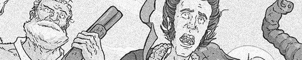
I Confess is unwieldy.
Director Hitchcock is extremely precise in his composition, the same goes for Robert Burks' photography (especially the photography) and Rudi Fehr's editing (which changes in harshness based on the story's tone); sure, Dimitri Tiomkin's music is all over the place and intrusive, but it fits the script. George Tabori and William Archibald's ties together three very different stories–Confess is from a play, which explains some of the problems–but the end result is a disservice to the fine production values and some wonderful acting.
Besides the disjointed nature of the narrative, which keeps a big secret from the audience for the first fifteen minutes for a pointless surprise. The film never recovers from it, right up until the last scene.
Hitchock just has too many MacGuffins–is Confess about priest Montgomery Clift's struggle to cope with evil rectory worker O.E. Hasse's confession, is it about Clift's struggle to figure things out with pre-vows love Anne Baxter, is it about Clift trying to evade bulldog (but inept) police inspector Karl Malden's investigation? No, it's about all three and none at all.
Clift is phenomenal in the film, even though he only has a handful of full scenes. Hitchcock seems more comfortable having him silently react to events; Clift's great at such reactions, he's just capable of a lot more.
Instead, Hitchcock gives Baxter some big dialogue scenes and she nails them.
Thanks to the script, I Confess wastes its potential (Clift, Baxter, the gorgeous Canadian locations and everything else).
 ★★
★★
CREDITS
Directed by Alfred Hitchcock; screenplay by George Tabori and William Archibald, based on a play by Paul Anthelme; director of photography, Robert Burks; edited by Rudi Fehr; music by Dimitri Tiomkin; produced by Sidney Bernstein and Hitchcock; released by Warner Bros.
Starring Montgomery Clift (Father Michael Logan), Anne Baxter (Ruth Grandfort), Karl Malden (Inspector Larrue), Brian Aherne (Willy Robertson), O.E. Hasse (Otto Keller), Roger Dann (Pierre Grandfort), Dolly Haas (Alma Keller) and Charles Andre (Father Millars).

THIS POST IS PART OF THE O CANADA BLOGATHON HOSTED BY RUTH OF SILVER SCREENINGS and KRISTINA OF SPEAKEASY
RELATED
 Ah, the systems of a human imagined afterlife… such compelling ideas, such boring narrative. Fialkov does have some all right ideas and Gabo does illustrate them well, but The Life After is stumbling.
 Parker does a great job with the Arboria adventure–with Dale getting to hang out with some Hawkmen and then rescue Flash and Zarkov on her own. There’s a lot of personality for the Arborians–well, the people with the wings, less so for the sirens who don’t have wings. Parker keeps it relatively simple; maybe too much so, but it’s Flash Gordon and it works with simplicity.
 It’s secret origin of Kamala Khan time. Does she particularly need a secret origin? Maybe. But the way Wilson brings in the Inhumans–they’re not quite deus ex machina, but they’re a very convienient way to tie Ms. Marvel into big Marvel publishing events–doesn’t take advantage of anything.
 Something very bad happens this issue of Transformers vs. G.I. Joe. It becomes inane. Writers Scioli and Barber don’t exactly stop giving characters arcs of their own, they just get rid of having the overall issue story have anything to do with characters.
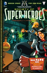 Besides the awkward bookends, which writer Grant Morrison seems to be writing as close to pulp as possible, The Society of Super-Heroes is an excellent Multiversity tie-in. Chris Sprouse is the perfect artist for the time period–it’s set in the forties or fifties, with some familiar heroes in newly designed, functional, period appropriate garb.
 Williamson finally finds a great cliffhanger for Ghosted. What’s so strange about it is how it continues the trend of somehow being either too intimate or too grandiose; but maybe for the first time he’s got his lead in real, scary danger. Ghosted is a supernatural heist story and Jackson is the mastermind and Williamson has spent the series setting him up as being smarter than everyone else.
 Brisson wraps up the arc wonderfully. Everything comes to a collision, there's lots and lots of action, lots and lots of violence. So much violence and action, in fact, it becomes very hard to follow the art. Couceiro just has too many bikers to draw and Michael Spicer's colors are so dark, it's difficult to keep them apart.

 Even though I can remember having some of the toys–or wanting them–I can’t remember the name of the Transformers planet. But all the action takes place there, with Lady Jane leading an attack force of Joes who are trying to green the planet to take out the evil robot aliens.

 There’s some great stuff in the issue, specifically where Hawkins describes how space battle works between ships. He does some quick, but detailed exposition, then carefully maneuvers the dialogue to reinforce what the reader already has passing familiarity with. It works out very well.

 It's the all-new Batgirl, which is mostly just a “Veronica Mars” in college where Babs solves hip crimes–the supervillain this issue is hacking phones and putting the embarrassing private information online. Why? Because he's a bad guy. And he's got a cybernetic brain and can hold his own with Batgirl in a fight.

 Williamson keeps this issue in constant motion. Even the expository scenes are in motion–with both Williamson and Gianfelice putting the emphasis on keeping things moving. The pace is important because Williamson needs to get in an unexpected turn regarding the villain of the arc before the cliffhanger.
 Big Trouble isn't exactly in big trouble yet, but Carpenter and Powell's plotting is definitely getting long in the tooth. The comic opens with a very funny trip through various hells; this trip seems like it should be setting up the showdown between Lo Pan and Jack Burton. But it doesn't.
 Gotham Academy manages to be entirely competent without being compelling at all. Becky Cloonan and Brenden Fletcher do a good job setting up the series–they go through the cast, making sure to make supporting players just memorable enough (the fireworks dealer, for example)–while raising questions about the protagonist.
 Nitz closes up the limited with just enough good will. Galusha doesn’t hack the talking heads scenes any better than he does the action scenes and there are lots of both this issue. All of a sudden Dream Thief has these ineptly composed sequences, something the comic just can’t support.
 Things take an unexpected turn when John’s sidekick takes him hostage (after he’s been possessed). It’s a bit of a spin on the Dream Thief standard but Nitz also has a new artist on the book–Tadd Galusha–and everything feels a little different.
 Gischler slows down a little too much this issue. Not enough to hurt Sally’s momentum exactly, but enough the cliffhanger feels protracted.
 What if the Punisher was a mob assassin who killed babies? What if he had a son who was in trouble with the mob? What if their last name was Rath? Wouldn't it be cool to have a hard-boiled crime comic called Men of Wrath, since they're both men and their last name is….
 Brubaker goes all over the place in the second issue of Fade Out. There's a bunch of stuff with protagonist Charlie's secret partner and best friend–and the way Brubaker narrates from a close third person on Charlie is phenomenal–but there's a lot at the movie studio too.
 It's an okay issue. It's not a great one, probably not even a good one. Soule coasts on a lot of good will and a lot of promise of what's to come–misunderstandings with the aliens, possible American-backed terrorism, the First Lady stepping out for a vote–and he doesn't actually do much here.
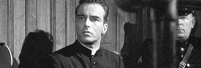


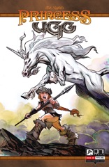 Somehow Naifeh manages to get through all of Ugg's problems to get the comic to a good spot for the finish. He's still on the horse–sorry, unicorn–where Ülga is helping her hideous mean girl roommate get ready for a house competition.
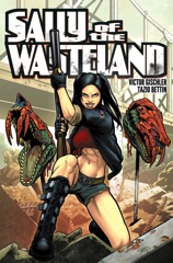 Gischler finds the perfect mix of all action and enough story to get things along. Sally takes front and center, with her stranded party getting into trouble with some pirates. It leads to glorious ultra-violence, which both Gischler and Bettin relish in. Bettin has some slight problems on the art–it's a little too slick–but he delivers on the action, time and again.
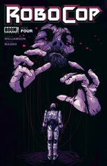 Williamson does a couple unexpected things this issue. First, he brings a level of what one has to call Robocop 2 ultra-violence–well, technically Magno brings it–but Williamson wrote the scene. It's a big hero moment for Robocop and it's awesome. Robo saves the day.
 A Voice in the Dark is back and in full color now. Well, not exactly full color–the figures get fully colored while the background are muted and messy. It’s a great look for the book, especially since writer and artist Larime Taylor doesn’t emphasize the backgrounds. The colors are striking.
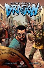 A Town Called Dragon would be a whole lot better with a different artist. Or maybe even if Legendary were willing to get a good inker for Geoff Shaw's competent but unimaginative pencils. Or not, actually. His composition is humorless, which works better for the flashbacks to Vikings fighting dragons but fails during writer Judd Winick's frequent comedy exchanges.