• Cluster #2There’s some nice development with Cluster this issue, but Brisson doesn’t have a good close for the issue. He seems to know it’s a problem because he goes into a flashback and shows another scene of the protagonist back when she was a partying socialite and not a prisoner.

    Much of that nice development comes from Couceiro’s influence. Brisson gives him some opportunity for good character interactions–and some very complicated ones–and Couceiro runs with it. The personality they give the characters plays out nicely in quiet ways throughout the rest of the issue. Even if the cast isn’t being explained, Brisson and Couceiro are definitely making the reader more comfortable with them.

    Brisson doesn’t plot out the action well, however. He rushes; he rushes the characters, he rushes the story, he rushes Couceiro. Cluster is a visually fantastic sci-fi comic without time to focus on the visuals.

    CREDITS

    Writer and letterer, Ed Brisson; artist, Damian Couceiro; colorist, Michael Garland; editors, Cameron Chittock and Eric Harburn; publisher, Boom! Studios.

  • Dekalog (1989) s01e01 – One

    For the first episode of “Dekalog,” director Kieslowski and co-writer Krzysztof Piesiewicz go straight for the jugular. Kieslowski fills the episode with foreshadowing until it spills over. And no symbolism is too obvious.

    One is about a computer programming professor (Henryk Baranowski) and his similarly tech-enthusiastic son (Wojciech Klata). The tech is poorly visualized–in one scene, Baranowski runs a couple DIR commands and Kieslowski treats it like the second coming, which is the point. These fellows have abandoned God for their home computer.

    Or maybe Baranowski is just a really bad dad. One’s full of symbolism, one’s full of story. Kieslowski goes with the former.

    Both Klata and Baranowski are good in too obviously written roles. Great music from Zbigniew Preisner and lovely photography by Wieslaw Zdort.

    What’s strange is how Kieslowski trusts the viewer to understand the little stuff, but not the big, obvious stuff.

  • In Service of Nothing (2015, Tyler Gibb)

    In Service of Nothing doesn’t have a writer credit, which is unfortunate. Even though the narration is occasionally too heavy-handed, it still has its effect moments.

    Nothing is an unlicensed James Bond “potential” short film. Director Gibb does it as a pre-visualization, which lets him get away with a lot. The unfinished format conditions the viewer’s expectations, all of it extremely gently. Likewise, the way Bond himself transitions–from Sean Connery to an older, balder Connery–is also gentle. There’s a lot less detail after the opening in the sixties, but it works.

    The short runs about ten minutes, which is good. There’s only so much despondent old man Bond one can take. Christopher Gee voices old man Bond and does well. It’s a Connery impression mixed with an actual performance.

    It’s a great mix of concept and constraint. Gibb and company tell a quintessential, impossible 007 story.

    3/3Highly Recommended

    CREDITS

    Directed by Tyler Gibb; based on a character created by Ian Fleming; produced by Adi Shankar.

    Starring Christopher Gee (James Bond).

  • Curb Stomp 1 (February 2015)

    Curb Stomp #1Curb Stomp, quite frankly, plays like a Troma remake of Repo Man. It’s post-apocalyptic, but not in a fantastical way, with its characters just trying to get by in a difficult world. The leads are the five or six members of the gang The Fevers. They’re punk rock and all women, as opposed to their rival gangs, who are coed and don’t have any major unified fashion statements going on.

    Writer Ryan Ferrier worries more about cool characters than good dialogue and it works. His dialogue’s fine, affected, not realistic. He doesn’t plot out long scenes. He keeps it moving. A lot happens in the first issue, maybe two major plot points, which is nice to see in an indie limited series.

    Devaki Neogi’s art reminds a little of Love and Rockets (in a good way) and the issue is a rather substantial success. Curb Stomp gets started strong.

    CREDITS

    Writer, Ryan Ferrier; artist, Devaki Neogi; colorist, Neil Lalonde; letterer, Colin Bell; editors, Jasmine Amiri and Eric Harburn; publisher, Boom! Studios.

  • A Night at the Opera (1935, Sam Wood)

    As good as the Marx Brothers are in A Night at the Opera–and George S. Kaufman and Morrie Ryskind’s strong script is important too–director Wood really brings the whole thing together. The film has its obligatory musical subplot and romantic leads. Wood knows how to balance those elements with the comedy; during long music sequences, he brings in the Brothers for a quick gag. And Opera smartly establishes those romantic leads (played by Kitty Carlisle and Allan Jones) in relation to their sympathies for Harpo and Chico.

    Opera also benefits from having one wonderful heinous villain (Walter Woolf King as an obnoxious opera star) and two great doofus ones (Sig Ruman and Robert Emmett O’Connor). King has the biggest part in the film and the briefest comedic sequences. Ruman and O’Connor both have long, elaborate sequences.

    But where Wood’s direction is most impressive is how he and Merritt B. Gerstad shoot the Marx Brothers. While there’s a great moment with Groucho admiring a long Harpo gag, my favorite is how Wood handles Chico and Harpo’s music scene. After a quick, finely staged song from Jones, Chico plays the piano, then Harpo plays the harp. Chico’s sequence is jovial and engaging. Harpo’s is jovial and emotive. It’s gorgeous and Wood gives it as much weight as any comedy sequence. It simultaneously breaks Opera’s reality and deepens the entire film.

    The film’s perfectly timed, has some great exasperation from Margaret Dumont, and some wonderful sketches. It’s a marvelous Night.

    4/4★★★★

    CREDITS

    Directed by Sam Wood; screenplay by George S. Kaufman and Morrie Ryskind, based on a story by James Kevin McGuinness; director of photography, Merritt B. Gerstad; edited by William LeVanway; music by Herbert Stothart; released by Metro-Goldwyn-Mayer.

    Starring Groucho Marx (Otis B. Driftwood), Chico Marx (Fiorello), Harpo Marx (Tomasso), Kitty Carlisle (Rosa), Allan Jones (Ricardo), Walter Woolf King (Lassparri), Sig Ruman (Gottlieb), Margaret Dumont (Mrs. Claypool), Edward Keane (Captain) and Robert Emmett O’Connor (Henderson).


    RELATED

  • 2 Fast 2 Furious (2003, John Singleton)

    At some early point during 2 Fast 2 Furious–probably soon after the first car race, it becomes clear the film has two major influences for director Singleton. First, Star Wars. The car races often feel like Singleton is shooting an X-Wing sequence. Second, dumb white cop/black cop eighties movies. In this one, Paul Walker is serious white cop while Tyrese Gibson is funny black cop.

    They’re not actually cops, they’re undercover ex-cons trying to clear their records. It doesn’t matter. For a movie about two childhood friends reconnecting in their adulthood, there’s no character development in 2 Fast. Singleton doesn’t just have superficial banter and car races, there’s Mr. Big too!

    Cole Hauser, apparently in make-up as a Cuban-American but playing a German Miami villain (did they change their minds last minute and give him a new name?), is an evil Mr. Big. He tortures people and he menacingly cuts his cigars.

    The torture scene is actually rather disturbing. Singleton manages not to take much seriously but even he apparently has limits.

    Walker’s not any good, but he’s somewhat likable; his Keanu Reeves impression is improving. And while Gibson struts instead of acts, some of his lines work out well. As the girl, Eva Mendes is harmless. Hauser’s silly, James Remar’s atrocious, but otherwise, the supporting cast is fine.

    Except Devon Aoki; she’s bad.

    Good photography from Matthew F. Leonetti, bad editing from Bruce Cannon and Dallas Puett.

    Decent car races.

    Pretty dumb movie.

  • The Autumnlands: Tooth & Claw 4 (February 2015)

    The Autumnlands: Tooth & Claw #4Yeah, Dewey really can’t draw people. He’ll do this beautiful anthropomorphic giraffe and then the lame human character. Of course, the human character is only lame in how Dewey draws him; Busiek writes the character rather well.

    Busiek brings Dusty–who the first entire issued followed–into the present narrative as the human’s sidekick. They go out and explore the world and discover things aren’t like Dusty, on the sky-ship, has been told. And all the art is beautiful. Except the human.

    I can’t remember how to spell the human’s name, which is why I’m just calling him the human. Busiek goes for something close to Leonard, but there’s a Y in there somewhere.

    There’s the behind the scenes corrupt and the evil, if dumb, owl. I was hoping Busiek would tone down the political intrigue a bit, but the issue works out well even with it hanging around.

    CREDITS

    Writer, Kurt Busiek; artist, Benjamin Dewey; colorist, Jordie Bellaire; letterers, John Roshell and Jimmy Betancourt; publisher, Image Comics.

  • Turbo Charged (2003, Philip G. Atwell)

    With the exception of being a Hollywood production (even if it’s a Hollywood production for video), Turbo Charged plays like an amateurish short movie make on an iMac. The kind of thing iMovie was great for back in the late nineties–lots of imaginative transitions, the omnipresent music so there doesn’t need to be any dialogue or even sound recording.

    And at the center of Turbo Charged is movie star Paul Walker. He doesn’t have any lines, he just has to walk around, just has to run from the cops (he’s on the run, a rogue undercover cop, or so all the national news coverage says). Right, national. Because Turbo Charged is cross country, with flashier Indiana Jones map travel lines.

    Only all the locations are in Southern California.

    Those unreal moments are nothing compared to Walker. He can’t even successfully essay his part when he’s silent. He’s visibly lost.

  • Ms. Marvel 12 (May 2015)

    Ms. Marvel #12It’s an extremely impressive issue of Ms. Marvel from Wilson. Loki–the good version of Loki–guest-stars and gets involved with the life of Bruno and, through Bruno, Kamala, and through Kamala and Bruno, Ms. Marvel. It’s a classic Spider-Man coincidence but Wilson adorns it just right and homages with a great creativity.

    There’s also the guest art from Elmo Bondoc. Bondoc’s art is outstanding, but thanks to Ian Herring’s gentle colors. Almost watercolor-y.

    This issue of Ms. Marvel is where the series has arrived and achieved. It’s a Marvel comic, done with this not-Marvel art style, about a non-Marvel style hero; the art perfectly matches the story. But it’s not Marvel formula. It’s Wilson and her editors doing something really amazing with Ms. Marvel.

    The last time Marvel was this cool was on The Mighty Thor. It’s been way too long between the two.

    CREDITS

    Loki in Love; writer, G. Willow Wilson; artist, Elmo Bondoc; colorist, Ian Herring; letterer, Joe Caramagna; editors, Charles Beacham, Devin Lewis and Sana Amanat; publisher, Marvel Comics.

  • Blue Dream (2014, Gergö Elekes)

    Blue Dream runs just under five minutes. Until the end, I didn’t realize the protagonist isn’t a protagonist in a fictional story; rather Blue Dream is a very stylish documentary short.

    Elekes’s direction is fantastic; great Panavision-aspect composition. Great photography, great editing. And music. Elekes does almost all of it and the stuff he doesn’t do on his own, József Gallai helps with.

    The short follows swimmer Kinga Galambos, who’s actually a real person. It makes a difference. It changes how Blue Dream plays; it goes from a short where the narration is way, way, way too much to a short where the narration is a little off, but can’t hurt the whole product.

    It’s really impressive filmmaking from Elekes. It’s a little inaccessible if you’re not from Hungary, since familiarity with Galambos would help a lot. Or maybe you just have to watch it twice, which isn’t bad.

    2/3Recommended

    CREDITS

    Photographed and directed by Gergö Elekes; screenplay by József Gallai, based on a story by Elekes, Kinga Galambos and Kitti Galambos; edited by Elekes and Gallai; music by Elekes; produced by Elekes and Kinga Galambos.

  • Bullets Over Broadway (1994, Woody Allen)

    Bullets Over Broadway has a lot going for it. Between Chazz Palminteri, Jennifer Tilly and Dianne Wiest, there’s a lot of great acting and great moments. There are a decided lack of great scenes, however, thanks to director Allen’s choice of John Cusack as leading man. Cusack doesn’t so much give a performance as imitate Woody Allen, though not all of the time. Occasionally he gives an overly affected performance and comes off as mocking the material. As opposed to Wiest, who gives an overly affected performance and embraces the material.

    There are also some big writing problems, like the narration. For whatever reason, Allen and co-writer Douglas McGrath go with some useless narration from Cusack to show time progressing. There are a half dozen better devices they could have used, but if Cusack’s performance of the narration weren’t terrible, it might work a little better. But a lot of it is on Allen, especially the moronic ending, which relies entirely on the nonexistent chemistry between Cusack and girlfriend Mary-Louise Parker.

    There’s some really nice supporting work from Jim Broadbent. Some okay support from Joe Viterelli and Tracey Ullman. Not so good supporting work from Jack Warden. He and Cusack’s scenes together are particularly bad.

    The best thing about Bullets is Allen’s matter-of-fact presentation of violence. It’s simultaneously shocking and mundane, as opposed to the film itself, which oscillates between mundane and annoying. It does move pretty well though. The good acting moves it right along.

    1/4

    CREDITS

    Directed by Woody Allen; written by Allen and Douglas McGrath; director of photography, Carlo Di Palma; edited by Susan E. Morse; production designer, Santo Loquasto; produced by Robert Greenhut; released by Miramax Films.

    Starring John Cusack (David Shayne), Chazz Palminteri (Cheech), Dianne Wiest (Helen Sinclair), Jennifer Tilly (Olive Neal), Tracey Ullman (Eden Brent), Jim Broadbent (Warner Purcell), Jack Warden (Julian Marx), Joe Viterelli (Nick Valenti), Mary-Louise Parker (Ellen), Harvey Fierstein (Sid Loomis) and Rob Reiner (Sheldon Flender).


    RELATED

  • The Unbeatable Squirrel Girl 2 (April 2015)

    The Unbeatable Squirrel Girl #2Cruel, cruel cliffhanger. So cruel.

    After an awesome–Doreen would agree with the adjective–issue of Squirrel Girl, writer North finds the perfect spot for a cliffhanger. Not so much for what’s going to happen next, but because of what’s happened just before. The way North plots the issue is fantastic. There’s a combination of Doreen in college, Doreen in the Marvel Universe as Squirrel Girl, Doreen as her own as Squirrel Girl.

    Well, with Tippy-Toe, of course.

    North has the most fun with the plot in the second half of the issue, with Doreen having to break into Stark Tower, but his best work is in how he establishes her friendship with roommate Nancy. North’s use of thought balloons reminds why they’re a great tool in the comic writer’s cache.

    Henderson’s handling of Doreen on art is the important thing. The expressions have to work. And they do.

    CREDITS

    Writer, Ryan North; artist, Erica Henderson; colorist, Rico Renzi; letterer, Clayton Cowles; editors, Jacob Thomas and Wil Moss; publisher, Marvel Comics.

  • Gotham by Midnight #4
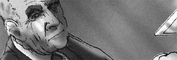
Well, Templesmith gets to draw the Spectre and it mostly works out. He gets to draw big giant Spectre even, which I wasn’t expecting. And big giant Spectre is like a big giant monster, fighting another big giant monster. Gotham by Midnight is definitely distinct. Even if Templesmith’s Batwing looks like a Batarang. And his panel arrangement doesn’t change to accommodate a giant-size character.

    As for Fawkes, he jumps around the cast but doesn’t give them anything important to do. Story arc is almost over, it’s time to hurry. There are a couple hints of character development, but nothing substantial.

    There’s also some of the explanation for the arc’s supernatural events. It seems way too large scale for what Fawkes has been doing in the comic. I’m curious to see how he finishes it, but will keep coming back for the Templesmith art regardless. It’s always interesting to see.

    CREDITS

    We Fight What We Become; writer, Ray Fawkes; artist, Ben Templesmith; letterer, Saida Temofonte; editors, Dave Wielgosz and Rachel Gluckstern; publisher, DC Comics.

  • Brute Wanted (1934, Charles Barrois)

    Quite a bit of Brute Wanted is rather funny. The whole idea is funny–dimwitted, failing actor (Jacques Tati) goes for an audition and it turns out he’s agreeing to wrestle a musclebound Russian grotesque. Tati’s got a nagging wife (Hélène Pépée) who also manages him.

    A lot of the short is spent on the fight promoters. Tati and co-writer Alfred Sauvy exercise brevity with their exposition when it comes to Pépée and Tati’s situation so the fight promotion scenes just go too long. And so does the wrestling match, with Tati hilariously trying to avoid his opponent.

    Barrois’s direction is never on par with the script’s humor, but it’s usually adequate. In the wrestling match, not so much. Barrois loses track of Tati, who’s holding Brute together, and spends it on his scheming friend, played by Rhum.

    These problems are tolerable. But the final joke? Cruel and unfunny.

  • Abigail and the Snowman 3 (February 2015)

    Abigail and the Snowman #3This issue of Abigail and the Snowman is Langridge’s strongest–it’s also the penultimate issue and the one where it’s clear Langridge could definitely keep this going longer. The issue’s kind of high adventure; it’s the expository in front of high adventure, but thanks to Langridge’s abilities, it moves beautifully.

    The issue’s full of fantastic moments for Abigail. He even develops her father’s character through the interactions with her. It’s exceptionally thoughtful stuff. Langridge doesn’t even save his big moments for full page panels (just the action); the little character stuff he has in small panels, never breaking stride to draw attention to himself.

    The entire comic takes place–with the exception of a few pages of Abigail and Claude playing–in one night. And not a long night. Langridge gets in a bunch of information (including Claude’s flashback) and keeps that great pace.

    It’s great stuff, page after page.

    CREDITS

    Writer, artist, letterer, Roger Langridge; colorist, Fred Stresing; editors, Cameron Chittock and Rebecca Taylor; publisher, KaBOOM!.

  • Power/Rangers (2015, Joseph Kahn)

    Just from the concept, Power/Rangers should be a lot better. Or maybe not. The concept–a gritty action movie “Power Rangers” adaptation, done as a short with a professional cast, professional effects–sounds really amusing.

    The result, however, is way too mired in continuity to be amusing for its fourteen minute run time. Or eleven and change, minus the end credits. It’s funny to rely so much on continuity from a kids show without a cult following, but it doesn’t make for a good narrative. Not even an eleven minute one.

    The short has bad grown-up Power Ranger James Van Der Beek interrogating good grown-up Power Ranger Katee Sackhoff. Both actors are game, but Van Der Beek has too much material, Sackhoff not enough.

    It’s a funny idea and an unsuccessful short. Director Kahn does okay with Power/Rangers, he just doesn’t know how to execute it.

    1/3Not Recommended

    CREDITS

    Directed by Joseph Kahn; written by Kahn, James Van Der Beek and Dutch Southern; director of photography, Christopher Probst; music by Brian and Melissa; production designer, Brett Hess; produced by Adi Shankar and Jil Hardin.

    Starring Katee Sackhoff (Kimberly/Pink), James Van Der Beek (Rocky), Russ Bain (Tommy/Green), Will Yun Lee (General Klank) and Gichi Gamba (Zack/Black).

  • Batgirl #39There’s a shocking amount of this comic book I don’t care about in the least. I’ve been tiring of Stewart and Fletcher’s somewhat incompetent Barbara, but at least they acknowledge her here. Sure, they make too many leaps of logic to get there, but they finally get to something.

    The problem with Batgirl has been too much style over any substance. The creators are soft-relaunching a character (who’d just been soft-relaunched), integrating a whole bunch of difficult to mesh history, and trying to make the character younger. And they didn’t want to spend any time on Barbara. She had all the personality of a romantic lead in a gum commercial.

    Do they give her a bunch more personality here? No. But Stewart and Fletcher do show they might be going somewhere and not somewhere defined by the comic’s pseudo-Brooklyn hipster thing. They’re working on their story.

    Finally.

    CREDITS

    Batgirl vs. Burnside; writers, Cameron Stewart and Brenden Fletcher; pencillers, Stewart and Babs Tarr; inker, Tarr; colorist, Maris Wicks; letterer, Jared K. Fletcher; editors, Dave Wielgosz and Chris Conroy; publisher, DC Comics.

  • MPH 5 (February 2015)

    MPH #5Millar gets to a nice manipulative finish on MPH. He does give Fegredo a bunch of cool stuff to draw and the art’s great, but Millar has enough story for another five issues and he doesn’t want to tell it.

    He suggests MPH is deeper for his lack of interest in proper storytelling, but it’s really not. It’s just more manipulative.

    Half the issue is spent on a super-speed fight sequence. It’s pretty cool, actually. If it took the whole issue, it’d be even more cool. And then Millar could save the two big reveals for another issue, which would’ve worked a lot better.

    But it still wouldn’t have been good. Because one of Millar’s reveals is a huge one and he tries to pass it off as small potatoes. It should be the defining element of the series; it’s not. Because it’s not flashy enough.

    Still, beautiful art.

    CREDITS

    Writer, Mark Millar; artist, Duncan Fegredo; colorists, Peter Doherty and Mike Spicer; letterer, Doherty; editors, Lucy Unwin and Nicole Boose; publisher, Image Comics.

  • Manifest Destiny (2013) #13

    Manifest Destiny  13

    It’s a bridging issue of Manifest Destiny. Dingess makes it seem full, starting with a different journal than the normal one, but he doesn’t do much with it. He gets the reader’s brain going in the first few pages, then doesn’t ask anything more of him or her.

    There’s a little with Sacagawea this issue; more than usual, but it’s more hints, no answers. Dingess seems resolved to use her as little as possible, while constantly implying she could be doing so much more.

    Otherwise, it’s just more rumblings of mutiny and vague flirting. And monsters. But possibly cute ones. It’s hard to tell with Roberts’s art how scary a monster’s supposed to be until it eats someone.

    As usual, Manifest Destiny running just a bit longer would help–especially since Roberts is doing big panel arrangements (with lovely landscapes) to hide the brevity in the script. It’s too lean.

  • Ms. Marvel #11Wilson wraps up this Ms. Marvel arc rather nicely. In fact, she finally does what I said Ms. Marvel should’ve done issues ago–she calls the cops. Not sure why she couldn’t call Wolverine, who’d be guest star value (oh, wait, I heard he’s dead), but still… calling for help’s a good move.

    Alphona has some great art moments at the end of the issue. The art’s fine–even if the action scenes are confusing and not particularly rewarding–but the art at the end on all the characters (there are about two dozen roaming around) is great. There’s a lot of personality to that scene.

    And the comic’s got personality too. Wilson’s final speeches for Kamala are a little much, but they’re sincere as far as the character goes.

    The story arc ends with a big bang, but not much character development. Ms. Marvel is a sturdy comic book.

    CREDITS

    Generation Why, Part Four; writer, G. Willow Wilson; artist, Adrian Alphona; colorist, Ian Herring; letterer, Joe Caramagna; editors, Devin Lewis and Sana Amanat; publisher, Marvel Comics.

  • Manifest Destiny #13It’s a bridging issue of Manifest Destiny. Dingess makes it seem full, starting with a different journal than the normal one, but he doesn’t do much with it. He gets the reader’s brain going in the first few pages, then doesn’t ask anything more of him or her.

    There’s a little with Sacagawea this issue; more than usual, but it’s more hints, no answers. Dingess seems resolved to use her as little as possible, while constantly implying she could be doing so much more.

    Otherwise, it’s just more rumblings of mutiny and vague flirting. And monsters. But possibly cute ones. It’s hard to tell with Roberts’s art how scary a monster’s supposed to be until it eats someone.

    As usual, Manifest Destiny running just a bit longer would help–especially since Roberts is doing big panel arrangements (with lovely landscapes) to hide the brevity in the script. It’s too lean.

    CREDITS

    Writer, Chris Dingess; artist, Matthew Roberts; colorist, Owen Gieni; letterer, Pat Brosseau; editor, Sean Mackiewicz; publisher, Image Comics.

  • The Treasure of the Sierra Madre (1948, John Huston)

    The Treasure of the Sierra Madre often comes as a complete surprise, even though director Huston carefully foreshadows certain events. He’s playing with viewer expectations–both of having Humphrey Bogart as his lead and Walter Huston in a supporting role. Sierra Madre is a thriller, but a thriller set during an adventure movie.

    Bogart and Tim Holt play a couple down on their luck Americans who manage to get out a little ahead and throw in with Huston to go gold prospecting. This development comes at the end of the first act–Huston’s very deliberate with the screenplay, very careful about how he positions the audience’s relationship with the characters. The audience isn’t along for the adventure, the audience is kept back a bit. Huston is also deliberate with the shot composition; he and cinematographer Ted D. McCord fill the first half of the film with these exceptional group shots of the actors.

    All three are fantastic. Huston has what seems like it’s going to be the showiest role, but it calms down soon into the second act. Bogart’s a combination of against type and in exaggerated type. He’s got some amazing scenes. Holt’s something of the straight man; Huston gives him the quietest character development and, in some ways, the quietest arc.

    Max Steiner’s music is also crucial. Huston uses it to help guide the audience’s relationship with the film.

    Sierra Madre is small, contained, expansive, elaborate. Huston and his actors do some truly exceptional work in the film.


  • The Fast and the Furious (2001, Rob Cohen)

    An undercover cop (Paul Walker) finds himself drawn into a criminal underworld with a charismatic leader (Vin Diesel)! There’s not much original about The Fast and the Furious. What the screenwriters don’t lift out of Point Break, there’s director Cohen grabbing car chase related moments out of Lethal Weapon 3 and so on. Well, Cohen also does have a neat Duel reference too.

    Oh, right. I should try to discuss The Fast and the Furious, not just list all the other movies it rips off.

    Diesel’s fine. Walker’s bad. Michelle Rodriguez’s bad. No one else leaves an impression. Except Ted Levine, who should know better.

    The movie has this strange disconnect between Cohen’s more traditional cops and robbers bro-mance and the pervasive, overbearing soundtrack. Whole sequences are just set to a song, seemingly chosen just because it’s loud and sounds cool. Peter Honess’s editing is deaf to the corresponding songs; even if they match the narrative, Honess can’t figure out where to cut them. The first half of the movie feels entirely different from the second, mostly because BT’s sentimental score completely replaces the Top 40 selections.

    Another interesting disconnect is the one between how Cohen visualizes the race scenes and how the script talks about them. Diesel gets a long monologue about how it feels to drive and Cohen’s best idea for visualizing the experience is to make it play like a sci-fi movie. Time slows down and there’s bullet-time.

    But time is just a magazine.

  • War Stories (2014) #5

    Ws05

    I wonder how this issue would be with a decent artist. Not even a good artist, just a decent one. One who clearly doesn’t have the time he needs to get the issue complete. Because Aira’s art is occasionally almost okay. He could be doing a better job. When it’s really bad, it’s because he’s rushing.

    Regardless, it still really hurts the comic. Ennis is trying a different thing with this seventies-set story. He’s trying a different style of storytelling, he’s trying a different character relationship; he’s also going all out on the battle stuff. Aira can’t just not those elements competently, he doesn’t bring anything to the art.

    There are also some Ennis problems with this issue. This War Stories arc features soldiers who spout lots of exposition, meaning they have to be very well informed. There’s no groundwork for that situation.

    Ennis does keep his style fresh.

  • Aftermath (2014, Tofiq Rzayev)

    Aftermath goes too far. Director Rzayev operates without taking the benefits of reduction and constraint into account. The short would work a lot better if he just cut out a couple money moments. It’s a short with one scene–Gizem Aybike Sahin argues with her brother, played by Berkan Uygun; most of that scene is exposition. Aftermath has room to be muted.

    Technically, a lot of the short is fantastic. Rzayev’s composition is outstanding. However, he uses a Panavision aspect ratio with shaky DV. DV can be shaky in 16:9, but that added crop just breaks some of the reality.

    Great music from Gergö Elekes. And Rzayev’s lighting is fantastic too.

    Sahin’s okay as the sister. She’s trying. Uygun’s bad. His one big moment flops because it’s not believable Sahin’s in the room; the shot’s off.

    Aftermath has a more is less problem. But Rzayev’s direction has definite strengths.

    1/3Not Recommended

    CREDITS

    Photographed and directed by Tofiq Rzayev; written by Rzayev and Erdogan Ulgur; music by Gergö Elekes.

    Starring Gizem Aybike Sahin (Sister) and Berkan Uygun (Brother).


    RELATED

  • War Stories #5I wonder how this issue would be with a decent artist. Not even a good artist, just a decent one. One who clearly doesn’t have the time he needs to get the issue complete. Because Aira’s art is occasionally almost okay. He could be doing a better job. When it’s really bad, it’s because he’s rushing.

    Regardless, it still really hurts the comic. Ennis is trying a different thing with this seventies-set story. He’s trying a different style of storytelling, he’s trying a different character relationship; he’s also going all out on the battle stuff. Aira can’t just not those elements competently, he doesn’t bring anything to the art.

    There are also some Ennis problems with this issue. This War Stories arc features soldiers who spout lots of exposition, meaning they have to be very well informed. There’s no groundwork for that situation.

    Ennis does keep his style fresh.

    CREDITS

    Children of Israel, Part Two: In Fire They Will Come; writer, Garth Ennis; artist, Tomas Aira; colorist, Digikore Studios; letterer, Kurt Hathaway; publisher, Avatar Press.

  • Sons of Anarchy #18It’s an okay flashback issue from Brisson and Bergara. It might have more meaning if one is familiar with the “Sons of Anarchy” television program, not just the comic book. I don’t even remember the protagonist of this issue–Happy–having much to do in the comic overall.

    In this issue, set in the eighties, he goes to prison and goes a little crazy and runs off and joins SAMCRO. Brisson does reasonably well making the character sympathetic, but he’s never likable. He’s just surrounded by bigger jerks, not necessarily more dangerous ones. Brisson doesn’t have time to explore that aspect of the story, which is too bad. It’s more interesting than the plot.

    Some of that interest problem is because of Bergara. His scenes set in prison come off like Archie In Oz just because the faces are too genial. Works against the mood.

    And the ending’s too rushed.

    CREDITS

    Writer, Ed Brisson; artist, Matías Bergara; colorist, Paul Little; letterer, Ed Dukeshire; editors, Mary Gumport and Dafna Pleban; publisher, Boom! Studios.

  • Letter 44 (2013) #14

    Letter 44  14

    It’s a fairly decent fill-in issue on Letter 44. Drew Moss guest illustrates a flashback to before the mission issue. Soule recaps the relationship between Overholt and Willets; I don’t remember them on the mission. Soule expects a lot from his monthly readers. Letter 44 isn’t written for the trade in terms of plotting, but definitely in the details.

    Moss’s art is nearly okay. It could be stronger in a lot of places, but it moves reasonably well. Willets, the enlisted mechanic savant, asks too many questions about Project Monolith and gets in trouble. Overholt is around to help him out. Neither have much character depth and Soule overdoes the military dialogue. He has to overdo it, actually. Otherwise the issue wouldn’t work.

    Between Soule’s thoughtfulness and deliberate storytelling–and Moss’s amiable, if lacking, art–the issue’s fine. The plot and revealations aren’t compelling, but don’t need to be.

  • Letter 44 #14It’s a fairly decent fill-in issue on Letter 44. Drew Moss guest illustrates a flashback to before the mission issue. Soule recaps the relationship between Overholt and Willets; I don’t remember them on the mission. Soule expects a lot from his monthly readers. Letter 44 isn’t written for the trade in terms of plotting, but definitely in the details.

    Moss’s art is nearly okay. It could be stronger in a lot of places, but it moves reasonably well. Willets, the enlisted mechanic savant, asks too many questions about Project Monolith and gets in trouble. Overholt is around to help him out. Neither have much character depth and Soule overdoes the military dialogue. He has to overdo it, actually. Otherwise the issue wouldn’t work.

    Between Soule’s thoughtfulness and deliberate storytelling–and Moss’s amiable, if lacking, art–the issue’s fine. The plot and revealations aren’t compelling, but don’t need to be.

    CREDITS

    Writer, Charles Soule; artist, Drew Moss; colorist, Dan Jackson; letterer, Crank!; editor, Robin Herrera; publisher, Oni Press.

  • She-Hulk 12 (April 2015)

    She-Hulk #12Well, there’s quite a bit to the last issue of She-Hulk, where Soule reveals the great conspiracy but not the paralegal’s secret. The conspiracy has to do with magic and some other stuff and Soule assumes the reader remembers small details from eight issues ago. Not enough expository reminding and it affects how the issue reads.

    Of course, Pulido’s art also affects the issue’s reading experience, simply because he’s not doing very much. Most of the issue takes place in the middle of nowhere North Dakota. Even when Pulido does have scenery, he doesn’t do much with it. The whole thing–even if Soule and Pulido intentionally wanted to focus on the characters–feels rushed.

    And the resolution isn’t much of a pay-off. It answers all the questions, but it’s a pat resolution.

    Soule and Pulido close genially enough. She-Hulk’s been mostly amusing and occasionally awesome.

    CREDITS

    Final Verdict; writer, Charles Soule; artist, Javier Pulido; colorist, Muntsa Vicente; letterer, Clayton Cowles; editor, Jeanine Schaefer; publisher, Marvel Comics.