RELATED
-

-

The Galapagos Affair: Satan Came to Eden has way too long of a title. The subtitle is a reference to something the viewer will probably be unfamiliar with until the epilogue (it’s the title of a book by one of the documentary’s players), but at least it shows a certain engagement from the filmmakers. Their enthusiasm for their project doesn’t forgive its problems, but it does make them seem far more affable.
Unless, of course, one reads about how there are no tortoises on the Eden island, something the documentary implies many times throughout its really long two hour runtime.
Some of the other problems are side effects of the film itself. Directors Geller and Goldfine cut from 16:9 interview and modern location footage to old, black and white 4:3 footage, which they imply was taken by the island’s settlers. It’s always implied (the filmmakers have no presence until the epilogue either), but it eventually becomes clear a lot of this footage ostensibly from the 1930s is just modern stuff run through a filter.
And the titular Affair? The big mystery? It’s nowhere near as interesting as the lives of the people living on the island the filmmakers do interview. These sons, daughters, grandsons, granddaughters of mostly German expats who went to the end of the world to get away from Hitler (in some cases) is far more interesting than the mystery. The mystery doesn’t have enough information to be mysterious.
Galapagos is long, professional and meanderingly pointless.
 ★½
★½CREDITS
Directed by Daniel Geller and Dayna Goldfine; screenplay by Goldfine, Geller and Celeste Schaefer Snyder, based on books, journals, articles and letters by Dore Strauch, Margret Wittmer, Friedrich Ritter, Hinz Wittmer and John Garth; director of photography, Geller; edited by Bill Weber; music by Laura Karpman; produced by Geller, Goldfine and Snyder; released by Zeitgeist Films.
RELATED
-

 Well, Naifeh sure does wrap up Ugg nicely. Oh, he hurries it a little to be sure. There’s no reason he couldn’t have stretched this issue out to two and it would’ve done a lot better for the other princesses’ arcs and the diplomatic stuff, but it’s impossible to hold it against him or Ugg.
The conclusion is unexpected, sort of obvious, rather intelligence, rather empathetic. The only thing it’s missing is an appearance from Ülga’s professor, who’d be proud of her. Naifeh is rushing, no doubt. He cuts scenes short in the epilogue too, I just realized.
But again, it really doesn’t matter. Because Ugg brings a tear to one’s eye and Naifeh gets there sincerely. Somehow, Naifeh’s able to bring surprise after surprise and for it all to come across naturally. Like he’d been laying the groundwork for it all along.
Naifeh brings Ugg and Ülga home well.
CREDITS
Writer and artist, Ted Naifeh; colorists, Warren Wucinich and Naifeh; letterer, Wucinich; editors, Robin Herrera and Jill Beaton; publisher, Oni Press.
-
 On his first issue, it’s clear new writer Ryan Ferrier doesn’t have handle on Sons of Anarchy. He’s got Bergara on the art, which doesn’t exactly help him. Bergara has a few more really good panels this issue than I was expecting, but he doesn’t bring anything to the book overall.
And it’s not clear what Ferrier’s trying to do. The Sons bring in a new member who screws up a deal. There are problems and there will be more problems, there’s just not any tension. It’s also strange how the kid gets inducted; maybe because Ferrier doesn’t even write new dialogue for the scene, just recycles stuff from earlier.
Sons has had a really good run; it’s possible Ferrier is just finding his footing but it sure doesn’t bode well for the series’s future. It’s an unworkable combination of too ambitious and not ambitious enough, which is too bad.
CREDITS
Writer, Ryan Ferrier; artist, Matías Bergara; colorist, Paul Little; letterer, Ed Dukeshire; editors, Mary Gumport and Dafna Pleban; publisher, Boom! Studios.
-

Keep Your Left Up is a genial little short set in a small French country town. The arrival of the postman sets off the short, which eventually has local do-nothing Jacques Tati in the ring against boxer Louis Robur.
The charm comes mostly from the setting, Clément’s excellent composition and Jean Yatove’s oddly mismatched score. Left doesn’t have any ambient sound when the music plays; just Yatove’s music and the occasional line of dialogue or sound effect gives the short a detached quality. But detached in a charming way (it’s hard to fault anything technical with the film–Clément’s composition would make up for anything).
Tati’s appealing as the lead, but he doesn’t have much to do. He handles the physical comedy fine, though a lot of it seems to be through the editing.
Only real problem? The continuity gaffes. They’re distracting. Otherwise, Left amuses all the way through.
-


I’ve got a suggestion for Ennis and Avatar on their War Stories. One issue stories, a decent artist a issue. No more guys like Aira, who can’t even hold together the perspective on the vehicles this issue. It’s just way too much.
And Ennis doesn’t have a story. He’s got a weak lecture from the sensitive, intellectual tankie about how Israel can’t compare everything to the Holocaust and they can’t be at war forever. The sergeant isn’t part of it because he’s one of Israel’s golems! That throwaway line is a lot more effective than the lengthy monologue about endless war.
Ennis stayed somewhat apolitical, just telling a history, until this point. Worse, he then tries to turn the golem sergeant into a different symbol at the end.
It’s very problematic work. Ennis has too much space, not a good enough artist and no editor crossing out lame, preachy monologues.
-
 I’ve got a suggestion for Ennis and Avatar on their War Stories. One issue stories, a decent artist a issue. No more guys like Aira, who can’t even hold together the perspective on the vehicles this issue. It’s just way too much.
And Ennis doesn’t have a story. He’s got a weak lecture from the sensitive, intellectual tankie about how Israel can’t compare everything to the Holocaust and they can’t be at war forever. The sergeant isn’t part of it because he’s one of Israel’s golems! That throwaway line is a lot more effective than the lengthy monologue about endless war.
Ennis stayed somewhat apolitical, just telling a history, until this point. Worse, he then tries to turn the golem sergeant into a different symbol at the end.
It’s very problematic work. Ennis has too much space, not a good enough artist and no editor crossing out lame, preachy monologues.
CREDITS
Children of Israel, Part Three: Saul Hath Slain His Thousands; writer, Garth Ennis; artist, Tomas Aira; colorist, Digikore Studios; letterer, Kurt Hathaway; publisher, Avatar Press.
-

 Takeshi Miyazawa’s art changes Ms. Marvel. Along with the family emphasis this issue–Kamala spending time with them instead of her friends at school–it nearly feels like a different comic. Miyazawa is action-oriented and less detailed than the comic’s usual artists; the experience is different.
Even Wilson’s writing feels a little different, as she’s telling a story about Kamala having a crush on an older guy from her perspective (complete with her family being concerned).
Not to mention there are now so many Inhumans everywhere it’s like Marvel got worried about “The Flash” TV show being able to create a new supervillain every week and had to do the same thing themselves.
Unfortunately, that aspect of the comic–the big, somewhat boring supervillain fight–is where Wilson loses track of her story. The texture is gone. It’s a fine issue, it just ends a little out of step.
CREDITS
Crushed, Part One; writer, G. Willow Wilson; artist, Takeshi Miyazawa; colorists, Ian Herring and Irma Knivila; letterer, Joe Caramagna; editors, Charles Beacham, Devin Lewis and Sana Amanat; publisher, Marvel Comics.
-
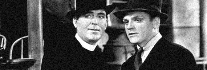
Angels with Dirty Faces runs less than ninety minutes, but doesn’t really fill them. The first fifteen minutes of the film are flashbacks, tracking James Cagney’s character from troubled boyhood to juvenile detention to prison. Once the present action starts, Cagney immediately reunites with Pat O’Brien’s now priest, former similarly troubled youth. But Angels doesn’t have a story for O’Brien separate from Cagney and it doesn’t have much of a story for Cagney separate from the Dead End Kids.
For much of the film, Angels uses the Dead End Kids in a reduced capacity, or at least it immediately qualifies the scenes they get to themselves, tying it into Cagney’s recently released gangster storyline. The film’s last act, however, almost entirely removes Cagney and O’Brien. It does remove them separate from the Dead End Kids’s storyline; poor Ann Sheridan, as Cagney’s unlikely love interest, does entirely disappear for the third act.
So while they never have quite enough story to make a full film, even a ninety minute one, screenwriters John Wexley and Warren Duff certainly seem like they should have enough material for one. But since the Dead End Kids are all caricatures, maybe it’s just not possible. Cagney, O’Brien and Sheridan only get slightly better scenes–they’re just better actors. Director Curtiz expects more from them and gets it.
Curtiz directs some great sequences, like the lengthy, thrilling final shootout sequence or anything with Sheridan and Cagney.
Cagney’s fantastic performance almost carries Angels; the structure’s just too wobbly.
★★½CREDITS
Directed by Michael Curtiz; screenplay by John Wexley and Warren Duff, based on a story by Rowland Brown; director of photography, Sol Polito; edited by Owen Marks; music by Max Steiner; released by Warner Bros.
Starring James Cagney (Rocky Sullivan), Pat O’Brien (Jerry Connolly), Humphrey Bogart (James Frazier), Ann Sheridan (Laury Ferguson), George Bancroft (Mac Keefer), Billy Halop (Soapy), Bobby Jordan (Swing), Leo Gorcey (Bim), Gabriel Dell (Pasty), Huntz Hall (Crab) and Bernard Punsly (Hunky).

THIS POST IS PART OF THE LUCK OF THE IRISH BLOG O'THON HOSTED BY THE METZINGER SISTERS OF SILVER SCENES.
RELATED
-

With Fast & Furious, director Lin and screenwriter Chris Morgan do something incredible. They take what, a decade before would have been at best a video game spin-off (maybe featuring the original, now down in their career cast's voices), and make an energetically mercenary movie out of it. The film's ludicrous at almost every turn, but it's hard not to appreciate a huge budget in CGI being spent on car chase after car chase.
Oh, there are some real cars racing, but Lin apes the conclusion to Return of the Jedi for the finale–just with cars. It's entirely admirable and entirely pointless. There's not an honest moment in the entire movie, everything is perfectly calculated to entertain. The film gets too loud and almost too busy–Gal Gadot's useless character is in the not really bad bad Bond girl part–seemingly because Vin Diesel wants a lot of tear jerker scenes to be a tough guy during.
Lin doesn't want to hold a shot–he's clearly more into Michael Bay for car chase inspiration than Billy Friedkin–but his composition is good and Amir Mokri does a fine job shooting the film. The real car racing footage looks great. All the composite CGI stuff is a little too obvious, but it's a video game, you're not supposed to care.
The film does require a certain enthusiasm for Diesel and Paul Walker's bromance; Lin gets a surprisingly okay performance from Walker.
Like I said, big, loud, dumb, sometimes perfectly amiable.
-

The strange part of Los Bandoleros isn’t how it ends lame–it’s how well it starts. Sure, there’s this dumb story about how Vin Diesel, on the lamb in the Dominican Republic, has become a Robin Hood to the local people.
Oh, right, forgot–It’s a Fast and the Furious vanity short “film” from Diesel. Undoubtedly something the studio did to make him happy.
Anyway, besides the stupid club scene and the foreshadowing for the subsequent action movie and, most of all, besides Michelle Rodriguez… Diesel’s got a not bad eye for his location shooting in the Dominican Republic. He’s got a great photographer (Shawn Kim) and, even though the script is really contrived, at least the pre-franchise stuff works.
It’s pretentious, sure, with Diesel telling the story of the little people, but the movie looks great. But looking great isn’t enough to make up for Rodriguez’s vapid performance.
-


Episode #22 – The Comics Fondle Podcast
It’s the Comics Fondle Podcast Episode #22 for March 2015. Comics: Batgirl, Big Man Plans, Black Hood, Casanova, Cluster, Criminal one shot, Crossed +100, Dave, Descender, Eight, Ghosted, Gotham by Midnight, Hawkeye, Howard the Duck, Multiversity Mastermen, Nameless, Rat God, Squirrel girl, Suiciders, Supreme Blue Rose, Tooth and Claw. Other stuff: Girl comix! Image Onslaught vs Convergence vs Secret Wars! The End of the Second Superhero Era Sci Fi is the New Zombies? Other media: Supergirl iZombie DaredevilWHERE TO LISTEN

Apple Podcasts 
Spotify 
Stitcher 
RSS -

When director Miner finally does a decent sequence in Friday the 13th Part 2, it comes as something of a surprise. Amy Steel is on the run from the masked killer and, even though it’s stupid, it’s somewhat effective. Steel probably gives the film’s best performance (she’s still not any good) and Ron Kurz’s script gives her the most to do. She’s about the only character in the film who thinks. It’s kind of amazing how inept Kurz and Miner are at giving actors character motivation.
But Miner’s sort of off-step throughout the entire film. For the majority of Part 2–Miner shows the killer by his or her legs. Except the viewer isn’t trying to ascertain the killer’s identity, so why be so coy. Because it’s manipulative. It’s also a waste of time.
Miner also doesn’t seem comfortable spending much time with the potential victims. The constant cutting to the killer on the prowl drags the viewer away from any empathic connection to the characters in danger. Many of the directors of other films who Miner rips off here have successfully employed such devices.
There are a couple likable enough actors, Bill Randolph and Marta Kober, and Stuart Charno tries so hard to be annoyingly lovable one has to appreciate the gusto. Unfortunately, in the most obnoxious role, John Furey also gives a rather bad performance.
Harry Manfredini seems confused on the music, which doesn’t help.
Part 2 is artistically bankrupt and incredibly pointless, but does move well.
-


Wouldn’t it be funny to do a new Howard the Duck comic full of pop culture references to tie into his newfound recognition thanks to the Guardians of the Galaxy movie? People might buy it! It’ll be amazing.
Or, actually, thanks to writer Chip Zdarksy, it’ll be painfully obvious.
Wait, what if there are references to DC Comics characters too!?! Then it’ll be amazing.
Nope, it’ll still be painfully obvious.
Wait, wait, wait. What about a Rocket Raccoon cameo in the first issue?!? Everybody loved him in Guardians; he’s like Wolverine, only Marvel controls all of his rights, not just comics, animation, toys and video games.
If you can’t guess, the new Howard the Duck is just about the most soulless mercenary comic someone could come up with. It’s not Zdarsky’s fault; he doesn’t care. The comic’s readable, just obvious and entirely uninventive.
Wait… why can’t Howard meet Donald now?
-
Ride the High Country is a fine attempt. It’s not a successful attempt, but it’s a fine one. Director Peckinpah seems to know what he wants to do, but he’s too trapped in Western genre tradition. Having icons Joel McCrea and Randolph Scott as his leads (they’re both great), George Bassman’s intrusive score and Lucien Ballard’s strangely flat photography might all be forgivable if N.B. Stone Jr.’s script were all right but it’s not.
The plotting is awkward. Retired lawman McCrea hires old partner Scott to help him transport gold, not knowing Scott is planning on taking said gold with the help of his new, youthful partner, played by Ron Starr. Along the way, they meet farm girl Mariette Hartley, who Starr gets involved with, much to the chagrin of the older men. Country runs just over ninety minutes and most of the important scenes involve Hartley and her poor choice to marry James Drury. McCrea and Scott spend their time talking about their glory days, which is cute the first couple times, but tiring when it’s clear Stone doesn’t have any other ideas for them and Peckinpah doesn’t seem to care.
Peckinpah doesn’t seem particularly interested in the film until the shootouts at the end; he does spend some time on the scenery, which should be prettier (that drab photography).
Both McCrea and Scott get pretty decent iconic moments at one point or another in the film, they just don’t get actual characters to play. It’s too bad.
This post is part of the CinemaScope Blogathon hosted by Becky of Classicbecky’s Brain Food and Rich of Wide Screen World.

-

 Wouldn’t it be funny to do a new Howard the Duck comic full of pop culture references to tie into his newfound recognition thanks to the Guardians of the Galaxy movie? People might buy it! It’ll be amazing.
Or, actually, thanks to writer Chip Zdarksy, it’ll be painfully obvious.
Wait, what if there are references to DC Comics characters too!?! Then it’ll be amazing.
Nope, it’ll still be painfully obvious.
Wait, wait, wait. What about a Rocket Raccoon cameo in the first issue?!? Everybody loved him in Guardians; he’s like Wolverine, only Marvel controls all of his rights, not just comics, animation, toys and video games.
If you can’t guess, the new Howard the Duck is just about the most soulless mercenary comic someone could come up with. It’s not Zdarsky’s fault; he doesn’t care. The comic’s readable, just obvious and entirely uninventive.
Wait… why can’t Howard meet Donald now?
CREDITS
Writer, Chip Zdarsky; artist, Joe Quinones; colorist, Rico Renzi; letterer, Travis Lanham; editors, Jon Moisan and Wil Moss; publisher, Marvel Comics.
-

 Very unexpected turns in this issue. Williamson almost seems to be getting to a place where he might wind Ghosted down. Soon. I hope not.
This issue–this arc–is the greatest hits of the series so far. He brings back the first villain, he brings back cast members from subsequent arcs. The interplay between these characters, who came into the series in its wholly different phases, is great. Even when it’s a little aside or a character talking under his or her breath, it’s great. Williamson’s got a vision for how the comic plays out.
Again, hope it’s not winding down.
But this issue, which has the characters tasked with getting from point A to point B (albeit through a field of angry ghosts), goes somewhere unexpected. It’s a nice, gentle move from Williamson.
It’s Ghosted so it’s not gentle in action, just in how he gets to it.
CREDITS
Writer, Joshua Williamson; artist, Vladimir Krstic Laci; colorist, Miroslav Mrva; letterer, Rus Wooten; editors, Helen Leigh and Sean Mackiewicz; publisher, Image Comics.
-
It takes Fun Sunday! almost the entire short film to find its footing. The problem is director Berr; he has no comic timing. Sunday cuts a couple corners as far as budget–the sound cuts in and out, going over to music and not the background noise–but it’s rather ambitious stuff. Except for Berr. He doesn’t have any ambition.
Writers and stars Jacques Tati and Rhum, however, have lots of ambition. They do an alternative on the classic comic duo–instead of playing off each other, they play off the environment. Rhum has more to do, just because he has the magic tricks (which Berr really can’t shoot).
Just when Sunday seems to be winding down, Tati and Rhum get in one good gag after another and bring it to a great finish. Even with Berr screwing the beautifully lighted shots (Fun Sunday!’s uncredited cinematographer does some excellent work).
-

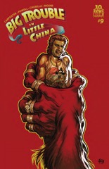 Churilla’s art seems really rushed this issue, but it might not be his fault. The issue winds down and Powell gets to his cliffhanger and all of a sudden it’s clear the big panel composition wasn’t to help Churilla, but Powell. There’s not a lot of story this issue–and when there is story, it’s Powell keeping the movie villain in play (after promising his demise three or four times now).
It’s amusing enough, but Big Trouble in Little China hasn’t really gotten anywhere. It’s even lost some of the devices Powell utilized in the first few issues (like Jack’s flashbacks). Mostly it’s because Jack is barely a character in the comic anymore, save his appearance on the covers.
Only the supporting cast hasn’t really taken his place. Powell just has all these likable characters doing mundane mystical adventure tasks.
But, like I said, it’s amusing enough. Even when lazy.
CREDITS
Writers, John Carpenter and Eric Powell; artist, Brian Churilla; colorist, Lisa Moore; letterer, Ed Dukeshire; editors, Alex Galer and Ian Brill; publisher, Boom! Studios.
-

 Robert Wilson IV’s guest art on this issue of Bitch Planet leaves a lot to be desired. Wilson seems like he wants to do cheesecake–or at least something more appropriate for Archie–and writer DeConnick doesn’t do anything with that sensibility. Her story’s the very tough tale of one of the convicts and how she got to Bitch Planet.
Which is another problem. Third issue is way too soon for a couple things. First, obviously, a fill-in artist with a completely different style than the regular series artist. Second, a character origin story. The character isn’t distinctive enough to remember and this issue doesn’t make her more memorable in the context of the regular story.
DeConnick also tells a lot of tales of the future in this issue, lots of the patriarchal society. It’s all pretty bland sci-fi stuff. And Wilson’s art’s wrong for it too.
Eh.
CREDITS
Writer, Kelly Sue DeConnick; artist, Robert Wilson IV; colorist, Cris Peter; letterer, Clayton Cowles; editor, Lauren Sankovitch; publisher, Image Comics.
-

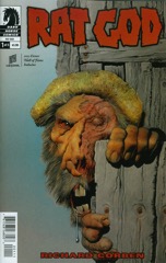 Even with some really bad narration from one of the characters, Rat God is off to a fantastic start thanks to Richard Corben. The book is that sturdy combination of great art and inventive, terrifying storytelling.
While there are apparently going to be some Lovecraft nods, Rat God starts out with a couple Native Americans on the run from some kind of danger. It’s Corben illustrating the American wilderness; the scenery is jaw-dropping, gorgeous. Great colors from Corben and daughter Beth Corben Reed.
The story’s fine. It’s creepy and looks amazing. But then Corben changes up the comic completely with the introduction of an obnoxious white guy and reveals the comic’s set in the 1930s and this guy knows the Native American girl from the opening, only as a “modern” woman.
It’s a lot of information for a first issue, but Corben handles the mood perfectly. Except that narration.
CREDITS
Writer and artist, Richard Corben; colorists, Corben and Beth Corben Reed; letterer, Nate Piekos; editors, Jemiah Jefferson, Shantel LaRoque and Scott Allie; publisher, Dark Horse Comics.
-

Director Jarecki tries to appear like he’s staying out of Capturing the Friedmans. His voice occasionally appears behind the camera when interviewing but these questions are usually for effect. Jarecki is deliberate in the construction of the documentary; he only lets it get away from him once.
Capturing the Friedmans examines a sensational child abuse case from the eighties involving Arnold Friedman and his son, Jesse. Jesse Friedman, his older brother David Friedman and their mother, Elaine Friedman, are the principal interviewees. At least after the first third or so, where Jarecki concentrates on the police and prosecutors, who are all sure of the defendants’ guilt.
Once Jarecki focuses on the story from the Friedmans’ perspective, he’s able to use a lot of home movie footage. Both Arnold and David Friedman were home movies enthusiasts, though Arnold made idyllic family home movies while David used the technology to chronicle his father and brother’s legal dealings and their family’s collapse. That element Jarecki can’t control? Having David Friedman as protagonist while the home movie footage shows him berating his mother.
Jarecki can stay out of Friedmans all he wants, but certain elements–like how he’s able to use that private home movie footage–should be made clear. There are a number of devices Jarecki utilizes to sway his viewer. Like when Jarecki needlessly shows the possibly overzealous cop has a George W. Bush coffee mug.
Or all of Andrea Morricone’s lovely, if saccharine, score.
Friedmans is a well-made, reductive package.
★½CREDITS
Directed by Andrew Jarecki; director of photography, Adolfo Doring; edited by Richard Hankin; music by Andrea Morricone; produced by Jarecki and Marc Smerling; released by Magnolia Pictures.
RELATED
-

Identifying the most interesting thing about The Fast and the Furious: Tokyo Drift isn’t difficult. There’s so very little interesting about the film at all, anything slightly interesting becomes rather vibrant and engaging. Unfortunately, it’s the really weird treatment of girls in the film. Not women, but high school-aged girls. They are either mercenary or damaged and, since they’re not with leading man Lucas Black, their boyfriends try to kill them during car races.
It’s very strange. In the second instance, Nathalie Kelley is riding in Black’s car as her boyfriend, played by Brian Tee, tries to kill them. The first one has the girl in her boyfriend’s car and him just not caring about her safety in order to beat Black in the race.
Except Tokyo Drift takes a long time to establish Black can actually drive a car well. He races at the beginning and isn’t particularly impressive; then he goes to Tokyo and races and isn’t impressive there either. Not until Sung Kang comes along and teaches him how to “drift” is Black any good at driving.
Black doesn’t have much of a character to play. He says he can drive, the film doesn’t show it. He says he can fight, the film doesn’t show it. He seems to think he can treat Kelley right, the film doesn’t show it. They have zero chemistry. In one of his only good moves, director Lin decided not to force it.
Great editing, bad music, decent enough final cameo.
-
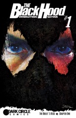 Michael Gaydos is the wrong guy for The Black Hood, just because he’s so perfectly the “right guy” for it. The series is Archie Comics’s attempt to do something knew with their superhero properties (they’ve been trying to do something with them for a couple decades now). Duane Swierczynski writes a tough story, Gaydos does tough art. It’s all realistic, set it modern Philadelphia, very depressing.
So why’s Gaydos wrong? Because he doesn’t bring anything to the comic. Swierczynski doesn’t have an appealing protagonist or a compelling setup–a cop gets injured (and disfigured); he eventually gets hooked on painkillers and then assumes the identity of the Black Hood, a vigilante he himself killed in the incident where he got disfigured.
It’s all so clean it’s pointless. Swierczynski is going through the motions; make this comic tough. Gaydos is doing the same thing.
Whether it’s tough isn’t important at all.
CREDITS
The Bullet’s Kiss, Part One; writer, Duane Swierczynski; artist, Michael Gaydos; colorist, Kelly Fitzpatrick; letterer, Rachel Deering; editors, Vincent Lovallo, Paul Kaminsky and Alex Segura; publisher, Archie Comics.
-

South Africa produces the most macadamia nuts in the world, as well as the most electricity. However, according to Chappie, those achievements come with quite a cost. Every single native white South African–again, according to Chappie, is an amoral, dimwitted thug. The only people in the country doing good are foreigners, like Dev Patel, who creates robots for the Johannesburg police department in the film.
He works for a weapons manufacturer, run by very American Sigourney Weaver, and has interoffice squabbles with Hugh Jackman. Jackman, sporting a mullet, lots of religion and a military background, is one of the film’s bad guys. At least he doesn’t have subtitles for when he speaks English, like Brandon Auret; that device is one of director Blomkamp’s annoying eccentricities. As opposed to his incompetent ones, which are legion.
The near future Johannesburg, with its Robocop-quote spouting robot cops, runs on command line Linux and flip phones. It’s dirty, it’s grimy, it doesn’t matter that Weaver’s company has achieved the extraordinary in robots, even before Patel gives one sentience.
With that sentience comes the titular Chappie’s new family–criminals Ninja and Yo-Landi Visser. Ninja and Visser, in real life, are rock stars (performing as Die Antwoord). They have interesting videos. Blomkamp turns Chappie into a bad commercial for them; relying on Ninja for acting is a big mistake. Visser is a little better, but not much.
Chappie’s an atrocious two hours. Blomkamp’s filmmaking masterfully combines dumb ideas, incompetent execution and bad directing.
-

 Descender isn’t the most original thing under the sun. It’s hard to read it and not be reminded of the Spielberg movie, A.I.. Writer Jeff Lemire borrows major android concepts, but apparently not a lot of emotional heft concepts, which is good. Because, even though it’s got a lot of problems, Descender is far more successful than A.I..
Dustin Nguyen’s art makes the comic. He does this watercolor-looking thing and it’s great. He still has detail in his panels; the painting style doesn’t overtake the lines. It’s fantastic looking.
And the story has some unexpected moments, but there’s a nice collaboration between Lemire and Nguyen going on. Like Nguyen’s got more detail than Lemire’s putting into the story. Even though the story’s somewhat predictable and the details are mostly bland sci-fi things, the comic engages. Nguyen’s art is the right mix of mainstream and not to sell it.
CREDITS
Tin Stars, Part One; writer, Jeff Lemire; artist, Dustin Nguyen; letterer, Steve Wands; publisher, Image Comics.
-

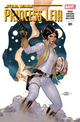 You know, I almost like Princess Leia. Oh, the Terry Dodson and Rachel Dodson art is lame cheesecake–though they draw Chewbacca well enough–and Mark Waid’s script isn’t lame cheesecake. Waid’s doing this whole “young Princess Leia” comes into her own thing, really playing into the original Star Wars idea of her being young.
Waid’s dialogue makes Leia feel like a good “Disney Princess” Leia; not so much believable Carrie Fisher would be speaking the lines, which are far too modern and not seventies (or Lucas) enough. And it raises an interesting question about this new Star Wars line of comics.
As these first Disney Star Wars titles start, serving as direct sequel to the original seventies film, with the new film with that cast imminent, can these characters be bigger than their actors?
No. No, they can not.
Leia is still okay. Waid’s engaged, even though Dodson isn’t.
CREDITS
Writer, Mark Waid; penciller, Terry Dodson; inker, Rachel Dodson; colorist, Jordie Bellaire; letterer, Joe Caramagna; editors, Charles Beacham and Jordan D. White; publisher, Marvel Comics.
-
The Battle of Algiers is brilliantly constructed. Director Pontecorvo deceptively frames the film–he also gives most sequences a date and time, which shows the viewer how greater events are progressing, but Pontecovro also gives multiple times in a day, which puts the viewer on edge even though the exact time isn’t really useful.
Pontecorvo and co-writer Solinas are extremely careful about how they show sympathy to either side–the revolutionary Algerians and the occupying French. A character will get all sorts of humanizing only to be revealed a monster and vice versa. Pontecorvo most enthusiastically shows the contradictions in Jean Martin’s colonel in charge of suppressing the revolt. Martin’s performance is so striking, he’s the most active thing in the second half of Algiers. The film, and the viewer, wait for him.
After the first act, which follows Brahim Hadjadj’s transition from a petty crook to a freedom fighter, Martin is the only sign Pontecorvo is going to allow easy access to the film. Everything else is disinterested. Hadjadj isn’t likable or even charismatic. Saadi Yacef, as the revolutionary leader, is both those things. Pontecorvo makes Hadjadj by forcing the viewer to question why he shouldn’t be sympathetic.
The narrative complexities can’t work with Pontecorvo’s direction. Every shot is so controlled–but every shot is of something chaotic–it creates detached cinéma vérité. In Algiers, Pontecorvo is showing truth through an acknowledged fictive lens, giving him options.
Glorious editing from Mario Morra and Mario Serandrei.
Algiers is brilliant.
★★★★CREDITS
Directed by Gillo Pontecorvo; screenplay by Pontecorvo and Franco Solinas, based on a book by Saadi Yacef; director of photography, Marcello Gatti; edited by Mario Morra and Mario Serandrei; music by Ennio Morricone and Pontecorvo; production designer, Sergio Canevari; produced by Saadi Yacef and Antonio Musu; released by Magna.
Starring Brahim Haggiag (Ali La Pointe), Jean Martin (Col. Mathieu), Saadi Yacef (Djafar), Samia Kerbash (one of the girls), Ugo Paletti (captain), Fusia El Kader (Halima), Mohamed Ben Kassen (Petit Omar).
RELATED
-

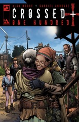 For this issue of Crossed, Moore goes nice and calm. He brings his explorers back to their home and lets all the things they’ve learned settle in. What’s so disconcerting–but not bad–about One Hundred is the way Moore’s vernacular makes sense by the end of the issue but not necessarily at the beginning. It’ll probably be perfect in a trade.
Moore even makes a joke (using Cormac McCarthy’s The Road).
Most of the issue is the protagonist, Future, hanging out with her mom, her cat (Flash Gordon) and catching up. Through that catch-up, Moore’s able to reveal the future society a bit. Then there’s the building toward whatever the big reveal is going to be.
It’s a calm, fantastic, quietly terrifying issue; the people’s lives seem so mundane, it conditions the reader not to get too excited by the horrific nature of it all. Moore’s kicking butt.
CREDITS
Writer, Alan Moore; artist, Gabriel Andrade; colorist, Digikore Studios; letterer, Jaymes Reed; publisher, Avatar Press.
-

There’s some nice development with Cluster this issue, but Brisson doesn’t have a good close for the issue. He seems to know it’s a problem because he goes into a flashback and shows another scene of the protagonist back when she was a partying socialite and not a prisoner.
Much of that nice development comes from Couceiro’s influence. Brisson gives him some opportunity for good character interactions–and some very complicated ones–and Couceiro runs with it. The personality they give the characters plays out nicely in quiet ways throughout the rest of the issue. Even if the cast isn’t being explained, Brisson and Couceiro are definitely making the reader more comfortable with them.
Brisson doesn’t plot out the action well, however. He rushes; he rushes the characters, he rushes the story, he rushes Couceiro. Cluster is a visually fantastic sci-fi comic without time to focus on the visuals.
