The funniest thing in Birdman is, surprisingly, not when Michael Keaton and Edward Norton get into fisticuffs and Norton’s in nothing but speedos. The funniest thing in Birdman, which is about former superhero movie megastar Keaton staging a pseudo-intellectual comeback stage production of a Raymond Carver adaptation, is–after Norton makes fun of Keaton’s character’s overly wordy adaptation (Carver wasn’t a wordy writer, as published)–how pointlessly wordiness of director Iñárritu, Nicolás Giacobone, Alexander Dinelaris and Armando Bo’s script.
There’s also a huge gaffe when Emma Stone talks about Carver’s story being sixty years old (unless Birdman takes place in 2041 and, given the constant references to social media networks, it isn’t).
Birdman is a pretentious, Hollywood “indie” melodrama. Iñárritu’s fake single shot style, expertly manipulated by cinematographer Emmanuel Lubezki, brings nothing to the film except a distance from the audience. Iñárritu uses the style–and Antonio Sanchez’s drum score–to keep up the film’s energy, because otherwise, there’s nothing but Batman references, superhero movie jabs, New York condescension of Hollywood, trite father-daughter problems and expository dialogue.
Oh, and Keaton being haunted by Birdman, the superhero his character played to great financial success.
There’s nothing in the script for Keaton to do. He does it all pretty well, but his part’s exceptionally shallow. The “deep” scenes with ex-wife Amy Ryan suggest Keaton and Ryan could make a good film. Not this one.
Norton’s great, Stone’s awful. Nice supporting work from Naomi Watts.
Birdman’s gallingly light stuff.
 ★
★
CREDITS
Directed by Alejandro González Iñárritu; written by Iñárritu, Nicolás Giacobone, Alexander Dinelaris and Armando Bo; director of photography, Emmanuel Lubezki; edited by Douglas Crise and Stephen Mirrione; music by Antonio Sanchez; production designer, Kevin Thompson; produced by Arnon Milchan, John Lesher, James W. Skotchdopole and Iñárritu; released by Fox Searchlight Pictures.
Starring Michael Keaton (Riggan), Edward Norton (Mike), Emma Stone (Sam), Naomi Watts (Lesley), Zach Galifianakis (Jake), Andrea Riseborough (Laura), Amy Ryan (Sylvia), Lindsay Duncan (Tabitha), Jeremy Shamos (Ralph) and Merritt Wever (Annie).
RELATED
 What’s Red One all about? Being sensational. It opens with a Christian fundamentalist psychopath killing a porn star–oh, Red One is set in the seventies so pornos are still being shown in the theater (in this case, a theater resembling the White House). Then the action jumps to the Soviet Union and the top Russian super-spy.


 It’s another good issue of Squirrel Girl with a whole bunch of action. Doreen gets into a big fight with Whiplash–while I get what North’s trying to do with the dialogue, the Whiplash dialogue isn’t any good, which might be my only complaint about the dialogue–and then has to save her roommate from bank robbers.
 There’s something very nice about Giant Days, even if its tranquil UK college campus isn’t an entirely clear setting straight off. One might be able to figure it out from the way writer John Allison talks about college and maybe from the characters’ dialogue, but I didn’t get it until a Northampton reference.


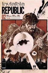 This issue of Invisible Republic has a little too much flashback and not enough with the reporter in the present. The problem is how little the flashback stuff actually matters; sure, the girl is sympathetic, but only because she’s in an unfair situation and she has a psycho future-dictator for a cousin.
 Garth Ennis is back to form on War Stories; his artist, Tomas Aira, is probably worse than the last time I saw him working on the book (could’ve been last issue… he’s not memorable).
 This issue of C.O.W.L. is an excellent bit of work from creators Higgins, Siegel and Reis. First off, Reis’s art really makes the issue. He gets to do talking heads and action, but he has a bunch of variety when it comes to the talking heads. The style fits the conversation and the players beautifully.
 There’s really no other way to say it.
 This issue of Big Trouble is unrepentant in its awesomeness. It’s Jack Burton versus the probably dimwitted demons of Hell as he tries to plan his escape. Powell goes for humor the entire issue–so much so, when Jack gets into a fight at the end, it’s hard to see there being any danger.

 Not really enough story for this issue of Ei8ht. There are quite a few scenes and a bit of information–without being exposition–but there’s not a lot of story. In fact, as far as story goes, there’s only like five pages. The protagonist gets up and walks around and hears about the Meld.
 I’m going to be cynical for a second and remember Orson Scott Card did a spin-off of his Ender’s Game novels where he told the story of the brother turned benevolent dictator. Gabriel Hardman and Corinna Bechko’s Invisible Republic does the story of the cousin turned regular crappy dictator.
 It’s an action-packed issue of Satellite Sam. At least it’s action-packed for Satellite Sam. And not even the kinky sex, which Chaykin must’ve loved getting a crack at. No, Fraction is moving Michael’s murder investigation to what seems to be its third act (and the third act for the series, based on some developments for supporting cast), and there’s action.

 Besides the art–I mean, who doesn’t want to see Frankenstein’s monster fight a dinosaur–there’s not much going for this issue of Frankenstein Underground.


 It’s a new arc for Copperhead and Faerber’s off to a strong start.


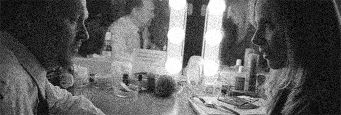
 It’s a sort of gentle issue of The Fade Out, with Brubaker and Phillips heading to the country. The movie production is doing location shooting–albeit on sets, but they’re away from the studio and things are developing. Charlie the protagonist continues his flirtation with the replacement girl while his flashbacks reveal his relationship with the original. Blacklist Gil goes and gets drunk and finds himself in a pickle.
 It’s another too fast issue of Manifest Destiny. Or maybe it’s just how Dingess uses the cliffhanger. He’s actually doing character development, both in scene and through the journal narration device, but it doesn’t get to go anywhere because the last few pages are all setting up the cliffhanger.

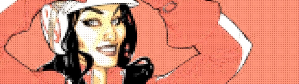
 This issue of Batgirl is a little weird. Stewart and Fletcher sort of do an adaptation of… Captain America 2. Satellite going to shoot people from space because they’re bad or might someday be bad. Big plot point in that movie. In the previews, I believe. Just a few years ago.