
 Lemire has a great device in this issue–lots of small panels full of conversation to show a rapid-fire exchange. Not sure if it's his own creation but it's a wonderful tool for pacing the reader while still having visually dynamic panels. They're just smaller panels.
The good composition and pacing continues until about halfway through the comic, when it all goes to pot.
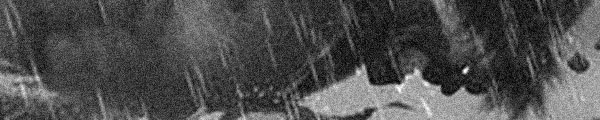
Lemire goes for a really cheap ending to Trillium; really obvious, really self-indulgent (he changes styles at one point and I think photoshops in panels from earlier issues, regardless where the panels are from–he photoshops badly). The ending reveals how the series's pacing problems disabled it too much. The characters have changed too much, too quickly and the ending Lemire goes after needs a lot of thorough work.
Lemire ignores the series's finest qualities for its finish.
Oddly, I liked his art here more than anywhere else.
D
CREDITS
Two Stars Become One; writer and artist, Jeff Lemire; colorists, José Villarrubia and Lemire; letterer, Carlos M. Mangual; editors, Sara Miller and Mark Doyle; publisher, Vertigo
 Jones gets the whole cast together and things finally start improving. Braithwaite draws Bruce as this vaguely awkward, aging pudgy guy. It’s a very interesting visualization of the character; it goes to making him seem a little less familiar even. Oddly enough, the second half of the issue has Jones’s most traditional use of Bruce Banner in many issues.
 So how does Lapham end the first Juice Squeezers series? Well, but with too much of an eye on the future. He opens up two new story lines in this issue–one out of the blue–and confirms another one will continue.
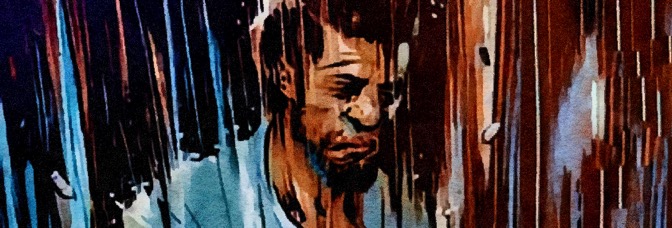

 If it weren't for the José Luis García-López art, I'm not exactly sure what Star Raiders would have going for it. But Raiders isn't "just a comic," it's the first in DC's line of graphic novels and the art is spectacular. García-López's alien worlds, space battles, everything else–it's all fantastic.
 Just fair warning, I’m going to be really mean to Dead Letters. I want to clarify right off Chris Visions doesn’t deserve any of it for his art. His art’s packed, frantic, detailed. It’s good art, if a little too much. But it’s too much of itself, which isn’t a bad thing.
 It’s a Hulk without even Bruce Banner. And I can’t figure out why. Usually when Jones takes forever with an issue, there’s at least an imaginative conversation going on. Lots of literary references, whatever. But not this issue. Here’s it just Doc and Betty arguing while Nadia Blonsky is in danger.
 Carey continues to let Suicide Risk slide down further. It’s not a terrible issue, though the stuff with Requiem fighting his family and then leaving them when the mind control villain shows up is dumb. It doesn’t make any sense, but then Carey’s never known what to do with the family.
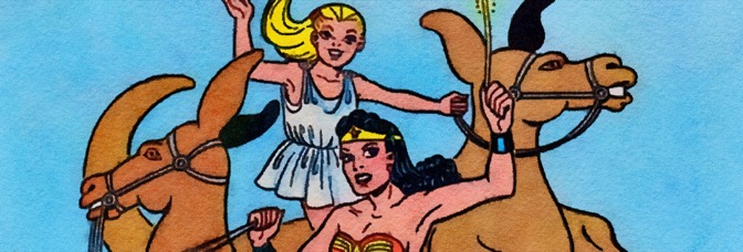

 And here Busiek and Robbins run into a big problem. They’re doing a last pre-Crisis story and so there needs to be some transition. Well, needs is a strong word. They put in some transition, which the bookend system they’re using requires. And it’s a nice enough transition, it’s just not the right one for this series.
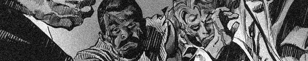
 It’s an odd issue. There’s a lot at the hospital with the P.I.’s assistant recovering, then becoming the target of both the investigators and the bad guys. It’s all very dramatic and Martin does a good job laying on the thrills. Vaughan actually ends up using some of it for comic relief, which is a little odd.
 Jones gets a far better art–Dougie Braithwaite on pencils, Bill Reinhold on inks–and decides to celebrate. Of course, his celebration is dragging his cast through the dirt. He’s got Bruce emotionally pounding on Nadia, who’s a fine enough regular supporting cast member so it’s too bad Jones didn’t establish her more, and then he’s got Betty pounding–literally–on Doc Samson.
 When DC relaunched Blue Beetle with a teen male Hispanic lead, wasn’t his last name Reyes? In a rare act of Marvel aping DC, the relaunched teen male Hispanic Ghost Rider has Reyes for a last name too.

 Someone–Busiek or Robbins or both of them–came up with the structure of this series and all of a sudden it becomes clear this issue and it’s fantastic.
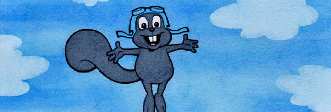


 Fraction gets some kudos for getting tough on Kate in L.A., but then he goes and does two really annoying things. First, he sets up Kate’s latest case as a way to get her back to New York and teamed up with Clint. It’s contrived. Second, the hard cliffhanger requires Kate be unaware of her surroundings. She’d probably be long dead if she were so unaware.
 Here’s the thing. If Jones had structured this series better, been less concerned with diversions like the Absorbing Man, he might have been able to do a fantastic storyline regarding the Banner, the bunnies, Doc Samson, the evil conspiracy. It would have worked. The issue works to some degree just because Jones lets the characters all feel the weight of what’s occurring.
 I can’t decide if Rocky & Bullwinkle should or shouldn’t work as a comic book. Conceptually, I mean. I suppose I should mention it does work–and very well. Writer Mark Evanier and artist Roger Langridge adapt the source material’s sensibilities for the comics medium, which is exactly the way to go about adapting a property from another medium… yet so few ever do it.

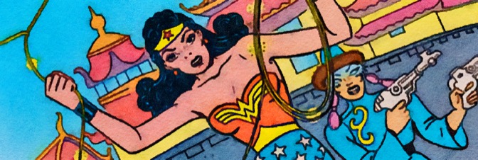

 Right after I say Robbins doesn’t spend a lot of time on backgrounds… she spends a lot of time on backgrounds this issue. The difference is the setting. It’s a fantastical hidden city, not Washington D.C.–and, during the action sequence, the backgrounds do still fade away. So my observation seems about half right.
 Fraction's doing less of an arc than a window into Mike–as in the new Satellite Sam–and his descent into obsession. It's funny, but I think Fraction's still trying to get keep the character as likable as possible. He's just over his head, trying to relieve his father's photography fetish.
 Oh, good grief. When Deodato goes for artistic it’s a really bad page. Also when he goes for Hulk action. Hulk rips open a mountain. Is it any good? Nope, it’s boring.
 This issue, while obviously winding up to the big finish, is a bit of return to form. Brubaker takes the time to introduce a new character–one impervious to Jo's charms–and he's a nice addition. There's some levity amidst Jo's preparations.


 ★★★
★★★ How far can unbridled enthusiasm take something? Well, if The Legend of Wonder Woman is any indication, unbridled enthusiasm can go a very long way.
