• The Incredible Hulk 75 (October 2004)

    The Incredible Hulk #75Here I thought Darick Robertson and Tom Palmer on the art would help….

    It does help for a while. But the issue’s double-sized and once Doc Samson shows up, maybe a quarter of the way in, the art starts sliding.

    Jones reveals the mastermind behind all of Bruce Banner’s troubles. It gets sillier when the villain explains all of it; the ludicrousness of Jones’s conspiracy doesn’t hold up well under examination.

    There’s a slightly interesting gimmick, which Jones shuts down so he can bring back the supporting cast. I’m not sure how Nadia–just a regular small business owner in Nevada or somewhere–can get to L.A. in a matter of hours to help save the day. Worse, Tony Stark is around to hang out with Doc Samson. Wouldn’t it make more sense for Tony to help as Iron Man? Or maybe call the Avengers.

    It’s a lousy comic.

    D- 

    CREDITS

    Wake To Nightmare; writer, Bruce Jones; penciller, Darick Robertson; inker, Tom Palmer; colorist, Raul Trevino; letterer, Randy Gentile; editors, John Miesegaes and Axel Alonso; publisher, Marvel Comics.

  • Daredevil 1.50 (June 2014)

    Daredevil #1.50I'm really glad Mark Waid cares so much about Daredevil to craft the comic, and Matt Murdock, such a sweet story for the fiftieth anniversary of the character. It's a nice story. It's also completely pointless.

    Waid tells a future story with Matt Murdock as former mayor of San Francisco (or something) and gives him a crisis to resolve–some mystery villain has made most of the city blind, including little Jack Murdock. Mom is a mystery but Foggy's around. He's probably supposed to be fifty too. He looks like a thirty year-old.

    The story is slight and saccharine. Javier Rodriguez and Alvaro Lopez's art's decent, never anything more.

    Then, to amplify the self-indulgence, Brian Michael Bendis does a text piece with Alex Maleev art. Comic book text pieces are real bad. Every time.

    Finally, Karl Kesel and Tom Palmer do something goofy. It's bad, but they appear to enjoy themselves.

    C 

    CREDITS

    The King in Red; writer, Mark Waid; penciller and colorist, Javier Rodriguez; inker, Alvaro Lopez. My name is Stana Morgan…; writer, Brian Michael Bendis; artist, Alex Maleev; colorist, Matt Hollingsworth. The Last Will and Testament of Mike Murdock; writer and penciller, Karl Kesel; inker, Tom Palmer; colorist, Grace Allison. Letterer, Joe Caramagna, editor, Ellie Pyle; publisher, Marvel Comics.

  • Vision Quest (1985, Harold Becker)

    Linda Fiorentino might be a year older than Matthew Modine back she's supposed to be playing a worldly twenty-one year-old to his eighteen year-old high school senior in Vision Quest and they sure don't look it. Modine looks about twenty-four, his age at the time of filming. Fiorentino looks twenty-one. She isn't the problem with the film (she nearly makes it worth a look on her own).

    The problem isn't even Modine, who's very earnest, just physically unable to portray his character. The problem's Darryl Ponicsan's awkward script. The film's technically perfect–great photography from Owen Roizman, great editing from Maury Winetrobe–and Becker does compose his shots well, he just can't make the script work. It's superficial and set back; Modine's barely got a character to play. All of his character relationships are a joke–Ponicsan implies people other than Modine having stories, but Fiorentino's the only one to pull it off–even though the supporting cast is superb.

    Wait, Michael Schoeffling gets an impossible role. A better script would juxtapose Schoeffling and Modine, both growing up without mothers, except Ponicsan wants to fixate on Modine's asinine crush on Fiorentino. Even more inexplicable is why Fiorentino would go for Modine.

    But Ronny Cox, Harold Sylvester, Charles Hallahan and J.C. Quinn are all really good as the adults around Modine. His obvious not-teenage age isn't their fault.

    The approach–focusing on Modine, letting everything else be background–would work if the background were well-done. It isn't.

    The soundtrack–top forties, lame Tangerine Dream–doesn't help.

    Fiorentino's fantastic, however.

    1/4

    CREDITS

    Directed by Harold Becker; screenplay by Darryl Ponicsan, based on the novel by Terry Davis; director of photography, Owen Roizman; edited by Maury Winetrobe; music by Tangerine Dream; production designer, Bill Malley; produced by Peter Guber and Jon Peters; released by Warner Bros.

    Starring Matthew Modine (Louden Swain), Linda Fiorentino (Carla), Michael Schoeffling (Kuch), Ronny Cox (Louden’s Dad), Harold Sylvester (Tanneran), Charles Hallahan (Coach), Daphne Zuniga (Margie Epstein) and J.C. Quinn (Elmo).


    RELATED

  • Manifest Destiny (2013) #6

    Manifest Destiny  6

    It’s a decent issue with some great art sequences from Roberts–the explorers are fighting plant zombie wildlife after all–but it moves too fast. Dingess seems too concerned with keeping things moving and keeping to his narration structure to really relax and enjoy.

    This issue, for example, once again has Sacajawea kicking butt. Only Dingess is too busy showing Lewis and Clark’s side of the event, which involves hallucinations, to let the reader enjoy the butt-kicking. The script sometimes makes Roberts’s art feel stunted. Who knows, maybe it’s the other way around and the art’s a stunted rendition of the script.

    But I doubt it.

    Still, the baseline quality of Manifest Destiny is undeniable. It remains to be seen whether Dingess is going to achieve something amazing for the series or be satisfied being above average.

    The characters, who Dingess does give good attention, deserve more ambitious plotting.

  • Atari Force #7The series is definitely back on track. Not only does Conway come up with a way to utilize all seven principal cast members in the issue, he also comes up with a very amusing turn of events.

    Before getting to any of these plot developments, he opens with Tempest’s father going over to the bad guy’s spaceship in what he thinks will be an exchange. In this sequence, Conway makes it very clear the father, Martin, is the action hero of the series. Conway hadn’t utilized him well enough before. All of a sudden the character seems interesting on his own and not as an appendage of the surfer dude son.

    There’s a lot of humor too. Dart and Pakrat are good comic relief, though the psychic gets the best jokes. Not many, but good ones.

    It’s once again imaginative work from Conway, with some fantastically rendered pages from García-López.

    B+ 

    CREDITS

    Counter Attack; writer, Gerry Conway; penciller, José Luis García-López; inker, Ricardo Villagran; colorist, Tom Ziuko; letterer, Bob Lappan; editor, Andy Helfer; publisher, DC Comics.

  • Manifest Destiny #6It’s a decent issue with some great art sequences from Roberts–the explorers are fighting plant zombie wildlife after all–but it moves too fast. Dingess seems too concerned with keeping things moving and keeping to his narration structure to really relax and enjoy.

    This issue, for example, once again has Sacajawea kicking butt. Only Dingess is too busy showing Lewis and Clark’s side of the event, which involves hallucinations, to let the reader enjoy the butt-kicking. The script sometimes makes Roberts’s art feel stunted. Who knows, maybe it’s the other way around and the art’s a stunted rendition of the script.

    But I doubt it.

    Still, the baseline quality of Manifest Destiny is undeniable. It remains to be seen whether Dingess is going to achieve something amazing for the series or be satisfied being above average.

    The characters, who Dingess does give good attention, deserve more ambitious plotting.

    CREDITS

    Writer, Chris Dingess; artist, Matthew Roberts; colorist, Owen Gieni; letterer, Pat Brosseau; editor, Sean Mackiewicz; publisher, Image Comics.

  • The Incredible Hulk 74 (September 2004)

    The Incredible Hulk #74I don’t like finishing a comic wondering what the heck I’ve just read. Getting through this issue of Hulk isn’t just troublesome because of the incredibly uneven art–Braithwaite and Reinhold spend the least amount of time on the big fight between Hulk and Iron Man–but through the constant stupidity.

    Jones boils down his resolution to a confession, which doesn’t make much sense. Of course, having the drama hinge around Tony Stark having a suicidal girlfriend with a lock-picking, would-be amateur assassin brother doesn’t make much sense either.

    Then there’s poor Bruce Banner. What’s he doing this arc? Following Tony around mostly. Only neither character has a real arc. Tony’s is superficial, Bruce is just a spectator. Jones doesn’t spend any time on Bruce outside him helping with the experiment.

    There are numerous false endings too. It’s easily the worst issue Jones has done on the title.

    F 

    CREDITS

    Big Things, Part Four; writer, Bruce Jones; penciller, Dougie Braithwaite; inker, Bill Reinhold; colorist, Rainier Beredo; letterer, Randy Gentile; editors, John Miesegaes and Axel Alonso; publisher, Marvel Comics.

  • Sons of Anarchy #8There’s a lot of lovely art this issue. It’s a hard story–most of the leads are in jail, the women are being threatened on the outside, but Damian Couceiro–with the able help of colorist Michael Spicer–manages to embrace the hardness while still being stylishly appealing. About the only time the art doesn’t work is when there’s too much artificial pacing to it, like for the cliffhanger.

    Ed Brisson’s script moves nicely between prison and the outside world. He focuses on the characters, leaving himself a little space for tension relieving humor, but Sons of Anarchy is a serious book without room for much in the way of jokes. It’s still a very odd licensed property but Boom! executes it well.

    Again, I still haven’t seen the show, yet Brisson’s able to get the reader immediately engaged with the characters and their troubles.

    It just ends too fast.

    B+ 

    CREDITS

    Writer, Ed Brisson; artist, Damian Couceiro; colorist, Michael Spicer; letterer, Ed Dukeshire; editor, Dafna Pleban; publisher, Boom! Studios.

  • Atari Force #6García-López returns to full duties and Force gets back on track. Mostly. Conway seems to be influenced by Star Wars–and I’m intentionally using the passive voice, because I doubt he really meant to rip-off going on to the Death Star with some plot accouterments.

    Dart and Tempest have to go over to the bad guy’s ship–the bad guy also looks a little too much like a space knight (or Sith Lord); it’s a neat design but it’s way over the top. Unless DC was hoping to sell toy licenses. Anyway, they’re on his ship, the rest of the team is on the regular ship. There’s drama. It’s good.

    Conway’s really utilizing the estranged father and son relationship, with Dart thrown in as an awkward sort of sibling. Given there’s a telepathic psychologist on the team, a little much exposition on that subject… but it’s good.

    The comic flows quite well.

    B 

    CREDITS

    A Meeting With Life and Death; writer, Gerry Conway; penciller, José Luis García-López; inker, Ricardo Villagran; colorist, Tom Ziuko; letterer, Bob Lappan; editor, Andy Helfer; publisher, DC Comics.

  • Lumberjanes #1I wish Lumberjanes was better. The first issue definitely shows promise, but it’s missing something. Unfortunately, what it’s missing seems to be a connection between the writing and the art.

    Brooke Allen’s art is hyperactive and intense. The comic takes place at a girls camp where one cabin of girls is obviously going to get into trouble. Only they’re apparently getting into trouble with mystical creatures and their cabin leader isn’t in on it but the camp director knows about the creatures. Allen has a great time with all of it.

    But writers Noelle Stevenson and Grace Ellis are writing too slow for the art. They don’t maintain an adequate level of humor and they let their characters disappear without exuding enough personality. Allen can make up for some of it on the art, but not if she doesn’t have the material in the script.

    I’m still hopeful, but guardedly.

    B- 

    CREDITS

    Writers, Noelle Stevenson and Grace Ellis; artist, Brooke Allen; colorist, Maarta Laiho; letterer, Aubrey Aiese; editor, Dafna Pleban; publisher, BOOM! Box.

  • The Incredible Hulk 73 (August 2004)

    The Incredible Hulk #73Watching Braithwaite try to do depth in panels gets painful fast. Bruce is pointing at Tony Stark in one panel and the hand is at exactly the same depth as his body. Maybe it’s Bill Reinhold’s inks, but there’s something definitely off with the art.

    Also off is the story. Bruce Banner is still helping Tony Stark on a government contract. There’s a third scientist on the project and he’s mad at Tony, then there’s the guy who Tony’s holding hostage (he did try to kill him so apparently it’s okay). Throw in a Playmate who plays waitress to everyone and Jones has set up a really disturbed version of “The Real World.” Oh, and they’re all stuck in the Stark mansion.

    Lousy dialogue and bad characterizations don’t help things. Bruce isn’t just different from the rest of Jones’s run, he’s different from the last issue.

    Jones’s checked out completely.

    D- 

    CREDITS

    Big Things, Part Three: Shock Waves; writer, Bruce Jones; penciller, Dougie Braithwaite; inker, Bill Reinhold; colorist, Rainier Beredo; letterer, Randy Gentile; editors, John Miesegaes and Axel Alonso; publisher, Marvel Comics.

  • John Carpenter's Asylum #5It isn’t enough for there to be one exorcism this issue, Jones has to flashback to a previous exorcism. The flashback does get some of the back story between the priests out of the way, which is good, but it’s a whole lot of demonic art. Manco has almost nothing to draw except demons in various stages of upset this issue.

    As for Jones, for the most part he’s just got to write priests saying lines out of Exorcist movies. Not particularly heavy lifting for him. Manco at least has a lot to do. There’s a double-page spread of angels and demons–it’s totally useless as far as narrative value, but it’s very detailed work from Manco.

    There are some big plot developments and big things for cast members. Unfortunately, there’s so little concern for the cast it doesn’t really matter who’s in danger.

    Besides Manco, Asylum’s running near on empty.

    C- 

    CREDITS

    Writers, Bruce Jones, Sandy King and Trent Olsen; artist, Leonardo Manco; colorist, Kinsun Loh; letterer, Janice Chiang; editor, King; publisher, Storm King Comics.

  • Atari Force #5There seem to be some pages missing, like the scene where Martin talks his kid into stealing a space craft. His estranged kid.

    Conway glosses over that problem, along with the one where Martin convinces his shrink to commit treason to join his mission. The mission, to save the world, isn’t revealed until over halfway through. Seems somewhat unlikely people who sign up without some idea. They do steal a huge spaceship after all.

    Multi-dimensional ship, but you get the idea.

    There’s not much time for the characters, though the huge baby alien character gets a couple nice moments and the action’s not bad. It reminds a little too much of Star Wars for a moment but not bad.

    Conway seems to be setting up the series for high adventure. He doesn’t quite promise it, which might be good since this issue doesn’t deliver any.

    The comic harmlessly underperforms.

    C+ 

    CREDITS

    Dark Dawn; writer, Gerry Conway; penciller, Ross Andru; inker, José Luis García-López; colorist, Tom Ziuko; letterer, Bob Lappan; editor, Andy Helfer; publisher, DC Comics.

  • Shotgun Wedding 1 (April 2014)

    Shotgun Wedding #1Shotgun Wedding is “Spy vs. Spy” with hormones. It opens up with a jilted bride, implying she’s just a girl from Nevada who likes her assault rifles. Then writer William Harms jumps forward four years to introduce the jilting bride groom. He’s an international assassin or something. Probably a good guy, based on the accent of his target.

    There’s some back story showing how bloody the girl makes things, with Harms showing past events to make the reader worry about the guy’s new fiancée and his invalid mother. It’s really cheap, derivative stuff from start to finish.

    Edward Pun’s art is simple, black and white, stylized. He’s definitely trying to do things with the action, to tell a scene in the most engaging way possible. That effort doesn’t go unnoticed. It’s counter to Harms’s standard, unambitious script.

    Worst, Harms seems to think being mean is the same thing as funny.

    C 

    CREDITS

    Writer, William Harms; artist, Edward Pun; letterer, Troy Peteri; editor, Betsy Gonia; publisher, Top Cow Productions.

  • The Incredible Hulk 72 (July 2004)

    The Incredible Hulk #72Deodato has some kind of painted thing going on. It’s not good and it’s often unclear what’s going on–and there are real problems with montage–but at least he’s not doing the little panels for big action.

    The issue continues with the Iron Man guest appearance. There’s a strange fight scene where Bruce is in Iron Man armor fighting Tony. Because Tony wants to prove his innocence regarding a girl who committed suicide. It makes no sense; Jones’s editors must have been napping.

    Even though Bruce Banner is front and center again, but Jones is more using him as an add-on to an Iron Man story. And the Iron Man story is bad. Jones doesn’t have much insight into Tony as a character; none of his actions make sense. He’s just around for the murky art crossover.

    The crossover is a complete misfire. Jones has lost his grip.

    D 

    CREDITS

    Big Things, Part Two: Strange Bedfellows; writer, Bruce Jones; artist, Mike Deodato Jr.; colorist, Rainier Beredo; letterer, Randy Gentile; editors, John Miesegaes and Axel Alonso; publisher, Marvel Comics.

  • Rover Red Charlie 4 (February 2014)

    Rover Red Charlie #4Ennis utilizes a very effective device this issue–he has such a great last scene, it overrides the issue’s problem. What problem? Three things happen the entire issue.

    One of the friends tries cooking duck, the friends meet an army dog, the friends meet an infected dog. Three things. Ennis drags out the army dog meeting, which doesn’t really service much purpose other than to show how different dogs think. Of course, that level of examination seems more appropriate for an ongoing, not a limited series.

    He also makes an effort to hint at whatever has driven the humans crazy. There’s no place in the series to give an answer to the reader–the narrating dog realizes he’s been on his own long enough he wants to know why, but it’s for him (and he wants to know why about many things now).

    It’s still good and thoughtful, just slight.

    B 

    CREDITS

    Walked Off to Look for America; writer, Garth Ennis; artist and colorist, Michael DiPascale; letterer, Kurt Hathaway; publisher, Avatar Press.

  • Atari Force #4What an odd issue. Not because of Dart making out with her de facto brother–the whiny surfer dude–just after her man has died, but because Conway brings back surfer dude’s dad. Previously, the dad (a main character from the first Atari Force series) has been off to the side. He’s been present, but never the focus. Now Conway reveals he’s basically the protagonist.

    Then there’s the art. Ross Andru handles the pencils, Garcia-Lopez only having time for the inks. Andru doesn’t do a bad job–he gets very stylized for some of the scenes and the inks are good, but it’s not the same. Force doesn’t pack the same visual wallop.

    The issue has the same subplots too, but Conway isn’t really moving forward on them. There’s progress for surfer dude, but only because Dart’s there and his dad’s there.

    It’s odd how the plotting problems coincide with the art change.

    B 

    CREDITS

    Families; writer, Gerry Conway; penciller, Ross Andru; inker, José Luis García-López; colorist, Tom Ziuko; letterer, Bob Lappan; editor, Andy Helfer; publisher, DC Comics.

  • Real Heroes 1 (March 2014)

    Real Heroes #1The first issue of Real Heroes doesn’t offer much in the way of surprises. It’s Bryan Hitch doing realistic superhero disaster scenes and he’s good at those. He does a lot of photo-referencing, of course, but it fits since he’s doing Hollywood stars.

    The premise is pretty simple. What if the cast of The Avengers had to go play superhero in an alternate reality. How Hitch wasn’t able to sell “Galaxy Quest with superheroes” to a major studio is beyond me. Or maybe he’s trying to establish the brand first.

    Hitch doesn’t shy away from plot or character contrivances either. His cast includes the son of a 9/11 firefighter who’s obviously going to be concerned about doing the right thing and then a paraplegic actor who’ll probably get to walk again in the alternate universe.

    It’s a little too real with the 9/11 stuff, but Hitch’s earnest and definitely engaged.

    B 

    CREDITS

    Writer and penciller, Bryan Hitch; inker, Paul Neary; colorist, Laura Martin; letterer, Chris Eliopoulos; editor, Drew Gill; publisher, Image Comics.

  • The Incredible Hulk 71 (June 2004)

    The Incredible Hulk #71Bruce is in L.A., no matter why, and he runs across a Tony Stark press conference. So they fight and team up. They fight because Tony can’t recognize Bruce in his sunglasses. Very convenient disguise.

    There’s a lot of talking, some confusing art from Deodato–though he’s better than usual–and more of Bruce being able to turn immediately into the Hulk. One thing about that instantaneous change? Jones has never really said how Bruce feels about it. Has he turned the Hulk into a tool? Isn’t the Hulk his own guy to some degree? How does he feel about it?

    All these questions go unasked and unanswered and are far more interesting than the comic itself. It’s unclear what Bruce is on the run from this time, which is another thing Jones could have explored but does not.

    Worse, the arc’s four parts and Iron Man’s a lousy guest.

    D 

    CREDITS

    Big Things, Part One; writer, Bruce Jones; artist, Mike Deodato Jr.; colorist, Hermes Tadeo; letterer, Randy Gentile; editors, John Miesegaes and Axel Alonso; publisher, Marvel Comics.

  • Starlight 2 (April 2014)

    Starlight #2
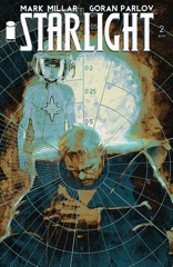
I was expecting a lot more from Starlight. This new development where series totally fall off after strong openings didn’t seem like something Millar would fall for, but this issue suggests otherwise. Duke argues with a kid from the planet he saved about whether he’s going back to save them again.

    Of course he’s going to go back. Otherwise there’s not a series.

    About the only time the comic shows any signs of life is when Duke says they’re going to show off the spaceship to all the people who said he was crazy. And then Millar fails to deliver anything.

    So it’s a redundant, predictable talking heads book. Without very interesting art. Parlov doesn’t do a lot of backgrounds and his panels are simplistic. There’s an overemphasis on the kid, who’s not particularly interesting, and most of the moodiness about Duke’s solitude is gone.

    Starlight’s dimming. It’s too bad too.

    C 

    CREDITS

    Writer, Mark Millar; artist, Goran Parlov; colorist, Ive Svorcina; letterer, Marko Sunjic; editor, Nicole Boose; publisher, Image Comics.

  • Atari Force #3There are a few big surprises this issue. The non-spoiler one has to do with how adult Conway’s willing to take the comic. He’s not goofing around with it, not just with conjugal relations, but also with implying age differences and responsibilities of older partners. It’s all very subtle, all very clear.

    That plot line, which gets the most emphasis–Dart always gets the beginning and end–makes up for the weaker ones. The thing with the giant rock alien and the overgrown rodent are mostly fine. Conway gets a lot of humor into those scenes and a nice amount of characterization. The problem’s with the surfer dude.

    The whiny, blond surfer dude has another hissy fit this issue. Conway’s gone out of his way to make the character unlikable but I think he’s supposed to be sympathetic too. It isn’t coming off.

    The fantastic García-López makes up for any problems, however.

    B 

    CREDITS

    I Saw You Die; writer, Gerry Conway; penciller, José Luis García-López; inker, Ricardo Villagran; colorist, Tom Ziuko; letterer, Bob Lappan; editor, Andy Helfer; publisher, DC Comics.

  • Caliban 1 (March 2014)

    Caliban #1Oh, good, Garth Ennis wants to try his hand at derivative sci-fi. Caliban takes place on a ship traveling through warpspace–which sounds a lot more “realistic” than hyperspace or warp… wait, never mind. It doesn’t.

    But he does try to work in the reality of cryogenic sleep for long voyages. The cast of the series are the maintenance crew for the ship who don’t get to sleep. Instead they bicker and flirt and write very explanatory journal entries on their iPads.

    Given the odd pacing and pointless characters, I wonder if Ennis tried his hand at writing a movie script. Because as a comic, this issue is a mess. It’s more annoying than anything else once it gets obvious. Regurgitated sci-fi movie ideas from as far back as 2001 and as recent as Prometheus.

    It’s not even an imaginative regurgitation.

    Facundo Percio’s mediocre art is another problem.

    C 

    CREDITS

    The Ship; writer, Garth Ennis; penciller, Facundo Percio; inker, Sebastian Cabrol; colorist, Hernán Cabrera; letterer, Kurt Hathaway; publisher, Avatar Press.

  • The Incredible Hulk 70 (June 2004)

    The Incredible Hulk #70Deodato is back once again. And, once again, the art is bad. This time there’s a lot Deodato can’t do. He can’t do the talking heads, he can’t handle Bruce willfully turning into the Hulk for a quick emergency.

    And it’s too bad, because the issue’s a reasonable done in one where Bruce meets up with a clairvoyant on the FBI payroll. Most of the issue is the two men talking while the clairvoyant can see things unfolding.

    Jones doesn’t exploit it as a narrative device enough, but Deodato couldn’t handle it if he did anyway. But the issue’s decent. Bruce and the guy talk through the issue, Jones getting in a couple twists. It doesn’t explain why the guy didn’t try to find the Hulk before, like during the national manhunt, but whatever.

    Too bad Jones didn’t do his run more episodically, it would’ve worked. Minus Deodato, of course.

    B- 

    CREDITS

    Simetry; writer, Bruce Jones; artist, Mike Deodato Jr.; colorist, Hermes Tadeo; letterer, Randy Gentile; editors, John Miesegaes and Axel Alonso; publisher, Marvel Comics.

  • She-Hulk 3 (June 2014)

    She-Hulk #3There's nothing off about this issue of She-Hulk; its problems aren't a mistake. Soule is very deliberate in how he paces out the action, then humor, the set pieces. I assume his scripts are similarly deliberate, so it's not like Pulido chose to stage a lot of big action in small settings.

    And–just to be clear–Pulido's composition is fantastic. He's got a lot of double page panels and they do a great job moving the story quickly and visually.

    So what's the problem?

    Well, with the continuing buildups from page to page, Soule needs something extraordinary for the finish. Instead, he goes for a rushed cliffhanger with so little drama I didn't believe the story had actually ended. I thought She-Hulk would be on the next page winking at me.

    A lot of this comic could be an example of near perfect comics storytelling. Soule just can't write cliffhangers apparently.

    B 

    CREDITS

    He Who Wouldn’t Be King; writer, Charles Soule; artist, Javier Pulido; colorist, Muntsa Vicente; letterer, Clayton Cowles; editors, Frankie Johnson, Jeanine Schaefer and Tom Brennan; publisher, Marvel Comics.

  • Atari Force #2The second issue follows the same general structure as the first. Open with Dart–she’s the white-haired, good guy mercenary lead–and her boyfriend in some kind of “no win” battle. They eventually beat the odds, because she’s the hero. There’s great García Lopez action art so it looks great too.

    Then Conway moves into what’s going on with the rest of the cast, which is a lot of positioning this issue. The psychic guy goes to visit surfer dude’s dad–surfer dude is the human who can travel the multi-verse (not the regular DC one, I don’t think) without a vessel–and the broken father and son relationship, if Conway continues it, might be interesting.

    But there are also the other characters, the reluctant smuggler, the stowaway thief; their scenes are just to get them in place for whatever union of story lines Conway utilizes.

    The script’s imaginative, the art’s gorgeous. Force’s fine.

    B 

    CREDITS

    Direct Encounter; writer, Gerry Conway; penciller, José Luis García-López; inker, Ricardo Villagran; colorist, Tom Ziuko; letterer, Bob Lappan; editor, Andy Helfer; publisher, DC Comics.

  • Pretty Deadly 5 (April 2014)

    Pretty Deadly #5DeConnick has a decent finish for the end of the first Pretty Deadly arc. There’s something missing, like she rushed through resolving the showdown in order to get to the next showdown. It’s hurried and there’s little sense of the journey the characters take.

    There’s also a lot of narration through the issue–the framing sequence has never felt so prevalent. The characters all become the subject of this narration and no longer the leads in it.

    Still, Rios’s art is gorgeous and DeConnick gets in some good character moments. There’s just not enough room for all the things they’re imagining. It feels undeveloped, especially when it comes to the big finale. There’s a mix of action and character stuff and neither really gets the deserved amount of attention.

    Deadly has been able to be confusing and rewarding at the same time. Here, DeConnick tries too hard to be intelligible.

    B 

    CREDITS

    Writer, Kelly Sue DeConnick; artist, Emma Rios; colorist, Jordie Bellaire; letterer, Clayton Cowles; editor, Sigrid Ellis; publisher, Image Comics.

  • The Incredible Hulk 69 (May 2004)

    The Incredible Hulk #69After spending the first third of the book setting up the best Hulk fight since he’s been on the run–the way Jones paces out the banter between Hulk and evil spider-clone Hulk (don’t ask) is perfect–Jones trashes the whole thing. He goes back to his talking heads model. Down to no one really having anything to say to one another.

    There’s an awkward lack of ambition to those scenes. Doc, Betty and Nadia’s lives are wrought with angst and Jones goes for easy bickering. Not even inventive easy bickering, just page-filling easy bickering. He comes up with a mystery and has to do everything in service of it. The mystery isn’t a good one and he handles it poorly.

    The lack of ambition isn’t just lazy dialogue, it’s much worse–it’s Bruce Banner. He’s a marionette. Jones has stopped implying he has any depth. Hulk’s the only interesting thing about him.

    C- 

    CREDITS

    Dead Like Me, Part Four: Trust Me; writer, Bruce Jones; penciller, Dougie Braithwaite; inker, Bill Reinhold; colorist, Studio F; letterer, Randy Gentile; editors, John Miesegaes and Axel Alonso; publisher, Marvel Comics.

  • Captain America: The Winter Soldier (2014, Anthony Russo and Joe Russo)

    Captain America: The Winter Soldier has a bunch of great, thoughtful scenes and many excellent–and some just better than normal–performances but it doesn’t add up to much. Those fine scenes don’t have enough separation from the very hurried plot to resonate on their own. What should be subplots turn out to be nothing but texture scenes or, more cynically, ones to tie into later big plot developments.

    Directors Anthony Russo and Joe Russo do an adequate job with the film. Some of the action, particularly in the first half, is good. The big finale goes from way too hurried for the scenes with sidekicks Scarlett Johansson and Anthony Mackie to way too protracted with Chris Evans’s second big fight opposite Sebastian Stan. These scenes take place amid the film’s only enormous CGI sequence, which the directors don’t really know what to do with.

    The acting is all good; even the weaker performances like Johansson’s are mostly all right. Evans and Mackie are fantastic. Screenwriters Christopher Markus and Stephen McFeely don’t have an honest relationship between any of the characters–Evans and Johansson, Evans and Mackie, Samuel L. Jackson and Robert Redford–but the actors make it all work.

    Though Redford does look a little lost. He doesn’t chew the scenery as much as the role requires.

    Nice supporting work from Frank Grillo too.

    The Winter Soldier stays engaging throughout–even during the bloated third act. The film’s already got the viewers invested in the characters.

    It’s too bad though, it should’ve been better.

  • Veil 2 (April 2014)

    Veil #2The first issue of Veil just had present action scenes, no exposition. This issue, Rucka adds exposition. He adds rapist cops–and their compliant partners, he adds fundamentalist Christian preachers who make deals with demon conjurers–and he adds a lot of dialogue.

    Oddly, it also gives Fejzula a lot less to do. More stuff, but less interesting visuals.

    Unfortunately, all of the additions are bad and they’re all at the expense of the title character. Veil, this issue, just sits around until she conveniently goes off–doesn’t like waffles. The guy helping her talks to himself the entire issue and his dialogue’s terrible.

    There’s an early moment to forecast the problems–the guy freaks out because he can’t climb over a dumpster to escape the cops. Not the rapist cops. Presumably regular ones. Why can’t he climb over the dumpster? Nice pants?

    It’s so bad it’s not even disappointing.

    D 

    CREDITS

    Writer, Greg Rucka; artist and colorist, Toni Fejzula; letterer, Nate Piekos; editors, Shantel LaRocque and Scott Allie; publisher, Dark Horse Comics.

  • Atari Force #1Alien worlds, lots of different kinds of action… what else goes on in Atari Force. Alien species, lots of different alien species. It’s also got a nice setup story. Gerry Conway frames it around one set of characters’ action sequence, then cuts to other characters. Presumably they’ll come together soon enough as the titular Atari Force.

    But Conway seems to be writing for his artist, José Luis García Lopez. Not in a bad way; Conway’s not doing quick action scenes and letting García Lopez drag them out. Instead, he’s throwing a bunch of disparate ideas at García Lopez to see how they hash out.

    Even before the sci-fi spectacular stuff starts, there’s an amazing fight scene. So much movement.

    The female protagonist is more likable, so far, than the male.

    It’ll be interesting to see where the creators take the series, since the possibilities are seemingly endless and unconstrained.

    B+ 

    CREDITS

    Fresh Blood; writer, Gerry Conway; penciller, José Luis García-López; inker, Ricardo Villagran; colorist, Tom Ziuko; letterer, Bob Lappan; editor, Andy Helfer; publisher, DC Comics.