• Sons of Anarchy #10I'm trying to come up with a phrase to describe Sons of Anarchy–amoral entertainment, the amorality of entertainment. The problem with those two phrases are they're something difference, even if the vocabulary is similar.

    With this issue of Anarchy, Brisson does a couple big things. First, he turns in one of the best licensed comics I've ever read–he and Couceiro do phenomenal work here. Couceiro's art is just getting better and better.

    Second, Brisson plays with the idea of plot structure and epilogues and what goes where. Without the epilogue, this story isn't an action story, it's the story of these criminals working out a deal to stay alive in prison. Brisson tells this tale compellingly, but it's got a short present action and it's not all that big.

    Until the epilogue, which I wasn't even expecting because Brisson paces so well.

    Anarchy is getting to be a singular comic.

    A- 

    CREDITS

    Writer, Ed Brisson; artist, Damian Couceiro; colorist, Michael Spicer; letterer, Ed Dukeshire; editor, Dafna Pleban; publisher, Boom! Studios.

  • Arthur 2: On the Rocks (1988, Bud Yorkin)

    With the exception of Jill Eikenberry, all of the cast members from the original return for Arthur 2: On the Rocks. Cynthia Sikes replaces her. Eikenberry’s absence means she’s the only person who doesn’t embarrass herself. I’m sorry, did I say embarrass? I more meant humiliate.

    Worse, director Yorkin and screenwriter Andy Breckman don’t just reserve the humiliation for the returning cast… the new cast members (like Kathy Bates, Paul Benedict and Sikes) humiliate themselves too. Watching Arthur 2, seeing actors who gave great performances in what are supposedly the same roles now giving terrible ones–Geraldine Fitzgerald is just awful, ditto for Stephen Elliott. Elliott’s the worse of the two, however.

    As for leads Liza Minnelli and Dudley Moore–who were so precious and cute and good in the original–oh, they’re bad. Minnelli’s better, but only because Moore’s debasing himself in this one.

    Besides a fifty-three year-old Moore no longer being adorable as an obnoxious drunk in the lead, the problem is the script. Yorkin’s direction is definitely lame, but Breckman’s script is atrocious. He tries to mimic the first film without actually developing the characters. There’s an unclear interim between the two films (it ranges from three to six years, never the actual eight) and it just goes to show how little thought Breckman puts into anything here.

    Arthur 2: On the Rocks does have one big distinction–there’s nothing good about it. Even Burt Bacharach’s score is lousy. It’s a dismal, long, unfunny debacle.

  • Star Trek 9 (December 1980)

    Star Trek #9Dave Cockrum must have refused to draw faces and made the inker do it. It might explain why the features on the characters this issue appear to slide around their faces, Frank Springer had to get them all filled in.

    Bad art aside, it’s not a bad issue. It’s nearly decent, but Pasko throws in a subplot about Kirk and some ex-girlfriend and then some other big coincidence. The ex-girlfriend is a weak character and Kirk doesn’t look anything like himself anyway, so it’s almost entirely out of place. When Pasko resolves it, he relies in the female character only he never did anything to build her up.

    The rest of the issue has a somewhat predictable finish but also has a boring way of unfolding. Pasko can’t make it compelling, maybe because he mocks the danger. He shows one extreme, then a nearly comical one.

    Very mixed bag.

    C+ 

    CREDITS

    Experiment in Vengeance!; writer, Martin Pasko; pencillers, Dave Cockrum and Frank Springer; inker, Springer; colorist, Carl Gafford; letterer, John Costanza; editor, Louise Jones; publisher, Marvel Comics.

  • Stray Bullets 40 (October 2005)

    Stray Bullets #40This issue is the story of Kevin’s father. Kevin is the bad guy who has kidnapped Virginia with badder guy Huss.

    Kevin’s dad is deaf and he’s a drunk because a low level mobster took off one of his fingers and he can’t hear his kid trying to gang rape a teenage girl. Lapham’s aiming for the stars here as far as artistic ambition.

    Oddly, he clearly thinks it’s a great idea–the storytelling device with the deaf guy moving in front of all this action and not being aware of it. But the art’s crap, so it’s not like he worked on it.

    Lapham also thinks it’s a good idea to reduce a character who was once one of the best female comic book characters to a mannequin who’s single purpose to be exploited. Apparently, Lapham can’t do anything else with Bullets but assault, rape or molest Virginia.

    It’s repugnant.

    F 

    CREDITS

    Zippity Doo-Dah!; writer, artist, and letterer, David Lapham; editors, Renee Miller and Maria Lapham; publisher, El Capitán Books.

  • Letter 44 1 (October 2013)

    Letter 44 #1Writer Charles Soule isn't doing anything fresh with Letter 44 so why does it feel so new? Because he's doing thoughtful science fiction in an era where thoughtful science fiction isn't mainstream anymore. 44 feels like it could have been a movie–or TV mini-series–from the seventies and no one would have questioned it.

    The setup is simple. The new President finds out about an alien device in the asteroid belt. The story goes between him processing and reacting to this information and the crew aboard the vessel sent to investigate. I'd say, if it were a seventies movie, Burt Lancaster would be the president but he was a fit guy so I'll be the would have wanted to be on the space ship.

    It's engaging stuff throughout and Soule doesn't shy away from being overly intelligent.

    Alberto Jiménez Alburquerque's art is fine.

    44's successful so far.

    B 

    CREDITS

    Writer, Charles Soule; penciller, Alberto Jiménez Alburquerque; colorist, Guy Major; letterer, Shawn DePasquale; editor, Jill Beaton; publisher, Oni Press.

  • Star Trek 8 (November 1980)

    Star Trek #8Martin Pasko writes the heck out of this comic book. He’s got a really complicated plot and it makes for a fantastic, lengthy read. Pasko doesn’t just come up with a great reveal for the aliens, he’s also got the really cool subplots going. He runs two subplots through the comic, resolving one and then introducing the next. And those run under this intriguing main plot.

    It shows why, for once, a licensed property comic can excel. The comic only works because it’s a Star Trek comic yet Pasko so profoundly transcends the norm in plotting ability, it becomes something singular.

    Unfortunately, Ricardo Villamonte is the apparently worst possible inker for Dave Cockrum in the world. Forget the characters looking too photo-referenced, they don’t even look the same between panels. And there’s no depth. Villamonte didn’t put in any shadows. None.

    But that Pasko script is a wonderful thing.

    A- 

    CREDITS

    The Expansionist Syndrome; writer, Martin Pasko; pencillers, Dave Cockrum and Ricardo Villamonte; inker, Villamonte; colorist, Carl Gafford; letterer, Ray Burzon; editor, Louise Jones; publisher, Marvel Comics.

  • Princess Ugg 1 (June 2014)

    Princess Ugg #1If the first issue is any indication, Princess Ugg is going to be a rip-roaring good time. It’s kind of like a fish out of water story, only maybe a more appropriate description would be a (good-hearted) piranha in the goldfish tank story.

    One Princess Ülga–not sure where the title Ugg comes from yet–makes some decisions against the normal way of her people. She’s kind of viking, but tougher. She decides she wants to go get proper princess schooling outside her mountain kingdom. At some kind of royal academy. Ted Naifeh doesn’t really specify yet, because he’s having way too much fun.

    The comic works because Naifeh isn’t going the humor route, at least not as how Ülga sees it. She wants this education to further her understanding of the world, to better serve her people. He gets all of that sentiment in quickly. Naifeh knows how to pace.

    Ugg rocks.

    A 

    CREDITS

    Down the Mountain; writer and artist, Ted Naifeh; colorist and letterer, Warren Wucinich; editors, Robin Herrera and Jill Beaton; publisher, Oni Press.

  • Stray Bullets 39 (September 2005)

    Silly me, how did I forget Lapham always follows up hard cliffhangers with Amy Racecar stories. Sadly, not even Amy Racecar is safe from Lapham’s laziness.

    It isn’t a story about Amy–her sidekick, William, returns, because apparently Virginia and Amy both always need sidekicks now. She doesn’t narrate, which is good, because it’s a terrible story and I wouldn’t have wanted to read Lapham write bad Amy Racecar narration. It would have made me sadder.

    The issue has her in feudal Japan because someone–probably Lapham, not Virginia–was on a Kurosawa kick. Lots of visual references to some of Kurosawa’s most famous samurai movies. Not to mention a direct homage to Yojimbo. It’s too bad Lapham didn’t spend the time on the actual content of this issue.

    Also, there are a lot of bad puns.

    Lapham’s awful output’s confusing. He’s not trying with story or art; it’s terrible.

    D- 

    CREDITS

    Hatukaraki!!!!; writer, artist, and letterer, David Lapham; editors, Renee Miller and Maria Lapham; publisher, El Capitán Books.

  • Vampirella 1 (June 2014)

    Vampirella #1It’s difficult to take Vampirella seriously with that costume. Even though writer Nancy A. Collins does come up with a decent plot and a couple good twists (and a lame soft cliffhanger), the costume hurts the comic quite a bit. It just says, “We aren’t that serious.”

    Another big problem is how Collins paces out the narrative. There’s a prologue with a family in danger, then Vampirella coming to investigate and then an action sequence and then, finally, Collins taking the time to establish the character. Collins uses third person narration for it; while lamely presented in a text box, the narration itself is good.

    Strangely, even though the comic doesn’t seem to have much promise–the art from Patrick Berkenkotter and Dennis Crisostomo is adequate if uninspired mainstream stuff (too slick to be scary)–the comic’s still compelling. Collins’s two good twists are excellent, making Vampirella a definite curiosity.

    C 

    CREDITS

    Writer, Nancy A. Collins; penciller, Patrick Berkenkotter; inker, Dennis Crisostomo; colorist, Jorge Sutil; letterer, Rob Steen; editors, Hannah Gorfinkel, Molly Mahan and Joseph Rybandt; publisher, Dynamite Entertainment.

  • Fallen Angels (1993) s01e01 – Dead-End for Delia

    Director Joanou definitely familiarized himself with film noir before directing Dead-End for Delia (an episode of noir anthology “Fallen Angels”) but apparently didn’t realized doing it in color would break the shots. Especially since cinematographer Declan Quinn often just boosts the contrast to hide modern background elements.

    But Scott Frank’s script is also a problem. He and Joanou play up the film noir homage to an absurd level, with Gary Oldman walking around in a coat too big for him like it’s a B noir from the fifties and not something with a budget. Frank’s script (it’s based on a short story) has a couple nice moments, but the twist is obvious and weak.

    Ditto the acting. Gabrielle Anwar’s terrible as the titular character and Oldman ranges from mediocre to bored. Meg Tilly, Vondie Curtis-Hall and Paul Guilfoyle do provide nice supporting work though.

    Besides them, there’s nothing here.

  • Star Trek 7 (October 1980)

    Star Trek #7
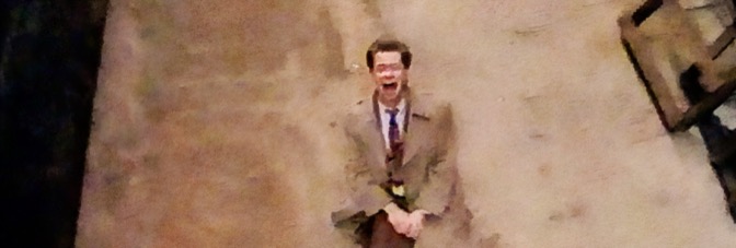
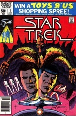
Tom DeFalco’s Trek script feels a little too generic. He doesn’t bring much personality to the principal cast members, saving it instead for Scotty and Uhura. She gives him a very clear bicep squeeze for support. It’s interesting.

    But Kirk just occasionally yells when he’s stressed out and Bones makes a quip or two at Spock’s expense. DeFalco doesn’t write Spock well. It’s probably hard to write the character after Star Trek: The Motion Picture as the character just went under a major change. DeFalco tries with it and does not succeed.

    Still, Michael Netzer does a great job on the pencils. He does lots of stuff with panel layout and with perspective in space. The Enterprise shooting while rotated and so on. The art is very imaginative. And Janson inks it beautifully. All the art’s good, some is better.

    DeFalco moves the issue well too; it’s just got problems.

    B- 

    CREDITS

    Tomorrow or Yesterday; writer, Tom DeFalco; penciller, Michael Netzer; inker, Klaus Janson; colorist, Carl Gafford; letterer, Ray Burzon; editor, Louise Jones; publisher, Marvel Comics.

  • Five Weapons 9 (June 2014)

    Five Weapons #9I've talked before about how Robinson constructs Five Weapons more as a deduction story than anything else. It's like Encyclopedia Brown, I think I said.

    Well, this issue Robinson has takes the big deduction reveal and wraps it around itself two or three times. There's Enrique's suspicion, his revelation, the truth and then how the truth affects everything else. Robinson has all three (or four) balls in the air at once, all of them working in conjunction.

    It's a fantastic reveal sequence and it takes up maybe a fourth of the issue. All talking heads, all Robinson looping the dialogue through itself in order to get to the big revelations and then what comes next.

    All of this stuff comes after Robinson resolves the previous cliffhanger and does some more work after it. The issue's tightly paced and moves beautifully.

    It's unbelievable Robinson can pull the cliffhanger off. He does.

    B+ 

    CREDITS

    Tyler’s Revenge, Part Four; writer, artist and letterer, Jimmie Robinson; colorist, Paul Little; editor, Laura Tavishati; publisher, Image Comics.

  • Stray Bullets 38 (May 2005)

    Stray Bullets #38Seriously? Seriously? Okay, so the bad guy who’s secretly gay and can’t accept it so he rapes other guys is named Huss. He’s the villain. I wonder why Lapham wanted to do this story arc. Bullets always had some kind of point, the way it revolved around a certain group of criminals. And then Virginia’s story too, of course.

    But Lapham has now set Virginia up as a superhero against this villain kid. There’s no attempt at understanding this kid, which is strange since Lapham was always sympathetic to the kid who shot up the first issue. One might have thought Bullets would be about him and Virginia.

    Instead of Virginia coming up against villains to defeat. Ones who are number one murder suspects who then just get away with it.

    I think the art is a little better than last issue but not by much.

    Lousy hard cliffhanger too.

    D 

    CREDITS

    Poppycock; writer, artist, and letterer, David Lapham; editors, Renee Miller and Maria Lapham; publisher, El Capitán Books.

  • Big Trouble in Little China 1 (June 2014)

    Big Trouble in Little China #1With John Carpenter breaking out the story with Eric Powell (who does the scripting), one has to wonder if Big Trouble the comic sequel is the same as a movie sequel would have been. Because it’s an odd opening, directly continuing the movie and then kind of going in reverse (to get protagonist Jack Burton back to Chinatown).

    For that course correction, the comic is amusing. Brian Churilla doesn’t have the realistic style for an adaptation but then it becomes clear Powell’s going to go out of his way to make Big Trouble a comic book and not an attempt at a movie. The humor, for instance, reminds of the film’s humor in content, but Powell and Churilla know how to make it fit the comic medium.

    The comic goes from mediocre to excellent in its well-paced twenty-some pages. It shouldn’t work, but it does and gloriously so.

    CREDITS

    The Hell of the Midnight Road & The Ghost of Storms, Part One; writers, John Carpenter and Eric Powell; artist, Brian Churilla; colorist, Michael Garland; letterer, Ed Dukeshire; editors, Alex Galer and Ian Brill; publisher, Boom! Studios.

  • 7x6x2 (2013, Paul Pope and Sridhar Reddy)

    If a viewer is unfamiliar with co-director Paul Pope–and his comic work–he or she might not be as disappointed with 7x6x2. The short would probably still be disappointing, just because it takes itself way too seriously and has no self-awareness about being a sci-fi short apparently shot where the old "Star Trek" filmed a bunch.

    But, if a viewer is familiar with Pope's comics work, he or she would be able to identify the composition and how close Pope's style matches in live action and illustration. Sadly, that composition doesn't carry over into any other directing skills–and it isn't just Pope, co-director Reddy's fault too. They can't direct the actors at all.

    Lead Joseph Aviel is bad; it doesn't help he gets poorly handled flashbacks, which just increases the bad. As his sidekick, Shawn Thomas is pretty good.

    Bad music from Ben Rubin doesn't help.

    7x6x2 isn't uncreative, just inept.

    1/3Not Recommended

    CREDITS

    Directed by Paul Pope and Sridhar Reddy; screenplay by Pope and Reddy, based on a graphic novel by Pope; director of photography, Jesse Green; edited by Stephane Dumonceau; music by Ben Rubin; production designer, Mike Conte; produced by Gary Krieg; released by Tribeca Digital Studios.

    Starring Joseph Aviel (Bryce) and Shawn Thomas (Swanson).


    RELATED

  • Star Trek 6 (September 1980)

    Star Trek #6
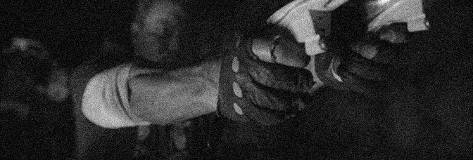
Barr gives the Enterprise crew a mystery to solve. Unfortunately, it’s almost the same mystery as one of the television episodes. It’s like Barr took out one part just to make it fit better in a comic.

    There’s an almost amusing scene for Sulu and Chekhov–the issue otherwise centers around the big three. Uhura never gets a scene. But it might be a more accurate representation of the television show. Barr clearly knows how to structure the issue like the show. That feat sometimes is more impressive than what’s going on in the story.

    Cockrum and Janson are really on the ball. Their faces have a lot more depth and have similar expressions to the source actors. Overall, the art just feels less rushed.

    I’m still waiting for a lengthy subplot or some sign of character developments. Even for a licensed property, Star Trek feels too restrained, practically stifled.

    B- 

    CREDITS

    The Enterprise Murder Case!; writer, Mike W. Barr; pencillers, Dave Cockrum and Klaus Janson; inker, Janson; colorist, Carl Gafford; letterer, Rick Parker; editor, Louise Jones; publisher, Marvel Comics.

  • C.O.W.L. 1 (May 2014)

    C.O.W.L. #1There’s something really neat about C.O.W.L.. Writers Kyle Higgins and Alex Siegel don’t mess around with the setting–it’s early sixties Chicago and there’s a unionized team of superheroes defending the city. But it’s less a superhero comic than a police procedural.

    For example, there’s not a lot of emphasis on explaining the characters’ powers. Artist Rod Reis does an awesome, probably digital paint thing, and his panels move fast. There’s no time to waste with exposition about who can do what. Higgins and Siegel seem happy to let the reader figure out the powers when needed, but just to fill pages.

    The issue jumps around a lot, from the costumed heroes to the plainclothes ones, and it all has to do with this one case. So there’s that procedural aspect.

    There are way too many balls in the air at the end of the issue, but it’s definitely impressive stuff.

    CREDITS

    Principles of Power, Chapter One: Motivation; writers, Kyle Higgins and Alec Siegel; artist, Rod Reis; letterer, Troy Peteri; editor, Andy Schmidt; publisher, Image Comics.

  • Stray Bullets 37 (March 2005)

    Stray Bullets #37Okay, so the high school arc is apparently all about Virginia going up against that kid who went insane because he had a gay encounter. Actually, it’s rather homophobic. Not just that event and the outcome, but the series overall. This issue has the guy raping another kid (another guy).

    Lapham’s nothing if he isn’t cheap. And vaguely homophobic. And really lazy on the art. It’s the worst art in the series ever.

    But he’s also got Virginia stirring the pot and investigating and it’s hard not to appreciate having her around. Even if all the high school stuff is idiotic and somehow getting worse. This Bullets arc is set in the early eighties so maybe you didn’t go to jail as a teenager if you murdered someone, which is the implication with the villain.

    And why does the comic now have (another) shallow villain? Because Lapham’s given up entirely.

    C 

    CREDITS

    Fiddlesticks; writer, artist, and letterer, David Lapham; editors, Renee Miller and Maria Lapham; publisher, El Capitán Books.

  • The Woods 2 (June 2014)

    The Woods #2Tynion loses a lot of momentum with all the characters. He’s got two things going on–he’s got the kids who went into the woods and he’s got the school. The school has kids and adults. He splits the issue into two and a half–the kids in the woods, the adults at the school, then less on the kids at the school.

    The school stuff is sociologically interesting. A nebbish principal letting a psychopath jock of a gym teacher pull the strings on him. It’s probably not going to go well, but it’s also very different than the kids in the woods who are encountering alien creatures.

    Actually, the issue doesn’t have enough alien creatures–they’ve stopped attacking the school for some reason.

    There are just too many characters moving around, especially with Dialynas not being so great on distinctive faces.

    It’s still working, it’s just not working smoothly.

    B 

    CREDITS

    Writer, James Tynion IV; artist, Michael Dialynas; colorist, Josan Gonzalez; letterer, Ed Dukeshire; editors, Jasmine Amiri and Eric Harburn; publisher, Boom! Studios.

  • Lake Consequence (1993, Rafael Eisenman)

    For a late night cable movie–how’s that description for a euphemism–Lake Consequence is shockingly okay. It runs ninety minutes (to facilitate more airings, undoubtedly) and it actually runs too long. The film’s at its best during the final third, when hunky tree trimmer Billy Zane has to get the bored housewife he’s been dallying around with (Joan Severance) back to her family.

    Actually, without the middle, where Severance gets sucked into Zane’s absurdly sensual lifestyle–which includes Hollie L. Hummel as Zane’s lady friend and a small California mountain town entirely populated by Chinese people–it might even be good. Why is this small town important? So there can be a parade and a bathhouse and truly some amazing editing.

    That sensual middle is a narrative waste of time and lengthy enough it plods, but between Harris Savides’s photography, the editing from James Gavin Bedford and Curtis Edge and George S. Clinton’s score, it’s wonderful filmmaking. Besides being too long, the problem–at least as far as how the narrative incorporates it–is the symbolism. Director Eisenman–and, to be fair, the script–goes overboard with the symbolism. Instead of Severance getting to act, she instead makes outlandish symbolic gestures.

    They’re way too much and they drag the movie down. Until she and Zane get on the road, anyway.

    Zane’s good in the mysterious romance novel stranger role, Severance is good, Hummel is terrible (so’s her part). Whip Hubley’s awful as Severance’s husband.

    Consequence is accomplished (with qualifications).

  • The Punisher 12 (March 2001)

    The Punisher #12Why is the only good scene in the issue–besides the apartment cast’s send-off, of course–when Soap meets the Punisher? The rest of the stuff with Soap is dumb, as are the other subplot resolutions, but there’s something about that scene. Maybe Ennis thinks of the reader as Soap, someone dumb enough to be amused even after a seagull tags you’re forehead.

    Because The Punisher is pointless. There’s no story for Frank, not since the first or second issue. There’s no story for the mobsters or the cops. The story for the apartment cast would be more amusing than this comic but only because Ennis actually worked on them.

    The series has had some very high points, but Ennis failed to follow through on anything. He introduced ideas, did some development, then forgot them.

    Even Dillon seems to have given up a little, especially with his figure drawing.

    D 

    CREDITS

    Go Frank Go; writer, Garth Ennis; penciller, Steve Dillon; inker, Jimmy Palmiotti; colorist, Chris Sotomayor; letterers, Richard Starkings and Wes Abbott; editors, Kelly Lamy, Stuart Moore and Nanci Dakesian; publisher, Marvel Comics.

  • Trees 1 (May 2014)

    Trees #1The Jason Howard art on Trees is probably going to be the best thing about it. While Warren Ellis definitely has an interesting idea–giant space aliens who don’t notice the human population and are apparently just gigantic columns (the titular Trees)–he does a roving eye thing with a lot of characters. Presumably they’ll be the cast.

    Except the ones in the pointless opening action scene. It gives Howard a chance to show off his range, like later when he’s got some Chinese village guy walking around some hippie walled off city. The comic’s set ten years after the invasion so it’s in the future and there’s some advanced robotics in the future.

    Robot dogs are goofy. Also goofy is the New York cops viciously killing the citizenry. They’re both tired tropes, just like Ellis following a mayoral candidate.

    But Howard brings a (much needed) distinct freshness to the comic.

    B- 

    CREDITS

    Writer, Warren Ellis; artist, Jason Howard; letterer, Fonografiks; publisher, Image Comics.

  • Nailbiter (2014) #2

    Nailbiter  2

    It’s hard to say when being self indulgent is the right movie. Even with a good writer–and Williamson is a good writer–it can go wrong. It goes wrong this issue of Nailbiter. Williamson spends way too much time on the interview with the famous serial killer and lets this guy overshadow the protagonist.

    The best scene in the issue is the protagonist and the sheriff talking over dinner. Even with some forced exposition into the famous serial killers of the town. Wait a second, A Voice in the Dark has a town full of serial killers too… maybe it’s going to be Image’s new thing instead of superheroes; serial killers.

    Anyway, there’s a showdown scene with the townspeople, which is a waste of pages except to foreshadow. Then there’s the issue’s villain meeting up with the secret big boss.

    The comic’s got good art, good scene writing, but it meanders.

  • Stray Bullets 36 (January 2005)

    Stray Bullets #36Some of Lapham’s problem is the lack of restraint. He’s let Bullets go all over the place, he’s let his art go to pot and he’s gone too far. Maybe he hyper-extended his narrative muscles too many times and they’re just damaged.

    This issue has Virginia bonding with her awful mother’s new boyfriend, who’s not a good boyfriend but isn’t a terrible guy. And there’s some stuff with her sister. If it had been the first in the “Virginia goes home” arc, it might have been a little better because some of it wouldn’t seem so forced, like the Leon references.

    Oh, right–Lapham does it all from Virginia’s diary. Just like he used to do when the comic was frequently fantastic. It hasn’t even been good lately and the return to the device seems a tad desperate.

    At least this time, Virginia carries the issue to moderate success.

    B- 

    CREDITS

    Monkey Business; writer, artist, and letterer, David Lapham; editors, Renee Miller and Maria Lapham; publisher, El Capitán Books.

  • Nailbiter #2It’s hard to say when being self indulgent is the right movie. Even with a good writer–and Williamson is a good writer–it can go wrong. It goes wrong this issue of Nailbiter. Williamson spends way too much time on the interview with the famous serial killer and lets this guy overshadow the protagonist.

    The best scene in the issue is the protagonist and the sheriff talking over dinner. Even with some forced exposition into the famous serial killers of the town. Wait a second, A Voice in the Dark has a town full of serial killers too… maybe it’s going to be Image’s new thing instead of superheroes; serial killers.

    Anyway, there’s a showdown scene with the townspeople, which is a waste of pages except to foreshadow. Then there’s the issue’s villain meeting up with the secret big boss.

    The comic’s got good art, good scene writing, but it meanders.

    B- 

    CREDITS

    Writer, Joshua Williamson; artist, Mike Henderson; colorist, Adam Guzowski; letterer, John J. Hill; editor, Rob Levin; publisher, Image Comics.

  • The Punisher 11 (February 2001)

    The Punisher #11Ennis continues with the goofy issues. The dialogue out of this one is hideous. Ennis is going for cheap one liners. It’s awful.

    But, hey, the detectives might have something to do next issue. Maybe for a minute or two. Though Ennis could have given them something to do this issue; instead he reminds the reader of their presence, which he’s been doing for the last few issues. Promising they’ll eventually pay off.

    Kind of like the other idiot vigilantes. It’s not good comic relief or anything else at this point. Ennis tries to rationalize the absurd way too much in this comic. He goes for humor in those rationalizations and it gets old fast.

    The supporting cast all get their page time this issue and Ennis continues to protect them.
    Like everything else, Ennis has no idea what to do with them but at least they are likable characters.

    C 

    CREDITS

    Any Which Way You Can; writer, Garth Ennis; penciller, Steve Dillon; inker, Jimmy Palmiotti; colorist, Chris Sotomayor; letterers, Richard Starkings and Wes Abbott; editors, Kelly Lamy, Stuart Moore and Nanci Dakesian; publisher, Marvel Comics.

  • Ms. Marvel 4 (July 2014)

    Ms. Marvel #4Well, this issue definitely delineates Wilson’s strengths when it comes to writing scenes. The opening where Kamala reveals her secret identity to Bruno is a fantastic, long scene. Wilson gets to do all the “I’m a superhero now” exposition and brainstorming about a costume amidst a sincere scene between two friends.

    Then there’s a comic ending to the whole thing when the cops show up.

    And the scenes with Kamala’s mom are good, even though it ends way too quick because Wilson has to move things along to the big action scene. The big action scene is where there are problems.

    Ms. Marvel fights little evil robots in a crappy beach house while trying to save a high school classmate. Why are their evil robots? Who cares, it’s a terrible idea. Wilson’s clearly having a problem finding her awesome protagonist superhero adventures.

    There’s a disconnect and the heroics feel forced.

    B 

    CREDITS

    Past Curfew; writer, G. Willow Wilson; artist, Adrian Alphona; colorist, Ian Henning; letterer, Joe Caramagna; editors, Devin Lewis and Sana Amanat; publisher, Marvel Comics.

  • Stray Bullets 35 (October 2004)

    Stray Bullets #35Lapham is really enjoying his high school arc. It’s not as violent anymore because of Virginia getting the cops involved with the brawl. Or so Leon, who’s around to explain everything to Virginia because she’s become a caricature, says.

    Leon and Virginia sit around and comment on the events in the issue, a jock-related love triangle. Because everyone reading Stray Bullets wants to read a misanthropic, X-rated version of “Friday Night Lights.” It should be better, for Lapham to take the traditional lionizing of high school athletes and show the realistic side of it but… it’s not. It’s terrible. It’s a dumb idea for a story and Lapham is incompetent at executing it.

    From the first couple pages, I could tell he was slacking on the art and I kept hoping he wouldn’t slack on the writing too. I kept waiting for a point. There isn’t any point.

    D- 

    CREDITS

    Bamboozled; writer, artist, and letterer, David Lapham; editors, Renee Miller and Maria Lapham; publisher, El Capitán Books.

  • Rover Red Charlie 6 (May 2014)

    Rover Red Charlie #6Garth Ennis just made me cry.

    Jerk.

    I’m not sure Red Rover Charlie has the most honest finish, but it has the finish the series needs. Ennis manages to reward the reader–which he definitely should, given the four dollar price tag per issue–and he does it with breaks. There are a whole lot of endings in this issue and Ennis keeps doing them through the rewarding ones to the somewhat profound ones.

    There are actually quite a few profound moments in the comic, both about animals, humans, the idea of pets and then the idea of nature itself. It’s actually a rather lovely comic.

    All the sentiments are difficult to balance out and it might be where Ennis has the most success. He’s very sure of himself and willing to risk going too far to make it work.

    Some very nice art from DiPascale too.

    Charlie’s an unexpectedly great series.

    A 

    CREDITS

    The Angel With His Darker Draught; writer, Garth Ennis; artist and colorist, Michael DiPascale; letterer, Kurt Hathaway; publisher, Avatar Press.

  • The Punisher 10 (January 2001)

    The Punisher #10An issue long fight scene with the Punisher mostly getting his butt kicked. Ennis goes for light, edgy humor from the Russian. Nothing too far, but some of the jokes are still smart.

    Then there are detectives Molly and Soap. They get a talking heads scene and then it’s off to the vigilantes teaming up. Unfortunately, Ennis doesn’t have anything for the detectives to talk about because they’re not doing anything anymore. They’re sitting around.

    The vigilantes are not sitting around, they are driving around. Ennis goes for a lot of humor with them. It’s the worst he’s done with the Elite one and Mr. Payback. This issue brings them down to the level of the priest. It’s really too bad.

    As for that big fight scene… it’s only the first round. There’s another round; hopefully Ennis will have mercy and cut to the best parts instead of plodding through.

    C 

    CREDITS

    Glutton for Punishment; writer, Garth Ennis; penciller, Steve Dillon; inker, Jimmy Palmiotti; colorist, Chris Sotomayor; letterers, Richard Starkings and Wes Abbott; editors, Kelly Lamy and Nanci Dakesian; publisher, Marvel Comics.