• Satellite Sam 10 (September 2014)

    Satellite Sam #10Just when I thought Fraction would never turn the series around, he delivers a fully fantastic issue. There’s no wasting time here, there’s no dawdling. At most he spends a few pages with the minor supporting cast, but it all turns out to be to prop up the main cast.

    And having Mike back as the lead helps immensely. Even though the supporting cast–Gene’s secret gets out, along with some other secrets–have their share of story this issue, Fraction is back to Mike on his investigation. He doesn’t discover much, though Fraction and Chaykin do an astounding explanation of women’s stockings, but the investigation (and its weight on him) brings Sam back around.

    Hopefully Fraction can maintain the pace–he’s spent a lot of time putting things in place without them paying off and now he’s showing his deliberate pacing was worth the wait.

    It’s amazing stuff again.

    A 

    CREDITS

    Keyhole and Welt; Shadow, Seam, Heel; writer, Matt Fraction; artist, Howard Chaykin; letterer, Ken Bruzenak; editor, Thomas K.; publisher, Image Comics.

  • C.O.W.L. 5 (September 2014)

    C.O.W.L. #5It’s a decent enough issue–with Reis doing a lengthy Sienkiewicz-inspired action sequence–but it’s a little light.

    C.O.W.L. is a hard-sell, which makes writers Higgins and Siegel’s accomplishments more significant, because it’s a comic book about a labor union and union politics and union negotiating. The superhero aspect of the comic doesn’t come into play much throughout the issue, with Higgins and Siegel saving it for the finale.

    But even then it has a lot to do with the union and its problems.

    Most of the art is highly stylized, but Reis never gets in the way of the story. He keeps the talking heads scenes visually interesting. Even with its problems, the issue is impressive. Higgins and Siegel find time for character scenes, they find time for conspiracies, they just don’t have enough A plot for the issue.

    Slightness aside, it’s still perfectly good stuff.

    CREDITS

    Principles of Power, Chapter Five: Sacrifice; writers, Kyle Higgins and Alec Siegel; artist, Rod Reis; letterer, Troy Peteri; editor, Andy Schmidt; publisher, Image Comics.

  • The Fez 2 (September 2013)

    The Fez #2The Fez is, unsurprisingly, a lot of fun. The longest story in the issue has the Fez helping exorcize the queen of England. It comes in the middle of the comic, after Langridge has done some smaller stories establishing the Fez as something of a buffoon. There's a great Twitter-related joke to show just how out of it the Fez can get; he's an invisible man, so who knows what kind of stresses he's under.

    But the Queen story moves fast and unexpectedly–The Fez is a very British comic, one of the most British things I've read from Langridge–and he doesn't slow down for the reader. The jokes get their own space, but Langridge doesn't make any extra.

    The final story has the Fez versus a bunch of his foes, in something of a Spirit homage. It works out too.

    It's just a solid little book from Langridge. Very pleasing.

    B 

    CREDITS

    Writer, artist and letterer, Roger Langridge; publisher, Hotel Fred Press.

  • After Hours (1985, Martin Scorsese)

    After Hours is meticulous. Director Scorsese, editor Thelma Schoonmaker and cinematographer Michael Ballhaus work with exacting precision throughout, with the first third of the film serving to prepare the viewer for the rest. The film follows boring, regular guy Griffin Dunne as he impetuously pursues an attractive mystery woman (Rosanna Arquette) in Soho in the middle of the night.

    Scorsese, Dunne and writer Joseph Minion never spend any time establishing Dunne beyond his office drone existence–the viewer comes to sympathize with him due to the strangeness of the events unfolding around him. And the events in the first third are strange in a far more reasonable way than later in the film. Dunne has to maintain sympathy even after he reveals himself to be shallow and callous.

    Also during the first third of the film, Scorsese uses a lot of obvious, repeated stylizing to force the viewer to pay attention. So many of the later coincidences and occurrences are fast and just in dialogue, the viewer has to be ready to grab them.

    Amid all the noise–After Hours moves very fast and often loud–there are quiet moments of startling humanity, both good and bad. It's a concentrated whirlwind.

    Fantastic supporting turns from John Heard, Teri Garr and, especially, Linda Fiorentino. As the ostensible love interest, Arquette manages to be a different person multiple times in a scene while still maintaining consistency. She's essential. Dunne's great.

    Scorsese's direction is often breathtaking, especially in how he makes Ballhaus's graceful camera movements unsettling.

    4/4★★★★

    CREDITS

    Directed by Martin Scorsese; written by Joseph Minion; director of photography, Michael Ballhaus; edited by Thelma Schoonmaker; music by Howard Shore; production designer, Jeffrey Townsend; produced by Amy Robinson, Griffin Dunne and Robert F. Colesberry; released by Warner Bros.

    Starring Griffin Dunne (Paul Hackett), Rosanna Arquette (Marcy), Verna Bloom (June), Tommy Chong (Pepe), Linda Fiorentino (Kiki Bridges), Teri Garr (Julie), John Heard (Tom), Cheech Marin (Neil), Catherine O’Hara (Gail), Dick Miller (Diner Waiter), Will Patton (Horst) and Robert Plunket (Street Pickup).


    RELATED

  • Pop 2 (September 2014)

    Pop #2
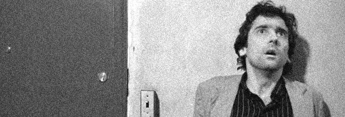
Copland's art would be enough to carry Pop; he has intricate panel composition–through a bunch of psychedelic sequences–but also a wonderful sense of movement for the rest. About the only thing he doesn't get to do this issue is talking heads scenes, since most of the issue's calm moments are internal. But the art is very impressive.

    And Pires's script has its impressive moments too. He just doesn't offer any character development on his protagonists. Everything and everyone acts on them, even though they're somewhat active–the guy takes the escaped from her gestation pod pop star into the woods to trip and try to sort things out–there's no movement for them.

    But the supporting cast gets a lot of attention, with Pires doing the bickering, punk assassins, their obsessive, hideous secret bosses, the lead's sidekick… it all works, especially when Pires does comic relief.

    He just doesn't mind his protagonists.

    B 

    CREDITS

    Pseudologia Fantastica; writer, Curt Pires; artist, Jason Copland; colorist, Pete Toms; letterer, Ryan Ferrier; editors, Roxy Polk, Aaron Walker and Dave Marshall; publisher, Dark Horse Comics.

  • The Wicked + The Divine 4 (September 2014)

    The Wicked + The Divine #4Well… let’s see… where to start–the issue is two and a half scenes. The first has our protagonist, the human girl detective investigating on Lucifer’s behalf, with her sidekick interviewing Baal. He’s evil but irresistible. Only it’s not really an interview scene, it’s to get the protagonist into see all the gods and ask them for help with Lucifer’s wrongful imprisonment.

    McKelvie makes a very interesting choice with the gods’ hangout chamber. It looks like Tron. Not a little like Tron, exactly like it. Only the protagonist is too young to make the reference.

    So then there is a lot of talking and a lot of banter from the various gods and none of it’s good. Gillen spends almost half the issue on exposition he could summarize in a paragraph.

    The second scene is the protagonist and Lucifer. It’s even slighter.

    It’s all about the gimmick, not the protagonist.

    B- 

    CREDITS

    Writer, Kieron Gillen; artist, Jamie McKelvie; colorist, Matthew Wilson; letterer, Clayton Cowles; editor, Chrissy Williams; publisher, Image Comics.

  • Velvet (2013) #7

    Velvet  7

    Leave it to Brubaker–my favorite issue of Velvet so far and she isn't even in her own comic. Instead, it's Brubaker chronicling the efforts of two guys working for the agency (and neither seem to be the corrupt faction out for Velvet) trying to find her.

    There's really good narration from the first guy, Colt, as Brubaker takes him through the first half of the comic. The guy's figuring out how Velvet's working, which is subtle at first but then gets more important. He's also surprised at himself–the character, not Brubaker–for missing the signs of Velvet being a master spy.

    The second guy is Colt's boss and he's also got a path to go on to figure things out. Brubaker never forces the narration, never does anything obvious. When the boss figures out Velvet's next step, it's a huge surprise for the reader.

    It's an outstanding issue. Brubaker nails it.

  • Manifest Destiny (2013) #10

    Manifest Destiny  10

    Dingess just can't stop with the cliffhanger problems. Manifest Destiny always has these fake cliffhangers, where Dingess is teasing what ever is going to happen next and it usually is a character's intention, not an outside event. It's an interesting narrative device, but Destiny isn't character driven. If it were, such cliffhangers might make sense.

    Most of the issue is good. There's a blowout between Lewis and his female assistant and it's pretty good stuff. Dingess definitely knows how to do the talking heads scenes to give them weight; they're nice and layered. Sadly, it comes right before a confusing montage. Roberts visually implies a mutiny, which doesn't correspond to the actual scene content at all.

    There's some good Sacajawea action, even though it's off-screen–Dingess can't seem to figure out what to do with her.

    But the series feels a little stuck… appropriate given the expedition is, quite literally, stuck.

  • The Man-Thing 8 (August 1974)

    The Man-Thing #8In some ways, this issue has Gerber's most predictable comics scene. Man-Thing and his arch-nemesis, Schist, duke it out in a laboratory where Man-Thing could regain his humanity and Schist could gain immortality. Sure, it's got Ploog artwork, but there's nothing special about it. Man-Thing's almost human again and Gerber can't think of anything to do with him except fight.

    Again, Ploog art, so it's a nice-looking fight, but it's just narratively goofy.

    Gerber opens the issue with an about-face in the cliffhanger resolution. Man-Thing goes straight back to the secret city, this time Schist and a sidekick following. Man-Thing's return to the city is the most impressive handling in the issue, with Gerber giving him a guide and so on. It just doesn't go anywhere. The character development on the guest stars, for example, is just filler before the fight scene.

    It's a pretty good issue… but not great.

    B 

    CREDITS

    The Gift of Death!; writer, Steve Gerber; artist, Mike Ploog; colorist, Petra Goldberg; letterer, Artie Simek; editor, Roy Thomas; publisher, Marvel Comics.

  • The Man-Thing 7 (July 1974)

    The Man-Thing #7Gerber only puts in a few pages of about Man-Thing's erstwhile human sidekicks, but it's all rather effective. It grounds the issue in reality, while elsewhere Gerber pulls even more out of it. Turns out Schist isn't just a bad guy industrialist, he's actually a bad guy industrialist looking for the fountain of youth.

    Unconnectedly, Man-Thing finds himself captured by a bunch of Spanish conquistadors and stumbles across said fountain and a lost city.

    The issue works thanks to Gerber's pacing and Ploog's art. The capture sequence is lengthy–and Man-Thing's attack on the city is somewhat inexplicable–but Gerber keeps everything busy enough he's able to sneak in a big moment towards the end. While there's a visual component, there's also how Gerber handles the familiar expository narration regarding Man-Thing.

    It's an excellent issue. Ploog doesn't get to draw much in terms of variety, but he excels at what he's given.

    A- 

    CREDITS

    The Old Die Young!; writer, Steve Gerber; artist, Mike Ploog; colorist, Glynis Wein; letterer, John Costanza; editor, Roy Thomas; publisher, Marvel Comics.

  • 100% 5 (July 2003)

    100% #5Wow.

    I remembered this issue being amazing, just because Pope has such a fantastic closing moment. But he's also got a lot going on throughout the issue with how he handles the narration.

    Daisy gets close third, close second, with Pope juxtaposing it against her gastro dancing. She hasn't been a mystery to this point, but she's definitely been closed off. Opening her up in narration comes at just the right time, same with Eloy getting close second person narration. Instead of the established characters getting narration–John and Kimberly–Pope flips it. He flips it and opens up the comic.

    Because 100% isn't about the future or the gastro dancing or the international boxing circuit or the hinted at world wars, it's about these people. And Pope figures out an amazing way to tell their story amid all the hubbub and noise. And he visualizes noise this time.

    It's peerless comics.

    A 

    CREDITS

    Writer and artist, Paul Pope; colorist, Lee Loughridge; letterer, John Workman; editors, Mariah Huehner and Shelly Bond; publisher, Vertigo.

  • 100% 4 (October 2002)

    100% #4Pope tries so much different stuff with this issue–he's got one scene in here where he seems to be homaging Charles Schulz. Everything he tries is successful; some of it is more wildly successful than the rest, but it all works.

    He has his cast set. He has lovers, John and Daisy; he's serious about them, she's not. He has potential lovers, Kim and Eloy–she won't compromise and he needs to decide whether or not he's going to compromise his artwork. Very little thing but Pope makes it hugely consequential, even as he skims over the future society details.

    Then there's Strel, who gets a bunch of pages again since her husband is back. The backstory is both confusing and not–Pope has a great way of getting in the exposition.

    He's also doing things with narration–flipping flopping who gets first and third–and ambitious panel pacing for scenes.

    It's brilliant stuff.

    A 

    CREDITS

    Writer and artist, Paul Pope; colorist, Lee Loughridge; letterer, John Workman; editors, Mariah Huehner and Shelly Bond; publisher, Vertigo.

  • The Field 4 (September 2014)

    The Field #4Well, it’s definitely a predictable ending because Brisson sets it up for two possibilities. I had been hoping for a third result, but no luck. Instead, The Field concludes more visually than anything else. Brisson gives Roy something to do, but it’s not much. If it weren’t for Roy’s ability to stretch the material… it wouldn’t work out as well.

    Nothing happens, of course, because Brisson goes with an all action finale. There’s no point to thinking too hard about the science–which I had sort of forgotten at the beginning exactly. Brisson deftly fills them in, then later on brings up the cultural ramifications of everyone living in Groundhog Day. And that idea is more potent than the series itself.

    So, not the best finish, but well-executed from both Brisson and Roy.

    It’s just too bad it doesn’t have more oomph. The protagonist is just too slightly rendered.

    B 

    CREDITS

    Writer and letterer, Ed Brisson; artist, Simon Roy; colorist, Simon Gough; publisher, Image Comics.

  • The Mummy (1932, Karl Freund)

    The Mummy is a strange horror movie. While there’s a definite villain–a monster–in Boris Karloff’s resurrected mummy, he poses a danger specifically to only one cast member–Zita Johann. She’s the reincarnation of his lost love and her exact importance to him isn’t clear until the last act. There’s a somewhat goofy moment where Edward Van Sloan, as Johann’s guardian and the closest thing to Karloff’s nemesis, reveals it all to David Manners (as Johann’s more appropriate suitor). Fortunately Van Sloan experiences the eureka moment just in time but not too early… otherwise the entire last act could have been avoided.

    And the last act is the payoff of The Mummy. There are some excellent sequences throughout and Karloff is fantastic, but the last act is where Johann gets to toggle between a reincarnated Egyptian priestess finding herself in the 20th century and her initial character. It’s less than fifteen minutes of the runtime, but it’s awesome stuff. There’s an abrupt ending to the picture, but it has gotten the job done.

    Van Sloan is reliable, Manners is likable–he and Johann’s initial flirtation scene is one of the film’s more successful ones between the couple. Arthur Byron is good as another Egyptologist.

    John L. Balderston’s script has a lot of fine moments too, especially for Byron, as he comes to terms with meeting a reincarnated mummy.

    As for Freund’s direction… it’s always good, but sometimes exceptional. Great editing from Milton Carruth too.

    The Mummy is lean and successful. Rather good stuff.

    3/4★★★

    CREDITS

    Directed by Karl Freund; screenplay by John L. Balderston, based on a story by Nina Wilcox Putnam and Richard Schayer; director of photography, Charles J. Stumar; edited by Milton Carruth; music by James Dietrich; produced by Carl Laemmle Jr.; released by Universal Pictures.

    Starring Boris Karloff (Imhotep), Zita Johann (Helen Grosvenor), David Manners (Frank Whemple), Arthur Byron (Sir Joseph Whemple), Edward Van Sloan (Docter Muller), Bramwell Fletcher (Ralph Norton), Noble Johnson (The Nubian), Kathryn Byron (Frau Muller), Leonard Mudie (Professor Pearson) and James Crane (The Pharaoh).


    RELATED

  • 100% 3 (October 2002)

    100% #3This issue has three things going on. First is the boxer who's Strel's ex-boyfriend. He gets a couple chapters–Pope splits 100% into chapters and there are a lot of them in this issue. Anyway, the boxer gets a couple chapters. They're mostly for mood and exposition.

    But then John and Daisy get to go on their date (after some flirtation earlier on) and John has managed to swipe Daisy's panties from work. Quite innocently, of course. Between this problem and Kimberly's date with Strel's cousin to get sushi, the comic feels like Love and Rockets. Not in the art, but in how Pope presents the little adventures of the cast.

    It's sort of meandering. There's a lot of personality and mood, but Pope's muted. And then, out of nowhere, he executes the exceptional sex scene and all of a sudden the issue's the best in the series.

    Just crazy good.

    A 

    CREDITS

    Writer and artist, Paul Pope; colorist, Lee Loughridge; letterer, John Workman; editors, Mariah Huehner and Shelly Bond; publisher, Vertigo.

  • Sirens 1 (September 2014)

    Sirens #1Sirens is a whole lot of work. George Pérez clearly had this series in mind for a while, considering it’s a sequel to some other long-running series in his imagination. He’s not introducing the cast of beautiful and empowered caricatures he calls Sirens, he’s reintroducing them.

    So there are a lot of characters, all of them in different times through history–not sure any of the time periods are particularly realistic. The Wild West one, where the schoolmarm is teaching the kids secular reads on religion themes? Not realistic.

    The art’s okay. Everything’s really busy and detailed and it’s a bunch of new characters so who cares.

    Pérez spends more time on the supporting casts–in terms of writing–in these various time periods, than he does on the lead characters. They’re supposed to be a surprise, sure, but they need some kind of depth. Even if it’s shallow.

    C 

    CREDITS

    From Time to Time; writer and artist, George Pérez; colorist, Leonardo Paciarotti; letterer, Ed Dukeshire; editors, Chris Rosa and Dafna Pleban; publisher, Boom! Studios.

  • Blue Devil 23 (April 1986)

    Blue Devil #3The issue's all action, which makes up for Alan Kupperberg and Bill Collins's artwork. The proportions are weird, even if Kupperberg's fight choreography and panel composition are generally okay. It's a forced crossover issue, with Blue Devil passing through Pittsburgh so of course he's going to get into the middle of a fight between Firestorm and his foes.

    Writers Gary Cohn and Dan Mishkin do a fairly good job for the visiting Firestorm readers. There are maybe three pages of regular Blue Devil stuff going on, all of them compelling and inviting enough to try to get those visitors back for the next issue. There's a big reveal for Blue Devil too and the writers are able to make it palatable to new readers.

    It's a fairly neat issue, all told; Firestorm gets almost as much to do as Blue Devil and their protracted conflict makes narrative sense.

    It's fine.

    B 

    CREDITS

    Caught in the Firestorm; writers, Gary Cohn and Dan Mishkin; penciller, Alan Kupperberg; inker, Bill Collins; colorist, Michele Wolfman; letterer, Albert DeGuzman; editor, Alan Gold; publisher, DC Comics.

  • Sons of Anarchy 13 (September 2014)

    Sons of Anarchy #13So much talking. And Couceiro does a great job with all that talking, but the issue consists of four or five conversations and one suggestive last page. I can't remember but it might be the first time Brisson's done a bridging issue on Sons of Anarchy. Maybe not, but certainly never so deliberate as this one.

    Worse, the principal conversation is recapping events the reader already knows about. Jax and the regular cast members have been guest starring in this arc, but here Brisson brings them up to a lead status… only there had to be a better way than the recap. The conversation just goes on and on.

    But, like I said, Couceiro's art is fantastic throughout and he does keep those conversations moving. And Brisson's dialogue is good, it's just too much build-up. The arc, which is definitely different, is now lagging.

    Brisson should wrap it fine though.

    CREDITS

    Writer, Ed Brisson; artist, Damian Couceiro; colorist, Michael Spicer; letterer, Ed Dukeshire; editor, Dafna Pleban; publisher, Boom! Studios.

  • 100% 2 (September 2002)

    100% #2Pope introduces a few new characters this issue, including a couple fairly substantial ones. He opens the issue on some guy who's calling Strel; she doesn't want to talk to him. Later on, Pope introduces Strel's cousin, who's interested in Kim. Kim doesn't exactly narrate her scenes–Pope uses close third person, which really brings the character into focus.

    For focusing on Strel, on the other hand, Pope uses her home-life. Strel in the club or even hanging out with Kimberly isn't as vibrant as her at home with her family.

    But this issue also has Daisy and John and their blossoming mutual interest. John's the other lead–narrating in the first person, explaining gastro dancing to the reader. There's a wonderful disconnect in John's queasy explanation and the beautiful Pope visualization.

    Pope plays the medium too–he's especially focused on sound. How to create sound in the comic book panel.

    It's awesome.

    A 

    CREDITS

    Writer and artist, Paul Pope; colorist, Lee Loughridge; letterer, John Workman; editors, Mariah Huehner and Shelly Bond; publisher, Vertigo.

  • MPH 3 (September 2014)

    MPH #3Will the real Mark Millar please stand up…

    After a couple relatively good issues, MPH starts to have some major problems. First and foremost, Millar has given up on characters for this issue. He has his protagonists robbing banks and sharing the takings with the people of Detroit, but the characters have no personalities. Oh, the one guy is jealous of the guy and the girl, but it’s very hard to care.

    Presumably, Millar thought he did enough character work in the previous two issues to establish the characters but he didn’t. The comic is written, very much, for the trade–and that trade is written, very much, to be sold to Hollywood. This issue is all events, all gags, all gimmicks. The ending is idiotic.

    Millar has a lot of ideas–and Fegredo does a fabulous job visualizing them–he just doesn’t have a story. He’s generating a property.

    C+ 

    CREDITS

    Writer, Mark Millar; artist, Duncan Fegredo; colorist and letterer, Peter Doherty; editors, Jennifer Lee and Nicole Boose; publisher, Image Comics.

  • The Fury of Firestorm, The Nuclear Man #46Joe Brozowski appears to be taking over as regular penciller. He does okay; he tries real hard with expressions, which don’t tend to work out with the regular people but it’s fine with the action scenes. He’s stuck with plotting out an action scene in an arena–a bunch of giant computers on loan from the Batcave.

    Conway plots some really odd action scenes in this series, really odd locations. It might be a natural side effect of having a flying superhero in stories more in the web-slinging superhero level.

    For instance, this issue has lots of character development for Ronnie and his father. They finally hash it out about a number of things, like Ronnie’s problems with his bully and the father’s fiancée. Though Conway still hasn’t made her likable and he does reduce Ronnie’s girlfriend to a non-speaking prop.

    It’s simultaneously too late while still ambitious.

    B- 

    CREDITS

    Deadly Prelude; writer, Gerry Conway; penciller, Joe Brozowski; inker, Mike Gustovich; colorist, Nansi Hoolahan; letterer, Carrie Spiegle; editor, Janice Race; publisher, DC Comics.

  • Ms. Marvel 8 (November 2014)

    Ms. Marvel #8Alphona is back on the art, which explains the awkwardness of the action scenes. Alphona goes crazy with the settings–this time an abandoned factory setting–and that detail distracts from the action. It's hard to discern foreground from background.

    But Alphona returning does make Kamala and company seem very familiar; it's only eight issues in and it feels a little retro.

    Kamala gains a friend in Lockjaw. Wilson might be using him too much as a comedy prop, but it's cute enough. The problem with the issue is the ending; everything up until the cliffhanger works out fine but the cliffhanger has Kamala's powers failing her in a crisis situation (a giant robot attacking her at school).

    Of course they're going to fail her at just that moment, when else would they? Powers always have to fail at the most dramatic moment otherwise the plotting would have to be more compelling.

    B 

    CREDITS

    Generation Why, Part One; writer, G. Willow Wilson; artist, Adrian Alphona; colorist, Ian Herring; letterer, Joe Caramagna; editors, Devin Lewis and Sana Amanat; publisher, Marvel Comics.

  • 100% 1 (August 2002)

    100% #1What's 100% about? It's about this club–the Cat Shack. One of the characters is a dancer there, another is a manager, another is a busboy, another is a prospective dancer. Writer and artist Paul Pope uses the club–which also has a dancer get murdered at the start of the story–as a central location; it's the embodiment of the setting. But Pope gets away from it enough throughout, it never feels forced.

    Maybe because the opening scene is away from it. Pope's panel composition and flow are so intricately executed, it would be no surprise if he made sure he kept away from the club just as carefully.

    The issue, which introduces the four main characters, has a couple narrators. One is busboy John, the other is dancer Kimberly. They don't intersect, except glancingly. Pope starts the characters deep, then just fills them out to show how deep.

    It's phenomenal work.

    A 

    CREDITS

    Writer and artist, Paul Pope; colorist, Lee Loughridge; letterer, John Workman; editors, Mariah Huehner and Shelly Bond; publisher, Vertigo.

  • Captain Victory and the Galactic Rangers 2 (September 2014)

    Captain Victory and the Galactic Rangers #2
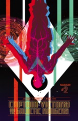
Casey goes with a four-way split on this issue of Captain Victory. There's the original spaceship, hunting down the Captain Victory clones who are off who knows where. Then there's the full-grown, yet battle damaged Captain Victory who doesn't remember anything exactly; he's getting in fights on a garbage planet. He's not particularly interesting and Casey doesn't give Fox a lot of great stuff to draw on his story.

    But then the stuff with the teenage Captain Victory on Earth in a bad neighborhood is awesome. Casey and Fox create this distinct look, where the kid–Victor–has a mentor, has friends, yet still has his goofy mission. It's nice stuff.

    The fourth part comes in between Captains Victory on their respective planets–it's the flashback. Michel Fiffe handles the art. It's a boring flashback to Captain Victory's bland space adventures.

    Even the garbage planet is better than dull flashbacks.

    It's okay stuff.

    CREDITS

    Writer, Joe Casey; artists, Nathan Fox and Michel Fiffe; colorist, Brad Simpson; letterer, Simon Bowland; editors, Molly Mahan, Hannah Elder and Joseph Rybandt; publisher, Dynamite Entertainment.

  • The Fury of Firestorm, The Nuclear Man #45It's funny, but George Tuska really brings the book around. He's just filling in, but Conway's got Multiplex (Firestorm's foe since the second issue of the original series) getting all the villains together–although Firestorm's rogues gallery doesn't have a clubhouse–to attack him. Or something.

    But it's a very Flash, very Spider-Man story and Tuska just brings that fun, Silver Age vibe to the book. The art isn't great–some of he and Mike Gustovich's faces are atrocious–but it's got a lot of energy to it. They bring the same energy to the civilian storyline, with Ronnie and Martin both having problems at school. Ronnie because his stepmother-to-be is suing Firestorm and Martin because his sexy dean has the hots for him.

    Conway's prudish portrayal of Martin–along with a chaste one of Ronnie and his girlfriend's relationship–is peculiar. He teases character development then doesn't deliver.

    Still, the Tuska energy gets it through.

    B- 

    CREDITS

    A Gathering of Hate!; writer, Gerry Conway; penciller, George Tuska; inker, Mike Gustovich; colorist, Nansi Hoolahan; letterer, Carrie Spiegle; editor, Janice Race; publisher, DC Comics.

  • Annihilator 1 (September 2014)

    Annihilator #1A Hollywood screenwriter discovers his creation has sort of come to life and he also has a brain tumor. The writer, not the creation.

    Grant Morrison has clearly seen Barton Fink and a bunch of other movies. What originality does he bring to the idea in Annihilator? Getting artist Frazer Irving to do a lot of sex scenes? Umm… Oh, Morrison's seen Lord of Illusions too, I think.

    Would Annihilator be better if it were Grant Morrison's movie reviews, with Irving illustrating? Probably. Morrison gives Irving L.A. or some other planet to draw. Irving's got a spared back style–he doesn't seem to want to work too hard on this one–and occasionally his figures remind of Corben. So the comic's interesting looking, even if none of the visuals are particularly impressive.

    The Fountain. Lots of it reminds of The Fountain too.

    Why read a knockoff when you can watch the original?

    C 

    CREDITS

    Writer, Grant Morrison; artist, Frazer Irving; letterer, Jared K. Fletcher; editors, Greg Tumbarello and Bob Schreck; publisher, Legendary Comics.

  • Lazarus (2013) #11

    Lazarus  11

    Not a torture issue, thank goodness; instead it's a Lazarus issue with a lot of well-done political intrigue. There's not a lot of fighting, but there are some stylized stand-offs. Lark can do talking heads, he can do stand-offs. The issue's the perfect medium grade Lark–he's not stretching, but he's surpassing all goals.

    Rucka gets to do political plotting related to the previous issue–the torture one–but also back to the first story arc. All of those awkward opening issues with too much melodrama have laid the groundwork for Rucka to get creative with his storytelling. His requirements are a lot different now.

    There's some good character stuff with Forever, which has been a long time coming. She's slowly becoming a worthwhile protagonist instead of just an interesting character.

    Lazarus has been on slow burn but it's starting to get downright reliable issue after issue. It's very solid work from Rucka.

  • Captives (1994, Angela Pope)

    Nearly seventy percent of Captives is a fantastic romantic drama. Julia Ormond is a newly divorced dentist who starts working part-time at a minimum security prison, where she begins a liaison with inmate Tim Roth. Frank Deasy's script concentrates primarily on Ormond and her experiences–with occasions scenes for Roth amongst the inmates, but that first seventy minutes of the film is from Ormond's perspective.

    Director Pope carefully, meticulously presents Ormond's story, from her experiences with her ex-husband, her friends, her family, herself. The romance with Roth is an otherworldly occurrence, much different from the noise and movement of Ormond's regular life. Most of their initial scenes–he's on a release program so he can attend college (the film establishes him as an okay guy real fast)–are in static environments. It's actually after that seventy minute mark, when Ormond disappears for a week of the present action and Roth becomes the protagonist, where Pope finally brings Roth into Ormond's motion-filled world.

    It's a terrible scene too; they're arguing on a busy roadway. The acting's great, but the scene's bad, because after the seventy minute mark, when Captives all of a sudden becomes a thriller and no longer a quiet mediation on class and marriage and other such things, the movie falls apart.

    Ormond's work here is indescribably fantastic. Roth's great and everything, but Ormond's performance is singular.

    Pope's direction is solid; good supporting turns from Keith Allen and Colin Salmon.

    Excellent photography from Remi Adefarasin.

    Captives misfires, Ormond and Roth do not.

  • Star Trek 13 (April 1981)

    Star Trek #13It's another high concept issue from Pasko. He's got McCoy meeting his estranged daughter for the first time in years–she's marrying a Vulcan (a much, much older one), he's got the Enterprise landing on The Planet of the Apes and how it plays out when the Klingons get there. Pasko plays a lot with the Apes thing, working in all sorts of genre stuff from outside. For a few pages, it all feels like a mystery, and for the last few pages, Pasko goes for difficult character work.

    In the meantime, there are also Klingons around causing trouble. These are post-The Motion Picture Klingons having a very television series encounter with the Enterprise crew. Pasko hits all the right notes.

    Unfortunately, Joe Brozowski, Tom Palmer and Marie Severin don't exactly knock it out of the park on the art. There's some detail, but it's more consistently messy than anything else.

    B+ 

    CREDITS

    All the Infinite Ways; writer, Martin Pasko; pencillers, Joe Brozowski, Tom Palmer and Diverse Hands; inkers, Palmer and Marie Severin; colorist, Carl Gafford; letterer, Joe Rosen; editor, Louise Jones; publisher, Marvel Comics.

  • The Fury of Firestorm, The Nuclear Man Annual 3 (November 1985)

    The Fury of Firestorm, The Nuclear Man Annual #3Akin and Garvey’s inks are a little better this issue. Not much, but a little. There are a lot of action sequences and most of them come off well, as does Firestorm’s trip to the sun. Martin has some theories about their powers and wants to investigate; for a moment, Firestorm feels like sci-fi and it works better for it. Conway’s engaged and imaginative.

    The main story of the issue, however, just gives Kayanan an excuse to draw elaborate fight sequences in Miami. They’re fine, they’re just pointless. Ronnie and Martin get involved because they see it on TV. And Conway wastes a lot of time setting up the characters for this pointless excursion.

    Well, it’s an annual so I guess it’s the special element to the issue.

    The rest–Martin’s going away party at work, Ronnie’s father’s awful girlfriend–is the regular series stuff; sadly, Conway short-changes them on page time.

    B- 

    CREDITS

    Sparx; writer, Gerry Conway; penciller, Rafael Kayanan; inkers, Ian Akin and Brian Garvey; colorist, Nansi Hoolahan; letterer, Duncan Andrews; editor, Janice Race; publisher, DC Comics.