• Stray Bullets: Killers 4 (June 2014)

    Stray Bullets: Killers #4It's all connected! It's all connected! And why shouldn't Virginia Applejack fall for the kid from the first issue of Killers once he's grown up? It makes everything so neat and tidy, even if Lapham does skip over the actual romance because it'd be too hard to establish it. And even if Lapham does turn the guy's mom into a shrill knock-off of Virginia's evil mom.

    There's still a lot of good stuff in the comic, maybe even some great stuff; the connections almost seem added later. Lapham really tries hard to make Killers, save Virginia, its own interconnected thing.

    Why?

    Because he still hasn't realized interconnected stories don't necessarily make something good.

    It's a fine issue, but more of what I expected from Killers than Lapham has been doing. Until now, the nostalgia has been subtle. Here, it's forced. It's still above average until the desperate third act.

    B 

    CREDITS

    Sorry; writer, artist and letterer, David Lapham; editors, Renee Miller and Maria Lapham; publisher, Image Comics.

  • Incognito (1997, John Badham)

    Despite trying to appear dark and serious, Incognito is actually a rather light outing. Sure, protagonist Jason Patric is something of a jerk, but he’s a lovable jerk. And he’s usually in the right.

    Patric is an art forger who reluctantly sets about creating a new Rembrandt. He’s working some very annoying people, played by Thomas Lockyer, Simon Chandler and Togo Igawa, but the money’s good and Patric also wants to tour Europe with his ailing father (Rod Steiger showing off he can still run away with a glorified cameo).

    Europe’s a big thing in Incognito. It almost feels like a continental adventure until Patric ends up stuck in England, though he’s got Irène Jacob as a love interest and she’s definitely not English. Patric and Jacob have a nice little arc together, which probably takes up twenty minutes–Jordan Katz’s script is smart enough to bring her in earlier so the viewer is already hoping she’ll come back. Like I said, Incognito is a light thriller. There’s a lot of humor eventually

    There’s also a lot of awesome montages involving art forging. Director Badham has some terrible crane shots in the film, but he does a good job for the most part. He makes England very exciting. It helps he’s got Patric and Jacob; they both do great work, even though she doesn’t have much of a character. Patric’s got more depth, but he brings it, not the script.

    Incognito works out rather nicely. It’s confident, measuredly ambitious and rewarding.

  • The Flash #296What’s strange about the feature is how much better Bates writes Elongated Man and Sue Dibney than he does Barry and the Flash. There’s a lot of charm to his characterizations of the Dibneys and it breathes a lot of life into the story.

    Of course, the story also has Carmine Infantino artwork and every page has one or two phenomenal panels; Infantino is able to turn anything the Flash does into a moment of comic gold, whether it’s a fight scene or just a costume change. It’s not just how much movement Infantino implies, it’s how he composes each panel to have a narrative flow to it.

    It also doesn’t hurt the story’s a genuine surprise with a great reveal.

    The Firestorm backup has Conway trying too hard to make the protagonist likable, but some ambitious artwork from Starlin. Rather unfortunately, the detail doesn’t live up to the composition.

    B 

    CREDITS

    The Man Who Was Cursed to the Bone!; writer, Cary Bates; penciller, Carmine Infantino; inker, Bob Smith; colorist, Gene D’Angelo. Firestorm, Rain, Rain, Go Away… Come to Kill Us Another Day!; writer, Gerry Conway; penciller, Jim Starlin; inker, Bob Wiacek; colorist, Jerry Serpe. Letterer, John Costanza; editor, Len Wein; publisher, DC Comics.

  • C.O.W.L. 2 (June 2014)

    C.O.W.L. #2This issue of C.O.W.L. doesn’t so much have scenes as it has snippets of scenes. The whole thing plays like a movie trailer for itself.
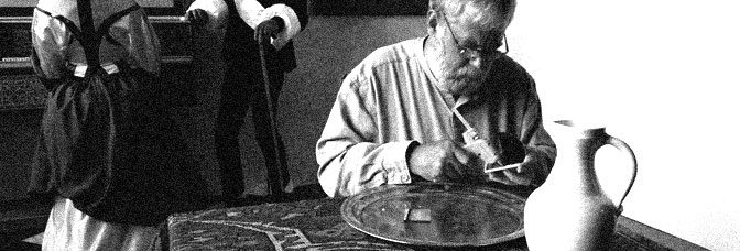
    Higgins and Siegel open with the two plainclothes guys dropping on of them’s kids off for school. The kid gives his dad crap for not having a costume. Think it comes back in a dramatic fashion? Big time.

    Then there’s some corruption stuff and some scheming stuff. All of these scenes hint at something ominous going on but ominous ongoings don’t make the story move. The characters should make the story move, only Higgins and Siegel barely let the characters breathe. The best scenes in the comic are the conversation scenes wiht the guy investigating the corruption. The political stuff is terrible.

    “The West Wing” it ain’t.

    Worse, the plainclothes guys stuff is bad because they don’t get enough time.

    Luckily, Reis’s art holds up.

    CREDITS

    Principles of Power, Chapter Two: Self-Deception; writers, Kyle Higgins and Alec Siegel; artist, Rod Reis; letterer, Troy Peteri; editor, Andy Schmidt; publisher, Image Comics.

  • Tim’s Vermeer (2013, Teller)

    Tim’s Vermeer is simultaneously an intensely personal look at a guy–the titular Tim, Tim Jenison–and also not an intensely personal look at him. Jenison sums up his hypothesis in the first few minutes of the film–what if Vermeer (and some of his contemporaries) were less hippy dippy artists (my term) and more inventors? They were using cutting edge technology to make what we now consider fine art, but at the time they were creating the form.

    The documentary, which barely runs seventy minutes, doesn’t really discuss any specific friction caused by Jenison’s venture. It mentions general friction at the idea, but I think I remember from art history classes the idea of Vermeer using science to accomplish his paintings. What Jenison does himself could be handled far more like Pierre Menard, Author of the Quixote, only director Teller and co-writer (and narrator) Penn Jillette don’t go that route. Because it’s not actually a personal look at the guy or even a questioning one about the cultural connotations of his experiment.

    The film has three sections–the introduction, the building of the set, then the painting. The de facto fourth section is the abbreviated reaction to the final product. The fourth section could be the whole picture. But the film’s not grandiosely ambitious, it just wants to show this guy’s experience. Only not too personally.

    Technically, Vermeer is decent. Teller has fine composition. Lousy editing from Patrick Sheffield though. Conrad Pope’s music is awesome.

    It’s cool stuff.

    3/4★★★

    CREDITS

    Directed by Teller; written by Penn Jillette and Teller; director of photography, Shane F. Kelly; edited by Patrick Sheffield; music by Conrad Pope; produced by Jillette and Farley Ziegler; released by Sony Pictures Classics.


    RELATED

  • The Comics Fondle Podcast – 1×14
    We’re coming up on our one year anniversary and we didn’t even notice it! This episode, Vernon and I talk about a lot of new comics. Not many rants, but we do start down some tangents. Give it a listen.

    WHERE TO LISTEN

    Apple Podcasts
    Spotify
    Stitcher
    RSS
  • The Man-Thing 3 (March 1974)

    The Man-Thing #3I almost want to cut this issue slack for the art; Jack Abel inking Val Mayerik is an interesting thing. Abel adds not just a lot of detail–to Man-Thing in particular–but comic expressions for most of the characters. Man-Thing all of a sudden seems to recognize its humor.

    And a good deal of the issue has Gerber dealing with his human civilian cast. While they aren’t the most engaging people ever, Gerber’s coming up with new situations for them and plotting these situations well. It’s like he can’t ever screw up too much because his storytelling instincts are strong.

    But then there’s Foolkiller, who makes his first appearance this issue. Gerber runs him through the issue, tying together all the subplots, but it’s all too obvious. The character feels way too artificial.

    The worst part of the issue might be the cliffhanger–because Gerber doesn’t make it a rewarding one.

    C 

    CREDITS

    Day of the Killer, Night of the Fool!; writer, Steve Gerber; penciller, Val Mayerik; inker, Jack Abel; colorist, Linda Lessmann; letterer, Jean Simek; editor, Roy Thomas; publisher, Marvel Comics.

  • The Private Eye 7 (19 June 2014)

    The Private Eye #7
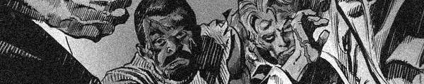
It’s a bridging issue. It’s got beautiful art, but it’s a bridging issue. Having a bridging issue on The Private Eye seems very strange because it’s self-published and digital and I’ve always assumed bridging issues were to meet some kind of publishing requirement or editorial mandate. Yet Vaughan does one here; maybe once you start doing them, you can’t stop.

    A few things happen, I suppose. The kidnapped girl is still kidnapped. The P.I. fires a gun for the first time. There’s a nonsensical pop culture reference. And then the chase sequence, action set piece.

    Like I said before, it’s beautiful. Martin does a great job with the chase scene in particular, just because he finally gets to let loose with something besides future design.

    But Vaughan has run out of cool things to do with the story. It’s a really light issue and the series can’t support it.

    B- 

    CREDITS

    Writer, Brian K. Vaughan; artist, Marcos Martin; colorist, Muntsa Vicente; publisher, Panel Syndicate.

  • The Flash #295Heck gets lazy on the strangest stuff for the feature in this issue. It’s not the super gorillas or all the different locations in Bates’s script… no, it’s the people. Whenever Heck is drawing a person, it just doesn’t work out. It’s like he spent all his time on everything else and rushed through the faces.

    The feature story has an odd structure too and it never quite recovers from it. Bates relies on deceiving the reader to get create drama at the end, but he also weighs down the front of the story. There are a couple lengthy action scenes as Grodd is brainwashing Flash and the good super gorilla; these scenes are quick and pointless and Bates gives them too much time.

    He just moves too fast through the story, which is too slight anyway.

    The Firestorm back-up has Conway suffering pacing problems too. And the art’s mediocre.

    C 

    CREDITS

    In Grodd We Trust; writer, Cary Bates; artist, Don Heck; colorist, Gene D’Angelo. Firestorm, By the Sea, By the Sea, By the Dangerous Sea; writer, Gerry Conway; penciller, Jim Starlin; inker, Bob Wiacek; colorist, Jerry Serpe. Letterer, Ben Oda; editor, Len Wein; publisher, DC Comics.

  • Ms. Marvel 5 (August 2014)

    Ms. Marvel #5It’s not often I’m reading a superhero comic and think, why don’t they just call the cops, but really… they should have just called the cops.

    There’s a kidnapped teenager and house full of deadly robots. You can call the cops on that one. They may just call the Avengers, but you can call the cops. Instead there’s a montage where Kamala trains to save the kidnapped teen. Wilson doesn’t specify how long it takes, but it seems like at least two or three days.

    During those two or three days, she’s grounded, which Wilson never talks about once quickly establishing it and the kid could be killed too.

    It’s lazy plotting. Wilson’s going for cool sequences instead of a solid plot. And the ending, featuring the reveal of the villain, is an awkward one. Either the villain’s goofy or just looks dumb.

    Still, it’s fine–Kamala’s a great protagonist.

    B 

    CREDITS

    Urban Legend; writer, G. Willow Wilson; artist, Adrian Alphona; colorist, Ian Henning; letterer, Joe Caramagna; editors, Devin Lewis and Sana Amanat; publisher, Marvel Comics.

  • The Man-Thing 2 (February 1974)

    The Man Thing #2One problem I can see Gerber having with Man-Thing is what to do on the regular issues, the ones where he has a somewhat ambitious narrative structure, but isn't doing anything fantastical. Gerber excels at the fantastical. This issue is not fantastical.

    The structure's kind of neat. Man-Thing saves a guy who runs into a girl in trouble while Schist is plotting against Man-Thing (though Gerber tries too hard on the humor of the big scheming scene) and then Man-Thing runs into the trouble the girl's running from (a biker gang). It all comes together at the end.

    Maybe if the guy, the protagonist for a lot of the issue, were a better character, it would work. Instead, he's a comical doofus; Gerber goes for jokes for his backstory without thinking them through.

    It's a dense issue, however, and Gerber's plotting is a success. Mayerik and Trapani keep it moving.

    B 

    CREDITS

    Nowhere to Go But Down!; writer, Steve Gerber; penciller, Val Mayerik; inker, Sal Trapani; colorist, Petra Goldberg; letterer, Jean Izzo; editor, Roy Thomas; publisher, Marvel Comics.

  • The Auteur 4 (June 2014)

    The Auteur #4What do you do when your last issue goes off the rails? Well, if you're Rick Spears and you're writing The Auteur you do something really odd.

    You pretend it never happened. Oh, there's some fallout–the producer protagonist, Rex, feels bad about the events in the previous issue, but Spears quickly moves him into a new activity. He's romancing his new leading lady–as part of the guilt, he's making romantic comedies now–only she's rejecting him so there's this hint of danger given Rex does know some serial killers.

    Well, one. Who used to be a main character in the comic, but Spears has apparently dismissed.

    There's a lot of irreverent humor and Spears moves the comic at a breakneck pace. Callahan is doing these tiny panels to try to get in all the information.

    Is it a successful issue? Definitely. Does it mean Spears has fixed the series? No idea.

    CREDITS

    Presidents Day, Part 4 of 5: The Martini; writer and letterer, Rick Spears; artist, James Callahan; colorist, Luigi Anderson; editor, Charlie Chu; publisher, Oni Press.

  • The Flash #294The super gorillas. I forgot about the super gorillas. If Bates likes writing anything more than strange applications of Flash’s powers, it’s got to be these super gorillas.

    But the super gorillas aren’t interesting to talk about, because it’s just the overdone dialogue and the gorillas talking about their intelligence. The Flash’s powers and their applications? At least in those scenes Bates is trying something. It’s a decidedly not visual way to express the powers. Artist Heck doesn’t do anything special with these scenes either. The feature story’s visually unimaginative.

    Luckily, Bates has a good plot. It’s multi-layered, it’s got a lot of neat plotting tricks. It works out well, even though Bates probably shouldn’t have started foreshadowing the cliffhanger so early in the book. Not so obviously.

    The Firestorm backup has terrible art from Jim Starlin and Bob Wiacek. It’s impossible to ignore it and the story suffers.

    B 

    CREDITS

    Fiend the World Forgot; writer, Cary Bates; artist, Don Heck; colorist, Gene D’Angelo. Firestorm, The Typhoon Is a Storm of the Soul; writer, Gerry Conway; penciller, Jim Starlin; inker, Bob Wiacek; colorist, Jerry Serpe. Letterer, John Costanza; editor, Len Wein; publisher, DC Comics.

  • Clockwork Angels 3 (June 2014)

    Clockwork Angels #3I don't know how it's possible, but somehow Anderson has sucked even more drama out of Clockwork Angels. I'm not a Rush aficionado, so I have no idea whether the source material is a song or album, but if it's a song, it's got to be a really boring one.

    This issue has the small town protagonist kid joining a circus and falling in love with the lovely tight rope walker. She doesn't return his affections because he's a weak character. This situation does not change throughout and it's not like the kid gets any better at the circus stuff. Instead, Anderson has revelations about the Clockmaker (or the Wizard of Oz) and finally gets around to showing the titular angels.

    Sadly, even though Robles's art is gorgeous, the scene with the angels is really boring. There's no flare, there's no visual emphasis, it's just another scene.

    Another boring one.

    C 

    CREDITS

    Writers, Neil Peart and Kevin J. Anderson; artist, Nick Robles; letterer, Ed Dukeshire; editors, Jasmine Amiri and Ian Brill; publisher, Boom! Studios.

  • The Man-Thing 1 (January 1974)

    The Man-Thing #1
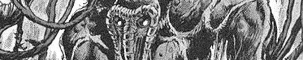
At one point during the issue, the editor–or writer Steve Gerber–apologizes for the visual madness in Gerber’s script. This apology is for the reader. But given all the insanity Gerber throws together, which ranges from superheroes, Howard the Duck, wizards, barbarians, politicians in big cars and then army guys–not to mention castles, swamps and cosmic walkways–one has to wonder how artist Val Mayerik felt about it.

    Ostensibly–and from the title, Man-Thing–this comic is about Man-Thing. But not really. Especially not since Gerber does a slight retcon on the character and removes its ability for maintaining thought. So, while the comic’s great and Gerber uses Man-Thing to good effect, it’s hard to say where he can take the comic.

    But it certainly seems like it’ll be somewhere great. Part of Gerber’s charm is his unexpectedness.

    It’s a brilliantly written comic book with these fantastic little moments. Gerber and Mayerik are awesome.

    A 

    CREDITS

    Battle for the Palace of the Gods!; writer, Steve Gerber; penciller, Val Mayerik; inker, Sal Trapani; colorist, Dave Hunt; letterer, John Costanza; editor, Roy Thomas; publisher, Marvel Comics.

  • Star Trek: The City on the Edge of Forever 1 (June 2014)

    Star Trek: Harlan Ellison's The City on the Edge of Forever: The Original Teleplay #1
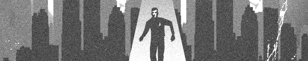
I guess I didn’t realize–or care–how much Harlan Ellison’s original teleplay for the classic “Star Trek” episode The City on the Edge of Forever got changed.

    From the first couple pages, it certainly seems like IDW is mounting an ambitious adaptation. Artist J.K. Woodward paints a mean Enterprise and writers Scott Tipton and David Tipton certainly set up the characters well. Not the principal cast, but the supporting characters.

    Then the regular crew shows up and the problems start showing. Woodward spends too much time on likenesses, while the Tiptons’ script doesn’t do enough with the characters. As a comic, City on the Edge of Forever is way too dedicated to the source material. Adapting the original script, while an interesting project, is somewhat short sighted. There have been thousands of “Star Trek” stories since… something in them might synthesize well.

    The coolest thing so far is Yeoman Rand’s inclusion.

    C 

    CREDITS

    Writers, Harlan Ellison, Scott Tipton and David Tipton; artist, J.K. Woodward; letterer, Neil Uyetake; editor, Chris Ryall; publisher, IDW Publishing.

  • The Flash #293Conway fills in on both stories–one where the Pied Piper comes up with a new plan to get rich, with Heck on art, and then the Firestorm team-up, with art from Perez and Rodin Rodriguez.

    The Firestorm team-up is goofy, with Conway not giving Perez much to draw, though I suppose there’s an interesting deep action scene with events happening in three places. Conway also seems to be writing it to bring regular Flash into the regular Firestorm backup, given the characters don’t really mesh, and it’s an odd perspective.

    The feature’s quite a bit of fun, however. Conway has a great time with the Flash figuring out the Pied Piper’s plan and then the plan itself. It’s sort of obvious, sort of not. There’s a lot of amusing dialogue too. It’s a shame the second story didn’t get any of these touches.

    It’s definitely a mixed bag.

    C+ 

    CREDITS

    The Pied Piper’s Paradox Peril!; artist, Don Heck; colorist, Gene D’Angelo; letterer, Gaspar Saladino. The Deadliest Man Alive!; pencillers, George Perez and Rodin Rodriguez; inker, Rodriguez; colorist, Jerry Serpe; letterer, Milt Snapinn. Writer, Gerry Conway; editor, Len Wein; publisher, DC Comics.

  • Dream Thief: Escape 1 (June 2014)

    Dream Thief: Escape #1You know, I’ve been talking about limited series spending too much time in their last issue setting up the sequel series but, dang, if Jai Nitz and Greg Smallwood don’t pull it off beautiful for Dream Thief: Escape.

    Even though this series directly continues the previous one, Nitz gets to revamp his whole approach to the setup. He’s already explained the whole mystical mask and the protagonist being a vehicle for justifiably angry ghosts seeking vengeance. It’s also letting him develop the protagonist better, since he’s got a sidekick and sidekick chit-chat is great for exposition.

    Most of the big action actually belongs to the protagonist’s father in a flashback. Doing the story of two dream thieves, one established, one establishing, is a nice touch too. Also, Nitz seems to enjoy doing eighties references and the flashback has a few good ones.

    The end reads fast, but otherwise, Escape’s excellent.

    B+ 

    Writer, Jai Nitz; artist and letterer, Greg Smallwood; editors, Everett Patterson and Patrick Thorpe; publisher, Dark Horse Comics.

  • The Mice Templar 6 (October 2008)

    The Mice Templar #6
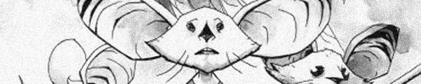
What an issue. In hindsight, it should have seemed unlikely Glass was going to be able to wrap anything up while setting up for the next Mice Templar series.

    He does not get much wrapped up. He does, however, introduce the new status quo for the series–Karic under the mentorship of Cassius, who does not like the lad one bit. And this relationship is where Glass is setting up the series for some interesting problems–Cassius doesn’t believe Karic is Neo, but the reader knows Karic is Neo thanks to the visions.

    There hasn’t really been any setup for hallucinations or visions, meaning Karic seeing the great owl god has to be taken at face value. Maybe. It’s hard to say, but it certainly seems likely.

    Glass also takes time to work with the coming villains in the capital. Those scenes are good.

    The issue’s just too busy without much impact.

    B 

    CREDITS

    The Prophecy, Part Six: The Symbol; writers, Michael Avon Oeming and Bryan J.L. Glass; artist, Oeming; colorist, Wil Quintana; letterer, James H. Glass; editors, Judy Glass and Will Swyer; publisher, Image Comics.

  • Eye of Newt 1 (June 2014)

    Eye of Newt #1
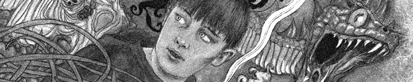
When I read a comic from Dark Horse called Eye of Newt, even if it’s set in olden times and has dragons and wizards and talking cats and cheap Gollum knockoffs, I expect one thing. I expect an Aliens tie-in.

    Just kidding.

    But some kind of tie-in to anything would have really helped the comic, which is clearly a labor of love for writer and artist Michael Hague. He draws some gorgeous dragons and wizard seals and so on. Not so great at the people, who seem way too two dimensional, or the scenery, which seems underdeveloped. But the dragons look great.

    And he loves the story of Newt, a wizard’s apprentice, who has problems on his way to becoming a real wizard and worries about pissing off his mentor.

    In other words, it’s every single young wizard story ever told just again. Worse, Hague’s style isn’t appropriate for comics.

    D 

    CREDITS

    Writer and artist, Michael Hague; letterer, Nate Piekos; editors, Ian Tucker and Daniel Chabon; publisher, Dark Horse Comics.

  • The Flash #292Bates sure does try hard to get the reader to pay attention. He has another sequence this issue where the Flash discovers some clue and Bates calls out the reader to try to figure it out too. There’s only one problem with it… Bates still writes the revelation scene like the reader didn’t figure it out. So if the reader has figured it out, he or she has wasted some engagement time.

    Engagement time–there’s no reward to figuring it out. It’s a DC no prize.

    The story itself is a neat one, with the Mirror Master outsmarting Barry for a while. Heck doesn’t do great on the art and Bates writes the new love interest real annoying… but the main plot works out well.

    The Firestorm backup is all action and lots of good Perez composition. He and Conway pack the limited pages. The pluses outweigh the lackluster finish.

    B 

    CREDITS

    Mirror, Mirror, Off The Wall…; writer, Cary Bates; artist, Don Heck; colorist, Gene D’Angelo; letterer, Milt Snapinn. Firestorm, The Hostages of Precinct 13!; writer, Gerry Conway; pencillers, George Perez and Bob Smith; inker, Smith; colorist, Lynne Gelfer; letterer, Ben Oda. Editor, Len Wein; publisher, DC Comics.

  • The Wicked + The Divine 1 (June 2014)

    The Wicked + The Divine #1I read a few scenes in The Wicked + The Divine too fast and got confused about whether Jamie McKelvie was drawing boys who look like girls or girls who look like boys. It’s the latter but, dang, was it confusing for a page or so.

    It’s a very high concept series, though old gods living among hipsters is the latest thing in comics. A teenage girl finds herself hanging out with these reincarnated gods and angels–writer Kieron Gillen is obviously enjoying having Lucifer as a character.

    But lots of time is wasted in the issue revealing this situation to the reader. Gillen uses a lot of music references, including what might be an ABBA one (oh, I hope so), and that approach does give the comic an in-joke feeling. When the reader gets it, the scene’s better.

    Slow start, excellent finish. Hopefully Gillen improves the formula going forward.

    B 

    CREDITS

    Writer, Kieron Gillen; artist, Jamie McKelvie; colorist, Matthew Wilson; letterer, Clayton Cowles; editor, Chrissy Williams; publisher, Image Comics.

  • The Mice Templar 5 (July 2008)

    The Mice Templar #5Once again, Glass gets a whole lot done in one issue.

    He opens with the captives, who have their own flashback–which relates to the story of Karic and Pilot (sort of). The captives get some closure, then it’s off to resolve the cliffhanger with Pilot under attack from a fellow Templar.

    Here’s where the issue gets confusing. While Karic stands in for the reader when discovering things, there’s so much new information–new information he can’t understand–Glass often leaves the reader spinning around to try to make sense of things. Karic doesn’t spin because he’s just a kid, which actually makes the reader spin more as Karic’s somewhat to read.

    But then Glass even has time to go back to the captives and introduce the capital city and its political intrigue into the issue. He even textures it with regular folk.

    Finally, the doozy cliffhanger wallops both Karic and the reader.

    A 

    CREDITS

    The Prophecy, Part Five: Truth Behind the Lies; writers, Michael Avon Oeming and Bryan J.L. Glass; artist, Oeming; colorist, Wil Quintana; letterer, James H. Glass; editors, Judy Glass and Will Swyer; publisher, Image Comics.

  • Empire of the Dead #5This issue, the last one of the “first act”–either to give Romero time to finish the script or Maleev time to get ahead on the art–starts out fairly well.

    The scientist, the zombie SWAT lady, the little kid, the scientist’s male friend (the gladiator wrangler), they all have a somewhat interesting sequence together. Romero starts to explore that intelligent zombie thing he’s been playing with for thirty or forty years.

    Then he flushes it to set up all the subplots for the next act. This issue reads more like the first issue of an arc (or series) than the last one in an arc. There’s no resolution because Romero knows he’s coming back. So he’s trying to keep the reader enthusiastic.

    But it all backfires because there’s no real content to it. And the pacing is terrible. And the vampire politicians are just a silly idea.

    Worse, Maleev’s downright lazy.

    C 

    CREDITS

    Writer, George A. Romero; artist, Alex Maleev; colorist, Matt Hollingsworth; letterer, Cory Petit; editors, Jake Thomas and Bill Rosemann; publisher, Marvel Comics.

  • The Flash #291Even though Bates comes up with a lot of excitement for the Flash this issue–and the reader too–there’s something off about the feature story. Bates and Heck (inking himself to questionable success) put Barry through a bunch of different types of action. There’s a couple regular fights, a supervillain fight, a mid-town disaster sequence with a helicopter getting shot out of the sky, plus all the stuff with Barry’s neighbor thinking he’s trying to kill her.

    But it’s almost too much. Bates gives up on any attempt at character development, save one scene with Barry’s neighbor (not the girl, but some dude), and the action goes so fast it’s hard to find any footing.

    It’s a darned interesting approach–giving the readers their money’s worth–but it’s messy.

    And then the Firestorm backup has a lot of character development, but it doesn’t leave Conway time to give Perez anything phenomenal to draw.

    B- 

    CREDITS

    The Sabretooth is a Very Deadly Beast!; writer, Cary Bates; artist, Don Heck; colorist, Gene D’Angelo; letterer, Milt Snapinn. Firestorm, The Hyena Laughs Last; writer, Gerry Conway; pencillers, George Perez and Bob Smith; inker, Smith; colorist, Lynne Gelfer; letterer, John Costanza. Editor, Len Wein; publisher, DC Comics.

  • Fatale 23 (June 2014)

    Fatale #23What a frustrating penultimate issue. It’s intentional on Brubaker’s part, but it doesn’t really matter because even though there’s almost no content to the issue–he reveals one big, deep dark defining secret of Jo’s, but it’s handled so matter-of-factly it doesn’t have much weight–even though there’s nothing to it, there’s Phillips’s art.

    I don’t think I’ve ever seen Phillips get to go so big on a collaboration with Brubaker, much less on Fatale, where he’s usually just been the perfect artist for the story but never the driving force of the comic.

    Phillips drives this issue with its cosmic lovemaking and its double page spreads. There’s nothing to the comic besides this wonderful art, the underdone reveal and then the cliffhanger. But those big pages of Phillips, where he gets to equalize the stars and people, those are wonderful and nothing else matters. Not even Brubaker slacking off big time.

    B 

    CREDITS

    Writer, Ed Brubaker; artist, Sean Phillips; colorist, Elizabeth Breitweiser; publisher, Image Comics.

  • E.T. the Extra-Terrestrial (1982, Steven Spielberg)

    For E.T., Spielberg takes an incredible approach–every scene has to be iconic, every scene has to create a sense of nostalgia for it. It requires absolute control of the viewer and Spielberg’s only able to accomplish that control thanks to John Williams’s score. Every note in the score–and its corresponding image on screen–is perfect.

    As a narrative, E.T. is a complicated proposition. It’s about a highly advanced alien stranded on Earth with no one to rely upon except a kid–Henry Thomas. E.T. must know Thomas isn’t the most able person to help him, but Thomas and his siblings (Robert MacNaughton and Drew Barrymore) are the best choices because of their sincerity. Or so one would think, because Spielberg and writer Melissa Mathison offer very little insight into what E.T. is thinking.

    Except beer is good.

    But there’s also no perspective on the federal agents investigating the alien landing. Spielberg goes with shots out of a “Twilight Zone” episode but as a way of avoiding the traditional science fiction approach to the story. It’s one of his few highly stylized moves in the film.

    Instead of stylization, Spielberg instead relies on that Williams score and Allen Daviau’s moody photography. Daviau makes the suburban setting either mundane and discreet or full of mystery and magic. The magic moments in E.T. are the most difficult but also the most successful.

    E.T. is patently unambitious as far as narrative metaphors go; Spielberg smartly eschews symbolism in favor of wonderment.

    4/4★★★★

    CREDITS

    Directed by Steven Spielberg; written by Melissa Mathison; director of photography, Allen Daviau; edited by Carol Littleton; music by John Williams; production designer, James D. Bissell; produced by Kathleen Kennedy and Spielberg; released by Universal Pictures.

    Starring Henry Thomas (Elliott), Robert MacNaughton (Michael), Drew Barrymore (Gertie), Dee Wallace (Mary), K.C. Martel (Greg), Sean Frye (Steve), C. Thomas Howell (Tyler) and Peter Coyote (Keys).


    RELATED

  • The Mice Templar 4 (April 2008)

    The Mice Templar #4Trippy might be the best word for this issue. There’s a lengthy hallucination, mystical sequence as the finale, but Glass is constantly spinning the reader around before it. Actually, having a dream sequence is the most straightforward thing he does this issue. Everything before is much less so.

    First, there’s the resolution to the previous issue’s cliffhanger. Maybe it was a test for young Karic, maybe it wasn’t. Then there’s Pilot (Obi-Wan or just Don Juan) taking him on practically a vision quest, or at least a vision hike, and it’s exceptionally confusing. Set to all the lectures and descriptions is Oeming’s fantastic nature art.

    Then comes the final twist (before the actual dream sequence) and it’s set during a fight scene between Pilot and another Templar, where maybe Pilot’s not who he’s says.

    Somehow Glass doesn’t just get away with it all, it gets better as it progresses.

    B+ 

    CREDITS

    The Prophecy, Part Four: The Readers of the Wheat; writers, Michael Avon Oeming and Bryan J.L. Glass; artist, Oeming; colorist, Wil Quintana; letterer, James H. Glass; editors, Judy Glass and Will Swyer; publisher, Image Comics.

  • Minimum Wage 6 (June 2014)

    Minimum Wage #6I’m not sure if there’s a better formula for Minimum Wage; Fingerman might have found it. It balances out all the content between humor, outlandish humor and self-observation. There’s some time spent on Rob’s love life, then a lengthy comedic subplot, then some stuff with his male friends. Not too much with them, but enough for the pop culture references (though Fingerman opens with a great one and it’s Rob and the girl) and manly one liners.

    This issue continues with two of Rob’s ladies–almost called him Bob, maybe because one has to wonder how much of Wage is non-fictionally inspired–with Deputy Deedee successfully transitioned into being Rob’s buddy’s girl. Instead, there’s an idyllic main girl plot with Sheila, Rob’s boss. But Fingerman keeps up the humor and character work to make the idyllic hilarious.

    There’s also a great homage to various artists Rob (and Fingerman) like.

    Wage is fantastic.

    CREDITS

    Writer and artist, Bob Fingerman; publisher, Image Comics.

  • The Flash #290The way Cary Bates writes The Flash, there’s nothing super-speed can’t accomplish. But it’s so darn likable, it’s hard to get stopped up by the severe gaps in logic. Maybe not gaps… canyons. Canyons in logic.

    This issue has the incredible story of a young woman believing Barry Allen is out to kill her. The Flash, understandably, doesn’t think she’s got it right so he decides to help her. Bates paces the story beautifully, with some opening exposition, then some action, then more exposition, then maybe more action (or exposition). It’s a full story, even though it’s not the full issue.

    Bates also has a nice way of working in the character development. He takes good shortcuts to get the girl established quickly.

    Decent enough art from Heck and Chiaramonte, especially considering the absurdity.

    Conway rushes the Firestorm origin recap a bit but the Perez pencils are absolutely gorgeous.

    B 

    CREDITS

    “Will You Believe Me When I’m Dead?”; writer, Cary Bates; penciller, Don Heck; inker, Frank Chiaramonte; colorist, Gene D’Angelo; letterer, Milt Snapinn. Firestorm, The Secret History of the Nuclear Man; writer, Gerry Conway; pencillers, George Perez and Bob Smith; inker, Smith; colorist, Jerry Serpe; letterer, Shelly Leferman. Editor, Len Wein; publisher, DC Comics.