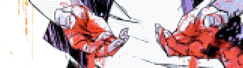
From the lengthy opening credits to the big action finale, it's always clear sound is important in The Getaway. Editor Robert L. Wolfe does some wonderful transitions with sound foreshadowing the cut and the next scene, but there's something more to it. That something more is the isolation theme running through the film–Steve McQueen starts in prison, surrounded by these loud, garish, yet hollow sounds. The action finale, at a nearly deserted hotel, also has loud, hollow sounds. They amplify Peckinpah's composition–particularly for the finish–and reinforce the film's dreamlike quality.
The Getaway is a few things at once. It's a heist picture, it's a revenge picture, it's a seventies relationship drama. That relationship aspect to it, with recently released from prison McQueen and wife Ali McGraw having some big problems, is the film's quietest plot line… if only because there's so much noise around it. But Peckinpah, McQueen, McGraw and screenwriter Walter Hill always keep it present. McGraw's timid, nervous performance works wonders–she's apparently inscrutable, but not really.
She and McQueen have fantastic chemistry, which they need to give their story more gravitas than Al Lettieri's subplot. Lettieri is a opportunist thief who kidnaps Sally Struthers and Jack Dodson in his pursuit of McQueen. Lettieri runs away with a bunch of the film. He's spellbinding; no other word for it. Struthers is rather good as well.
Technically, the film's a marvel. The Lucien Ballard photography is phenomenal, day or night, action or drama.
The Getaway is a fantastic motion picture.
 ★★★★
★★★★
CREDITS
Directed by Sam Peckinpah; screenplay by Walter Hill, based on the novel by Jim Thompson; director of photography, Lucien Ballard; edited by Robert L. Wolfe; music by Quincy Jones; produced by David Foster and Mitchell Brower; released by National General Pictures.
Starring Steve McQueen (Doc McCoy), Ali MacGraw (Carol McCoy), Ben Johnson (Jack Beynon), Al Lettieri (Rudy Butler), Slim Pickens (Cowboy), Richard Bright (The Thief), Jack Dodson (Harold Clinton), Dub Taylor (Laughlin), Bo Hopkins (Frank Jackson), Roy Jenson (Cully), John Bryson (The Accountant) and Sally Struthers (Fran Clinton).
RELATED

 I don’t know why Spears can get away with the end of The Auteur. I don’t want to think about it too hard either, just because the last issue of this arc (or the series, it’s unclear) is so entertaining and sincerely presented.
 I really hope Wimberly isn’t staying. He’s got a peculiar style and I gave it some slack last issue because it was different. This issue he’s doing superhero action and a lot of dialogue humor and it flops. Over and over, it flops.
 The issue opens with the Hyena hunting a bunny rabbit; Broderick and Rodriguez do a great job on the bunny rabbit, but it looks like there are some problems with the Hyena. So the issue starts right off with some questionable art and then it just gets worse.
 Groo vs. Conan. Even the title takes a moment to digest.
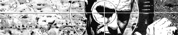
 Good grief–Ennis end the comic with a big Dubya is an alcoholic moron joke right before 9/11. Did they change the reveal for the trade?
 New artist Jacob Wyatt comes in just in time for Wilson to find–or find again–Ms. Marvel’s awesome.
 I wonder if Conway was playing with the idea of doing an anti-climatic story. Both Firestorm and Ronnie have muted outcomes to big events–Firestorm’s rematch with Typhoon and then Ronnie’s first fight with his classmate antagonist, Cliff. Neither have much visual payoff. The Typhoon fight does get a big lead-in with a flooding New York City, however.
 Someone, either at IDW or Walt Simonson himself, is doing everyone the great disservice of suggesting Ragnarök is some kind of Thor rip-off IDW is doing just because the character is a Norse god and in the public domain.
 Ennis has lost track of any real person–by real person, I mean the bartender from the first couple issues or maybe one of Soap’s cop antagonists–and he’s back to having a jolly old time. Lots and lots of pop culture references. Some day you’ll need footnotes to understand all the references and then further footnotes to explain why they’re funny.
 The second issue of Wildfire ties back to the beginning of the first issue–Los Angeles aflame. This issue explains more about how it happens, with Hawkins even taking the time to cut to the fire starting. He doesn’t really need to make the cut–he spends the rest of the issue establishing the characters, including newscasters who could cover it.

 Jerome Moore fills in on the pencils this issue; Conway gives him a lot to do. There’s the superhero stuff, which is mostly filler at the beginning–with a big action set piece, sort of unimaginably big, at the end. Moore handles it well. He also handles to high school drama pretty well too, though he does draw the characters a tad too old.
 It’s the Punisher on an island of dumb mercenaries. Or the next issue will be–and Ennis even goes so far as to promise it’ll be a good one for the soft cliffhanger. Actually, this issue is mostly exposition.
 I’m not sure if I’d say Black Market has a charm to it. Writer Frank J. Barbiere does have a big twist at the end, but he’s telling the story in two time periods a few months apart. Having a good twist and being able to do something with it for the rest of the series are two different things.
 For his debut as writer and editor, Conway turns in the weakest Firestorm script to date. Worse, Broderick and Rodriguez are really off with the art too. There’s a lot with Ronnie and his father being held hostage–the issue’s way too contrived as far as plotting–and Broderick flops on drawing regular people here.
 The last few pages are mostly text. It’s decent text, so Gillen can kind of get away with the hard cliffhanger and not actually have to do much. He doesn’t really do much in this issue all together, except write really good characters. He has his protagonist discovering the whole returned god thing as she goes along, which is great since the reader’s doing the same thing. It’s not heavy lifting.


 More funny stuff from Ennis. He’s got some cheap jokes but he sure does thoughtfully arrange them. He’s even for a bunch of Marvel puns in the comic–referencing Giant-Size Man-Thing and Marvel Team-Up, though he could have gone further with the pun about the latter.
 I thought this issue might just be okay–good, but not startling. Then Brisson does a big double ante finish with a surprise or two. He foreshadows them both, but discreetly enough they aren’t predictable. He’s got a loose focus on the cast this issue–the regular Anarchy club members are practically guest stars–and it lets him get away with a lot.
 The first two-thirds of this issue is rather good. Conway resolves the cliffhanger–Firestorm versus the Pied Piper–and has time to work the romance between Firestorm and frequent supervillain victim Lorraine Reilly before developing the friendship between Ronnie and Professor Stein. It leads into further character development and then it's Firestorm time again.
 Well, this issue is sure disappointing. It’s basically a montage sequence of the other princesses bring crappy to Princess Ülga. Naifeh could have gotten the same effect with about half the teasing and then an actual story for the rest of the issue. Instead, the soft cliffhanger implies next issue is when there’s actual character development.
 Garth Ennis takes a rather strange approach to this issue–and presumably this Punisher series. He does it as a comedy. There are levels of mocking, with the Punisher getting the least and Soap getting the most. There are some actual criminals in there and their stupidity gets mocked, but they’re at least aware. Soap isn’t even aware.
 If I had to describe artist John Bivens's style, I'd say Paul Pope meets Frank Frazetta–warrior women versus dinosaurs with a lot of lines. Unfortunately, Bivens has no narrative storytelling chops so it's one static panel after another. I don't think I've ever read such a boring fight scene involving a dinosaur and a cavewoman.
 Conway appears to have a formula for two-part stories. He opens with some action for Firestorm, then moves into the personal drama of Ronnie and Martin while working the villain subplot. Then Firestorm gets together, so to speak, and encounters the villain just in time for a cliffhanger.
 Ben Templesmith has a fairly interesting setting for Squidder. Imagine Cthulhu does come to the world, what happens when people fight back through technology and modern (or futuristic) warfare. It’s post-apocalyptic but after an inter-dimensional demon invasion. Why only fairly interesting? Because besides the vocabulary and details, it’s not much different than The Road Warrior.
 A couple quick observations. The first I should have made a long time ago–I wonder if having templar in the title and it being the name of famous knights affects people’s initial impression of Mice Templar. I see it as being a dismissive thing and, after reading Glass’s amazing success here… no one should be dismissing this comic.