• Wild’s End 1 (September 2014)

    Wild's End #1Wild’s End is supposed to be The War of the Worlds meets The Wind in the Willows. Only Dan Abnett’s approach to the quaint British townsfolk isn’t Willows, it’s a bad BBC show. There’s the sexy bruiser, there are the closeted elected officials, there are the annoying townsfolk. It’s dumb.

    But End has some more problems. I.N.J. Culbard’s art isn’t anywhere near detailed enough or stylistic enough. The animal (properly attired, of course) cast is boring to look at. Culbard has no personality to the animals. Sure, doing anthropomorphized characters well probably isn’t easy but Culbard doesn’t even seem to be trying.

    Some of the problem seems to be the lack of seriousness with End. Willows has, in recent years, become recognized as a work of literature and Worlds certainly has a solid reputation. Abnett and Culbard seem to be cashing in for a possible cheap CGI movie deal.

    Boo.

    D 

    CREDITS

    The Village Fete; writer, Dan Abnett; artist and letterer, I.N.J. Culbard; editors, Cameron Chittock and Dafna Pleban; publisher, Boom! Studios.

  • Hulk / Wolverine: Six Hours 4 (May 2003)

    Hulk / Wolverine: Six Hours #4Bickering. Jones concludes the series with Bruce and Logan bickering. Why are they bickering? Because Wolverine first appeared in a Hulk comic and Jones is trying to tie into their long history together? Who knows–Wolverine sure isn’t remembered for his Hulk appearance.

    The resolution is tightly paced, with Jones first using humor to get through Wolverine’s fight with the Shredder. The Shredder proves disposable–a distraction from the main event of the issue, Wolverine versus the Hulk. Even the resolution to the plane crash takes a backseat to the fight.

    And Kolins draws a visceral yet still amusing fight between the two. The Hulk’s foaming at the mouth at one point; Jones wisely doesn’t try for an intelligent Hulk or even a sensible one. It’s just the fight the comic has been promising since the first issue.

    It’s jokey, oddly pleasant while still maintaining some toughness. Jones isn’t going for deep.

    B 

    CREDITS

    Writer, Bruce Jones; artist, Scott Kolins; colorist, Lee Loughridge; letterer, Dave Sharpe; editor, John Miesegaes; publisher, Marvel Comics.

  • Hawkeye 20 (November 2014)

    Hawkeye #20What do the Kate Bishop Hawkeye comics read like if you haven’t seen The Last Goodbye?

    Fraction wraps up Kate’s trip to Los Angeles with one of his fractured (Fraction fractures, get it? Oh, never mind) narratives–the beginning is actually a midpoint and the ending is a reference to the beginning. But it’s a finite fractured narrative and it works. He doesn’t go too far with it.

    He’s always been better with Kate on the book, probably because the reader is going to identify with her read of Clint Barton as a tool. Fraction writes him as a tool after all.

    There’s a lot of humor, a lot of black humor, the occasional creepy moment and some great Kate narration. Fraction doesn’t do a lot of resolution for the L.A. outing, however, which would have been nice.

    Wu’s art is great.

    It gets laggy but it works out swell.

    A- 

    CREDITS

    Writer, Matt Fraction; artist, Annie Wu; colorist, Matt Hollingsworth; letterer, Chris Eliopoulos; editors, Devin Lewis and Sana Amanat; publisher, Marvel Comics.

  • The Fury of Firestorm, The Nuclear Man #44It’s Conway’s most ambitious issue in a long time. The first third of the issue is Firestorm versus a natural disaster–a freak tornado in Pittsburgh. Of course, Typhoon is creating the tornado to draw Firestorm out, but Firestorm doesn’t know it. Conway does a lot with the narration and the trying to use it to pace the scenes.

    It doesn’t work, but it’s ambitious. Maybe if the art were better. Machlan’s inks are a mess this issue. They’re better in the superhero part, but still a mess.

    The second part of the issue is Ronnie and Martin’s adventures at school. It’s just a regular day–they’re worried they can’t turn back into Firestorm but it’s barely a plot point. It’s all character development; if it weren’t for the dumb high school nemesis, it might work out.

    Meanwhile, there’s the villain storyline, which Conway also handles ambitiously.

    It’s decent enough.

    B- 

    CREDITS

    An East Wind Blowing; writer, Gerry Conway; penciller, Rafael Kayanan; inker, Mike Machlan; colorist, Nansi Hoolahan; letterer, Carrie Spiegle; editor, Janice Race; publisher, DC Comics.

  • Prophet: Strikefile 1 (September 2014)

    Prophet: Strikefile #1Prophet: Strikefile, after the entire relaunched series, explains a lot of what's been going on in the comic. The writers of Prophet always let in little details about the universe, without ever doing full exposition. Strikefile simultaneously has that full exposition, but writers Simon Roy and Brandon Graham still tell it in a reserved manner. They still rely on the art to subtly infer, for example.

    The issue has a lot of different artists, most of them regular artists from the series, so they know how to compose an informative Prophet page.

    Roy's opening history of the universe–with Grim Wilkins on art–is so dense, the subsequent pages covering various Prophet people, places and things is all gravy.

    In their exposition, Roy and Graham maintain a somewhat playful attitude; it's like they know Strikefile is extraneous but they still want to have fun with it.

    And, while entirely superfluous, it succeeds.

    B+ 

    CREDITS

    Writers, Simon Roy and Brandon Graham; artists, Roy, Grim Wilkins, Graham, Sandra Lanz,Matt Sheehan, Malachi Ward, Bayard Baudoin, Onta, Giannis Milonogiannis, Joseph Bergin III, Ron Ackins and Tom Parkinson-Morgan; colorists, Sheehan, Ward and Amy Clare; letterer, Ed Brisson; publisher, Image Comics.

  • Copperhead (2014) #1

    Ch01

    Copperhead is a Western. It has sci-fi and some elements of police procedural, but it’s a Western. It opens with a new sheriff coming to town on a train and having an unhelpful deputy. It’s a Western.

    And it’s a darned good one.

    Writer Jay Faerber operates with a “people is people” mentality. Even though the sheriff is human, her deputy and many (or most) of the townspeople are not. Undoubtedly, Faerber will explore the different alien races, but their personalities are what’s strongest now. So while artist Scott Godlewski draws all manner of aliens–cute, scary, in-between–Faerber’s writing defines them.

    Well, and Godlewski’s great attention to expression.

    Faerber gets a lot done, giving the sheriff a nemesis and a couple cases. She’s also got a kid who just can’t help being helpful. Again, very Western.

    I wasn’t expecting anything from Copperhead but it’s an awesome comic.

  • Hulk / Wolverine: Six Hours 3 (April 2003)

    Hulk / Wolverine: Six Hours #3Jones maintains a great pace through Six Hours. He’s got his four plot lines going–Bruce and Logan, the villain (the Shredder, because apparently Eastman and Laird don’t know how to copyright), the captive pilot and the missing boy’s parents back in Florida. It moves really well; Jones doesn’t cover a lot of time, but he does spend just the right amount on each characters’ experiences.

    Unfortunately, he also has some really goofy dialogue. And Bruce and Logan barely have anything to do in the comic. They bicker a lot. Jones isn’t big on character development and he’s even less inclined to spend any time developing his two leads. The cliffhanger, with Bruce and Logan versus the Shredder (or at least the first attack), is just silly.

    Dialogue aside, it’s also silly because it’s a big action set piece on a tranquil lake. Kolins does fine on art, lake and all.

    B- 

    CREDITS

    Writer, Bruce Jones; artist, Scott Kolins; colorist, Lee Loughridge; letterer, Dave Sharpe; editor, John Miesegaes; publisher, Marvel Comics.

  • Uncle Tom’s Bungalow (1937, Tex Avery)

    Uncle Tom's Bungalow manages to be both appallingly racist and a little progressive. Director Avery turning the slave trader into the devil, poking a little fun at the angelic white girl, general mocking of Southern cultural all around….

    But Bungalow just isn't a good cartoon. Ben Harrison's script–with Tedd Pierce obnoxiously narrating–doesn't even include a bungalow. It's just for the title. The first two or three minutes is setting up the characters and setting up the characters is the cartoon being both racist (with the black characters) and condescending (of the Southerners). The wrap-up even has the cartoon taking inexplicable pot shots at social security, which make it more significant historically than anything else about it.

    The gags are trite and predictable. The slave trader turning into a snake and getting electrocuted felt way too familiar.

    I kept expecting it to be worse, but it could never be any better.

    1/3Not Recommended

    CREDITS

    Directed by Tex Avery; written by Ben Harrison; animated by Virgil Ross and Sidney Sutherland; edited by Treg Brown; music by Carl W. Stalling; produced by Leon Schlesinger; released by Warner Bros.

    Starring Tex Avery (Uncle Tom), Mel Blanc (Hound), Billy Bletcher (Simon Simon Legree), Bernice Hansen (Little Eva) and Lillian Randolph (Topsy / Eliza); narrated by Tedd Pierce.


    RELATED

  • The Fury of Firestorm, The Nuclear Man #43What is it about Kayanan? Why does he never gets the right inker on Firestorm? Mike Machlan is better than the last couple guys, but still not great. For a lot of the pages, Kayanan seems to avoid a lot of close-ups because Machlan butchers the faces.

    The story has Ronnie and Martin at college, with Ronnie adjusting to college freshman life and Martin's thought balloons covering his unease as a new professor. He doesn't really get a story, however. And Conway gives Ronnie too much. Between football tryouts, which Kayanan doesn't break out well, his girlfriend and his high school nemesis plotting his downfall… it's too much. What's really bad is how ineffectual the girlfriend is as a character; Conway basically reinvents her every seven issues.

    The other plot–villain Typhoon's return–as awkward. Conway wants him to be both dangerous and sympathetic, but goes to far in the first direction.

    B- 

    CREDITS

    Night of Tears, Sky of Sorrow; writer, Gerry Conway; penciller, Rafael Kayanan; inker, Mike Machlan; colorist, Nansi Hoolahan; letterer, Carrie Spiegle; editor, Janice Race; publisher, DC Comics.

  • Prometheus: Fire and Stone 1 (September 2014)

    Prometheus: Fire and Stone #1Maybe doing a sequel to an in name only movie franchise isn’t a good idea. Because Paul Tobin’s script for Prometheus doesn’t have much to do with the movie. Anything yet, actually. Except the planet. It’s actually a sequel to Aliens, the movie, not the comics (near as I can tell).

    Tobin sends a group of varied scientists and military personnel and some other things–no warrant officers so far–to the planet. Someone’s investigating the death of Guy Pearce from the movie but it’s set 130 years later or something because no bumping into the unmade but planned Prometheus sequel.

    It’s predictable alien planet exploring. I’ll bet there’s some stuff with the goop and, hey, look, a ship of aliens from Aliens. I’m shocked.

    Juan Ferreya is way too gentle for the art too.

    Tobin’s script is boring and forced from the first page. Fire and Stone sinks fast.

    D 

    CREDITS

    Writer, Paul Tobin; artist, Juan Ferreyra; letterer, Nate Piekos; editors, Ian Tucker and Daniel Chabon; publisher, Dark Horse Comics.

  • Hulk / Wolverine: Six Hours 2 (March 2003)

    Hulk / Wolverine: 6 Hours #2
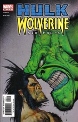
Kolins goes more into detail this issue than he did in the first. The exterior Canadian mountains are precise and intense; it makes Six Hours a distinct-looking comic, even when Kolins occasionally has problems. He doesn’t deal with movement particularly well.

    The story is reasonably successful, although Jones introduces an absurd villain and gives him crappy dialogue. Kolins runs with the art on the guy, who wears a hood and has an extended arm with claws on it. No doubt he’ll get into it with Wolverine one of these issues.

    And Wolvering finally gets to come into the issue, but he and Bruce Banner are just around to move the other story. Banner and Logan have no stories (so far) in Six Hours, they’re just caricatures. It’s the supporting cast who Jones most concentrates on, including a worried family and a mob boss.

    It’s a peculiar, but reasonably successful, approach.

    B 

    CREDITS

    Writer, Bruce Jones; artist, Scott Kolins; colorist, Lee Loughridge; letterer, Dave Sharpe; editor, John Miesegaes; publisher, Marvel Comics.

  • Letter 44 9 (August 2014)

    Letter 44 #9Soule has a big cliffhanger at the end and a bunch of little ones throughout. He lets his subplots thread out even further and some of these threads practically establish them as their own plot lines. For instance, who would have thought the previous President ever would have been such a big character?

    I think I said before Letter 44 would be just as interesting without the aliens and the science fiction aspect–the MacGuffin–because the way Soule plays things on Earth are just phenomenal. He’s adding layer after layer to the characters and their relationships and flushing readers’ expectations of where the story might go.

    As for the sci-fi element, Soule initially seems to be rushing things this issue but then it does turn out he has a plan. He wants to have two big cliffhangers and an even bigger final one.

    Letter 44 is an aggravatingly compelling comic book.

    B+ 

    CREDITS

    Writer, Charles Soule; penciller, Alberto Jiménez Alburquerque; colorist, Dan Jackson; letterer, Crank!; editor, Robin Herrera; publisher, Oni Press.

  • The Fury of Firestorm, The Nuclear Man #42It’s a thoroughly decent Crisis crossover. Firehawk and Wonder Girl are trying to find loved ones in New York and they run into all sorts of problems since New York City is split between different eras.

    Akin and Garvey don’t do great on the inks but they do better than they ever have before. The people’s faces don’t look two dimensional anymore. The action stuff is good and Kayanan breaks out a very nice flying sequence.

    Eventually there’s a Tomahawk guest appearance when they find themselves in colonial America Manhattan. There’s some adventure with Firehawk and Wonder Girl helping the troops against the British. Conway presents both time periods well; when they go to colonial time, it feels like they’re guesting in a Tomahawk story.

    There’s a big narration thing from Firehawk about her embracing life as a superhero. It’s not great, but it’s serviceable. It’s a crossover after all.

    B- 

    CREDITS

    A Long Night’s Journey Into Day; writer, Gerry Conway; penciller, Rafael Kayanan; inkers, Ian Akin and Brian Garvey; colorist, Nansi Hoolahan; letterer, Carrie Spiegle; editor, Janice Race; publisher, DC Comics.

  • Juice Squeezers (December 2013)

    Juice SqueezersDavid Lapham takes a really interesting approach with this first Juice Squeezers one-shot. He doesn't try to do too much. He opens the comic with new Juice Squeezer, Lizzy Beedle. She's the only girl on the team of high school students who kill all those giant bugs the world doesn't know about. He changes points of view quite a bit, but it's always Lizzy who's at the center of the character stuff.

    Then there's the way the kids go out and hunt the bugs. It's simultaneously scary and safe, with Lapham skipping from character to character. He doesn't go too far establishing any of the other characters, usually just giving them distinct names and personalities, but not entire scenes to themselves. He doesn't want to lose the focus.

    The conclusion nicely ties up this introduction issue while keeping things open.

    Great art too. The movement is outstanding, the bugs creepy.

    A 

    CREDITS

    Squish; writer and artist, David Lapham; colorist, Lee Loughridge; letterer, Nate Piekos; editor, Jim Gibbons; publisher, Dark Horse Comics.

  • Hulk / Wolverine: Six Hours 1 (March 2003)

    Hulk / Wolverine: 6 Hours #1Writer Bruce Jones takes great care plotting out this first issue. He reveals the significance of the Six Hours title towards the middle of the issue, during the first intense, action set piece. There are a couple of those set pieces, with the beginning of the issue instead dedicated to setting up the supporting cast.

    Bruce Banner is on the run and just happens to be at the airport when the men in black are after him so why not hop a flight to Canada. Things don’t go well on that flight, which Jones set into motion during the first quarter of the issue. He also moves between different characters and scenes through similar dialogue; it’s all very deliberate and it definitely creates tension.

    The Wolverine appearance so far is inconsequential to the story. Jones is teasing.

    Scott Kolins art is an odd fit for a wilderness story, but successful.

    B+ 

    CREDITS

    Writer, Bruce Jones; artist, Scott Kolins; colorist, Lee Loughridge; letterer, Dave Sharpe; editor, John Miesegaes; publisher, Marvel Comics.

  • Nightworld 2 (September 2014)

    Nightworld #2The second issue of Nightworld has even better art than the first. Leandri doesn’t have as many things to draw, but his huge chase sequence between the hero demon and the speed demon adversary is fantastic. There’s a lot of the speed demon on a cross-dimensional treasure hunt with a nice Raiders homage.

    The only problem would be McGovern’s script. There’s a lot of humor in it, but none of it is particularly funny. The grandfather in the supporting cast sort of talks in puns and vague rhymes. Is it amusing? It’s cute, not sure about amusing. Definitely not amusing enough to carry a scene.

    And the speed demon gets tiresome rather quickly too. Nightworld has a disconnect–the writing is nowhere near as strong as the art and scenes can be simultaneously gorgeous and exasperating.

    But McGovern does mean well and he’s got a lot of enthusiasm. It evens out.

    B 

    CREDITS

    Writer, Adam McGovern; artist and letterer, Paolo Leandri; colorist, Dominic Regan; publisher, Image Comics.

  • The Fury of Firestorm, The Nuclear Man #41The issue is simultaneously likable and shallow. The first half has Firestorm moving the Pittsburgh and Conway introducing the new supporting cast on the book. Conway gives Martin a whole new supporting cast of colleagues and teaching assistants, while Ronnie has his cast held over. His high school girlfriend, his high school rival. The former works out but the latter feels way too forced.

    Speaking of forced, the second half of the issue is the Crisis tie-in and Conway is rapidly cycling in place. Firestorm goes a little kooky because of Psycho Pirate and Harbinger has to calm him down. So what? And it’s the finish of the issue too. There’s not just no more character stuff with the supporting cast, there’s no character stuff with Firestorm.

    Ah, tie-ins.

    Akin and Garvey’s inks are a little better than usual. Some of the panels are excellent; Kayanan’s composition shines.

    B- 

    CREDITS

    Storm Warning; writer, Gerry Conway; penciller, Rafael Kayanan; inkers, Ian Akin and Brian Garvey; colorist, Nansi Hoolahan; letterer, Duncan Andrews; editor, Janice Race; publisher, DC Comics.

  • She-Hulk 8 (November 2014)

    She-Hulk #8Soule pulls one over on the reader. It’s a beautiful job of it too, because he sets the reader up and then distracts him or her from the inevitable.

    She-Hulk takes Captain America’s case–except it’s old Captain America, Steve Rogers in his nineties. They’re off to L.A. to the hearings and so on and there’s a lot of setup with the cast members and with She-Hulk. Soule writes old Steve Rogers as a special guest star, but an old man of one. He’s presented entirely from Jennifer’s perspective. It’s not just a great guest star, it’s an exceptional way of handling a guest star.

    Especially for a Marvel comic.

    The Pulido art is essential for the whole thing, but specifically for making Jennifer’s arrival in Los Angeles distracting enough to hide the foreshadowed reveal. Pulido’s composition for those scenes, told in summary and often silently, is outstanding.

    It’s great stuff.

    A- 

    CREDITS

    The Good Old Days, Part One; writer, Charles Soule; artist, Javier Pulido; colorist, Muntsa Vicente; letterer, Clayton Cowles; editor, Jeanine Schaefer; publisher, Marvel Comics.

  • Do You Love Me Like I Love You, Part 1: From Her to Eternity (2009, Iain Forsyth and Jane Pollard)

    From Her to Eternity, Nick Cave and the Bad Seeds' first album, runs about forty-four minutes. This short film–part of a comprehensive series (Do You Love Me Like I Love You), runs about forty minutes. It consists of band members, fans, journalists–everyone except Nick Cave–sitting in front of black and talking to the camera. Directors Forsyth and Pollard clearly told the interviewees to look directly into the camera. Some do, some don't; either way, the effect is startling.

    The film has a little narrative. The end of one band, the start of another. Then it moves through the tracks on the album–Forsyth and Pollard don't just not add in music, as it would distract from the interviewees, they don't identify the interviewees until the end credits. If the viewer isn't familiar with early eighties British and Australian punk… good luck.

    It's long, often boring, but the interviewees keep it engaging.

    2/3Recommended

    CREDITS

    Edited, photographed, directed and produced by Iain Forsyth and Jane Pollard; released by Mute Records.


    RELATED

  • Captain America/Thor: The Mighty Fighting Avengers (May 2011)

    Captain America/Thor: The Mighty Fighting AvengersIt's not a complicated story–writer Roger Langridge sends Captain America (from World War II) and Thor (from the present day) back to Camelot. They discover Loki has wormed his way into King Arthur's court and there's some trouble.

    Good thing there are a couple superheroes to deal with it.

    Langridge doesn't worry about establishing the relationship between Cap and Thor, he moves right into Loki, the Knights of the Round Table and the adventure. He's got a lovely Empire Strikes Back homage going too for the heroes versus a three-headed dragon. You'll just have to read it.

    At its core–with Chris Samnee on the art, doing a wonderful job–it's an issue of Thor: The Mighty Avenger with Cap (the Fighting Avenger version) thrown in. Langridge does make a little time for a Thor and Jane character development subplot and, while lovely, it begs for more.

    So it's a functional success.

    B+ 

    CREDITS

    Once and Future Avengers!; writer, Roger Langridge; artist, Chris Samnee; colorist, Matthew Wilson; letterer, Rus Wooton; editors, Sana Amanat and Michael Horwitz; publisher, Marvel Comics.

  • Concrete Park: Respect 1 (September 2014)

    Concrete Park: R-E-S-P-E-C-T #1
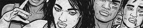
As much as I like the Demolition Man reference, there are a whole lot of problems with Concrete Park.

    I’m nearly sure co-writer and artist Tony Puryear does the art digitally; it would be hard to explain why the heads look so pasted on the backgrounds and why so much of the too thick line work looks artificial. Those artificial lines really hurt the comic, which occasionally resembles a Love and Rockets tangent with unfortunate coloring.

    The story has to do with a prison planet where the prisoners have all formed gangs. It’s unclear why anyone would bother putting people on a prison planet if they aren’t going to do any labor–why wouldn’t they just kill them?

    Doesn’t matter.

    Puryear and Erika Alexander’s script is enthusiastic but too problematic and unoriginal to do much. The dialogue’s weak too; feels too “unsold screenplay.” But it’s not a terrible comic. Just blah.

    C 

    CREDITS

    Writers, Eric Puryear and Erika Alexander; artist, colorist and letterer, Puryear; editors, Roxy Polk and Philip R. Stone; publisher, Dark Horse Comics.

  • The Fury of Firestorm, The Nuclear Man #40For the first time in a while–maybe ever–Conway dedicates over half the issue to Ronnie. He’s in trouble at school because he did too well on his final exams. He and Martin figure out it’s leakage from Martin, when they’re fused as Firestorm.

    There’s also a lot of stuff with his high school classmates–an argument with his girlfriend (the teenage one, Firehawk has been absent for a while) and then a fight with his adversary. Conway seems to have forgotten he’s already done the fight with the high school antagonist, but it lets him “mature” Ronnie in a matter of scenes than to do actual character development.

    Conway’s narrative construction is fine and if the art were better the issue would be a whole lot more successful. But the art’s weak. Mike Clark guest pencils; his lethargic composition gets no help from the inkers either.

    Too bad.

    C+ 

    CREDITS

    Graduation Day; writer, Gerry Conway; penciller, Mike Clark; inkers, Ian Akin and Brian Garvey; colorist, Nansi Hoolahan; letterer, Duncan Andrews; editor, Janice Race; publisher, DC Comics.

  • Southern Bastards 4 (September 2014)

    Southern Bastards #4What a surprise ending!

    Except for Aaron tacking on the epilogue so as to set up the next arc. Aaron’s giving the illusion of doing something original while really not; with the epilogue on there, he even retroactively makes it predictable. The reader can go back and look for all foreshadowing to the big surprise.

    All that foreshadowing is actually in Aaron’s attention to writing. It’s really good writing as far as the narration goes. It’s just not particularly good plotting. Aaron seems to be assuming his readers haven’t read lot of books or read a lot of his books because the narrative devices are similar to ones he’s used in the past.

    And while a new arc is starting next issue, Aaron’s shown his hand as far as how manipulative he’s going to write. If the point is the tricks he can play, what’s the point?

    Great art though.

    C 

    CREDITS

    Here Was a Man, Conclusion; writer, Jason Aaron; artist and colorist, Jason Latour; letterer, Jared K. Fletcher; editor, Sebastian Girner; publisher, Image Comics.

  • The Shadow 4 (August 1986)

    The Shadow #4
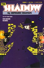
What a terrible comic. Chaykin’s handling of The Shadow reminds of someone trying to catch a hot potato; whenever he does have a hold on it, it’s not for long enough and it always leaves that all right place for an unpredictable direction.

    The problem with this issue–besides the big revelations are predictable and idiotic–is the focus on the villains. Chaykin elevates villains maybe deserving of a half issue crisis to a full four issues. All the sex and drugs and violence is supposed to be enough to make up for them not having any depth, but it doesn’t. It’s not even real flash–it’s implied flash.

    And Chaykin could try for flash but doesn’t. He doesn’t try with the art. After the art being The Shadow’s single exemplary factor to this point, he gives up for the last issue.

    It’s not completely worthless–the art’s still more than decent–but it’s close.

    D 

    CREDITS

    Blood & Judgment, Conclusion; writer and artist, Howard Chaykin; colorist, Alex Wald; letterer, Ken Bruzenak; editor, Andrew Helfer; publisher, DC Comics.

  • Sally of the Wasteland 1 (August 2014)

    Sally of the Wasteland #1
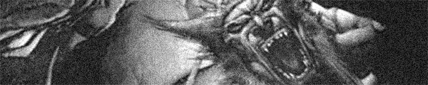
Sally of the Wasteland is great. It's going to be hard to talk about. Writer Victor Gischler has his post-apocalyptic setting and while it's tough and vicious and has a bunch of mutated animals, it's still humanist. It's thoughtful. Gischler starts with a relatively small cast and grows out from them, revealing the full setting. Or at least as full as he's going to reveal this issue.

    He also has two really strong characters (both of them female); one being the titular Sally, the other her alter ego. There's a guy involved, but it's doubtful the alter ego will be interested.

    Gischler has a lot of action, a lot of great conversation. Artist Tazio Bettin handles everything well. There are occasionally loose moments where the detail isn't as strong as usual, but overall, the art's great.

    The comic's only detriment is the post-apocalyptic nature but Gischler's definitely bumping its ceiling.

    B+ 

    CREDITS

    Writer, Victor Gischler; artist, Tazio Bettin; colorist, Jon Chapple; editor, Steve White; publisher, Titan Comics.

  • The Fury of Firestorm, The Nuclear Man #39Even though Conway tries a few things, the issue doesn't work out well. He's got both Martin and Ronnie playing detective, with a transformation into Firestorm a way for them to get out of trouble. It's lazy though–turning into a superhero when the detecting gets too dangerous.

    And then there's Martin's love interest for the issue. Just when she starts to make an impression, Conway exits her from the issue and returns to the lame villain, the Weasel. The reveal on him is underdone, maybe because of space, maybe because not even Conway is interested.

    There's a lot of Pittsburgh landmark minutiae, which makes little sense since it's New Yorker Martin identifying it all.

    The worst part is when Ronnie is talking about how his dad isn't a particularly big part of his life anymore–not that the father has ever had a significant role in the comic.

    Weak art too.

    C- 

    CREDITS

    Publish or Perish or the Academic Life is Killing Me!; writer, Gerry Conway; pencillers, Rafael Kayanan and Mike Chen; inkers, Ian Akin and Brian Garvey; colorist, Nansi Hoolahan; letterer, Duncan Andrews; editor, Janice Race; publisher, DC Comics.

  • God Hates Astronauts 1 (September 2014)

    God Hates Astronauts #1
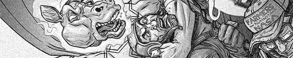
I'm not sure God hates astronauts, but I'm getting the feeling he hates me. Or I just hate myself. There's no other reason I would subject myself to God Hates Astronauts.

    It's a somewhat difficult comic to talk about because Ryan Browne's art is truly fantastic. His composition, his detail–his visual narrative chops aren't great but it's because his narrative is atrocious.

    God Hates Astronauts reads like if Beavis and Butthead wrote a comic book. Browne's storytelling sensibilities are pretty simple–bestiality is funny. Anything related to it is funny. You don't actually have to be funny–you just reference bestiality and something is funny.

    If, for whatever reason, bestiality doesn't make something funny, you have someone swear. Because swearing is funny.

    God Hates Astronauts isn't offensive. It's too poorly written to be offensive. Everything is a setup for a joke, usually involving bestiality or swearing. Maybe God just hates bad writing.

    F 

    CREDITS

    A Star is Born; writer and artist, Ryan Browne; colorist, Jordan Boyd; letterer, Chris Crank and Browne; publisher, Image Comics.

  • The Shadow 3 (July 1986)

    The Shadow #3With his third of four issues, Chaykin gets around to showing what his Shadow comic is actually going to be like.

    Tepid.

    Lots of ribald talk, lots of innuendo (both verbal and visual) and not much else. There’s one good action sequence, where Chaykin’s sense of design and the toughness of the comic inform how the Shadow fights criminals. But it’s just one scene. Then Chaykin’s got a pointless montage of all the Shadow’s new contacts–he’s got a finite story he’s trying to tell but he’s also got a checklist of old Shadow references to make.

    He also has way too big of a cast and sends around eighty percent of the good guy supporting cast off page because he doesn’t want to deal with them. He needs them for a line in a scene, then he disposes of them. It’s very messy and poorly designed.

    But the art’s magnificent.

    C 

    CREDITS

    Blood & Judgment, Part Three; writer and artist, Howard Chaykin; colorist, Alex Wald; letterer, Ken Bruzenak; editor, Andrew Helfer; publisher, DC Comics.

  • The Bride of Frankenstein (1935, James Whale)

    For The Bride of Frankenstein, director Whale takes a contradictory approach. It's either more is more, or less is less. More music, all the time. Franz Waxman's frequently playful music rarely fits its scenes, unless Whale is going for a melodramatic farce, which he really doesn't seem to be doing. I kept hoping he would be, because it might make the film more compelling.

    More Monster–Boris Karloff is nonsensically running around the countryside, finding someone to accidentally kill or not. William Hurlbut's screenplay contrives connections between loose, if memorable, scenes and never pauses to explain why the Monster kills another little girl. Maybe he really liked doing it from the first one.

    Of course, the Monster could explain since Karloff now has lines to deliver. But all of his lines are lame.

    Poor Colin Clive has almost nothing to do. None of the characters in Bride have arcs running the whole film–not even the Monster–but Clive pops in at the beginning and then at the end. In one of Hurlbut's weaker moments, Clive goes from pro-mad scientist to anti-mad scientist at the snap of the fingers. It's ludicrous.

    Ernest Thesiger's good as the villain. Valerie Hobson not as Clive's wife.

    Whale doesn't have enough coverage so Ted J. Kent's editing is usually bad. Except the finale, which is wondrous and is so tightly edited, one has to wonder why the rest of the film is so loose. Probably because there has to be a story.

    It's a trying seventy-five minutes.

  • Big Trouble in Little China 4 (September 2014)

    Big Trouble in Little China #4Even with some amusing jokes throughout, this issue is easily the weakest so far. It’s still pretty darn good–like I said, the jokes are amusing and Powell consistently rewards the reader with them, either big jokes or small. In some ways, Powell is making observations about Big Trouble to its fans, which is fine when the story’s good too.

    And the story here isn’t particularly good. There’s a protracted conclusion to the cliffhanger with the stupid monkey guys in the other dimension, then it’s back to Chinatown for the big build-up. Powell awkwardly goes sincere for Jack’s flashback this issue too.

    Churilla gets a few cool things to draw; not as many as he should.

    The cliffhanger is predictable and unfortunate. It’s a bridging issue and Powell’s enthusiasm can’t maintain it. Powell also has way too many little plot twists and not enough actual content.

    It’s entertaining instead of exceptional.

    CREDITS

    Writers, John Carpenter and Eric Powell; artist, Brian Churilla; colorist, Michael Garland; letterer, Ed Dukeshire; editors, Alex Galer and Ian Brill; publisher, Boom! Studios.