• Tooth & Claw 1 (November 2014)

    Tooth & Claw #1
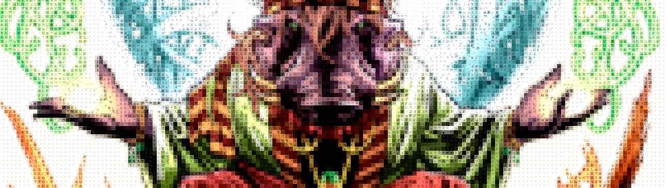
Writer Kurt Busiek takes a traditional–though not for comics–approach to this first issue of Tooth & Claw. He treats it as a “pilot movie” for the series, introducing a bunch of characters who aren’t going to be important later but are important to this issue’s story. It’ll be interesting to see if he keeps up the structure for the series going forward, will every issue have an actual complete three act structure.

    It’s a fantasy world where animals walk on two feet and talk and cast spells. The whole society is based on magic and trade. There are big hints of humanity being part of the story, but Busiek doesn’t go into it this issue. He should, given the time spent hinting, but he concentrates on his cast and how they handle a catastrophe.

    It works out because Benjamin Dewey’s art, gorgeous throughout, is even better on the finale.

    CREDITS

    Writer, Kurt Busiek; artist, Benjamin Dewey; colorist, Jordie Bellaire; letterer, Jimmy Betancourt; publisher, Image Comics.

  • Birthright #2The first half or so of this issue is worrisome. Williamson brings in a whole bunch of fantasy world vocabulary for a flashback–the structure is fairly simple, present day on Earth with Conan grown-up, the fantasy world in flashback when he’s still an Earth kid adjusting. And while Bressan’s art is fine–his action is better–there’s not much one can do with a fantasy world anymore. They’re standard, thanks to comics, movies, video games and television.

    The first half also has the pained meeting between brothers–the younger brother now much older (and Conan). Williamson’s sincere in the scene, but it doesn’t offer anything new.

    Luckily, the finale has something also not new, but still awesome. Conan breaks free in the police station and it’s the Terminator only with a magical warrior. Good character work in the sequence too. It pulls the issue around just in time.

    CREDITS

    Writer, Joshua Williamson; artist, Andrei Bressan; colorist, Adriano Lucas; letterer, Pat Brosseau; editors, Helen Leigh and Sean Mackiewicz; publisher, Image Comics.

  • Judge Dredd Mega-City Two: City of Courts 5 (May 2014)

    Judge Dredd Mega-City Two: City of Courts #5
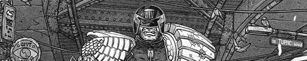
Not the strongest last issue, not at all. Though it probably does have Farinas’s most consistently decent art of the entire series. Well, in terms of detail and correct body proportions. His action composition is just terrible–Wolk tries to do way too much for the last issue, especially since he closes with a lengthy action sequence.

    The finale goes a little too far with Dredd and trying to make him more complex (albeit briefly). One of the slight twists as things go along require almost some suspicion of Dredd, which is ludicrous. Even for an unfamiliar reader, Wolk has written an excellent Dredd until this last issue of Mega-City Two. Wolk tries too hard with the humor too.

    Wolk also seems to set up one possible twist and then ignores it, even though it fits the series’s tone more appropriately.

    It’s entertaining often but should have been better.

    B- 

    CREDITS

    Everybody’s in Show Biz; writer, Douglas Wolk; artist, Ulises Farinas; colorist, Ryan Hill; letterer, Tom B. Long; editor, Denton J. Tipton; publisher, IDW Publishing.

  • Judge Dredd Mega-City Two: City of Courts 4 (April 2014)

    Judge Dredd Mega-City Two: City of Courts #4Wolk brings in the ex-judge with the Mexican wrestling mask–it isn’t too exciting as it looks just like a regular judge’s mask, only not a helmet–and Dredd has a team-up. In the second half of the issue, anyway. The first half of the issue is an introduction to Melody Time, which mixes Disneyland and anarchy. It feels like Judge Dredd meets Roger Rabbit, actually. It’s amusing.

    Nicely, Wolk gets in stuff about the corruption plotline without stopping the narrative. Sure, at the end he sets up the final issue and the presumed big reveal, but he otherwise handles it rather deftly.

    Farinas’s art, for the standard stuff, is better. Not many people without masks or helmets so he can’t mess up features. There are a lot of cartoon references in the story presentation (matching the setting) and they’re a little too simple.

    Still, it works out.

    B 

    CREDITS

    The Deterrence Machine; writer, Douglas Wolk; artist, Ulises Farinas; colorist, Ryan Hill; letterer, Tom B. Long; editor, Denton J. Tipton; publisher, IDW Publishing.

  • Moonshadow 2 (October 1994)

    Moonshadow #2Moonshadow continues with DeMatteis going high sci-fi–Moon, his mother and his sidekick, Ira, investigating a desolate spacecraft–while also going absurdist humor. DeMatteis works emotion into both and one of the most startling things about the comic is how dark DeMatteis will take it. The humor and the fantasy never distract; in fact, DeMatteis uses them to amplify the importance of the emotional goings on.

    It’s rather phenomenal. And very hard to take because DeMatteis doesn’t offer any relief. All the humor comes with the emotional weight.

    Muth renders some fantastic visuals this issue, particularly with his mix of styles at the end. And his work on the spacecraft exploration is positively frightening. Even though Muth’s art often gets to be far more playful than the script, that element of dread still lurks. DeMatteis and Muth create beauty, hope, dread and fear and intricately tie them all together.

    B+ 

    CREDITS

    A Very Uncomfortable Thing; writer, J.M. DeMatteis; artist, Jon J. Muth; letterer, Kevin Nowlan; editors, Shelly Bond, Laurie Sutton and Archie Goodwin; publisher, Vertigo.

  • Judge Dredd Mega-City Two: City of Courts 3 (March 2014)

    Judge Dredd Mega-City Two: City of Courts #3Dredd gets a sidekick–temporarily, it’s like Wolk doesn’t want him to bond with anyone in Mega-City Two or something–and fights a giant sea monster. He also gets to see how the city turns away people back to the ocean; there’s a conspiracy going on or something. Wolk also promises a former judge who dresses like a masked Mexican wrestler.

    There’s a little bit, with the conspiracy and then the setup at the end, about the main story, with the immigration scene an odd lull in the middle. There’s no action, even with one of Dredd’s camera crew (he’s a TV star) getting eaten by said sea monster.

    Farinas does a little better than usual; there aren’t a lot of closeups. He flubs closeups.

    The big action sequence with the sea monster doesn’t come off well–Dredd vs. kaiju–but Wolk has enough momentum to carry it through.

    B 

    CREDITS

    Beach Blanket Justice; writer, Douglas Wolk; artist, Ulises Farinas; colorist, Ryan Hill; letterer, Tom B. Long; editor, Denton J. Tipton; publisher, IDW Publishing.

  • Judge Dredd Mega-City Two: City of Courts 2 (February 2014)

    Judge Dredd Mega-City Two: City of Courts #2Even though Farinas art gets a little worse, Wolk isn’t spending time setting up the comic, he’s just telling a Judge Dredd goes undercover with a West Coast biker gang of the future. They’re really into found art.

    Dredd gets a sidekick in one of the biker gang and a lot of the issue is spent with their adventure to go get future beer. Work gets to concentrate on Dredd exploring the strange world–introducing it to the reader too–while still maintaining Dredd is in control of everything going on. It works rather well.

    The end has a good fight sequence, with Wolk utilizing Dredd’s procedural abilities as well as his physical ones. It’s a rather nice finish. And even though Farinas is real light on the facial detail (and of people in general), there are some good visual moments in the comic.

    Art problems aside, an excellent issue.

    B+ 

    CREDITS

    Some Dreamers of the Golden Dream; writer, Douglas Wolk; artist, Ulises Farinas; colorist, Ryan Hill; letterer, Tom B. Long; editor, Denton J. Tipton; publisher, IDW Publishing.

  • Judge Dredd Mega-City Two: City of Courts 1 (January 2014)

    Judge Dredd Mega-City Two: City of Courts #1The back matter for this issue discusses the history of Mega-City Two, which I only briefly read. Writer Douglas Wolk has a nice structure for the issue–he drops the reader into Mega-City Two, with Judge Dredd as the anchor, and goes crazy. It’s a strange, Hollywood-influenced, happy place. Think the future in Wall-E, only a little more active.

    Of course, no reader wants to see such a lame future and having Dredd around to kick things up is awesome. After almost half the issue of Dredd dealing with the dumb, extremely lax laws, Wolk gives the reader the backstory. He’s there on a secret mission, he’s supposed to like the chief judge; a quick recap then back to the story.

    Ulises Farinas art is so-so. He does well on the Mega-City Two scenery, not so good on the figures.

    Still, pretty good stuff.

    B 

    CREDITS

    West Coast Swing; writer, Douglas Wolk; artist, Ulises Farinas; colorist, Ryan Hill; letterer, Tom B. Long; editor, Denton J. Tipton; publisher, IDW Publishing.

  • Moneyball (2011, Bennett Miller)

    Moneyball is the traditional American sports movie with all the excitement sucked out of the accomplishment. The excitement isn’t gone because of the story–about how the Oakland A’s applied a statistical theory to how to win baseball games, but more because director Miller wants to make sure everyone is paying attention to the symbolism in his filmmaking.

    Miller’s style is generic, competent important mainstream filmmaking. He has a minimalist Mychael Danna, he has a big movie star (Brad Pitt) playing a guy who didn’t make it, he has a cast-against-type sidekick for Pitt (Jonah Hill), he’s even got Robin Wright as Pitt’s ex-wife. I didn’t realize she was in the cast, but when her single scene came on, I knew it was her before she got a close-up. Why? Because Moneyball is that type of movie.

    And the first hour, maybe hour and a half, moves beautifully. Steven Zaillian and Aaron Sorkin’s screenplay makes everything–all the baseball business, all the statistics–nicely digestible. It’s a very smooth film for that first ninety minutes, with some great editing from Christopher Tellefsen.

    But then Miller realizes he’s making an American sports movie and so he has to do his variation on the big game moment. But because Moneyball isn’t “just” a sports movie, everything goes on and on and on after that moment. It meanders when it needs to come together and the ending is way too obvious.

    Still, it’s perfectly acceptable mainstream “thinking” movie stuff.

    2/4★★

    CREDITS

    Directed by Bennett Miller; written by Steven Zaillian and Aaron Sorkin, based on a story by Stan Chervin and the book by Michael Lewis; director of photography, Wally Pfister; edited by Christopher Tellefsen; music by Mychael Danna; production designer, Jess Gonchor; produced by Michael De Luca, Rachael Horovitz and Brad Pitt; released by Columbia Pictures.

    Starring Brad Pitt (Billy Beane), Jonah Hill (Peter Brand), Philip Seymour Hoffman (Art Howe), Robin Wright (Sharon), Chris Pratt (Scott Hatteberg) and Stephen Bishop (David Justice).


    RELATED

  • Moonshadow 1 (September 1994)

    Moonshadow #1For Moonshadow, writer J.M. DeMatteis doesn’t shy away from showing off the comic’s sci-fi influences. There’s a little Douglas Adams, a little Kurt Vonnegut. But DeMatteis doesn’t rely on those nods to move the story along, they’re just around to make the reader feel comfortable.

    This first issue introduces Moonshadow, a half-human boy being raised in an intergalactic zoo, and his supporting cast. There’s his mother, who was a hippie on Earth, their cat, Frodo, and then Moon’s de facto best friend, Ira. Ira’s a shaggy alien who looks like Cousin It from “The Addams Family.”

    Not a lot happens in the first issue, just the setup–Moon, at twelve, ready to explore the universe–and a lot of good narration from DeMatteis and some beautiful art from Jon J. Muth. The comic moves deliberately and calmly, with DeMatteis carefully including some humor and Muth delivering gorgeous pages.

    A- 

    CREDITS

    Songs of Happy Cheer; writer, J.M. DeMatteis; artist, Jon J. Muth; letterer, Kevin Nowlan; editors, Shelly Bond, Laurie Sutton and Archie Goodwin; publisher, Vertigo.

  • The Fury of Firestorm, The Nuclear Man #49
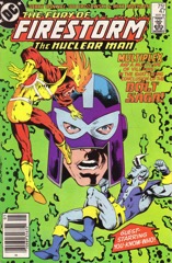
It’s sort of a goofy issue, with Firestorm’s lawsuit ending in the first scene, then the rest of the issue is the Moonbow story. Conway continues the Marvel vibe–maybe it’s because Moonbow (a female college student who moonlights as a vigilante) looks like a Marvel character, but also because there’s no other vibe to the comic.

    Conway doesn’t give his protagonists anything to do. Martin has a date, which Ronnie interrupts for a Firestorm outing, and Conway uses the interruption so as not to make any decisions for Martin. It’s more treading water.

    There are art problems too–Pablo Marcos and Rodin Rodriguez join Machlan on inks and the issue never has a consistent look to it. Brozowski again does all right with his page composition and the comic moves at a good pace.

    Even the ending, with Firestorm and Moonbow finally crossing paths, moves well.

    It’s passable enough.

    B- 

    CREDITS

    Justice: Lost and Found; writer, Gerry Conway; penciller, Joe Brozowski; inkers, Mike Machlan, Pablo Marcos and Rodin Rodriguez; colorist, Nansi Hoolahan; letterer, Carrie Spiegle; editor, Janice Race; publisher, DC Comics.

  • War Stories (2014) #2

    Ws02

    There’s something slightly off about the second issue of War Stories. Keith Burns’s art isn’t great, but it’s all right and Ennis’s script is strong enough to get over any visual bumps. Except the effort Burns puts into the aerial battles–there’s a lot of detail, but there’s no narrative to the illustration. So it contributes to that slightly off vibe, but not entirely.

    The real problem is Ennis. He doesn’t actually have a story. He has some great scenes and anecdotes for bomber crews and the protagonist’s relationship with a British widow makes for a good scene, but Ennis doesn’t have a narrative. He’s just stringing these scenes together and hoping the protagonist’s narration will somehow get it through. And it doesn’t. The narration has a couple excellent moments, but they’re jagged too.

    It’s not a cohesive issue. It’s a bridging issue in a three issue arc. But good.

  • Point of Impact 1 (October 2012)

    Point of Impact #1Jay Faerber is really excited about Point of Impact, even if one doesn’t read his back matter about his inspirations. The enthusiasm is clear. Unfortunately, he’s enthusiastic about writing a really generic police procedural.

    Everything is connected–a woman falls off a roof while her lover waits in a hotel room, but could she be somehow connected to the newspaper reporter Faerber is following around? And then there are the cops–the female cop knows her from yoga class and doesn’t want to give up the case. Her tough but understanding older black cop partner is there for her, but he’s not going to let her throw her career away.

    Everything’s very predictable–plot, dialogue. Without artist Koray Kuranel’s high contrast style–deep blacks on pure white–Impact would disappear it’s so flimsy. Kuranel’s detail for people isn’t great but his buildings and his mood work.

    It’s inoffensively bland.

    C+ 

    CREDITS

    Writer, Jay Faerber; artist, Koray Kuranel; letterer, Charles Pritchett; publisher, Image Comics.

  • The Fury of Firestorm, The Nuclear Man #48Firestorm hasn’t cratered or anything so severe, but Conway does seem to have found a new level for the book. It’s a little low, sure, but he’s hitting it consistently.

    And even though Brozowski and Machlan leave a lot to be desired in the art–creativity–the book does look okay. It doesn’t look much like a DC comic this issue, however; it looks a lot like an eighties Spider-Man, which is fine.

    Conway doesn’t do anything fresh or inventive. Firestorm is getting sued by Ronnie’s stepmother-to-be and she’s real impressed with his speech in court. Of course she’s impressed, otherwise the story might do something unexpected. Ditto the introduction of another girl in Ronnie’s life. Could she be the bow-wielding vigilante plaguing Pittsburgh’s mob?

    Conway doesn’t even make that one a surprise.

    It reads okay in parts, not okay in others. It’s bland superhero stuff.

    B- 

    CREDITS

    Moonbow; writer, Gerry Conway; penciller, Joe Brozowski; inker, Mike Machlan; colorist, Nansi Hoolahan; letterer, Carrie Spiegle; editor, Janice Race; publisher, DC Comics.

  • Captain Victory and the Galactic Rangers 3 (October 2014)

    Captain Victory and the Galactic Rangers #3Even though Casey is incredibly derivative–the Close Encounters nod is simultaneously cute and too much–Captain Victory continues to be a nice diversion. It’s not exactly a fun read, just because Casey doesn’t let his cast enjoy anything. There is some banter with the scientists on Earth who are looking at one of the spacecraft, but it’s over in a page.

    Otherwise, the comic is very serious. And having Jim Mahfood do the adventures of a cat-man on a slightly hostile planet without any humor is too much. The comic has some great art–Fox some outstanding work–but Captain Victory isn’t actually ambitious sci-fi. It pretends to be ambitious sci-fi; Casey’s script is very traditional stuff. Even the artists’ page layouts are very traditional (even when trying to appear otherwise).

    It’s an acceptable, enjoyable comic. But the artists deserve a balls to the wall script.

    CREDITS

    Writer, Joe Casey; artists, Nathan Fox, Jim Mahfood and Farel Darlyrmple; colorist, Brad Simpson; letterer, Simon Bowland; editors, Molly Mahan, Hannah Elder and Joseph Rybandt; publisher, Dynamite Entertainment.

  • Sally of the Wasteland 4 (November 2014)

    Sally of the Wasteland #4It’s another solid issue of Sally. There’s a lot with her and Tommy, which is nice because Sally cares a lot about him and Gischler handles their flirtation (for the first time, joint flirtation) really well.

    Most of the issue takes place in a flooded city and artist Bettin does fine with the buildings and even the mutants, but he has some problems with the cast. Their faces become too generic at times; it reads fast, which helps a lot. Until it becomes clear Gischler has written himself into a hole and he’s going to get himself out as fast as possible.

    So much happens over so few pages, it reads like Gischler is getting tired, which is too bad. Sally has been a great ride–and even continues to be, albeit too fast of one here–hopefully he’s got a nice finish for the series.

    It really deserves one.

    B 

    CREDITS

    Writer, Victor Gischler; artist, Tazio Bettin; letterer, Tom Williams; publisher, Titan Comics.

  • Le Fear II: Le Sequel (2015, Jason Croot)

    I thought the biggest joke in Le Fear II: Le Sequel was, not to rip off Maltin too much, the title. I didn’t realize it was an actual sequel. I thought writer-director Croot was spoofing the idea of making a sequel to a crappy horror movie. But, not. It’s an actual sequel, though there’s no time given to establishing that situation for the viewer.

    Croot somewhat successfully employs improvisation style, but without any thoughtfulness as to how the Le Sequel will play for the viewer. He shoots it on video, with occasionally jerky camera motion, but improvisation comedy has gotten so far away from Christopher Guest, I guess the viewer isn’t supposed to assume it’s a pseudo-documentary. Instead, it’s just the film’s rather problematic style. Croot and editors Steve McAleavy and Alexander Trotter-Fernandez don’t do well with transition shots or passage of time (although Croot does establishing shots just fine).

    The problems start immediately with protagonist Kyri Saphiris’s unbelievably naive director putting in for a second mortgage on his house to get the film made. Now, if Saphiris’s bonehead director really does have a house worth 500,000 pounds, which is $805,775 (as I write this post), someone should have realized he can’t be a complete fool or at least he’d need to be a rich fool. And then wouldn’t need investors.

    Then there’s the “stupid African immigrant con artist” thing. All of the African characters are buffoonish comic relief.

    Croot and Saphiris are sincere but so what.

    0/4ⓏⒺⓇⓄ

    CREDITS

    Written, produced and directed by Jason Croot; director of photography, Matthew Taylor; edited by Steve McAleavy and Alexander Trotter-Fernandez.

    Starring Kyri Saphiris (Carlos), Seye Adelekan (Efi Womonbongo), Denise Moreno (Racquel), Leila Reid (Jessie), Hadrien Mekki (Jacques), Roxy Sternberg (Africa) and Andrew Tiernan (Dirk Heinz).

  • The Fury of Firestorm, The Nuclear Man #47It’s not a bad special guest star issue, just another pointless one. Blue Devil and Firestorm are now teamed up–after a couple issues of mistaken fighting–against all of Firestorm’s villains.

    Brozowski continues to do a very clean, obvious approach with the composition; he and inker Mike Machlan don’t have a single outstanding panel in the comic, but there also aren’t any lemons. It’s straightforward superhero stuff and, given there’s a hallucination sequence with demons, the art works out okay. Never anything more… but okay isn’t terrible.

    As for Conway’s script… he tries a little character development (Ronnie’s dad and stepmother-to-be are hostages of all his villains, along with a mention of one of the villain’s failed rehabilitations), but it’s mostly action. It’s not great action; the giant-size computer showroom is goofy.

    Like I said, it’s not too bad. It’s a guest star issue, big whoop.

    B- 

    CREDITS

    Dead Devils Don’t Wear Blue!; writer, Gerry Conway; penciller, Joe Brozowski; inker, Mike Machlan; colorist, Nansi Hoolahan; letterer, John Costanza; editor, Janice Race; publisher, DC Comics.

  • Little Nemo: Return to Slumberland 2 (October 2014)

    Little Nemo: Return to Slumberland #2Shanower is really dedicated to giving Little Nemo a narrative and it doesn’t help the comic at all. Jimmy (or Nemo) is an annoying kid who Shanower has throughout the entire issue–he’s not having a little adventure and then waking up, he’s around the reader for page after page of adventure and he’s always got something annoying to say. Instead of turning these brief annoyances into the punchline, they’re the pulse of Return to Slumberland.

    It’s a far from ideal situation.

    Similarly, having this kid be so upset about having to hang out with a girl (the princess) is perfectly appropriate… if Shanower wants to fit into the sexism of previous generations. It would have been something if he hadn’t wanted to embrace that deficiency.

    The gorgeous Rodriguez art, meticulous not just in detail but in functioning the same way as McCay’s originals did in reading style, helps immeasurably.

    B- 

    CREDITS

    Writer, Eric Shanower; artist, Gabriel Rodriguez; colorist, Nelson Daniel; letterer, Robbie Robbins; editors, Michael Benedetto and Chris Ryall; publisher, IDW Publishing.

  • Winterworld 3 (August 2014)

    Winterworld #3Even with the Guice art and some solid writing in places from Dixon, his approach to Winterworld and its revelations is getting too annoying.

    The protagonists have found a wonderful refuge from the ice, but it turns out the people living there have only read an Al Gore book and now they’re crazy about global warming and, apparently, crucifying the heroine.

    Maybe if there were more grand action from Guice and not so much of the settlement, which looks like the Greek island from Mamma Mia!, the comic would be more compelling. But without any great visuals and such deceptive, manipulative plotting from Dixon, he gets tired fast.

    There’s an unnatural stop and go to the pace–Dixon revs up to get to the cliffhanger, for instance, while dragging through other scenes. The comic always comes off too controlled; Dixon and Guice know what they’re doing, maybe even too well.

    C+ 

    CREDITS

    Writer, Chuck Dixon; artist, Butch Guice; colorist, Diego Rodriguez; letterer, Tom B. Long; editor, David Hedgecock; publisher, IDW Publishing.

  • Our RoboCop Remake (2014, David Seger, et al.)

    It’s hard to imagine how Our RoboCop Remake would play for someone who doesn’t only love the original Robocop, but has seen it quite a few times. A lot of the humor in Remake is broad, but enough of the choices are subtle and incisive (while sometimes still maintaining a wink), one has to be familiar with the source material.

    The Remake project is the work of approximately fifty filmmakers who each took a different scene of Robocop and adapted it. Some are more straightforward than others; some use the beginning of the scene as a starting point for comedic interpretation, some just adapt through absurdist humor. Robocop has a lot of great lines–pretty much every actor taking over for Kurtwood Smith and Miguel Ferrer does an amazing job–and a lot of violence to comment on. The scene where Robocop stops a rape in progress becomes frantic ultra-violence in a way Paul Verhoeven never got to show.

    And Remake is definitely better towards the beginning; later, once Robocop appears, the filmmakers tend to go for the inherent humor having a guy in a bad costume allows. There are exceptions–the last few scenes (before the finish) are fantastic, with a couple musical numbers and a great action figure-based one.

    But the early scenes, with puppets, babies playing adults, interpretive dance… those are fantastic.

    There are some good animated sequences too.

    Remake is, overall, uneven. But it’s still a great time. Though probably mostly for Robocop aficionados.

  • Star Spangled War Stories: Futures End 1 (November 2014)

    Star Spangled War Stories: Futures End #1I’m a little shocked, though maybe I shouldn’t be. For their “Futures End” tie-in with G.I. Zombie, Justin Gray and Jimmy Palmiotti tell the last G.I. Zombie story. Maybe all the “Futures End” are the last issues in imaginarily long series (I don’t think I’ll find out). But what they do here works out.

    They’ve got their butt-kicking protagonist, G.I. Zombie, who doesn’t just fist fight or monster fight, he also gets in an old crop duster and has an air battle too. It’s a lot for artist Scott Hampton and the art is fantastic. There’s a lot going on; Hampton excels at it.

    But there’s also the sidekick and the nemesis, not to mention the end of the world. It actually would have worked better as a first issue than the third of Gray, Palmiotti and Hampton’s Star Spangled War Stories but whatever… it’s absolutely great comics.

    A 

    CREDITS

    United States of the Dead; writers, Jimmy Palmiotti and Justin Gray; artist and colorist, Scott Hampton; letterer, Rob Leigh; editors, David Piña and Joey Cavalieri; publisher, DC Comics.

  • Ragnarök 2 (September 2014)

    Ragnarok #2Why do I even talk? Why do I ever say nice things like Ragnarök isn’t going to be some non-Marvel Thor knock-off?

    Because I then end up with egg on my face when Simonson does the big reveal this issue. No, the comic’s not about the lady elf who kicks butt or whatever, it’s actually about a zombie Thor resurrected in a strange land after the Asgardian gods have fallen.

    Yawn.

    And Simonson spends the entire issue setting up the reveal of it being Thor, even after he brings the hammer back into it. So the entire comic is one scene, the resolution to the previous issue’s cliffhanger. There is a talking rat, however, and I like rats. But a talking rat is not enough to make this comic–or this series–worthwhile.

    Maybe Simonson think it’s his great last Thor comic but the deceptive narration kills it.

    C- 

    CREDITS

    Writer and artist, Walt Simonson; colorist, Laura Martin; letterer, John Workman; editor, Scott Dunbier; publisher, IDW Publishing.

  • Pop 3 (October 2014)

    Pop #3Even though Copland’s art is better than last issue–he gets really dark here and has a nice panel layout for all the talking heads–Pop has sort of, well, popped. Pires spends more time with not just his supporting cast, but with background characters than he does with his protagonists. He has nothing for them to do here. Except stand around and wait for something to happen.

    At one time, it seemed like Pires and Copland were going to explore the mystical with Pop. Instead, now Pires concentrates on making it all realistic and rational, scientifically explained. It’s rather boring. The art’s nice, but the story’s boring.

    Worse, there are reminders of when Pires was going to do something more with his protagonists. It’s a concept without anything else to it, which is unfortunate because Copland deserves better and so do the characters Pires created in the first issue.

    C 

    CREDITS

    Shot in the Dark; writer, Curt Pires; artist, Jason Copland; colorist, Pete Toms; letterer, Ryan Ferrier; editors, Roxy Polk, Aaron Walker and Dave Marshall; publisher, Dark Horse Comics.

  • A Town Called Dragon 2 (October 2014)

    A Town Called Dragon #2How long can Winick go with conversation between interesting towns people and absolutely no story? For 95% of the issue. And he and artist Shaw waste an entire page with the dragon killing a cow. Not sure why it’s a good splash, unless Shaw really wanted to draw a dying cow.

    There’s not a lot with the characters from last issue. Winick reduces them to stereotypes–black guy, drunk guy, art girl, crazy guy–but there’s a whole thing with the sheriff’s kids blowing stuff up. Like they’re training to be terrorists or something. I’m sure it’ll come in handy later for fighting dragons.

    Unfortunately, the new characters are all weaker than the previously established characters. And Winick rushes the introduction of the dragon. It’s a little unclear if Winick is trying to sell a movie or a TV show, because it’s not a comic, which is really too bad.

    C+ 

    CREDITS

    You Can’t Fight a Monster; writer, Judd Winick; penciller, Geoff Shaw; colorist, Jamie Grant; letterer, Sean Konot; editors, Greg Tumbarello and Bob Schreck; publisher, Legendary Comics.

  • Letter 44 11 (October 2014)

    Letter 44 #11Soule goes a little nuts with his application of Murphy’s law this issue. There’s a great scene where the President’s former chief of staff–recovering, somewhat, from his attack–lays out the President’s options and there aren’t many (or any). Things are going from bad to worse for the First Lady too, not to mention the soldiers in Afghanistan and then the astronauts.

    It’s a great issue in a lot of ways, with Soule letting the reader know, decisively, bad things are going to happen. It’s sometimes hard to remember how serious the comic would be with a different artist; Alburquerque adds a certain cartoonish quality overall (and, again, way too much with those goofy soldier costumes) so there’s a bit of a disconnect.

    As for where the comic can go… Soule’s gimmick (Obama, Bush, aliens) is over. He’s into his own territory now and he’s doing quite well there.

    B+ 

    CREDITS

    Writer, Charles Soule; penciller, Alberto Jiménez Alburquerque; colorist, Dan Jackson; letterer, Crank!; editor, Robin Herrera; publisher, Oni Press.

  • She-Hulk 9 (December 2014)

    She-Hulk #9The trial of Steve Rogers continues and… Soule fumbles it. There’s no other word for how he handles She-Hulk defending Captain America in a civil suit against Daredevil. He fumbles it.

    Because there’s the accusation against Steve Rogers and then there are two possibilities–one, Soule is going for a Mark Millar/Brian Michael Bendis “break the Internet in half” crap on Captain America, which seems unlikely (so his responsibility is just to make it seem possible) or, two, he’s going to drag out the courtroom stuff and reveal Captain America had a great, valiant plan up his sleeve the whole time.

    It’s hard to dislike the comic, just because the beginning court scenes are so good (before Soule reveals too much with Matt and Jennifer having an entirely unprofessional chat) and because Pulido’s art is so strong. He does wonders with the courtroom scenes.

    But it’s dramatically tepid.

    C+ 

    CREDITS

    Writer, Charles Soule; artist, Javier Pulido; colorist, Muntsa Vicente; letterer, Clayton Cowles; editor, Jeanine Schaefer; publisher, Marvel Comics.

  • Lazarus (2013) #12

    Lazarus  12

    If you had told me twelve issues in, Lazarus would be a comic I just had to read first the week it came out, I never would have believed it. You can go back and read the rather negative posts about the first five issues.

    But Rucka has found the series. Especially with this arc about the political intrigue with the families; it’s a little soapier and a little showier, but it works out beautifully. He gives Lark the most basic action–the Lazari sparring with each other in the gym–but then gives him some great talking heads and a grand ball to render. Lark does a fantastic job.

    The change in the comic seems to be from Rucka’s concentration on the intrigue–and Forever’s character development–instead of him having to guide the reader’s judgment with the families. Or something. Who knows. Who cares. It’s an excellent comic.

  • Sheltered 12 (October 2014)

    Sheltered #12Can Sheltered work if Brisson doesn’t have any actual sympathetic characters left? He’s bringing in the police, he’ll be bringing in the FBI, the ATF, some kind of child protective services–the issue reads real fast as Brisson and Christmas get to the ending, which sets up the grand finale arc–but he’s taken the “good guy” out of the equation.

    So now it’s the man versus a bunch of brainwashed teenagers who killed or helped kill their parents. Who cares. Let them die; the drama is gone.

    It’s still a well-executed issue, with the cops not listening to the good girl–who started the series as the protagonist but now I can’t even remember her name–until it’s a little too late. And there are likable cops in danger and all, but… who cares.

    Sheltered’s successes aren’t insignificant but the traditional narrative finish is going to hurt.

    B- 

    CREDITS

    Writer and letterer, Ed Brisson; artist, Johnnie Christmas; colorist, Shari Chankhamma; editor, Paul Allor; publisher, Image Comics.

  • Starlight 6 (October 2014)

    Starlight #6You know, I hate Mark Millar. I hate how he was able to goof around with Starlight–not just drag out the series, but be really late on the last issue–and how he’s still able to deliver exactly what he needs to deliver on this finale.

    Maybe it works better because he’s already disappointed in other issues, so when this one comes through, it works out. But I think it’s more because Millar actually understands how to write mainstream heroic moments and he just lets himself get too confused, too commercial. Starlight is definitely mainstream, definitely commercial, but it’s also got Millar taking the time with his protagonist.

    Even though he’s been through a problematic six issue limited series, Duke McQueen’s a great character and Millar wants to celebrate him–and the time the reader’s spent with him.

    So it’s cheap and easy, but it sure does taste good.

    A- 

    CREDITS

    Writer, Mark Millar; artist, Goran Parlov; colorist, Ive Svorcina; letterer, Marko Sunjic; editor, Nicole Boose; publisher, Image Comics.