• Nailbiter (2014) #9

    Nailbiter  9

    Somehow, Williamson can turn an exciting cliffhanger resolution into a boring comic. I mean, it’s interesting. Even if Henderson doesn’t get as much good to draw as usual because there’s the cliffhanger resolution and then another scene in the same location. Then it’s a bunch of interiors–the sheriff’s house, where Williamson works on his B plot involving the local preacher, and the school bus, the issue’s ostensible A plot.

    That A plot is just to get Williamson to another big cliffhanger, presumably one he’ll resolve quickly next issue and not just not offer any resolution but also use to get hostile about the idea of the reader connecting with the comic.

    Nailbiter is far too removed from itself; Williamson doesn’t want to focus on his main characters because he’s bored with them. Everyone else is far more interesting. Hopefully, he’ll be able to refocus the comic on something engaging.

  • Nailbiter #9Somehow, Williamson can turn an exciting cliffhanger resolution into a boring comic. I mean, it’s interesting. Even if Henderson doesn’t get as much good to draw as usual because there’s the cliffhanger resolution and then another scene in the same location. Then it’s a bunch of interiors–the sheriff’s house, where Williamson works on his B plot involving the local preacher, and the school bus, the issue’s ostensible A plot.

    That A plot is just to get Williamson to another big cliffhanger, presumably one he’ll resolve quickly next issue and not just not offer any resolution but also use to get hostile about the idea of the reader connecting with the comic.

    Nailbiter is far too removed from itself; Williamson doesn’t want to focus on his main characters because he’s bored with them. Everyone else is far more interesting. Hopefully, he’ll be able to refocus the comic on something engaging.

    CREDITS

    Writer, Joshua Williamson; artist, Mike Henderson; colorist, Adam Guzowski; letterer, John J. Hill; editor, Rob Levin; publisher, Image Comics.

  • The Unbeatable Squirrel Girl (2015) #1

    The Unbeatable Squirrel Girl  1

    Ryan North fits a lot of story into this issue of Squirrel Girl. Not only does he set up Squirrel Girl as a crime fighter, introducing her new life as a regular college student, he introduces her roommate, a possible love interest and gives her a great fight with Kraven.

    Things move a little fast at times–Squirrel Girl has a few realizations where North doesn’t draw the reader a logical path–but there’s enough personality to make up for those rushed moments. Squirrel Girl’s sidekick squirrel, for example, grounds the scenes. Seriously. The talking squirrel (only to Squirrel Girl) grounds things.

    The comic, at least in this first issue, has limited appeal. There’s a lot of Marvel trivia and it sometimes overshadows Squirrel Girl, but North tries to plot the issue so anyone can appreciate it.

    Nice art from Erica Henderson–lots of personality to her New York City.

  • The Unbeatable Squirrel Girl 1 (March 2015)

    The Unbeatable Squirrel Girl #1Ryan North fits a lot of story into this issue of Squirrel Girl. Not only does he set up Squirrel Girl as a crime fighter, introducing her new life as a regular college student, he introduces her roommate, a possible love interest and gives her a great fight with Kraven.

    Things move a little fast at times–Squirrel Girl has a few realizations where North doesn’t draw the reader a logical path–but there’s enough personality to make up for those rushed moments. Squirrel Girl’s sidekick squirrel, for example, grounds the scenes. Seriously. The talking squirrel (only to Squirrel Girl) grounds things.

    The comic, at least in this first issue, has limited appeal. There’s a lot of Marvel trivia and it sometimes overshadows Squirrel Girl, but North tries to plot the issue so anyone can appreciate it.

    Nice art from Erica Henderson–lots of personality to her New York City.

    CREDITS

    Writer, Ryan North; artists, Erica Henderson and Maris Wicks; colorist, Rico Renzi; letterer, Clayton Cowles; editors, Jacob Thomas and Wil Moss; publisher, Marvel Comics.

  • Atropa (2015, Eli Sasich)

    Atropa is just short enough–around nine minutes–not to be too frustrating in its failures.

    Director Sasich–and his production designer, Alec Contestabile–do a great job creating this little space ship where the lead (Anthony Bonaventura) tools about and plays chess with his computer. Eventually he finds a ship and then things progress through a silly expository conversation scene (Sasich’s Alien nods are intentional, which is good because there’s nothing to the scene without them) and then a cliffhanger.

    Only, while Bonaventura does a perfectly good job investigating the titular spaceship and so on, he’s not much of an actor. Neither are the other actors in the film. Of course, the script isn’t good either. Atropa is all style, no substance.

    And it’s great style. Greg Cotten’s photography, the CG… all awesome. It’s a shame Sasich felt the need to burden it with an attempt at a story.

    1/3Not Recommended

    CREDITS

    Directed by Eli Sasich; screenplay by Clay Tolbert, based on a story by Sasich and Tolbert; director of photography, Greg Cotten; edited by Zachary Anderson and Sasich; music by Kevin Riepl; production designer, Alec Contestabile; produced by Chris Bryant.

    Starring Anthony Bonaventura (OMG Officer Cole Freeman), Jeannie Bolet (Moira Williams), Ben Kliewer (Andrew Jensen), Chris Voss (Jacob Sanders) and David M. Edelstien (Captain Robert McKay).


    RELATED

  • Nailbiter (2014) #8

    Nailbiter  8

    Williamson and Henderson deliver a lot more in the mood of the issue than anything else. Between Williamson’s eerie town history and Henderson’s eerier art, Nailbiter succeeds in creating a wondrous setting. It also ends up hurting the reading experience because Williamson’s writing often feels like it doesn’t take full advantage of that setting.

    This issue has a bunch of subplots brewing. The sheriff has trouble on a couple fronts, the titular serial killer is under more scrutiny than usual, and then the FBI guy is doing his investigating thing. And that investigating thing leads to a very unlikely stand-off with a civilian.

    But Nailbiter often isn’t about being reasonable. It’s about well-written characters and good art. This issue delivers some of the former and a lot of the latter. Williamson just can’t hide he’s doing a bridging issue and spinning his wheels for time.

    It’s mostly fine.

  • War Stories (2014) #4

    Ws04

    Garth Ennis goes somewhat modern with the latest War Stories arc, jumping to the late sixties and the story of an Israeli tank commander. He’s got a flashback to WWII, with the same tank commander getting a tour of a Panzer from a German tankie.

    There’s a lot of narration, all third person and really close, going over this guy’s life. And a long dialogue exchange where Ennis has to go over the history of Israel, the guy’s career and then the current circumstances. Wait, maybe it takes place in the early seventies. I could check, but won’t.

    The art, from Tomas Aira, is all right. It’s not great. The characters’ faces lack enough personality and the detail Aira puts into tanks doesn’t go into the people. Of course, Ennis emphasizes the people over the tanks so it doesn’t exactly match.

    It’s ambitious, but too soon to really tell.

  • Captain Victory and the Galactic Rangers 4 (January 2015)

    Captain Victory and the Galactic Rangers #4Fox gets to do a lot on the art. There’s a lot of drama to the Earth stuff; between it and the adventures of the barbaric Captain Victory taking down a big monster, Fox gets to shine. Less, of course, with the subplot involving the guys on the ship. It’s really annoying this issue, with Casey desperately filling their dialogue with expository details.

    Once things get moving, then get to the Benjamin Marra-illustrated flashback to Captain Victory as a boy (it’s a huge, wonderful Kirby homage but with an absurdly tough mentor ranger narrating), the issue just clicks.

    Casey introduces a great subplot to the Earth stuff too, with the scientists creating a monster. In some ways, Captain Victory is too much going on at once and there’s never a chance to lock on any of the characters. In other ways, it’s smartly done fluff (with dashes of content).

    CREDITS

    Writer, Joe Casey; artists, Nathan Fox and Benjamin Marra; colorist, Brad Simpson; letterer, Simon Bowland; editors, Molly Mahan, Hannah Elder and Joseph Rybandt; publisher, Dynamite Entertainment.

  • Nailbiter #8Williamson and Henderson deliver a lot more in the mood of the issue than anything else. Between Williamson’s eerie town history and Henderson’s eerier art, Nailbiter succeeds in creating a wondrous setting. It also ends up hurting the reading experience because Williamson’s writing often feels like it doesn’t take full advantage of that setting.

    This issue has a bunch of subplots brewing. The sheriff has trouble on a couple fronts, the titular serial killer is under more scrutiny than usual, and then the FBI guy is doing his investigating thing. And that investigating thing leads to a very unlikely stand-off with a civilian.

    But Nailbiter often isn’t about being reasonable. It’s about well-written characters and good art. This issue delivers some of the former and a lot of the latter. Williamson just can’t hide he’s doing a bridging issue and spinning his wheels for time.

    It’s mostly fine.

    CREDITS

    Writer, Joshua Williamson; artist, Mike Henderson; colorist, Adam Guzowski; letterer, John J. Hill; editor, Rob Levin; publisher, Image Comics.

  • War Stories #4Garth Ennis goes somewhat modern with the latest War Storiese arc, jumping to the late sixties and the story of an Israeli tank commander. He’s got a flashback to WWII, with the same tank commander getting a tour of a Panzer from a German tankie.

    There’s a lot of narration, all third person and really close, going over this guy’s life. And a long dialogue exchange where Ennis has to go over the history of Israel, the guy’s career and then the current circumstances. Wait, maybe it takes place in the early seventies. I could check, but won’t.

    The art, from Tomas Aira, is all right. It’s not great. The characters’ faces lack enough personality and the detail Aira puts into tanks doesn’t go into the people. Of course, Ennis emphasizes the people over the tanks so it doesn’t exactly match.

    It’s ambitious, but too soon to really tell.

    CREDITS

    Children of Israel, Part One: A Stone Off My Heart; writer, Garth Ennis; artist, Tomas Aira; colorist, Digikore Studios; letterer, Kurt Hathaway; publisher, Avatar Press.

  • Ant-Man 1 (March 2015)

    Ant-Man #1My goodness, isn’t Ant-Man likable? Given the economics of the comic book industry, Big Two or not, it’s interesting how Marvel models their comics after the movies, even though the audience for the two is completely different.

    But Nick Spencer writes a likable Ant-Man comic. It’s self-depreciating and heartwarming, with Scott Lang endearing himself to the reader through narration. Not to mention Scott’s ex-wife being a harpy but Scott doesn’t want their daughter blaming her. Spencer gets away with a lot on the likability card. But, in the end, besides the rather competent execution from Spencer and artist Ramon Rosanas, the selling point is the gimmick.

    It’s about a guy who can shrink himself… what if he lived in a dollhouse? I’m sure this Ant-Man story has been told before. But why not tell it (and read it) again?

    Same ant channel, same ant time.

    CREDITS

    Writer, Nick Spencer; artist, Ramon Rosanas; colorist, Jordan Boyd; letterer, Travis Lanham; editors, Jon Moisan and Wil Moss; publisher, Marvel Comics.

  • Alice in Wonderland (2010, Tim Burton)

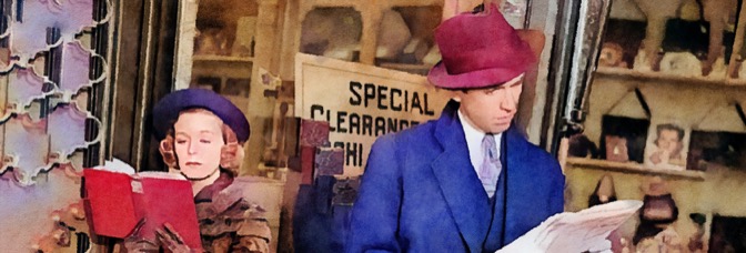
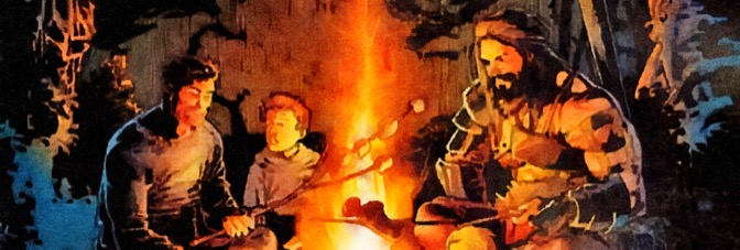
    Alice in Wonderland has a number of balls in the air at once and director Burton–though he does show a good sense of them each while in focus–can’t seem to bring them together successfully. The potentially unifying elements–like Danny Elfman’s score or Mia Wasikowska in the lead–both fall short. For whatever reason, Burton doesn’t have Elfman design the score to be memorable; even when it’s competent, it just reminds of better Danny Elfman scores. As for Wasikowska, who’s utterly phenomenal whether she’s in nineteenth century England or the titular Wonderland, the film loses her too often.

    And that loss of Wasikowska, even though it’s always to bring in the assorted cast of Wonderland, kills the film’s momentum. Alice has a very standard plot–Wasikowska has an unpleasant future waiting for her in reality, will her experiences in Wonderland somehow edify and empower her to deal with them? Even though it’s Alice in Wonderland, it often feels like Burton and screenwriter Linda Woolverton wish they were making Dorothy in Oz.

    But when Wasikowska is on screen, she’s able to sell Wonderland’s generic journey. She’s got able assistance too. Johnny Depp turns the Mad Hatter into a wonderful character, acting against his makeup, and Helena Bonham Carter is fantastic as the Red Queen. Both Anne Hathaway and Crispin Glover are painfully affected but they’re always opposite someone great so it doesn’t matter too much.

    Wonderland’s a moderate success, but should have been a much greater one.

    2/4★★

    CREDITS

    Directed by Tim Burton; screenplay by Linda Woolverton, based on novels by Lewis Carroll; director of photography, Dariusz Wolski; edited by Chris Lebenzon; music by Danny Elfman; produced by Richard D. Zanuck, Joe Roth, Suzanne Todd and Jennifer Todd; released by Walt Disney Pictures.

    Starring Mia Wasikowska (Alice Kingsleigh), Johnny Depp (Mad Hatter), Helena Bonham Carter (Red Queen), Crispin Glover (Stayne), Anne Hathaway (White Queen), Matt Lucas (Tweedledee and Tweedledum), Stephen Fry (Cheshire Cat), Timothy Spall (Bayard the Bloodhound), Michael Sheen (White Rabbit), Barbara Windsor (Dormouse) and Alan Rickman (Absolem the Caterpillar).


    RELATED

  • Birthright (2014) #4

    Birthright  4

    Williamson keeps improving with Birthright. He never loses what he’s already done, but he develops further–and not with his flashbacks to fantasy land, which get tiresome (something the father realizes too, in a great scene). Instead, he’s able to reveal things about the family without having to use a flashback. It comes up in the conversation, with the older brother reminding Conan of their lives before fantasy land.

    What’s particularly compelling about Birthright is how seriously Williamson takes both sides of the story. I’m dismissive of the fantasy elements because I’m not interested in them. But he’s still doing a tough story about this sword and sandal alternate reality; he never forces the tough. There’s an idealism, but a grounded one.

    And the family stuff is just getting better. It’s getting so good, actually, Bressan’s a little too clean for it.

    Birthright isn’t just impressive, it’s getting more so.

  • Birthright #4Williamson keeps improving with Birthright. He never loses what he’s already done, but he develops further–and not with his flashbacks to fantasy land, which get tiresome (something the father realizes too, in a great scene). Instead, he’s able to reveal things about the family without having to use a flashback. It comes up in the conversation, with the older brother reminding Conan of their lives before fantasy land.

    What’s particularly compelling about Birthright is how seriously Williamson takes both sides of the story. I’m dismissive of the fantasy elements because I’m not interested in them. But he’s still doing a tough story about this sword and sandal alternate reality; he never forces the tough. There’s an idealism, but a grounded one.

    And the family stuff is just getting better. It’s getting so good, actually, Bressan’s a little too clean for it.

    Birthright isn’t just impressive, it’s getting more so.

    CREDITS

    Writer, Joshua Williamson; artist, Andrei Bressan; colorist, Adriano Lucas; letterer, Pat Brosseau; editors, Helen Leigh and Sean Mackiewicz; publisher, Image Comics.

  • Robocop 7 (January 2015)

    Robocop #7Seeing Robocop run–he gets upgraded–reminds of two things. First, it’s like running zombies. Second, it’s a little like Batman on ice skates. It’s just too much. Magno’s art is stronger than it has been in the last few issues so he’s able to tone it down and keep the action grounded, but it’s still too much.

    However, Robocop being faster than a speeding bullet and able to leap tall buildings in a single bound isn’t the emphasis of the issue. The cops finally get around to going after the bad guy; Murphy gets some evidence, Lewis gets some evidence. Williamson’s Mr. Big is going down!

    But not this issue. This issue has a boring hard cliffhanger.

    Still, Magno does well with all the action and talking heads and so on and Williamson does really well with Lewis’s arc this issue. It’s problematic licensed property stuff, but still worthwhile.

    CREDITS

    Writer, Joshua Williamson; artist, Carlos Magno; colorist, Marissa Louise; letterer, Ed Dukeshire; editors, Alex Galer and Ian Brill; publisher, Boom! Studios.

  • The Fade Out 4 (January 2015)

    The Fade Out #4Even though there’s sensational material in the issue, the issue itself isn’t sensational. Brubaker is very measured. He’s meticulous in the plotting, giving just enough hints and just enough callbacks to the previous issues to get to some big surprises. By the time the issue ends, The Fade Out is something of a different comic than it was before.

    There are three big reasons. First, the previous issue where Brubaker changed up format. Second, the sensational material–the Red Threat in Hollywood. Third, the use of actual celebrities as characters. Brubaker’s very subtle about how he uses the last one and it works out beautifully.

    And Phillips. Phillips gets some great stuff to draw this issue. Not just the period scenes, clubs, talking heads banter, but a flashback to World War II and some more information about protagonist Charlie. It might turn out to be a great comic after all.

    CREDITS

    The Word on the Street; writer, Ed Brubaker; artist, Sean Phillips; colorist, Elizabeth Breitweiser; publisher, Image Comics.

  • Judge Dredd #29It’s a fairly strong issue, with only one weak story–a retelling of Frankenstein, only in Mega-City One; the other three stories are good.

    The first couple, with art from John Cooper, shows a kinder, gentler Dredd. The first deals with animal experimentation, the second with the plastic substance they use in the future dissolving. Writer Wagner goes for a final twist in the latter, which doesn’t do it much good (he’s thrown Dredd into a story not needing Dredd), but it’s still a good story. Cooper handles the humor of the situations and the action well.

    The last story, with Brendan McCarthy art, opens with a New Year’s Eve thing, then reveals the actual story. It’s still kinder Dredd, but ruthless too.

    As for the Frankenstein story–Brett Ewins does okay with the art, but it’s still weak. Wagner’s details are better than the plot.

    Still, nice overall.

    CREDITS

    Writer, John Wagner; artists, John Cooper, Brett Ewins and Brendan McCarthy; colorist, John Burns; letterer, Tom Frame; editor, Nick Landau; publisher, Eagle Comics.

  • Rocket Salvage 1 (December 2014)

    Rocket Salvage #1Rocket Salvage has a lot of information and nothing going on. The story, from Yehudi Mercado, is a future world out of the The Phantom Menace and a handful of other really popular movies or TV shows. Nothing original there.

    The hook–as far as the series concept goes, not as far as it being actually engaging–is a family of futuristic trash collectors. Dad’s a failed racer, Sis is super smart, Bro doesn’t have any luck with the ladies. And where’s Mom? Well, it’s a mystery.

    Rocket Salvage isn’t a pilot for a Disney show, it’s a pilot for an “adult” cartoon. Just not a funny one. Bachan’s art is detailed without being interesting. His design for the comic is precise, full of animated personality and nothing exciting.

    Mercado is obviously enthusiastic about Rocket Salvage. He just doesn’t seem to realize he’s got to make others enthusiastic for it.

    CREDITS

    Writer, Yehudi Mercado; artist, Bachan; colorist, Jeremy Lawson; letterer, Deron Bennett; editors, Alex Galer and Rebecca Taylor; publisher, Archaia.

  • Abigail and the Snowman 1 (December 2014)

    Abigail and the Snowman #1Abigail and the Snowman feels very familiar. Roger Langridge does a beautiful job with the artwork, which has a bunch of great montage sequences and sight gags. The art is great. And a lot of the writing is good. Really good. All of the writing is good, occasionally it’s really good.

    Occasionally too, however, the comic feels like a fresh take on a standard situation. Abigail is the new girl at school, she has a single parent–her dad, she sort of has to take care of him, she doesn’t make friends easily. There’s nothing interesting in the ground situation Langridge is setting up. A lot of it is stale.

    The titular Snowman appears towards the end of the issue. Presumably he’ll figure in more in subsequent issues…

    It’s a good comic from Langridge, but it never even approaches sublime. It’s too constructed, too self-aware of its selling points.

    CREDITS

    Writer, artist, letterer, Roger Langridge; editor, Rebecca Taylor; publisher, KaBOOM!.

  • Harbinger: Faith #0A lot of Faith, the comic, not the character, comes down to her boyfriend, Torque. Being majorly behind on Harbinger, I had no idea they were dating. I never liked the character and they seem like a questionable fit, which is what the comic turns out to be–Faith realizing her place in the world.

    Writer Joshua Dysart takes it seriously too. He puts enough work in so the dumb boyfriend moments like Torque feel like natural dumb boyfriend moments and not artificial ones engineered to move the plot along. They do look like those types of moments, but they aren’t. Dysart keeps the comic sincere.

    Artist Robert Gill does a good job too. He doesn’t have a lot of action to do, but he handles it well when it does come up.

    Dysart uses a Twitter device. It’s distracting… if only because I couldn’t stop thinking about character count.

    CREDITS

    Writer, Joshua Dysart; artist, Robert Gill; colorist, Jose Villarrubia; letterer, Dave Sharpe; editor, Kyle Andrukiewicz; publisher, Valiant Entertainment.

  • Star Trek/Planet of the Apes: The Primate Directive 1 (December 2014)

    Star Trek/Planet of the Apes: The Primate Directive #1
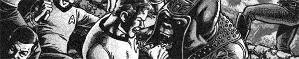
It’s strange, but the best thing about Star Trek/Planet of the Apes: The Primate Direction so far is Rachael Stott’s artwork. And her artwork isn’t particularly good. She does okay with people in action sequences, less with the spaceship stuff, but her talking heads are particularly interesting. She doesn’t go for photo referencing the cast of the original “Star Trek,” but she does capture the actors’ expressions.

    And, given writers Scott Tipton and David Tipton are really good at approximately an episode of “Star Trek” in terms of dialogue, the talking heads scenes are rather effective. It feels as much like Leonard Nimoy and William Shatner crossing over with Planet of the Apes in the late sixties as one is going to get.

    But what’s the point? So far, nothing. The Klingons go to Apes Earth and cause trouble. Big deal.

    Apes is nowhere weird enough for “Star Trek.”

    CREDITS

    Writers, Scott Tipton and David Tipton; artist, Rachael Stott; colorist, Charlie Kirchoff; letterer, Tom B. Long; editors, Sarah Gaydos and Dafna Pleban; publishers, IDW Publishing and Boom! Studios.

  • Song of the Thin Man (1947, Edward Buzzell)

    Song of the Thin Man has a lot of strong sequences and the many screenwriters sting them together well enough, but can’t figure out a pay-off. Some of the problem seems to be the brevity–while director Buzzell does an adequate job and Charles Rosher’s cinematography is good, none of the scenes end up having much weight.

    The film does give William Powell and Myrna Loy more to do in regards to their parenting–with Dean Stockwell as their son–they have less to do as far as investigating. Song runs less than ninety minutes and even another ten of a good mystery would help immensely. All of those really good sequences are either comedic parenting ones or a single “race the clock” one. Loy excels in the latter.

    There are just too many suspects and not enough time spent on them. The script sets up the suspects in the first few scenes and it plays efficiently enough, but then keeps everyone too suspicious to be sympathetic. The script works against itself and Buzzell isn’t at all the director to bring it together.

    Of the supporting cast members, Keenan Wynn and Jayne Meadows have the most to do and are the best. Wynn is Powell and Loy’s guide through the nightlife, with the script cutting a lot of corners as to how that tour progresses. It’s either lazy writing or lazy producing. Either way, it hurts the film.

    But Song is still entertaining, it just easily could’ve been better.

  • They’re Not Like Us 1 (December 2014)

    They're Not Like Us #1Not to be too reductive, but the proper response to They’re Not Like Us appears to be “OMG! It’s like a real life X-Men.” Only, apparently, the gifted youngsters don’t use their powers for good, but for selfish reasons. Writer Eric Stephenson sort of foreshadows said youngsters–really a collection of twenty something hipsters–using their powers to harm others. Just like Professor X, the leader has rules… the first being to kill everyone who you knew before you join the team.

    Will the Jean Grey-esque protagonist join with them, killing her family (who misunderstood her superpowers as schizophrenia)? Who cares. No one’s forcing me to read the comic, so I have no stake in it. Stephenson certainly doesn’t care about making his characters worth reading about.

    Simon Gane’s artwork is good. A little self-indulgent, but good.

    Like Us is a concept in search of a story.

    B- 

    CREDITS

    From Despair to Where; writer, Eric Stephenson; artist, Simon Gane; colorist, Jordie Bellaire; letterer, Fonografiks; publisher, Image Comics.

  • The Thin Man Goes Home (1945, Richard Thorpe)

    The Thin Man Goes Home is very genial. It would be hard for it not to be genial given some of the supporting cast is around just to be genial–familiar character actors like Edward Brophy, Donald Meek and Harry Davenport are around to be likable. And why shouldn’t William Powell and Myrna Loy heading to small town U.S.A. be genial? Of course, there’s a murder mystery, but director Thorpe manages to keep the investigation of it amusing too.

    The film’s problem is the geniality is the important thing, not just an approach to the story. Thorpe does really well with some of the comedic set pieces–the Grand Central Station sequence at the beginning, followed by a great packed train car sequence, then there’s a later one with Loy trailing Brophy to comic effect. He does great with Loy and Powell’s few scenes together too. Eventually their visit to Davenport and Lucile Watson (as Powell’s parents) and the murder mystery make it hard to make time for scenes together.

    At least, it’s hard for Robert Riskin and Dwight Taylor to figure it out in the script, which is strange, since it’s a really breezy piece of writing. Between Powell acting without sensible motivation, one large subplot being entirely ignored and then a few characters forgotten about, the script’s Home’s biggest problem.

    Powell and Loy are good, though she gets much better scenes, and the supporting cast is fine.

    After being a reasonably successful entry, the third act is a complete disaster.

  • Predestination (2014, Peter Spierig and Michael Spierig)

    With Predestination, the Spierig Brothers take the narrative gimmick to the nth degree. It’s not just a real part of the story, it’s the story. Unlike most films where there’s some satisfaction for the viewer in discovering the gimmick, the Spierigs figure out a way to just push the viewer further down the rabbit hole. The film’s a delicately constructed guided tour of a maze (though the guide isn’t clear) and the film raises a lot of questions it doesn’t want to be responsible for answering. The gimmick gives the Spierigs a way out–because if it’s about the gimmick, there’s no responsibility.

    But so much of Predestination is so good–and expertly constructed–it’s hard to imagine how they could do the story with responsibility. They don’t promise it and the gimmick unravels entertainingly throughout. So it’s a success. It’s a moderately budgeted time travel picture and all the settings are great. Between the careful composition and Ben Nott’s delicate photography, the film always looks good.

    And the acting is excellent. Ethan Hawke has to perform with the gimmick in mind, which means having an utterly sympathetic, but somewhat obtuse demeanor. It’s impossible to identify with him, more impossible the more his character develops, but the the film still requires the viewer do so. As his protege, Sarah Snook has a rather difficult role (which just gets more difficult) and she does well.

    It’s a very strange film (and not). It should be better, it shouldn’t be so good.

    2.5/4★★½

    CREDITS

    Directed by Peter Spierig and Michael Spierig; screenplay by Peter Spierig and Michael Spierig, based on a story by Robert A. Heinlein; director of photography, Ben Nott; edited by Matt Villa; music by Peter Spierig; production designer, Matthew Putland; produced by Paddy McDonald, Tim McGahan and Michael Spierig; released by Pinnacle Films.

    Starring Ethan Hawke (The Bartender), Sarah Snook (The Unmarried Mother) and Noah Taylor (Mr. Robertson).


    RELATED

  • Army of Darkness (1992, Sam Raimi)

    Bruce Campbell carries Army of Darkness. Not because there’s anything wrong with the movie–well, not so wrong it needs carrying–but because he’s got such a difficult role. His protagonist has to be sympathetic and stupid, a hero and a jerk. The audience can never stop to wonder if they should be rooting for Campbell, even when he’s wrong. The way the film presents him is probably the most significant thing about Army of Darkness.

    The film’s short, fast, funny. Even though it’s set in a medieval castle, full of people, director Raimi quickly establishes who’s important, who needs to be remembered for later. It’s a very practical film–Embeth Davidtz goes from being Campbell’s antagonist to his love interest. It serves no narrative purpose (she loses all personality once they’re romantic) other than the efficiency of not having to establish another character.

    There’s a lot of effects work. Lots and lots of rear screen projection and photographer Bill Pope never matches any of it. There are a bunch of great concepts, but the obvious artiface makes them more interesting technically than narratively. It’s too bad–especially since the deficiencies just intensify through the run time.

    But there’s so much enthusiasm from Raimi, such an odd reverence to the swashbuckler genre–and all the Harryhausen nods–the film is infectious. Campbell isn’t just always good, he’s always amusing; he makes the film entertaining, regardless of technical issues or narrative bumps.

    It’s self-aware and smartly stupid. Darkness works out.

    2.5/4★★½

    CREDITS

    Directed by Sam Raimi; written by Sam Raimi and Ivan Raimi; director of photography, Bill Pope; edited by Bob Murawski and Sam Raimi; music by Joseph LoDuca; production designer, Anthony Tremblay; produced by Robert G. Tapert; released by Universal Pictures.

    Starring Bruce Campbell (Ash), Embeth Davidtz (Sheila), Marcus Gilbert (Lord Arthur), Ian Abercrombie (Wiseman), Richard Grove (Duke Henry the Red), Timothy Patrick Quill (Blacksmith), Michael Earl Reid (Gold Tooth) and Bridget Fonda (Linda).


    RELATED

  • She-Hulk 11 (February 2015)

    She-Hulk #11Well. A She-Hulk versus Titania issue. With Volcana thrown in for good measure. It’s sort of fun, seeing Pulido do a huge fight sequence. He uses double-page spreads, half double-page spreads; it all looks pretty great.

    Unfortunately, even though Soule likes writing Titania’s banter, there’s nothing to the issue. It’s an all action issue without a gimmick. Pulido drawing the fight is fine, but they end up in the middle of nowhere, which is safer for collateral damage… and visually boring. Pulido’s looking at how the fight mechanics work between the two of them. And it just makes the whole thing a little tired.

    Of course the mystery bad guy is going to hire Titiana. Who else would he hire?

    And there’s no real pay-off with the final reveal because Soule takes the moment away from the regular cast. It’s amusing, but thin. It’s all thin.

    B- 

    CREDITS

    Titanium Blues; writer, Charles Soule; artist, Javier Pulido; colorist, Muntsa Vicente; letterer, Clayton Cowles; editor, Jeanine Schaefer; publisher, Marvel Comics.

  • Star Spangled War Stories 5 (February 2015)

    Star Spangled War Stories #5Lovable. Star-Spangled War Stories and G.I. Zombie are lovable. I’m not sure if it’s what Gray and Palmiotti intend–I assume so, since they go out of their way to make the comic read like a familiar, pleasantly inventive amusement. It’s the genial procedural of comic books.

    None of the details really matter–it doesn’t matter that G.I. Zombie works for the feds and isn’t a private eye–because Gray and Palmiotti just have to string together the little scenes. The great moments of the comic where the benefit of an undead hero comes in handy. There’s even time for him to catch up with an old–human–friend this issue.

    It’s awesome, start to finish. Gray and Palmiotti have found something special with this approach, because it’s not a horror comic and it’s not an action comic, but it borrows from both.

    And Hampton’s art looks absolutely fantastic.

    A 

    CREDITS

    Door-To-Door Delivery; writers, Jimmy Palmiotti and Justin Gray; artist and colorist, Scott Hampton; letterer, Rob Leigh; editors, David Piña and Joey Cavalieri; publisher, DC Comics.

  • Shadow of the Thin Man (1941, W.S. Van Dyke)

    Shadow of the Thin Man has a healthy mix of comedy and mystery. The resolution to mystery is a little lacking at the end, but the film moves so smoothly until then it’s easily forgivable. And there is one amusing final twist (along with a good final joke).

    Most of the comedy comes from William Powell playing responsible parent. Myrna Loy doesn’t have any scenes alone with their son, Richard Hall; instead, she has scenes commenting on Powell’s behavior around Hall. Thanks to Van Dyke’s direction–he excels in the oddest set pieces in Shadow, with a comedic merry-go-round sequence being a standout–the film always implies Loy’s active parenting without ever having to show it.

    Why not show it? Because it’s nowhere near as funny as Powell’s.

    As for the mystery, Powell and Loy keep stumbling into murder investigations. Eventually they take a more enterprising role. There are a lot of suspects and suspicious characters, ranging from the likable Barry Nelson and Donna Reed to Loring Smith and Joseph Anthony’s racketeers. None of the suspects, save Stella Adler, are particularly good but they’re all decent. The script doesn’t do the actors any favors. Anthony in particularly doesn’t get enough screen time.

    Instead, Irving Brecher and Harry Kurnitz’s script concentrates on the investigation and how Powell and Loy make discoveries. The mystery’s resolution isn’t spectacular, but the journey to it is rather good. Van Dyke’s pacing, both for tension and comedy, is outstanding.

    Shadow is a fine time.

  • The Shop Around the Corner (1940, Ernst Lubitsch)

    The Shop Around the Corner has a lot going on in a limited space. It’s not particularly long–under 100 minutes–and it mostly takes place in (or outside) the titular shop. And, while the present action is about six and a half months (there’s a big jump), the back story defines a lot of the characters and backstory.

    It also requires the viewer pay a lot of attention to the details in dialogue. Samson Raphaelson’s script–adapted from a play, which accounts for the big jump in time (director Lubitsch beautifully turns act breaks and scene breaks into gentle resets for the viewer with fade outs)–always has a lot of talking and many of the details become important. It’s all so well-written and so well-performed, you get the important details because you don’t want to miss even disposable dialogue.

    The film has two leads–James Stewart and Margaret Sullavan. They start out equal, but Stewart gets more to do in the second half as his professional story arc (involving their boss, Frank Morgan) becomes very important. The Shop Around the Corner is a romantic comedy, but it’s also a film with a lot of seriousness. Not even the romantic stuff is always happy–or always hopeful. Lubitsch goes out of his way to create a world where dramatic turns can be negative (and inevitable).

    The supporting performances are outstanding; Morgan, Felix Bressart and William Tracy are standouts.

    Shop is simultaneously quietly and noisily brilliant. It’s wonderful.