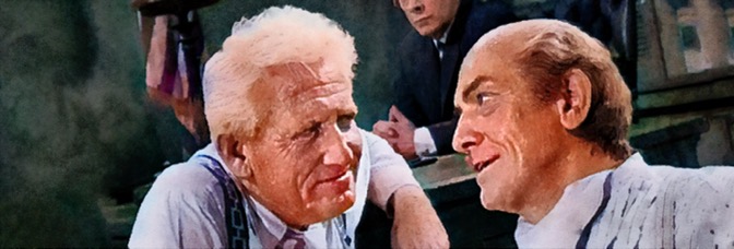
The Human Condition I: No Greater Love is about, you guessed it, the human condition and the problems with being a humanist when you’re working in a foreign country your country has invaded and occupied. The film takes place in 1943, in Japanese-controlled Manchuria. It’s a desolate spot, but lead Nakadai Tatsuya doesn’t want to go to war and the assignment lets him get out of the draft and he gets to marry his sweetheart, Aratama Michiyo.
These developments occur in the first fifteen minutes of Love, which runs three and a half hours. They should be important in establishing Nakadai and Aratama, but really it just shows the actors to have very little chemistry and very poorly written roles.
Director Kobayashi doesn’t bring much to film (he also cowrites the overcooked screenplay); he can’t direct the actors, wherever they shot on location adds all the tone and, even though Miyajima Yoshio’s photography is good, it’s clear the weak composition is holding it back.
Love is a historical melodrama. The cast is huge, nothing good ever happens to anyone, but it’s also a political melodrama and Kobayashi doesn’t like subtlety. At all. The film runs head first into any place it can make commentary–racism, classism, sexism–and leaves the characters racing to catch up.
At least they’re running through gorgeous landscape.
Yamamura Sô gives the best performance as Nakadai’s sidekick. The rest of the performances are, graciously put, thin.
Love avoids every interesting possibility and embraces every predictable.
 ★
★
CREDITS
Directed by Kobayashi Masaki; screenplay by Matsuyama Zenzô and Kobayashi, based on the novel by Gomikawa Jumpei; director of photography, Miyajima Yoshio; edited by Uraoka Keiichi; music by Kinoshita Chûji; production designer, Hirataka Kazue; produced by Wakatsuki Shigeru; released by Shochiku Company.
Starring Nakadai Tatsuya (Kaji), Aratama Michiyo (Michiko), Awashima Chikage (Jin Tung Fu), Arima Ineko (Yang Chun Lan), Yamamura Sô (Okishima), Ishihama Akira (Chen), Nanbara Kôji (Kao), Miyaguchi Seiji (Wang Heng Li), Abe Tôru (Sergeant Watai), Mishima Masao (Kuroki), Ozawa Eitarô (Okazaki), Mitsui Kôji (Furuya), Kôno Akitake (Captain Kono), Nakamura Nobuo (Head Office Chief), Sazanka Kyû (Meisan Chô) and Sada Keiji (Kageyama).
RELATED


 Much of the issue–maybe even most of the issue–is a sword fight. There’s no dialogue, no description; Lark moves through the fight, sometimes showing reaction shots, sometimes working on a subplot, but the point is the two women fighting. It’s brilliantly choreographed and it shows a level of concentration from Lark, who I never thought of as a movement guy.
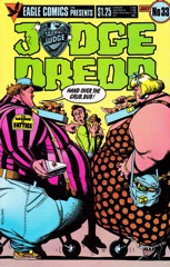 This issue of Dredd seems to be the strange issue, like they found all the absurdly funny strips from 2000 AD and gave them their own issue. And artist Ron Smith works for it. He has a jovial, cartoon-y style. He doesn’t draw Dredd very well, but everything else is good. Dredd–and the rest of Judges–seem inserted and static.

 Williamson has a surprise in him. Birthright has it’s big surprise, of course, the big overall one, but Williamson totally changes the series with the last scene and it’s pretty cool. Birthright, just because the concept is so defined, occasionally feels like it can’t surprise. Even when it’s really good, it’s because Williamson’s doing really well with that concept.


 Ghosted feels like a much different comic book with Vladimir Krstic Laci on art. It feels like a seventies ghost comic, slick in a classical sense, not a hip sense. It works against a bunch of the book’s concepts and makes Ghosted a much more entertaining read this month. Just the way Laci breaks out the action alone changes the experience.
 The writing on this issue of Satellite Sam is excellent. Fraction hits every subplot, sort of checks its temperature, stirs it a little, then combines a couple of them into the final scene of the comic.


 It’s a decent, not great, issue of Velvet. Brubaker’s resolution to his rip-off of The Rock works out a whole lot better than I would have expected; he and Epting do a nice talking heads comic with the Sean Connery (sorry, Patrick Stewart more like) telling Velvet just enough of what she thinks she knows. And Brubaker writes the hell out of the exposition. He had me trying to anticipate the twists, which I don’t usually care about.
 It’s a rather good issue of Nailbiter. I’m beginning to think the problem with Williamson’s writing isn’t too many ideas (or a lack of them on the fast issues), but a pacing one. On Nailbiter, his two issues would work better as one than two. The cliffhanger aside. Or maybe muted.
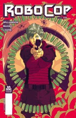 I’m not sure how I’d describe Killian, Williamson’s long-in-the-tooth antagonist in Robocop, but soap opera tough guy might be the best description. There’s no depth to the character, which is starting to get really annoying. Though Magno’s design for the him does look a lot like an eighties tough guy, which fits in with it being a sequel to Robocop.
 There are some definite issues with Reis’s art here. The people don’t look right; he’s maybe trying a new style and it doesn’t take. Or maybe there are just too many people to draw. The issue is a lot of talking heads scenes, no real action besides the introduction of staged supervillains.
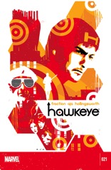 What’s confusing about this very late issue of Hawkeye is how little anyone is invested in it; Fraction has the most fun when doing a one page scene between Clint and Jessica Drew and Aja manages to do some great design, but not turn it into great art. So what does Fraction do? He goes for a gut shot at the end, just to make Hawkeye feel like it matters.


 There’s not much original in Cluster so far. It’s a remix of a lot of sci-fi, popular and not, but writer Ed Brisson manages to coat over all those elements because the story isn’t derivative, the details aren’t homage, they’re just part of the sci-fi language now. Of course there’s something out of BattleTech in Cluster. Why wouldn’t there be?
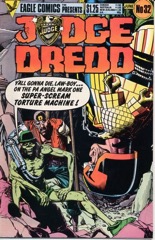 Dredd has his showdown with the surviving Angel brothers. It’s an oddly incomplete story just because Walter has a silent but important role and Wagner and Grant never get around to resolving it. At least not in this collection of progs; maybe in the actual 2000 A.D. they got to it in a good amount of time.
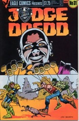 Besides having some very odd angles from Ezqerra, this issue does pretty well. Even if Wagner and Grant have a really, really silly setup.
 This issue of Bitch Planet, as far as DeConnick’s technical writing goes, is amazing. It’s the best plotted, best constructed comic I’ve read in a long time. The balance of talking heads to action sequences, how DeConnick and De Landro work those action sequences out, it’s phenomenal.