• MPH 2 (June 2014)

    MPH #2It’s bad, but I sort of wanted Millar to flop on the second issue of MPH. Not for any reason other than his adherence to the eighties multi-racial movie gang. He’s got them in here; nothing but it seems.

    But he doesn’t flop. Even without doing some fantastic super-speed moments–there’s only one–the issue proves incredibly entertaining and Millar manages to get in some good character work. He’s got a new approach to how the characters experience the drug. The world’s on pause around their adventures. It takes him a while to get to this device, with the guy from the last issue zooming in and out of his friends’ lives.

    MPH then has the problem of seeming too impulsive and I was ready for it to flop because of Millar’s brevity. He doesn’t skip the responsibility though, he owns it.

    Additionally, it doesn’t hurt the Fegredo art is absolutely gorgeous.

    B 

    CREDITS

    Writer, Mark Millar; artist, Duncan Fegredo; colorists, Peter Doherty and Mike Spicer; letterer, Doherty; editor, Jennifer Lee; publisher, Image Comics.

  • The Mice Templar 3 (January 2008)

    The Mice Templar #3This issue is a little busy. First, Glass showcases a rat battalion as they return home. They’re hunting. Nasty guys, these rats. It turns out some of the cast from the first issue has survived and are now prisoners of the rats, so Glass turns the focus to them for a while.

    Of course, he had a cliffhanger to resolve with Karic and Pilot–Luke and Obi-Wan–and he gets to it nearly halfway through. They have a lengthy resolution to their problems and it’s a rather neat one but then Glass proceeds to work towards another cliffhanger.

    If I’m counting right, the issue has one cliffhanger resolution, one soft cliffhanger for the prisoners and another hard cliffhanger for Karic. It’s just too much, even if Glass does pace it all beautifully. The emphasis on revelation and action means not enough character development.

    Still, Glass and Oeming have momentum.

    B 

    CREDITS

    The Prophecy, Part Three: Black Aniaus; writers, Michael Avon Oeming and Bryan J.L. Glass; artist, Oeming; colorist, Wil Quintana; letterer, James H. Glass; editors, Judy Glass and Will Swyer; publisher, Image Comics.

  • Wildfire 1 (June 2014)

    Wildfire #1Wildfire seems to a science thriller. It’s hard to say so far–writer Matt Hawkins gives the reader a glimpse of the titular disaster and then backtracks a few days, presumably to show now the event came to pass.

    He’s got Linda Sejic on art and she’s doing sort of a digital cartooning thing. I say sort of because she’s trying real hard not to be cartoonish but it comes through every once in a while, especially during the character development scenes. But it’s relatively competent–there are some blurring effects she uses to cover not doing full detail and those are annoying–but Hawkins’s script is outstanding.

    The setup has a lot to do with the controversy over GMO as food stuffs, but real human failings leading to the science thriller aspects.

    Hopefully Hawkins can keep up the balance between tension and character development; it’s a rather impressive start.

    B+ 

    CREDITS

    Writer, Matt Hawkins; artist, Linda Sejic; letterer, Troy Peteri; editor, Betsy Gonia; publisher, Top Cow Productions.

  • The Flash #289Cary Bates sure does like exposition. It’s practically endless in the Flash feature, with Bates writing really long paragraphs of thought balloons explaining why The Flash can do what he can do. None of it makes any sense, but it sounds scientific.

    The story has The Flash trying to sort of two villains who are battling each other. There are a lot more details–like they’re astral twins and so on–but he doesn’t really do anything with that relationship. It’s just another piece of the story requiring a whole lot of explanation, which Bates then provides.

    The art from Don Heck and Frank Chiaramonte is decent and everything works out pretty well. It’s just goofy and Bates can’t hide it.

    Then there’s the Firestorm backup with gorgeous George Perez art. Besides the lovely action intro, it’s a origin retelling. Gerry Conway’s writing is solid, but the art’s the thing.

    B 

    CREDITS

    The Good… The Bad… and The Unexpected; writer, Cary Bates; penciller, Don Heck; inker, Frank Chiaramonte. Firestorm, Firestorm is Back In Town!; writer, Gerry Conway; penciller, George Perez; inker, Romeo Tanghal. Colorist, Gene D’Angelo; letterer, Ben Oda; editor, Len Wein; publisher, DC Comics.

  • Thomas Alsop 1 (June 2014)

    Thomas Alsop #1Thomas Alsop is one confused comic. Not the art from Palle Schmidt, it’s excellent throughout. But Chris Miskiewicz’s story ranges from annoying to outstanding. Outstanding is when he flashes back to the titular character’s ancestor on Manhattan in the 17th century. Annoying is all the modern stuff.

    Miskiewicz writes the modern stuff as the lead character’s obnoxious blog posts. They’re based on the idea he’s a charismatic guy. He’s not. Thomas Alsop is a tool. His adventures as the mystical protector of Manhattan are ill-defined too (especially given the events of 9/11, something I don’t know if I’d even want Miskiewicz to attempt discussing).

    The modern stuff jumps around to show the reader Alsop hasn’t always been a tool–in the present-most time, he’s a rock star tool. Before he was just a buffoon. Miskiewicz is bad at writing the narration.

    Still, the art, and flashbacks, intrigue.

    C- 

    CREDITS

    The Hand of the Island, Part One; writer, Chris Miskiewicz; artist, Palle Schmidt; letterer, Deron Bennett; editors, Jasmine Amiri and Ian Brill; publisher, Boom! Studios.

  • The Mice Templar 2 (November 2007)

    The Mice Templar #2There’s a lot of information in this issue. There’s a recap of the last issue and there’s a big history lesson of the Mice Templar world. That history lesson is rather confusing. Glass brings in a lot of names and ideas–the Oeming art is really good for these sequences. But it’s still a long history lesson.

    The comic now follows a young novice and his mentor. I can’t remember the names. They’re mice, obviously. Glass does a great job with the kid, who’s trying to deal with the death of his friends and family and the enslavement of his townspeople. The comic tracks the two of them on their journey. There’s a little about the new settings, but never too much

    Glass and Oeming are clearly invested in Templar. The enthusiasm wouldn’t be enough but Glass has that strong character development and excellent plotting going too.

    It’s impressive stuff.

    B+ 

    CREDITS

    The Prophecy, Part Two: In the Beginning…; writers, Michael Avon Oeming and Bryan J.L. Glass; artist, Oeming; colorists, Wil Quintana and Cris Peter; letterer, James H. Glass; editors, Judy Glass and Will Swyer; publisher, Image Comics.

  • Loki: Ragnarok and Roll 4 (June 2014)

    Loki: Ragnarok and Roll #4Loki’s a trickster so it’s all been a trick! I won’t spoil it and say how or what has been a trick, but the biggest trick has to be Esquivel’s–he got me to read the whole series.

    The problem with wrapping up the entire comic in a reveal–and by entire comic, I mean all four issues–is there not being anything else going on for said comic. Esquivel wasted the last couple issues; he throws in some desperate attempts at character development here, then ignores them a page or two later. All because of that amazing reveal.

    As reveals go, it’s not bad. But there’s nothing else in the issue or comic. I remember the first issue being really tightly told and then the series went down hill. This final issue would be the absolute bottom, with Esquivel wasting many pages on lame action scenes.

    Loki’s a disappointment.

    D 

    CREDITS

    Writer, Eric M. Esquivel; penciller, Jerry Gaylord; inkers, Jerry Gaylord and Penelope Gaylord; colorist, Gabriel Cassata; letterer, Ryan Ferrier; editors, Chris Rosa and Ian Brill; publisher, Boom! Studios.

  • Firestorm, The Nuclear Man #5It’s a pointlessly double-sized issue. The extra pages give Conway time to get in fight scenes between Firestorm and both villains–and the art on the fight with the Hyena does have a great double page spread–without having to sacrifice the character development.

    Ronnie and the girlfriend, Doreen, go on an actual date. There are big problems with the date, both in them walking into a supervillain fight and in now Conway forces too much ominous foreshadowing, but it’s at least a scene between two people where they exhibit personalities.

    There’s some really good stuff with Professor Stein too. Conway roams a lot as far as protagonists for a scene. It’s too omniscient to let the comic have a personality, but it’s definitely effective for engaging storytelling.

    The problem is there’s just too much in the issue and it ends without having accomplished anything. It’s inflated but empty.

    C 

    CREDITS

    Again: Multiplex!; writer, Gerry Conway; penciller, Al Milgrom; inker, Bob McLeod; colorist, Jerry Serpe; letterer, Clem Robins; editor, Jack C. Harris; publisher, DC Comics.

  • Winterworld 1 (June 2014)

    Winterworld #1Winterworld is about some guy who has a teenage girl sidekick in a post-apocalyptic frozen wasteland.

    Writer Chuck Dixon has a very strange approach to the plotting–every scene is a glimpse of a full scene without any real transition between them. It reads like it’s on fast forward. Luckily, Dixon has Butch Guice on the art and it doesn’t matter how fast it reads, Guice’s panels are gorgeous.

    Particularly great are the frozen battleship and then a chase sequence where the protagonists are on the run from some bad guys on motorcycles. Maybe it’s like The Road Warrior but who knows because Dixon doesn’t spend time on anyone but the leads. And all they do is bicker and try to survive.

    The surviving stuff isn’t particularly interesting; the bickering passes the conversations. Dixon can write so maybe the pacing’s intentional. Or he just knows Guice will carry it.

    B- 

    CREDITS

    Writer, Chuck Dixon; artist, Butch Guice; colorist, Diego Rodriguez; letterer, Robbie Robbins; editor, David Hedgecock; publisher, IDW Publishing.

  • Labyrinth (1986, Jim Henson)

    Every so often, Labyrinth plays like an episode of “Fraggle Rock” with special guest star David Bowie. Oddly, the film starts Bowie heavy but pretty soon he’s just popping in to remind the viewer he’s still around. His performance is terrible; his singing sequences are fine, especially how capably he acts with all the puppets.

    It’s important too, because there’s nothing to Labyrinth without the puppets. Henson knows how to direct the puppets and his company knows how to make living creatures with them. It’s a shame none of this attention went into the story, which apes The Wizard of Oz more than a little.

    Except Jennifer Connelly’s lead is unlikable for a long, long time. There are all sorts of hints at how her adventure in the magical goblin land relates to her real life, but the metaphors are undercooked. The film’s goal is more about showcasing what Henson and company can do.

    And they can do quite a bit. Labyrinth is absolutely gorgeous. While the Alex Thomson photography doesn’t especially impress, John Grover’s editing is amazing.

    Connelly is likable enough–eventually–but she doesn’t really have a character to play. Labyrinth doesn’t even spend time making the fantasy world seem real, which becomes clearer and clearer. Henson just needed to slow down and enjoy himself. Or maybe he really didn’t want to do anything with human actors.

    Problems aside, there are some truly wondrous creature creations in the film and it goes by fast. Just way too fast.

    1.5/4★½

    CREDITS

    Directed by Jim Henson; screenplay by Terry Jones, based on a story by Dennis Lee and Henson; director of photography, Alex Thomson; edited by John Grover; music by Trevor Jones; production designer, Elliot Scott; produced by Eric Rattray; released by Tri-Star Pictures.

    Starring David Bowie (Jareth the Goblin King), Jennifer Connelly (Sarah), Toby Froud (Toby), Shelley Thompson (Stepmother), Christopher Malcolm (Father), Natalie Finland (Fairy), Shari Weiser & Brian Henson (Hoggle), Ron Mueck & Rob Mills (Ludo) and Dave Goelz & David Alan Barclay (Didymus).


    RELATED

  • Baby Buggy Bunny (1954, Chuck Jones)

    Baby Buggy Bunny opens with its weakest sequence–a bank robbery. The perpetrator is a baby-sized thug who gets away by throwing on a bonnet and hopping in a carriage. Clearly there are some Baby Herman connections, especially later on when the robber and Bugs Bunny start battling.

    Bugs gets involved thanks to a runaway baby carriage carrying the loot–hence the title–but most of the cartoon has him caring for this thug, unaware of the true identity of the “baby.” There are some great bits; Jones has the comic pacing down here.

    The arrival of Bugs also has a change (for the better) in the animation. The bank robbery sequence is erratic, maybe even intentionally, but the Bugs stuff is just good work. The writing is really strong too. The scene where Bugs finds out who he’s been caring for is fantastic.

    Buggy is a great time.

  • Rocky and Bullwinkle (2014) #4

    Rocky and bullwinkle 4

    Once again, Evanier seems to be running out of ideas–at least for what to do with his titular characters. Even the Dudley Do-Right story has Dudley reduced to a brief walk on appearance. Though the whole horse thing is back, which is awkwardly hilarious.

    But for the feature, it’s Rocky and Bullwinkle against Boris and Natasha–this time it’s a hamburger war. Evanier spends forever setting up the scheme from the villains and then has to quickly wrap it up in the second half of the story without Rocky or Bullwinkle getting much to do.

    I apologize for that lengthy sentence.

    There’s nothing particularly great about the story or even the art. Langridge does a fine job and gets to do some variety, but there’s not a lot of enthusiasm. Or anything to get particularly enthusiastic about. Hamburgers aren’t visually exciting, no matter what.

    It’s a decent finish.

  • The Mice Templar 1 (September 2007)

    The Mice Templar #1The Mice Templar is a heavy book. This first issue is double-sized, which is both good and bad. It’s good because Michael Avon Oeming and Bryan J.L. Glass are able to get the whole story done, but it’s bad because it’s too much at once. Glass has time to introduce the cast–maybe not make them all familiar to the reader, just because there are so many–and make the reader enjoying spending time with the cast.

    Then the rats arrive and the comic goes from something cute–it’s about medieval mice after all–with danger to something dangerous without cute. By the end of this first issue, the cute factor is gone. Glass and Oeming–especially Oeming during the battle scene–show themselves to be ruthless and violent.

    It’s a kiddie title with nothing kiddie about it.

    Glass does a great job texturing the setting with details; it’s a wrenching read for a first issue.

    B 

    CREDITS

    The Prophecy, Part One: The Calling; writers, Michael Avon Oeming and Bryan J.L. Glass; artist, Oeming; colorists, Wil Quintana and Cris Peter; letterer, James H. Glass; editors, Judy Glass and Will Swyer; publisher, Image Comics.

  • Firestorm, The Nuclear Man #4The issue opens with a lengthy recap of the previous one’s events and Conway’s found a great way to do exposition in the series. Ronnie and Professor Stein just talk about it naturally.

    There’s a certain appeal to this issue of Firestorm, even though Conway tries through hard throughout. About the only time he isn’t overextending himself is with Professor Stein. Those scenes are perfectly measured.

    The stuff with Ronnie–who has problems with his dad, problems with the kids at school–goes too far. Conway has a couple really nice moves in his scenes, but it’s way too obvious he’s going for melodrama and not letting the character build naturally. From scene to scene, there’s no sense of the previous scene having any effect on the character, just being a display for the reader.

    Also problematic this issue is the villain–the Hyena. The Hyena talks a lot and it’s really goofy.

    B- 

    CREDITS

    When Laughs the Hyena!; writer, Gerry Conway; penciller, Al Milgrom; inker, Jack Abel; colorist, Gene D’Angelo; letterer, Clem Robins; editor, Jack C. Harris; publisher, DC Comics.

  • Tales of Honor 3 (June 2014)

    Tales of Honor #3Hawkins does such a good job with the pacing–the way he’s able to split the story off into scenes with auxiliary characters and have his protagonist narrate from her side makes Tales of Honor something special. Only this time Hawkins doesn’t have a natural stopping point; he goes for a hard cliffhanger but it’s got to do with a mission, not the commander or the speaking cast.

    It cuts down on the effectiveness. Also problematic is that Jeong art. It’s so painfully digital and so uninventive, it needs Hawkins’s plotting and narration (presumably from the source novel) to keep things moving. But the finale has the aliens and Jeong is terrible at the living things.

    Still, the mid-section plot development and the character development are just phenomenal and keep Honor compelling on multiple levels. Hawkins just needs to stop leaving his main cast off page for the cliffhangers.

    B- 

    CREDITS

    On Basilisk Station, Part Three; writer, Matt Hawkins; artists, Sang-Il Jeong and Linda Sejic; letterer, Troy Peteri; editor, Besty Gonia; publisher, Top Cow Productions.

  • Ragamuffins 1 (January 1985)

    Ragamuffins #1Ragamuffins is a very strange comic. It’s unfortunate it’s strange, because in addition to being strange, it’s a lovely effort from Don McGregor and Gene Colan.

    McGregor writes first person narration to introduce each of the three stories, which start in 1951 and then follow up with the protagonist some years later to show how he’s grown up. The problem is how well the stories work–Colan doing small town Americana is just phenomenal and McGregor writes the heck out of the scenes–so when the last one has a forced finish, it’s very obvious.

    If McGregor had done a fourth story, or even put the three stories in a different order, it might work out. But for there to be two successful transitions between stories and then a failure on the last one. It hurts.

    But the comic’s successful right up until the last page. Wonderful mix of nostalgia and reflection.

    B 

    CREDITS

    Writer, Don McGregor; artist, Gene Colan; colorist, Steve Oliff; letterers, P. Bernard Jr. and David Cody Weiss; editor, Dean Mullaney; publisher, Eclipse Comics.

  • She-Hulk 5 (August 2014)

    She-Hulk #5Soule shows off major writing chops–the pace of the issue is phenomenal–and he’s got this amazing conversation between She-Hulk and Shocker but he tries for too much. He’s also got Ron Wimberley on the art. Hopefully Wimberley is a fill-in, because he eventually gets to be too much. During Hellcat and Tigra’s scene–they also have a good conversation–the exaggerated figures stop the comic cold.

    But it’s not all Wimberley’s fault, like I said before. Soule has three plot lines this issue–Jennifer, Patsy and Jennifer’s paralegal–and he juggles them well, only to let it all fall apart so he can get a hard cliffhanger. Almost literally.

    Something about the flow is just off, maybe because of how Jennifer’s wrap-up with Shocker goes from this quietly special moment to narrative mechanizations.

    It’s still a fine issue, just one with some rather significant problems.

    B 

    CREDITS

    Blue; writer, Charles Soule; artist, Ron Wimberley; colorist, Rico Renzi; letterer, Clayton Cowles; editors, Frankie Johnson, Jeanine Schaefer and Tom Brennan; publisher, Marvel Comics.

  • Firestorm, The Nuclear Man #3I don’t know how best to make the remark without it sounding like a slight but McLeod inks the heck out of Milgrom’s pencils this issue. There are maybe two questionable panels, otherwise the art is first-rate.

    And it’s first-rate art on an excellent comic. Conway doesn’t do a direct sequel to the previous issue, he jumps ahead a bit and starts with Firestorm being juvenile. There’s a lot in the issue about the dynamic between Ronnie and the Professor when it comes to being Firestorm and the maturity required for it (Conway wants to say the great power line and does come close).

    There’s also quite a bit with Professor Stein on his own, which is cool. And the villain introduced is Killer Frost. I should have punned.

    No, I shouldn’t have.

    The issue’s very strong thanks to the emphasis on Stein and the villain. Very strong.

    B+ 

    CREDITS

    Kiss Not The Lips of Killer Frost; writer, Gerry Conway; penciller, Al Milgrom; inker, Bob McLeod; colorist, Mario Sen; letterer, Ben Oda; editor, Jack C. Harris; publisher, DC Comics.

  • Starlight 4 (June 2014)

    Starlight #4I don't know if Starlight is exactly deceptive, but Millar does make you forget he's up to his old content tricks. There's just enough humor, character revelations (I was going to say development, but not really) and nods to the Flash Gordon roots of the project to move things along. Not to mention the Parlov art. There's some phenomenal Parlov art this issue.

    But then, as the issue wraps up, it becomes clear Millar only really resolved his cliffhanger from the previous issue and set Duke up for the next big cliffhanger and the next big opportunity for fantastic Parlov art. There's nothing wrong with that approach but if Starlight is just going to be comic to read for the art… maybe Millar could talk less.

    Because he doesn't really have anything to say. He hints at having something to say, but then avoids it.

    Even hampered, the comic's successful.

    B 

    CREDITS

    Writer, Mark Millar; artist, Goran Parlov; colorist, Ive Svorcina; letterer, Marko Sunjic; editor, Nicole Boose; publisher, Image Comics.

  • Star Trek 12 (March 1981)

    Star Trek #12Penciller Luke McDonnell–along with Tom Palmer on inks–does a lot of photo referencing this issue. But he’s only partially successful. Kirk looks spot-on, but Spock doesn’t. And Janice Rand returns this issue; she’s not spot on either. At least she’s not problematic. The work on Spock is downright bad.

    The issue references the first episode of the television show, the disappearance of Rand in the first season and then a lot from the movie. There are a few visual cues straight from The Motion Picture.

    Pasko’s script moves fast and doesn’t stop for the absurdity speed bumps. There’s a big crisis and the entire thing should have been avoided. Pasko seems to realize it and skips even trying.

    He also does a feeble characterization of Rand. She’s an entirely new character from her time on the show; Pasko can’t connect to her.

    It’s a well-intentioned misfire.

    C 

    CREDITS

    Eclipse of Reason; writers, Alan Brennert and Martin Pasko; pencillers, Luke McDonnell and Tom Palmer; inker, Palmer; colorist, Carl Gafford; letterer, Joe Rosen; editor, Louise Jones; publisher, Marvel Comics.

  • Star Trek 34 (June 2014)

    Star Trek #34
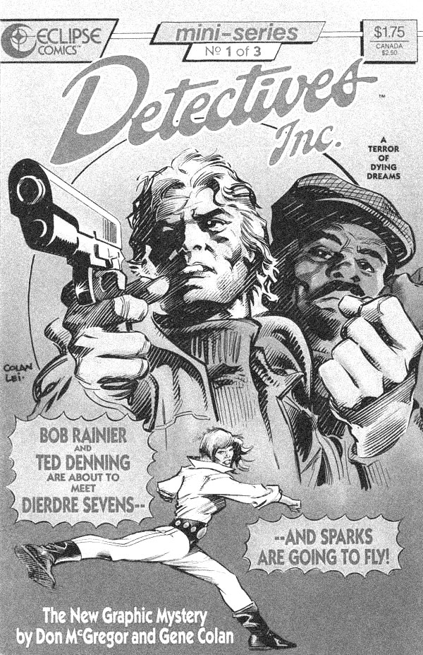
There's a goofy aspect to this issue because there's got to be, given Johnson's storyline. It's a rip-off of some other things, with a couple odd Jurassic Park homages thrown in, but it's not a terrible story. Johnson gives Kirk a lot to do.

    But Corroney's art doesn't help things. He does fine with the flashbacks to the 1970s. The art on that single page flashback is good. But then, once in Star Trek time, he falls apart. He spends too much time referencing photos of the actors playing the cast–which is hilarious for Bones, who Johnson writes wonderfully like the original series–and not enough time coming up with a style.

    There's an alien monster involved with the story and Corroney turns it into a goofy purple thing. It's not scary or impressive or anything, it's just goofy.

    It's nice to see Johnson trying for an original (if derivative) story.

    C 

    CREDITS

    Lost Apollo, Part Two; writer, Mike Johnson; penciller, Joe Corroney; inkers, Corroney, Victor Moya and Rob Doan; colorist, Sakti Yuwono; letterer, Neil Uyetake; editor, Sarah Gaydos; publisher, IDW Publishing.

  • Firestorm, The Nuclear Man #2I don’t want to spend time griping about Milgrom’s pencils. If his composition were better, I might even let it pass, but the composition–and how he handles the costumed stuff–is a real problem. Conway gets in a lot of scenes and Milgrom handles the transitions awkwardly. His figures in superhero motion are really awkward, especially the flying. Superman guest stars too so lots of flying.

    This issue picks up the day after the previous issue with more superhero stunts from Firestorm. He gets a villain–Multiplex–and Conway works a little bit on the character stuff too. Conway succeeds at making teenage Ronnie Raymond simultaneously a star athlete and a kid with low self-esteem. Right now, it’s all in broad strokes. Conway’s hinting there’s more depth.

    As for Professor Stein, the other half of Firestorm, Conway doesn’t give him much space.

    The issue’s likable, but very problematic.

    B- 

    CREDITS

    Danger Doubled Is Death; writer, Gerry Conway; penciller, Al Milgrom; inker, Bob McLeod; colorist, Adrienne Roy; letterer, Ben Oda; editor, Jack C. Harris; publisher, DC Comics.

  • Infinity Man and the Forever People #1It’s hard to get excited about Infinity Man and the Forever People because there’s only so much enthusiasm from creators Dan Didio and Keith Giffen. Giffen does a thoroughly competent job with the artwork; it looks and feels like a Kirby homage should look and feel. Didio even gets away with a blatant Kirby homage, just because it’s a readable “New 52” comic and deserves a lot of slack.

    But it’s just The Forever People. Even if Didio’s apparently mixing it with “Melrose Place.” He doesn’t actually have any great ideas or even excited, problematic ones. It’s a safe comic.

    About the most engaging thing is the lead-up to the cliffhanger just because things are moving. Equating the Highfather to Hitler isn’t moving, it’s exposition and boringly expressed. Didio does better other places, once the New Gods’ Earth guide shows up.

    It’s a likable, but undercooked proposition so far.

    B- 

    CREDITS

    Planet of the Humans; writers, Keith Giffen and Dan Didio; penciller, Giffen; inker, Scott Koblish; colorist, Hi-Fi; letterer, Travis Lanham; editors, Kyle Andrukiewicz and Joey Cavalieri; publisher, DC Comics.

  • Manifest Destiny (2013) #7

    Manifest Destiny  7

    Dingess and Roberts start the next arc–somewhat unannounced–with the survivors of the settlement aboard the ship. There’s very little not having to do with them–poor Pocahontas is reduced to two or three lines and background–but Dingess does take the time to detail some of the crew’s backgrounds.

    It’s nearly a calm river travel story, then one of the settlers sparks an argument for Lewis and Clark and brings one of the series’s problems into focus. I can’t remember who’s Lewis and who’s Clark. I double checked and Lewis is narrator and brown-haired guy, but it barely matters. Dingess has a great concept and plotting and letting the would-be protagonists get too much spotlight isn’t in the cards.

    It’s actually a very good issue in many ways and the great conclusion makes up for the bumps; overall, Dingess just hasn’t found a good narrative approach.

  • Star Trek 11 (February 1981)

    Star Trek #11This issue’s art, from Joe Brozowski and Tom Palmer, is better than the usual for the comic. A lot of emphasis on the faces, lots of photo reference, but also a decent level of general competency. If a little static.

    Pasko’s script regurgitates some of the old “Star Trek” episodes without offering anything new. He relies on bringing in a guest star from a character’s past, which hurries along the setup because Pasko can use expository conversation. It’s just not very useful in terms of furthering the characters. Everyone is stuck; it’s unfortunate the series doesn’t take the time to develop any character subplots. Maybe the license forbids it.

    It’s a perfectly fine licensed property comic. Pasko’s clearly a “Trek” enthusiast and he does fine remixing a bunch of old episodes into this story. It’s a shame Marvel isn’t doing anything more with the comic, but it’s to be expected.

    C 

    CREDITS

    “…Like a Woman Scorned!”; writer, Martin Pasko; pencillers, Joe Brozowski and Tom Palmer; inker, Palmer; colorist, Carl Gafford; letterers, Joe Rosen and Rick Parker; editor, Louise Jones; publisher, Marvel Comics.

  • Firestorm, The Nuclear Man #1What an awkward first issue. Writer Gerry Conway has a lot of story to tell, since he covers the origin of Firestorm and has to introduce the two alter egos, but there’s also a couple action sequences. His solution for having to convey all the information isn’t original–he uses expository dialogue. Lots and lots of expository dialogue.

    Offsetting the exposition is the playful nature of Conway’s narration–from the first issue, Firestorm feels more like a Marvel comic, between the colloquial tone of the narration and penciller Al Milgrom’s New York City backdrop.

    Milgrom’s has some rough patches–Firestorm has a funny looking face–but it’s fine for the most part.

    With the rush of information and characters getting introduced, not to mention Conway harping on Firestorm’s teenaged alter ago, Ronnie, having low-self esteem. At least he’s got a personality, while Professor Stein (the other alter ego) doesn’t.

    C 

    CREDITS

    Make Way For Firestorm!; writer, Gerry Conway; penciller, Al Milgrom; inkers, Klaus Janson and Joe Rubinstein; colorist, Adrienne Roy; letterer, Todd Klein; editor, Jack C. Harris; publisher, DC Comics.

  • The Empty Man 1 (June 2014)

    The Empty Man #1There's an air of not-so-quiet desperation about The Empty Man, like writer Cullen Bunn is sitting in the front row of a class with his hand up, practically leaping out of his seat, trying to get the attention of the great Hollywood gods who can option his new comic and turn it into a TV show.

    Only, like most desperate people, he's forgotten to be original and is instead recycling already existing media properties for most of the comic.

    There's something of a prologue–or two–before the main characters appear. They're FBI agents and are in a world of dark magic where evil spirits (or one) roam the real world. They have terrible chemistry too. Bunn tries too hard with everything, ending on a weak hard cliffhanger.

    Vanesa R. Del Rey has a distinct style and I love she modeled one character on Clark Gable. But it's far from enough.

    C 

    CREDITS

    Writer, Cullen Bunn; artist, Vanesa R. Del Rey; colorist, Michael Garland; letterer, Ed Dukeshire; editors, Chris Rosa and Eric Harburn; publisher, Boom! Studios.

  • Star Trek 10 (January 1981)

    Star Trek #10Having an interested artist helps Trek quite a bit. Leo Duranona does get Janson on inks and Janson’s been one of the series’s best parts so far.

    The story, from Michael Fleisher, has Kirk sick and Spock and McCoy on an away mission. They get involved with the uprising against a warlord while Kirk tries to figure out a way to get down to the planet.

    It doesn’t reinvent the wheel, but the art’s engaging enough for everything to move along smoothly. Removing Kirk from so much of the story is an odd move from Fleisher, especially since he doesn’t do a lot with Spock and McCoy. They get separated and work to get back together but McCoy’s biggest scenes are with one of the native girls. As for Spock, he just gets to work a rock quarry in his uniform.

    It’s competent enough though. The good art helps bunches.

    C+ 

    CREDITS

    Domain of the Dragon God!; writer, Michael Fleisher; pencillers, Leo Duranona and Klaus Janson; inker, Janson; colorist, Carl Gafford; letterer, Rick Parker; editor, Louise Jones; publisher, Marvel Comics.

  • Ordinary 1 (June 2014)

    Ordinary #1I can’t imagine how Rob Williams and D’Israeli are going to maintain on Ordinary. Actually, let me amend that statement–D’Israeli will maintain just fine. Doing a story about people getting fantastical powers and sometimes not fantastical powers, but always visually interesting ones… Well, it’s got to be a fanciful artist’s dream job.

    But Williams might have some problems.

    Here’s the setup–likable loser Michael (bad dad, bad friend, bad ex-husband, smalltime crook, owes loan sharks) is the only person not effected when the world goes mystical. Everyone gets crazy powers or crazy experiences. Williams and D’Israeli deserve recognition for the wonderful stuff they come up with in the backgrounds too.

    But there’s a story. Michael is trying to find his missing son and Michael is the only one not effected. He’s on a quest. There are many narrative perils ahead. I hope Williams can steer clear of them.

    A 

    CREDITS

    Writer, Rob Williams; artist, D’Israeli; editor, Steve White; publisher, Titan Comics.

  • Stray Bullets #41This issue is about eight years late. Maybe eight years and a month.

    Is it the comic Lapham always intended to tell? Who knows. Who cares.

    It ends with Virginia okay and heading out into the world because she can’t lead a regular life. I don’t care if I spoiled it. I won’t spoil how the whole kidnapping thing comes to a conclusion because it’s not worth talking about. Lapham has his chance a few times in that scene to do something good and he doesn’t.

    But at the end, and here’s another spoiler, Virginia gets it on with Leon. She loves the kid, he loves her. Lapham’s spent this series showing women getting beaten, raped, murdered. It’s the first time there’s some romantic love in this comic in many issues and more years.

    And he skips it.

    He tries some earnest sentimentality at the end, but he’s faking it.

    D+ 

    CREDITS

    Hi-Jinks!; writer, artist, and letterer, David Lapham; editor, Maria Lapham; publisher, Image Comics.