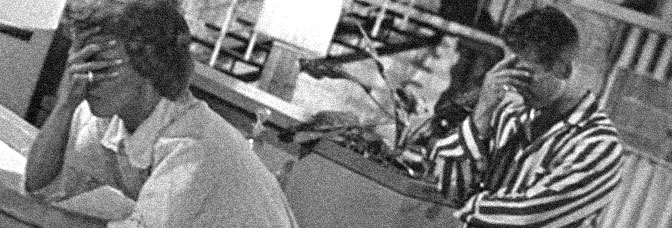
The Whole Town’s Talking has some peculiar third act problems, but it also has this extraordinary first act set over three scenes and twenty-some minutes, which evens things out.
Some of the problem might stem from Town’s plot–mild-mannered office clerk Edward G. Robinson just happens to look like a famous gangster and is falsely arrested. The actual gangster shows up and Robinson gets to act off Robinson. The second half of the picture is often just Robinson. He can carry it–and cinematographer Joseph H. August excels at the process photography (though not the projection shots)–it’s just odd.
Also, the gangster doesn’t come into the film until the second act; he’s not a predicted permanent fixture. Not like Jean Arthur, the omnipresent love interest whose vanishes signals the awkward finish. She and Robinson are great together; director Ford introduces most of the main cast quickly and then uses repetition to establish them. No one has a deep back story but they’re all fully drawn.
As for Ford’s directing of a gangster spoof–he does really well with the actors. Robinson, Arthur, Arthur Byron, Donald Meek–Edward Brophy is good in a small part. Ford does okay with the backlot shooting, but he’s a little unsure with the mellow scenes. Lots of people standing.
Jo Swerling and Robert Riskin’s script is strong, though they do forget a joke.
The finale also redeems itself with Ford letting Robinson eschew the comedy for moral complexity.
Town’s unique and good.
 ★★★
★★★
CREDITS
Directed by John Ford; screenplay by Jo Swerling and Robert Riskin, based on a story by W.R. Burnett; director of photography, Joseph H. August; edited by Viola Lawrence; produced by Ford and Lester Cowan; released by Columbia Pictures.
Starring Edward G. Robinson (Arthur Ferguson Jones), Jean Arthur (Miss Clark), Arthur Hohl (Detective Sergeant Boyle), James Donlan (Detective Sergeant Howe), Arthur Byron (Spencer), Wallace Ford (Healy), Donald Meek (Hoyt), Etienne Girardot (Seaver), Edward Brophy (‘Slugs’ Martin) and Paul Harvey (‘J.G.’ Carpenter).

THIS POST IS PART OF THE THE JOHN FORD BLOGATHON HOSTED BY CHRISTIANNE OF KRELL LABORATORIES and ANNA OF BEMUSED AND NONPLUSSED.
RELATED

 There’s some awesome art from Santos this issue. He gets to do not just the regular action, but also the flashbacks detailing the origins of the world. Glass has been doing a lot with the supernatural angle of the series and, for the first time, it feels like Mice Templar might not even take place on Earth. It’s way too soon to tell–and it might not even matter; this issue has a myth about two suns and one going out.
 I’m really hoping Earl isn’t leaving voicemails for his dead wife. I’m sort of hoping he’s leaving them for his dude. If Earl were an old gay guy who kicks ass, it might give Southern Bastards an edge. The series already has an edge, but it’s a predictable edge. I think I said it before–Bastards is prime option material for any actor from the Expendables series.
 I was hoping Bates would keep Flash running smoothly after the previous issue, but this one doesn’t bode well for the series keeping up. Even more than usual, Barry–and the Flash–are less characters in the comic than they are movable pieces for Bates’s plot. There’s not even the attempt at showing the Flash’s fantastic powers. Instead, Bates shows him doing what equates to a grade school science project without the traditional verbose, fantastic explanation.
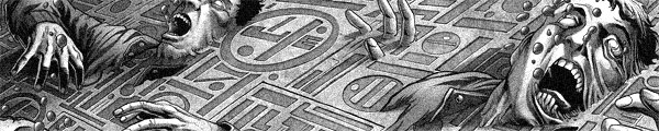
 This issue feels incomplete. Not just because of Brisson’s plotting, but also because of the lack of grandiose art. While Roy gets to go crazy a few times, it’s always reserved in terms of space. For instance, the decapitations don’t get the page time they deserve.
 There’s a lot of material this issue. Plot developments, character developments, but Glass still tries to deliver a somewhat action-packed narrative. The opening–the A plot–has the heroes held captive by moles; there’s humor from Cassius who mocks the moles, a fair amount of suspense (the moles are apparently under siege) and then some payoff on that suspense.
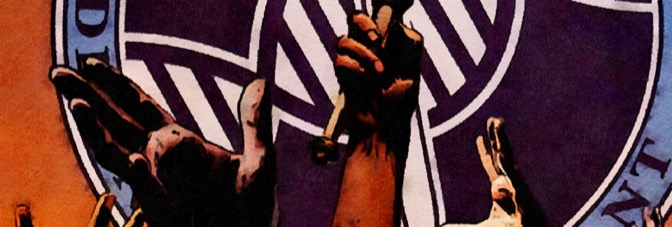

 Culbard’s art continues to be a problem when it comes to people. I spent half the issue wondering about the evil old maid lady who turned out to be some guy. Worse, there’s not enough of the scenery for Culbard’s strengths to make up for his weaknesses.
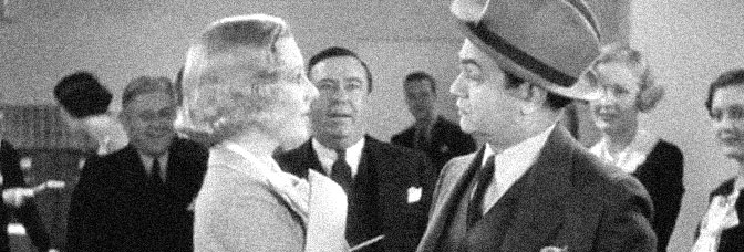
 Bates seems a lot more comfortable and assured this issue–maybe assured isn’t the right word. He’s ambitious again, both in plotting the feature story and how he gets through it. The only weak part is when the Flash has to beg for Barry Allen’s job back. It reveals how little work Bates does on either character.
 As this issue begins, with some flashbacks to the big battle ending the Templar, Glass also establishes the relationship between Cassuis and Karic. It’s a dysfunctional mentor and student relationship. Karic thinks Cassius hates him and Cassius hates Karic.
 Brass Sun is incredibly problematic. I don’t think I’ve read such a spotty first issue in a while, particularly one where the writer–Ian Edginton–just keeps going and going until he makes the narrative connect. And it takes this issue a long time, until the last fourth.
 About eighty-five percent of the issue is spent on flashbacks. Apparently Barry is in a mental institution, covered in bandages, and he’s been imagining the Flash side of his life for years. As he remembers things to keep himself sane, Bates and Infantino visualize them. These little stories tend to be short, sometimes just a few panels.
 Powell continues to show he gets it with Big Trouble. He and, presumably, Carpenter, give Churilla a bunch of crazy stuff to draw. Not right away. Right away is more comedy stand-off stuff with Jack Burton being an idiot but a well-intentioned one. The crazy stuff starts when Jack and Egg’s quest starts; they’re driving through a mystical Chinese sort of underworld… it’s phenomenal.
 It’s a short but not sweet zero issue for the second Mice Templar series, which picks up almost immediately where the first series ended.
 I’m a little surprised how well x and y hold Ordinary together for the second issue. There are almost no pitfalls, which is something considering the big change in reality is gearing up to be a dream or the end of the world.
 It’s too bad, but not even the Infantino art can make this issue particularly worthwhile. There’s a real lack of personality to all of it; Bates is just building towards the big event with Barry’s evil father (I wonder if he’s secretly Reverse Flash, could he be) in the next issue. Not even a scene with Barry’s dad holding a gun to his head (while Barry is sleeping) has any weight.
 Something important happens this issue of The Woods. It becomes “‘Lost’ with teenagers.” I can’t believe it took Tynion this long. It might not have been so sadly apparent if artist Dialynas were maintaining the previous issue’s level of quality, but he’s not. The book can’t handle the writing losing any ingenuity as the art becomes problematic.
 Gerber nails it again, this time using Man-Thing to write an epitaph for a character. He’s also introducing most of this character in this issue. He uses a three act device–obviously so, with the regular cast and guest stars put to work as actors in a play–and runs the character development throughout.
 Reading the big gladiator fight scene in this issue–and I make this statement as a compliment–one can almost hear the Queen music from the movie. Parker has a couple big action sequences in this one, with Flash destroying the factory at the beginning and then the gladiator battle against Ming’s beastmen.
 I’m not sure how to phrase it exactly, because Bates hasn’t exactly dumbed down The Flash for Infantino’s return to the book, but he’s definitely dulled the characters down. It’s like he’s changing the audience, aiming younger. There’s no character development anymore and the character details are lame. One colleague of Barry’s wonders if he’s always running off because the guy has bad breath.
 This comic is way too short.
 Here’s a rarity–the cliffhanger successfully ties the issue together. Gerber–with Mike Ploog joining him on the art–spends most of the issue bringing the players together. Rory and the biker chick, a couple circus performers, a dead clown and Man-Thing. They all converge at the end, where Gerber finds time for a fight scene.
 This issue doesn’t just have gorgeous art, it also has Parker getting to a Flash Gordon moment. Flash Gordon’s a hard character to portray because his behaviors are often contradictory. Parker understands some of that contradiction this issue, with Flash both being foolish and also being selfless. The selfless bit comes gloriously at the end.
 There’s something a little off about this issue. While Infantino is (hopefully) the new regular artist and he definitely has some good work in the issue–he can turn the smallest panel into the fullest one with all the movement and action–Bates is a little tone deaf.
 Oh, good, even when Ellis is doing better, he still feels the need to write dialogue about good coffee. I guess he’s assuming his audience has no longer seen Pulp Fiction or “Twin Peaks” or lived through the nineties and the litany of good coffee references in popular media.
 Abel inks Mayerik even better this issue; occasionally there’s an almost Eisner-like roundness to the figures and the faces. The hair too–the hair’s not Eisner-like, but there’s often a lot of phenomenal hair.