• Hawkeye 19 (September 2014)

    Hawkeye #19It’s another concept issue from Fraction and Aja. This time Clint is deaf and Barney has to start talking to him. It’s not a particularly ambitious concept issue as it turns out, since Clint and his deafness–and the sign language dialogue–is only half the issue. The other half is Fraction setting up the next encounter with the bros and Barney complaining about Clint.

    It’s all an inspiring story about Clint opening up and asking for help, except it’s really easy and Fraction goes so far as to apparently use it to jump start the resolution to the entire series. The finale has him finally calling on the Avengers for help, which is something he reasonably could have done fifteen issues before. Stubbornness isn’t a good excuse for perpetuating a periodical.

    Aja’s art is creative and awesome. It kind of makes the comic worth it, but with not entirely.

    C+ 

    CREDITS

    The Stuff What Don’t Get Spoke; writer, Matt Fraction; artist, David Aja; colorist, Matt Hollingsworth; letterers, Chris Eliopoulos and Aja; editors, Devin Lewis and Sana Amanat; publisher, Marvel Comics.

  • Trees 3 (July 2014)

    I have something called the “Oh, Hell, No” rule. When a writer uses those three words to show how much stronger his (or her) female character is compared to someone else or her situation… well, there’s a line is all. And Ellis steps over it with this issue of Trees. His super strong, gang leader’s girlfriend who’s really smart but also soulful is hideous and lazy.

    She’s stalking an old professor–who loves books–because she needs mentor. In the post-apocalypse, books are very important. Trees is turning out to be nothing but Ellis regurgitating ideas he gets from elsewhere. Some of them seem familiar, like he’s regurgitating himself; it’s a copy of a copy of a copy of a copy. With pretty art.

    Except this issue, Howard’s art is lazy, lifeless and hurried. Without him, Trees loTrees #3ses its single saving grace; outside muted, hostile condescension, Ellis isn’t bringing anything to it.

    C- 

    CREDITS

    Writer, Warren Ellis; artist, Jason Howard; letterer, Fonografiks; publisher, Image Comics.

  • The Mice Templar Volume III: A Midwinter Night’s Dream 3 (March 2011)

    The Mice Templar Volume III: A Midwinter Night's Dream #3While the issue is dedicated to Brian Jacques (of the Redwall series), Santos spends more of his time in homage to M.C. Escher. Mice in mazes and Escher–it’s fabulous. But Santos’s art isn’t just great for that playful and intricate composition, it’s everything this issue. He’s been building up with Midwinter and here he just lets loose.

    Speaking of letting loose, Glass goes a very unexpected route. He abandons Cassius and Karic and heads forward a little with the Templar camp from the previous two issues, but most of the issue is about the people–sorry, the rodents–in the capital. There are even weasels this time; lots of developments, lots of great character work.

    Glass is almost showing off–Mice Templar has hit the point where the adventure hook of young Karic isn’t necessary anymore.

    It’s a wonderful issue. Action, romantic longing, political unrest, rodent bigotry–it’s both comfortably excellent and entirely unexpected.

    A- 

    CREDITS

    Royal Division; writer, Bryan J.L. Glass; artist, Victor Santos; colorist, Veronica Gandini; letterer, James H. Glass; editor, Judy Glass; publisher, Image Comics.

  • Fatale 24 (July 2014)

    Fatale #24Given all the series’s problems as of late, I didn’t expect Brubaker to finish Fatale well. I knew it’d be problematic, but I hoped he’d go for satisfying at least.

    Instead, he pretends he’s been writing a lot of third person exposition in purple prose so he can finish the comic with a rumination on the beauty of a sunset or some such nonsense. But it shouldn’t have been a surprise. Fatale’s been on a downward trajectory for a while and a rushed one–not ending would have been satisfactory. The writing’s just been too reductive.

    But worse, Phillips’s art is rushed. He’s got lots of little panels and not enough detail on the people in those panels. He does a lengthy action sequence and it’s boring–it’s not entirely his fault, Brubaker’s rushing through the scene as far as tension.

    It’s an unfortunate ending. It ignores everything good about the comic.

    C- 

    CREDITS

    Writer, Ed Brubaker; artist, Sean Phillips; colorist, Elizabeth Breitweiser; publisher, Image Comics.

  • The Fury of Firestorm, The Nuclear Man #15Conway and Broderick do exceedingly well on the action part of the issue. The first half has Firestorm having to get free from Multiplex and then fight him and Enforcer. It’s a great action scene, both in terms of pacing and art. It really seems like Broderick is going to turn in an excellent issue.

    Until the second half of the comic, when Broderick has to draw the civilians and immediately it’s strange body proportions and hair helmets. It’s like he and Rodriguez entirely check out when it’s not superhero stuff and it doesn’t work.

    The second half of the issue is also messy because Conway splits it between boring, connected conspiracies–one against Martin and Ronnie and one involving c-level supporting cast member Senator Walter Reilly. Plus, Conway brings back a stale story line he never watered enough.

    The strong start only can make up for so much.

    B- 

    CREDITS

    Breakout; writer, Gerry Conway; pencillers, Pat Broderick and Rodin Rodriguez; inker, Rodriguez; colorist, Gene D’Angelo; letterer, Adam Kubert; editors, Nicola Cuti and Conway; publisher, DC Comics.

  • Day Men 4 (July 2014)

    Day Men #4Day Men is on its fourth issue. About a year after its first issue. No one’s going to tell Brian Stelfreeze to hurry up and try to do a monthly and it seems the writers know the score on that one, because they still haven’t gotten over establishing the ground situation.

    Gagnon and Nelson aren’t refreshing or starting over with this issue; they’re following up on all their old plot lines and story threads. But they’re definitely aware it might be the first issue a reader is picking up and they’re writing it for that casual reader, not the one who’s been around. Because there’s no other reason to introduce major plot points–like the protagonist having the unintentional hots for his vampire clan leader woman–other than to make Day Men seem fresh.

    It isn’t fresh. It’s stale. Boom! should’ve just done a graphic novel, regardless of Stelfreeze’s art being awesome.

    C 

    CREDITS

    Writers, Matt Gagnon and Michael Alan Nelson; artist, Brian Stelfreeze; colorist, Darrin Moore; letterer, Ed Dukeshire; editor, Eric Harburn; publisher, Boom! Studios.

  • 100th Anniversary Special: The Avengers (September 2014)

    100th Anniversary Special: The AvengersMarvel really let James Stokoe do an Avengers comic? He sets it in 2063–a hundred years from the first Avengers comic (identical to the thing Paul Pope did with Batman: Year 100 but who’s counting)–and sets this team of Rogue (immortal thanks to Wolverine somehow), Beta Ray Bill (immortal because he’s a god) and Dr. Strange (immortal through incarnation) on an adventure. Well, some of it is just them going to check up on Tony Stark, who’s brain is now in a giant Iron Man building.

    It’s crazy, crazy stuff but it isn’t until the end of the issue where Stokoe’s actually visionary. The future setting, the odd cast–those are just Stokoe standards. He’s not trying anything new here, he’s just bringing some eclectic enthusiasm to a commercial comic.

    Except his resolution with the guest villain. Stokoe makes a profound observation about superhero comics–Marvel or not, Avengers or not–with it.

    B+ 

    CREDITS

    Writer, artist, colorist and letterer, James Stokoe; editor, Jon Moisan; publisher, Marvel Comics.

  • The Mice Templar Volume III: A Midwinter Night’s Dream 2 (January 2011)

    The Mice Templar Volume III: A Midwinter Night's Dream #2Glass is having some real problems with cliffhangers in Midwinter, if this second issue is any indication. After not just going through the main plot, but also introducing the supporting cast back from the previous volume, Glass quarantines these first two issues (for protagonists Cassius and Karic, anyway). He’s moved the players from point A to point B and now he’s ready to get started again.

    It’s like a soft reset, with the ground situation now changed. It feels like a combination of treading water and contriving trouble.

    There’s still a lot of strong material in the issue–some fantastic action art from Santos–and Glass’s character moments are excellent. He’s just all over the place. This issue it becomes clear Cassius hasn’t been the protagonist these first two issues so much as subject; his lost love has a whole lot more going on and self-awareness.

    Hopefully things will get started now.

    B 

    CREDITS

    Consequences; writer, Bryan J.L. Glass; artist, Victor Santos; colorist, Veronica Gandini; letterer, James H. Glass; editor, Judy Glass; publisher, Image Comics.

  • Deep Gravity 1 (July 2014)

    Deep Gravity #1Deep Gravity is missing something rather important–a hook. It’s a sci-fi series about people working on a different planet, mining its resources and bringing them back to Earth. The explanations all sound scientific, but it doesn’t seem to actually be scientific, so the hook isn’t it being “hard science” sci-fi.

    The protagonist is some guy who goes to the planet to talk to his ex-girlfriend. It’s a three year trip so he’s dedicating six years just to talk to her again. Their relationship is fairly lame so it’s not a hook either.

    Then there’s the art, from Fernando Baldó. This other world is some crazy mostly ocean place where plants and animals are the same thing. Apparently. Except none of the designs are particularly good. Baldó’s got a lot of issues with people, places, things. So the art’s not the hook.

    So far Gravity’s painfully mediocre.

    C 

    CREDITS

    Writers, Mike Richardson, Gabriel Hardman and Corinna Bechko; artist, Fernando Baldó; colorist, Nick Filardi; letterer, Nate Piekos; editors, Shantel LaRocque and Scott Allie; publisher, Dark Horse Comics.

  • The Fury of Firestorm, The Nuclear Man #14Until the silly eighties toys show up at the end–the villain rides around in absurd tank–it’s a decent enough issue. Well, the villain–Enforcer (Conway remembering his old Spider-Man days perhaps)–is lame, but some of it might be the art. Broderick starts the issue strong and then loses his grip by halfway through. This time it’s worse than bad faces, it’s goofy bodies and so on.

    But the issue itself isn’t bad, Conway’s initial plot–Ronnie and Martin getting the newly unemployed scientist a job at Ronnie’s burger joint–works. He just keeps adding on to the plot until the issue is bloated. He doesn’t give anything enough time and keeps throwing in hints at future subplots.

    The action finish–that tank–is silly and poorly conceived. All this action in a confined space cuts down on action possibilities for Broderick.

    It’s a rather problematic issue.

    B- 

    CREDITS

    Enforcer; writer, Gerry Conway; penciller, Pat Broderick; inker, Rodin Rodriguez; colorist, Gene D’Angelo; letterer, Adam Kubert; editors, Nicola Cuti and Conway; publisher, DC Comics.

  • Low 1 (August 2014)

    Low #1
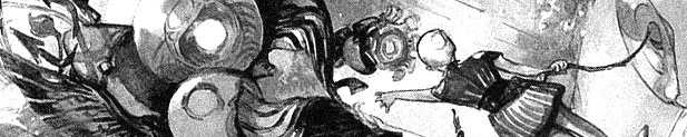
Low is a gorgeous comic. Greg Tocchini doing sci-fi. It’s just gorgeous, especially the double page spreads.

    Unfortunately, it’s clear from the first few pages of the comic writer Rick Remender is not bringing the same caliber of work. Instead, he’s writing a derivative, wordy, knock-off of “Lost in Space,” only set underwater.

    The issue opens with lots of marriage banter between the narrator and his upper class wife. He’s just the guy who drives the ship–in this case, the ship is the bubble city humanity survives in. He wants to teach the daughters to drive, the wife doesn’t. I didn’t think Remender was so cheap he’d use tragedy to endear the reader to the family in the first issue but I was wrong. Remender’s a really cheap writer.

    If it were just bad dialogue or dumb plotting, the art might make it worthwhile. But not both.

    D 

    CREDITS

    The Delirium of Hope; writer, Rick Remender; artist, Greg Tocchini; letterer, Rus Wooton; editor, Sebastian Girner; publisher, Image Comics.

  • Star Trek: The City on the Edge of Forever 2 (July 2014)

    Star Trek: The City on the Edge of Forever #2Not only is Janice Rand back, she kicks butt.

    There are a few more big changes in this issue, with Kirk and company beaming up after time has changed to find themselves on a mercenary freighter or some such thing. It’s where Yeoman Rand reveals her fighting skills.

    It’s very hard to take City seriously with this sort of distraction, although it does feature some decent action art from Woodward. Not great, because painted fight scenes just don’t move, but decent. Yeoman Rand kicks butt and all.

    The rest of the issue has Kirk and Spock going back in time and getting into some trouble with thirties rabble rousers. This comic shouldn’t be made just for people familiar with the original episode, but the creators certainly aren’t making it accessible otherwise. The whole soft cliffhanger hinges on that familiarity.

    It’s a mediocre comic and its curiosity value is waning fast.

    C 

    CREDITS

    Writers, Harlan Ellison, Scott Tipton and David Tipton; artist, J.K. Woodward; letterer, Neil Uyetake; editor, Chris Ryall; publisher, IDW Publishing.

  • Afterlife with Archie (2013) #6

    Afterlife with Archie  6

    It’s not hard to identify Aguirre-Sacasa’s influences for this issue, which tracks the story of Sabrina (the teenage witch) following her brief appearance earlier in the story.

    The issue is Lovecraftian homage, sort of by way of The Wicker Man, which works out splendidly.

    In some ways, the issue should be predictable to Lovecraft afficonados, with Aguirre-Sacasa hitting a lot of familiar notes. It’s just the presence of Sabrina–as she tries to figure out what’s going on (is naming her doctor Lovecraft just homage or is there more to it)–it distracts from the narrative beats. Even for someone who’s never read Lovecraft, just seen or read a handful of adaptations. Aguirre-Sacasa knows what he’s doing.

    And Francavilla does a beautiful, beautiful job. It’s gorgeous and tragic. Aguirre-Sacasa’s script has some dream sequences and flashbacks so Francavilla gets a whole bunch to draw.

    Phenomenal stuff.

  • The Mice Templar Volume III: A Midwinter Night’s Dream 1 (December 2010)

    The Mice Templar Volume III: A Midwinter Night's Dream #1
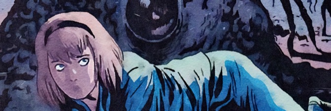
Besides the cliffhanger, which is too manipulative, A Midwinter Night’s Dream is off to a great start. Glass has a lot of territory to cover just getting the story going–there’s lengthy expository narration at the beginning, along with some fantastic art by Santos. For the flashbacks, Santos only gets a few panels to make his point and he does every time.

    The issue isn’t just well-executed flashbacks, of course. Glass does some character drama, some more action and a little romance–not to mention another creepy full page spread of the lead character having to negotiate with the bugs to survive during the day time. Santos isn’t a creepy artist so the bugs aren’t gross, but they’re still disturbing. Maybe just because Glass still hasn’t shown them angry yet.

    Glass uses the supporting cast to both build the mythology and move the action.

    It’s another excellent Templar comic.

    B+ 

    CREDITS

    Precious Burden; writer, Bryan J.L. Glass; artists, Michael Avon Oeming and Victor Santos; colorist, Veronica Gandini; letterer, James H. Glass; editor, Judy Glass; publisher, Image Comics.

  • The Fury of Firestorm, The Nuclear Man #13Firestorm is turning into a were-hyena and his plan is to go to Africa to find the cure. Why doesn’t he call the Justice League and have the many scientist super heroes help him? Because Conway wants to do a story about corrupt African nations? Because DC was docks writers pay if they used too many guest stars? Some third option?

    Suffice to say, the plot of this issue doesn’t make sense. It removes Firestorm from being the active character in his own comic for quite a few pages–he’s delirious or he’s a hostage or just an enraged jerk. He is turning into a were-hyena after all. Good thing it’s really cute. Broderick and Rodriguez make the transformed Firestorm adorable. It’s weird.

    Conway throws in a couple scenes developing the civilian subplots, but it’s not enough. This issue drags an unsuccessful plot out one issue too far.

    C+ 

    CREDITS

    Split!; writer, Gerry Conway; pencillers, Pat Broderick and Rodin Rodriguez; inker, Rodriguez; colorist, Gene D’Angelo; letterers, Andy Kubert and Adam Kubert; editors, Nicola Cuti and Conway; publisher, DC Comics.

  • Star Spangled War Stories 1 (September 2014)

    Star Spangled War Stories #1Star Spangled War Stories. G.I. Zombie. Neither of those titles suggest the comic is going to open in the present day, set in Louisiana, but writers Jimmy Palmiotti and Justin Gray don’t do anything predictable in this first issue. Not the first twist, not G.I. Zombie, not the cliffhanger. Not the zombie scene.

    It’s highly inventive stuff, with Palmiotti and Gray changing genres from military to federal agent procedural. Zombie’s setup–a female federal agent and her new partner, the only zombie in the world–is ready for a television pilot next season but that commercial appeal doesn’t hinder the issue at all. Having Scott Hampton on the art helps immeasurably; Hampton does a focus thing with the art. The backgrounds feel painted and distant, the characters sort of move on top of it. It’s an excellent effect.

    There are some third act pacing problems, but it’s off to a strong start.

    B 

    CREDITS

    Writers, Jimmy Palmiotti and Justin Gray; artist and colorist, Scott Hampton; letterer, Rob Leigh; editors, Kyle Andrukiewicz and Joey Cavalieri; publisher, DC Comics.

  • Starman (1984, John Carpenter)

    Starman’s first forty or so minutes speed by–director Carpenter gets as much information across as quickly as he can to discourage the viewer from paying too much attention. There aren’t exactly plot holes, but there’s a lot of silliness in the script. For example, Charles Martin Smith–who’s perfectly good in the film–has an entirely pointless character. He’s just there to contrive some drama in the third act.

    Except it isn’t really dramatic because Starman’s narrative is exceedingly predictable. What isn’t predictable is Carpenter’s direction or the performances from Jeff Bridges and Karen Allen. Bridges gets the unique leading man role of being able to continually reinvent his performance; right up until the last scene of the film, there’s always something new he gets to do.

    The script doesn’t fully acknowledge the strangeness of Allen’s character’s situation–her husband reincarnated but as an entirely different being. Bruce A. Evans and Raynold Gideon’s script is never particularly smart or self-aware. In some ways, Carpenter just ignores the script problems and pushes forward. He matches his personal indulgences (like the massively choreographed and utterly useless helicopter sequence) with similar indulgences for Bridges and Allen. Carpenter’s showcasing, because there’s not much else to do with the problematic narrative.

    Carpenter keeps the filmmaking ambitious, compensating somewhat for the script. The lush Jack Nitzsche score is initially muted, only coming through as the narrative develops. Carpenter and cinematographer Donald M. Morgan create some fantastic visuals.

    It’s a glorious, gorgeous misfire.

  • Transformers vs. G.I. Joe 1 (July 2014)

    Transformers vs. G.I. Joe #1Scoli and Barber’s madness continues and amplifies. What I love is how they put in some sense of a narrative–there’s a subplot involving Snake Eyes and what he’s been doing since he left G.I. Joe, not to mention how the Joes’ plan doesn’t get revealed until it’s already underway via flashback. Because the rest of the comic is a madhouse–Scoli gives the big non-action story scenes small scale panels to save room for more action. The result is big dramatic moments in small panels.

    There’s one crazy full page spread where the characters move down the page, without much visual hinting; Scoli’s intentional lack of depth just makes Transformers vs. G.I. Joe even more gorgeous.

    The comic doesn’t require any enthusiasm about the franchises themselves, just how Scoli and Barber are approaching the subject matter. A pseudo-simplistic illustrated toy commercial; it’s like a new genre, but not.

    Scoli’s rocking it.

    A- 

    CREDITS

    Writers, Tom Scioli and John Barber; artist, colorist and letterer, Scioli; editor, Carlos Guzman; publisher, IDW Publishing.

  • The Mice Templar Volume III: A Midwinter Night’s Dream 0 (November 2010)

    The Mice Templar Volume III: A Midwinter Night's Dream #0As a zero issue introducing the new Mice Templar volume, this issue isn’t effective. There are some really effective things about it–Bryan J.L. Glass and Victor Santos retell the finale of the previous volume from a different perspective and Santos gets in some wonderful pages–but the comic itself is too slight.

    Running about eight pages, it might just be too short to be anything but slight, but Glass takes an odd approach. One of the knights saving the citizenry from the tyrant king is questioning his orders and the idea of a savior and so on. If it were a full issue–and the protagonist were better defined–it might work as a rumination on events. But, like I said, it’s too short.

    The Santos art makes it easily worth a look and Glass’s script coasts on built-up good will towards the series. It’s hard not to be a little disappointed though.

    B- 

    CREDITS

    Faith in Miracles; writers, Michael Avon Oeming and Bryan J.L. Glass; artist, Victor Santos; colorist, Veronica Gandini; letterer, James H. Glass; editor, Judy Glass; publisher, Image Comics.

  • Transformers vs. G.I. Joe 0 (May 2014)

    Transformers vs. G.I. Joe #0Transformers vs. G.I. Joe is not serious. It is not a realistic examination of an elite international military organization battling sentient robotic beings from another star.

    It is Tom Scioli capturing the sensation of being a six or eight year-old boy watching afternoon cartoons, getting excited for that cartoon’s toys being advertised during commercial breaks. Seeing as how it’s a comic book and a printed medium (sort of), Scioli even integrates nods to action figure packaging. Even though this issue is just the promotional zero issue of a subsequent limited series, Scioli has done something no one else has done. At least not sincerely.

    Because the visible sincerity of the comic–just look at Scioli’s amount of detail and thoughtfulness of panel composition–is what makes it singular. If Scioli were doing it all as a joke, it wouldn’t work. He and co-writer John Barber are masterfully realizing boyhood fantasy. It’s breathtaking.

    A 

    CREDITS

    Writers, Tom Scioli and John Barber; artist, colorist and letterer, Scioli; editor, Carlos Guzman; publisher, IDW Publishing.

  • Velvet (2013) #6

    Velvet  6

    Brubaker starts Velvet’s second arc and it’s just as clear as with the first one, there’s something just a little off about it. Epting doesn’t get much opportunity for the period piece stuff this issue either, which is too bad.

    There’s a whole bunch of exposition with Velvet explaining her thinking about her investigation–it brings up the perspective question too. Who’s Velvet telling her story? Or is her first person narrative just easy first person narration with no thought about it other than what mood it creates.

    The issue is light on action, with Brubaker instead going for cheap visual thrills and innuendos at a London sex club. The short action scene at the end doesn’t make up for the lack of it throughout. Epting isn’t particularly creative on the composition either.

    The extreme competency of the series continues to keep it afloat, but it’s still rather dull.

  • Deadpool (2012, Tim Miller)

    Deadpool is an effects test by Miller to prove a feature is possible. It’s unclear, in terms of a narrative, if the ninety second short answers that question in the positive but it doesn’t much matter. These ninety seconds of a strange masked comic book character directly addressing the viewer are phenomenal.

    There’s a certain smugness to Ryan Reynolds’s performance–the titular, very skinny character is CG, but Reynolds did the motion capture and voice–but Miller makes it work. The comic timing of the test footage is what’s so spectacular.

    A feature length version would probably be tiresome unless it was just one high quality action scene after another.

    Miller gets everything right–the bad guys, the mood, the music–he’s proposing the idea of a superhero action movie, with lots of CG, but on a human action movie scale.

    It’s a neat idea… but probably wouldn’t work out.

    3/3Highly Recommended

    CREDITS

    Directed by Tim Miller; based on a character created by Fabian Nicieza and Rob Liefeld.

    Starring Ryan Reynolds (Deadpool).


    RELATED

  • The Fury of Firestorm, The Nuclear Man #12Broderick and Rodriguez continue to have problems with Ronnie’s civilian adventures. For whatever reason, they’re fine with Martin and his supporting cast, it’s just the teenagers who have awkward, flat expressions.

    The story has a slowly transforming Firestorm trying to stop the double Hyena threat. Conway spends more time coming up with witty exposition–and some of it’s quite good–than he does on the characters. Ronnie has a scene at his part-time job, one with his friends, but none have any resonance. It’s especially bad with the girlfriend.

    Martin, on the other hand, gets fired and then possibly gets blackmailed. Conway’s building that story slowly, with one exaggerated setup scene but otherwise it’s moving well.

    As for Firestorm versus the Hyena? The opening fight has some good visuals but the final one is a little confused. Broderick just doesn’t plot out the action well.

    Still, it’s reasonably compelling.

    B 

    CREDITS

    Howl; writer, Gerry Conway; penciller, Pat Broderick; inker, Rodin Rodriguez; colorist, Gene D’Angelo; letterer, Ben Oda; editors, Nicola Cuti and Conway; publisher, DC Comics.

  • THX 1138 (1971, George Lucas)

    Director Lucas makes one attempt at audience accessibility in THX 1138. It’s actually the first thing he does–he shows a clip from an old Flash Gordon serial to let the audience know the story is about the future. The clip also lets the audience know the future isn’t going to be happy.

    And once he’s made that concession, he stops being accessible at all. There are no explanations in the film, no foreshadowing, no acknowledgement of the characters’ realizations, Lucas doesn’t even introduce his leads in an easy fashion. Lucas instead just quickly visually familiarizes the audience with the leads–Robert Duvall, Maggie McOmie, Donald Pleasence–before focusing in on Duvall amid the first action confusion.

    Lucas’s secret weapon in THX 1138 is co-writer and sound designer Walter Murch. While the film definitely has distinctive visuals right off, the sound is even more important to setting the film’s tone. Lucas and Murch confuse the viewer at the same time they confuse Duvall–it’s the only way to put the viewer on anything near a similar level. Later on, when Pleasence is exploring his future world for the first time (and the viewer’s), he stops and gives up, not wanting to know. Only then does his introspection reveal anything to the viewer about the future world.

    Except there’s no explanation of the terminology, which leaves the viewer again removed.

    The film’s biggest problem is its length–it’s just too short to submerge the viewer–but it’s still a masterfully produced film. Great photography and editing too.

    3.5/4★★★½

    CREDITS

    Edited and directed by George Lucas; screenplay by Lucas and Walter Murch, based on a story by Lucas; directors of photography, Albert Kihn and David Myers; music by Lalo Schifrin; produced by Larry Sturhahn; released by Warner Bros.

    Starring Robert Duvall (THX), Donald Pleasence (SEN), Don Pedro Colley (SRT), Maggie McOmie (LUH), Ian Wolfe (PTO), Marshall Efron (TWA), Sid Haig (NCH), John Pearce (DWY) and James Wheaton (OMM).


    RELATED

  • The Comics Fondle Podcast – 1×15
    For the one year anniversary, Vernon and I do a double-length episode where we talk about a whole bunch of new comics and the state of the comics industry. As a special treat, since we recorded on San Diego Comic Con weekend… we don’t talk about SDCC news once!

    WHERE TO LISTEN

    Apple Podcasts
    Spotify
    Stitcher
    RSS
  • Anna (2013, Jorge Dorado)

    Anna is an exceptionally stupid movie. Apparently, no one involved with the film has seen films like Inception or The Sixth Sense because Anna apes big reveals from both of them rather obviously. It’s not a matter of guessing the twist ending, it’s a matter of trying to figure out what you’re supposed to be doing instead of guessing the twist ending.

    One possibility for the filmmakers going with the incompetency of Guy Holmes’s script is Mark Strong. As the lead, Strong seems compassionate and authoritative, but it turns out he’s a moron too. Some of the problem might be how poorly the film establishes its reality, where mind detectives consult and go into people’s memories for supplemental evidence in court cases. But these mind trips have no bearing in court… like I said, it’s a dumb movie.

    But it’s really well-acted from the leads. Strong’s character is doing his job for the money so maybe Strong was just doing the role for the money. He’s excellent, Taissa Farmiga is fantastic as the titular Anna. They’re both able to transcend the script. Because besides having an unimaginative approach to setting, it’s a good looking film. Dorado’s decent with composition and Óscar Faura’s cinematography is breathtaking.

    The supporting cast–who are all suspects–don’t do as well as the leads. Brian Cox cashes a paycheck, Saskia Reeves looks lost, Richard Dillane isn’t bad. Indira Varma’s not good, however; a combination of mediocre accent and terrible writing.

    Anna isn’t entirely worthless, just extremely close.

  • Stray Bullets: Killers 5 (July 2014)

    Stray Bullets: Killers #5I remember when the Amy Racecar issues of Stray Bullets were wildly imaginative, wonderfully constructed black comedy. This issue, the first Killers issue to bring Amy back… is none of those things. Instead, it’s Lapham doing the “Amy Racecar as painfully obvious analog to Virginia’s life” approach.

    It’s depressing–not because of the content, but because Lapham jumps all over the place to tie in to the original series (both the Amy issues and a little not) and to the Killers series. While one could argue the unanswered questions in the Amy Racecar stories are because Virginia herself doesn’t know the answers but it’s possible she’s dwelling on these subjects so they’re okay in the issue, I don’t think so.

    Lapham wants this story to inform the rest of the work, not do anything else whatsoever. Not even make the reader laugh or cringe. The vague hints barely register a shrug.

    C- 

    CREDITS

    Call Me Gilgamesh or The First Time Ever I Saw Your Face It Was On Your Butt; writer, artist and letterer, David Lapham; editors, Renee Miller and Maria Lapham; publisher, Image Comics.

  • Star Trek: Flesh and Stone (July 2014)

    Star Trek: Flesh and Stone
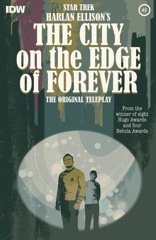
Was someone out there desperate for a really bad team-up of all the doctors from “Star Trek” shows? The only regular medical officer the writers don’t include is the new continuity McCoy, which is just as well–the issue is heavy on McCoy anyway.

    The important events, at least as how writers Scott and David Tipton show them, all take place in the past. The “Next Generation” doctors, along with all the other doctors, are just around to find McCoy and get his story. None of it’s interesting and the medical condition is less a condition as something they lost the solution for beating. The story is about finding that solution, not creating it or discovering it.

    I didn’t have many hopes for Flesh and Stone, but it failed to meet any of those. It’s a lame comic and the David Brothers’ lifeless art doesn’t help it much either.

    D 

    CREDITS

    Writers, Scott Tipton and David Tipton; artists, Joe Sharp and Rob Sharp; colorist, Andrew Elder; letterer, Neil Uyetake; editor, Sarah Gaydos; publisher, IDW Publishing.

  • The Fury of Firestorm, The Nuclear Man #11It’s a mess of an issue. Conway makes the Hyena’s return a really complicated story with curses and multiple were-hyenas–including Firestorm turning into one too. But there’s also Professor Stein’s ex-wife, who Conway avoids really defining and just makes her ominous instead. Ronnie’s tired at school, which turns out to be okay with his basketball coach–even though it shouldn’t be–and then there’s some nonsense with his girlfriend changing her hairstyle.

    Conway’s doing a whole bunch of stuff and not spending enough time on any of it. He makes Professor Stein’s contributions to the Firestorm scenes even worse. No longer satisfied doing wordy, obvious exposition, Conway uses Stein to tell the reader why things are bad for the characters. It’s beyond lazy.

    The issue finishes with the big action scene finale flopping. The Hyena doesn’t work on a large scale and Conway inexplicably stages a fight at the World Trade Center?

    C 

    CREDITS

    Waking Darkness; writer and editor, Gerry Conway; penciller, Pat Broderick; inker, Rodin Rodriguez; colorist, Gene D’Angelo; letterer, Adam Kubert; publisher, DC Comics.

  • Dream Thief: Escape 2 (July 2014)

    Dream Thief: Escape #2Nitz is wrapping everything together rather nicely, but then he goes a little overboard. He explains the plan in detail only to throw a significant wrench in it. That wrench is another ghost possessing protagonist John; presumably this act of vengeance will make things difficult for the A plot.

    It’s a problem because Nitz is rushing, he’s telling instead of showing. Most of the issue is in summary and the events are all lined up and the contrivances are starting to show. The final, cliffhanger possession–maybe the first time one of the ghosts gets to be in the driver’s seat as far as the reader experiencing it–is too dramatic after all the summary.

    Escape is only a four issue limited series and by the end of this issue, it sure seems like Nitz needs five to get the story done right.

    Still, most of it’s awesome as usual.

    B 

    CREDITS

    Writer, Jai Nitz; artist and letterer, Greg Smallwood; editors, Everett Patterson and Patrick Thorpe; publisher, Dark Horse Comics.