• The Wicked + The Divine 3 (August 2014)

    The Wicked + The Divine #3
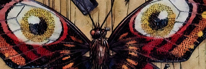
Something is a little off this issue. Gillen has maybe run out of establishing stuff to do and he’s getting underway with the actual story. This young woman investigating the gods and just happening to see some amazing stuff like a god-fight.

    The fight, which is full of banter between the gods, is just filler. Gillen’s strengths on the comic clearly aren’t going to be the investigative scenes and this issue doesn’t have much besides those. Except the protagonist and her sidekick recapping what they know at the end. It doesn’t go over well either.

    A lot of the problem is McKelvie. Most of the issue feels like someone trying to carefully mimic his style and even when it does feel like him… it feels very rushed. And without solid art, Wicked + Divine’s problems start to show. You start looking behind the curtain for the Wizard.

    It’s too bad.

    B- 

    CREDITS

    Writer, Kieron Gillen; artist, Jamie McKelvie; colorist, Matthew Wilson; letterer, Clayton Cowles; editor, Chrissy Williams; publisher, Image Comics.

  • Manifest Destiny (2013) #9

    Manifest Destiny  9

    There's just enough disgusting creativity to pull the issue through–even if it's far from original. Dingess still has he problems with pacing and plotting, but he does get around to a few characters this issue. He's got Clark and a bunch of people stranded, while Lewis tries to figure out how to get rid of the giant monster frog. So there are a few scenes for Lewis, but a lot for the landing party.

    Clark actually doesn't get much to do until the end of the issue. Instead, there's a new friend for Sacajawea and then some more rumblings of mutiny. But the big thing (pardon the pun) has to be the giant insects; they bring back Manifest Destiny's pulse in the second half of the issue.

    Dingess writes some good scenes for the cast, he's just taking too much time on everything. Roberts's art can't carry the comic alone.

  • The Fury of Firestorm, The Nuclear Man #31George Tuska seems an unlikely guest penciller for Firestorm. He makes the whole thing look like a New Gods comic. But it works. Between Tuska's action-based take on the characters and events and Conway's willingness to cut around through the story, it's an exceptional issue.

    In many ways, with Conway shedding the high school stuff and a lot of Martin's science stuff (but this issue does resolve the ex-wife subplot), Firestorm is a lot tighter. Sure, he's basically a supporting cast member in Firehawk's story (Conway really loves tying subplots together), but it works for the comic. It lets Conway do good superhero action without promising actual character development.

    There's also the villain, Mindboggler, who gets a nice story arc this issue. Tuska doesn't do a lot of detail on faces, but somehow he and inker Alex Nino get the subtle emotions across.

    It's an outstanding, rather unexpectedly produced issue.

    A- 

    CREDITS

    A Mind of Her Own…; writer, Gerry Conway; penciller, George Tuska; inker, Alex Nino; colorist, Nansi Hoolahan; letterer, Bob Lappan; editors, Janice Race and Conway; publisher, DC Comics.

  • The Comics Fondle Podcast – 1×16
    Even though there are a lot of new comics out, Vernon and I have been busy so we get through what we can–including the final issue of Prophet. Give it a listen.

    WHERE TO LISTEN

    Apple Podcasts
    Spotify
    Stitcher
    RSS
  • Old Stock (2012, James Genn)

    The last scene of Old Stock doesn't exactly overshadow the rest of the film, but it certainly sets it apart. It's one of the more subtle finishes to a film. Without giving the viewer any guidance, director Genn and writer Dane Clark close the picture with a silent reference to a line in the dialogue. Hopefully the viewer gets it, because it's a fantastic pay-off.

    The film concerns Noah Reid, the Stock of the title, who ends up hiding out in a retirement community (at the ripe old age of twenty) with his grandfather (Danny Wells), after an initially vague personal tragedy. The film manages to make it forty-five minutes before explaining the situation; when it finally does so, Genn goes with a full flashback. After hinting at it in dialogue–it's a small enough town Reid's famous for it–the flashback's the easiest way to get the story told.

    Old Stock is short and to the point. Clark's script gets in a full subplot involving Wells and his estranged wife, Corinne Conley, and implied subplots for Melanie Leishman and Meghan Heffern, as the girls in Reid's life. Heffern is the girl involved with that vague personal tragedy, Leishman is the one who appears in the retirement community and causes Reid to reexamine his seclusion.

    Genn's direction is fantastic, both composition and direction of actors. No one really gets a big scene, just quietly devastating ones. Reid, Leishman, Heffern, all outstanding.

    Great editing from Kye Meechan too.

    Stock is a notable success.

    3/4★★★

    CREDITS

    Directed by James Genn; written by Dane Clark; director of photography, Arthur E. Cooper; edited by Kye Meechan; music by Dave Genn; production designer, Rosanna Lagace; produced by Geordie Sabbagh; released by E1 Entertainment.

    Starring Noah Reid (Stock), Melanie Leishman (Patti), Meghan Heffern (Dhalia), Corinne Conley (Gloria), Anna Ferguson (Millicent), Gene Mack (Wendel), Jason Weinberg (Jason Weaver), Anand Rajaram (Dr. Anand), Jacob Kraemer (Tristan) and Danny Wells (Harold).


    RELATED

  • Letter 44 6 (April 2014)

    Letter 44 #6Alburquerque definitely does better on the art this issue. There’s not much action; there’s some running, when the landing party returns to the spaceship, and they don’t look good but there’s no other action.

    Soule deals with the political stuff and the human interest story for the crew of the spaceship. The President has a really good scene and there are a few developments with the space side, but nothing significant on the latter. Or the former, really. Soule is sort of soft resetting the series, getting it ready for the next arc. It’s unclear why this issue is the end of an arc, however. Things have changed, yes, but the character development is all forced.

    Still, there are some decent moments and a couple surprises. The surprises aren’t great, but one is for the characters so Soule is at least thinking about them.

    It’s just an artificial pause point.

    B- 

    CREDITS

    Writer, Charles Soule; penciller, Alberto Jiménez Alburquerque; colorist, Dan Jackson; letterer, Shawn DePasquale; editors, Charlie Chu and Robin Herrera; publisher, Oni Press.

  • Stray Bullets: Killers 6 (August 2014)

    Stray Bullets: Killers #6Well, it’s far from the worst issue of Killers. It’s more with Virginia and her mostly lame boyfriend Eli; Lapham does very little to show why Eli’s any good as a boyfriend other than he’s usually sweet to Virginia.

    This issue has him not being sweet for the first time and it’s an awkward scene. Usually outburst scenes in Stray Bullets lead to some kind of murder scene. This time it leads to teenage angst.

    It’s also one of the first issues–Killers or regular series–where something turns out not to be the worst possible scenario. Except maybe some of those early Virginia issues where Lapham frequently threatens her to keep the tension high. It’s a Stray Bullets comic without the big finish. Very odd.

    The art’s really lazy at times; Lapham rushes through the talking heads sequences and it hurts the comic. Ditto the narratively pointless hallucination subplot.

    B- 

    CREDITS

    99 Percent; writer, artist and letterer, David Lapham; editors, Renee Miller and Maria Lapham; publisher, Image Comics.

  • The Fury of Firestorm, The Nuclear Man #30It’s another messy issue from Cavalieri. Firestorm gets arrested–I can’t believe they didn’t go with it for the cover–and then gets beat up in jail. He’s recovering from the brainwashing, so there’s not a lot he does in the comic. Instead, the lame villains are back. There’s Mindboggler, who’s doing all the brainwashing–only she’s supposed to be slightly sympathetic because her evil boss (in a hooded robe) energizes her powers through torture.

    Then there’s a guy who can transform himself into anyone and then a street gang. Cavalieri takes the time to include the street gang’s leader is also brainwashing him.

    These villains do not make an impressive rogues’ gallery. They’re bad.

    There’s some subplot movement with the woman planning on suing Firestorm getting a job at Ronnie’s dad’s paper. Contrived doesn’t begin to describe it.

    Worse, Tanghal doesn’t ink Kayanan very well. The weaker art significantly outweighs the stronger.

    C 

    CREDITS

    The Depths of Despair; writer, Joey Cavalieri; penciller, Rafael Kayanan; inker, Romeo Tanghal; colorist, Nansi Hoolahan; letterer, John Costanza; editors, Janice Race and Gerry Conway; publisher, DC Comics.

  • The Multiversity 1 (October 2014)

    The Multiversity #1If Grant Morrison needs help breaking the fourth wall–he does it poorly in this first issue of Multiversity–he should have asked John Byrne. But with the exception of Captain Carrot, Morrison’s references to other comics are all mocking and derisive.

    Whatever he says he’s doing with the comic, Morrison is actually trolling for fanboy outrage. Superman isn’t just black, he’s Obama. And all the other superheroes are black. Flash and Green Lantern are gay. Marvel Comics are stupid. Real stupid. Especially the Ultimates, Fantastic Four and Infinity Gems. There are probably a few more.

    It’s all very contemporary and hip, but I assume Morrison will get around to throwing poo at Alan Moore and Mark Millar.

    There are some amusing moments with Captain Carrot and Ivan Reis and Joe Prado do well on art.

    Unless someone’s researching for a book about Morrison’s ego, there’s no worthwhile reading here.

    C- 

    CREDITS

    House of Heroes; writer, Grant Morrison; penciller, Ivan Reis; inker, Joe Prado; colorist, Nei Ruffino; letterer, Todd Klein; editor, Ricky Purdin; publisher, DC Comics.

  • Letter 44 5 (March 2014)

    Letter 44 #5It’s the first issue with a lot of action, both on Earth and in space. Alburquerque doesn’t do well with either. His figures in motion don’t work. He gets so rushed, people become squatter from one panel to the next. It’s unfortunate, especially because the awkwardness affects the pace of the comic.

    All the action distracts from a decided lack of character and plot development. Soule reveals what the FBI has been working on, but it seems–so far anyway–an excuse to tread water through an issue to change up the cast a little. There’s a little fallout from the previous issue’s political cliffhanger, but it’s a couple pages and nothing really happens. Good line for the President, not much else.

    On the space side of the story, things are worse. Soule ignores most of the astronauts and concentrates on the two exploring. The scientist explorer makes some really dumb moves.

    B 

    CREDITS

    Writer, Charles Soule; penciller, Alberto Jiménez Alburquerque; colorist, Dan Jackson; letterer, Shawn DePasquale; editors, Charlie Chu and Robin Herrera; publisher, Oni Press.

  • Sons of Anarchy 12 (August 2014)

    Sons of Anarchy #12Brisson sure does have a complicated situation setup. Not bad complicated, good complicated. The regular Sons members are still supporting cast and maybe even moreso with Brisson introducing the father of a guy who died in a meth lab. Either this new character is going to be a long-term player in the arc or short-term but the way Brisson is weaving the plot strands is phenomenal.

    There are three subplots and none of them have to do with the Sons of Anarchy, regular or guest starring. Instead, they’re to emphasize the villains. With a different writer, it might give the titular characters less to do, but Brisson still drives the main plot through SAMTAZ and its dealing with the bad guys.

    The comic continues–with Couceiro’s as usual excellent art–to be an oddity of a licensed property. Brisson, Couceiro and BOOM! are unfailingly ambitious with the comic.

    CREDITS

    Writer, Ed Brisson; artist, Damian Couceiro; colorist, Michael Spicer; letterer, Ed Dukeshire; editor, Dafna Pleban; publisher, Boom! Studios.

  • The Fury of Firestorm, The Nuclear Man #29It’s Firestorm versus three really lame villains, one angry businesswoman and one angry high school classmate. I’m not sure what Cavalieri is trying to do–except further the problems with the series. Cavalieri doesn’t even bring Firehawk into the issue, which is odd since I thought they were trying to rescue her missing father the last issue, and she does provide an iota of character development.

    Instead, Martin is mad at Ronnie for how he handles being Firestorm and Ronnie is obnoxious in general. He’s obnoxious as Firestorm, he’s obnoxious at school; there are some subplot developments–Martin’s romance and Ronnie’s dad getting fired, not to mention the woman threatening to sue Firestorm for property damage.

    The finale has Firestorm fighting hallucinations without knowing he’s hallucinating. There are a few important things Kayanan and Rodriguez fail to make clear and the sequence flops. It’s nonsensical.

    There’s some good art, but not enough.

    C+ 

    CREDITS

    The Assassination Bureau; writer, Joey Cavalieri; penciller, Rafael Kayanan; inker, Rodin Rodriguez; colorist, Nansi Hoolahan; letterer, Duncan Andrews; editors, Janice Race and Gerry Conway; publisher, DC Comics.

  • The Fade Out 1 (August 2014)

    The Fade Out #1The Fade Out is the story of a Hollywood screenwriter in the 1940s. Ed Brubaker writes the comic’s narration in really close third person. Between Brubaker–who has his fair share of writing predictable twists–and the protagonist–who would probably write even more of them–one of them should have noticed the utterly predictable nature of this issue.

    The writer wakes up next to a dead body. Is there any chance he could have something to do with the dead body–a young starlet whose picture he’s working on? He sure doesn’t think so and Brubaker sure tries to make it seem like he’s not involved but guess what… you probably don’t have to guess if you’ve ever seen a single film noir.

    I’m being a little hard on the comic, which is well-researched and beautifully illustrated by Sean Phillips. It’s recycled material–James Ellroy deserves an “inspired by” credit at least–but professionally, thoroughly presented.

    B 

    CREDITS

    The Wild Party; writer, Ed Brubaker; artist, Sean Phillips; colorist, Elizabeth Breitweiser; editor, David Brothers; publisher, Image Comics.

  • Liberty Heights (1999, Barry Levinson)

    Liberty Heights is about protagonist Ben Foster's last year in high school. Levinson never puts it in such simple terms because the film is about quiet, deliberate, but perceivable life events. Every moment in the film's memorable because Levinson is going through these people's memorable moments of the year. Of course, he never forecasts the film will take place over a year. Heights is an epical story, lyrically told.

    Levinson splits the film primarily between Foster and Adrien Brody, as his older brother. But Joe Mantegna, as their father, and Orlando Jones, as Mantenga's business antagonist, also get some of the individual focus. So Levinson, along with cinematographer Christopher Doyle, editor Stu Linder and composer Andrea Morricone have to figure out how to identify these moments for the characters. Through the sound, the light, everything has to be perfect because of Levinson's approach.

    It seems like a precarious approach–to set up a film to only have intense scenes; even scenes with Foster watching television or Brody talking to a friend, they all have to be intense in some way or another. Morricone's score is gorgeous and exuberant, but Levinson also uses contemporary popular music to get the scenes done too.

    The performances are essential. Foster, Brody, Jones. All three are phenomenal. Bebe Neuwirth's great as Foster and Brody's mother, Rebekah Johnson is excellent as Foster's friend. The entire supporting cast is perfect.

    Heights is simultaneously ambitious in its filmmaking, but also in its sincerity. It never hits a false note.

  • Bottle Rocket (1996, Wes Anderson)

    Bottle Rocket is such a masterpiece of narrative design, it eschews drawing any attention to that design. Somehow Anderson and Owen Wilson manage to tell a satisfactory long short film and affix an additional thirty minute postscript to the whole thing.

    It’s like a movie and a sequel all in ninety minutes. Or maybe they’re just setting up the train set for the first hour and loosing the trains for the last thirty minutes. It’s hard to say–Anderson employs obvious but unspoken connections and complexities. Even though the film is never simple, he refuses to make anything obtuse. The viewer just has to pay attention.

    Like a metaphor for protagonist Luke Wilson’s romance with Lumi Cavazos. He’s ostensibly on the run from a book store hold-up and she’s a housekeeper at the motel where he hides out. Cavazos doesn’t speak English, Luke Wilson doesn’t speak Spanish. The script never goes for easy jokes; their romance is the calm. Even though it involves crime and occasional violence, Bottle Rocket isn’t dangerous. But through the performances and script’s delicate, deliberate treatment of the romance, the importance of a calming factor for Luke Wilson’s peculiarly troubled soul becomes clear.

    Offsetting that Wilson is Owen Wilson as his frantic best friend. He gets all the fun stuff, only his performance can’t be easy. Bottle Rocket wouldn’t work if it were too fun or too silly. It’s absurd, but every moment’s real.

    Great support from Robert Musgrave, awesome editing from David Moritz.

    Bottle Rocket’s magnificent.

  • Letter 44 4 (February 2014)

    Letter 44 #4Soule scores big with this issue. He's got a lot of political machinations going on with the President's story–a duplicitous subordinate and then an eerie Lady Macbeth vibe off the first lady–and Soule delivers on them. He doesn't build them up and make the reader wait, he takes care of it in this issue.

    But then he's got the space story too and while there's a human component to it as well, Soule finally goes from fact-based science fiction to regular science fiction. Or at least more fantastical science fiction. It's the first time he and Alburquerque try it and it's a definite success. It serves as one of the issue's two hard cliffhangers; while it gets overshadowed by the political plot line, it's well-executed turn.

    As for the human side of the space mission, Soule has an unexpected event there as well. Along with–possibly–a Right Stuff homage.

    A- 

    CREDITS

    Writer, Charles Soule; penciller, Alberto Jiménez Alburquerque; colorist, Dan Jackson; letterer, Shawn DePasquale; editor, Jill Beaton; publisher, Oni Press.

  • Alien³ (1992, David Fincher)

    Alien³ is a strange film. Some of its problems inevitably stem from its post-production issues, but there's also the question of intent. It's three films in one; first is a sequel to Aliens. That storyline takes about an hour. Then it's its own film for about forty-five minutes. Then it's the final film in a series for the last ten or so. Characters move between these phases, but not necessarily subplots and the filmmaking techniques even change.

    Disjointed might be the politest description; incredibly messy also works. Gloriously messy might be the best, however, because Alien³ is glorious. Fincher does an outstanding job directing–and his composition techniques also signal changes in the film's phases–with wonderful Alex Thomson photography. But the Terry Rawlings editing really brings the whole thing together. It's a lush, dark, dank film.

    All of the acting is great, especially Charles S. Dutton and Charles Dance. Sigourney Weaver is fantastic (of course, it wouldn't work at all if she wasn't). She and Dutton occasionally get some terrible, trailer-ready lines and they push through them. It's in the quieter moments Weaver really shines; it's simultaneously too obviously on her shoulders and just right.

    The special effects are fine. The practical ones are outstanding and the production design is phenomenal.

    Additional good supporting turns from Danny Webb, Ralph Brown, Brian Glover, Pete Postlethwaite. Paul McCann's good even if he inexplicably disappears (one of those post-production issues).

    Great Elliot Goldenthal score.

    In pieces, Alien³ is excellent. All together, it's still good.

  • Black Market 2 (August 2014)

    Black Market #2Two issues into a four issue limited series and I can't figure out why I'm supposed to be reading the comic. Barbiere's writing is–at best–mediocre. Not because there's anything particularly wrong with it, but because there's nothing particularly good about it. He's not just not doing anything original, he's not even trying to be imaginative. He's got his hook, he's running with it and he doesn't mind it being highly derivative.

    Santos's art continues to be the comic's redeeming factor, especially since Barbiere gives him an action sequence or two this time. Santos makes the chase sequence, which goes on too long as far as writing, work out beautifully. Though it is Barbiere who comes up with the strong conclusion to the chase.

    If Black Market had anything distinctive to it–besides Santos's art–it might be something significant. Or at least compelling. It'd be nice if it were compelling for once.

    B- 

    CREDITS

    Writer, Frank J. Barbiere; artist, Victor Santos; colorist, Adam Metcalfe; letterer, Ed Dukeshire; editors, Chris Rosa and Eric Harburn; publisher, Boom! Studios.

  • The Fury of Firestorm, The Nuclear Man #28And now it's Joey Cavalieri scripting from a Conway plot. The most visible change in the scripting is the personality Cavalieri gives Firestorm's two sides. Martin is dismissive of how Ronnie does things and Ronnie is irresponsible.

    There's a great line with Martin mocking Ronnie and Firestorm's romance with Firehawk.

    The issue eventually has some great action art, but the opening has lots of problems. Someone–either Pablo Marcos or Rodriguez–doesn't do well finishing faces for Kayanan. All the civilian scenes are plagued with characters with awkward, too static expressions.

    The issue's villain is goofy but just a mercenary and the action plays out rather well.

    There are some hints of character development at the beginning for Ronnie and his high school problems but Cavalieri doesn't follow through. He's getting to be unlikable, mostly because he's barely present.

    Ditto the turgid conspiracy subplot–it desperately needs its resolution. The sooner the better.

    B- 

    CREDITS

    The End of His Rope; writers, Gerry Conway and Joey Cavalieri; penciller, Rafael Kayanan; inkers, Pablo Marcos and Rodin Rodriguez; colorist, Nansi Hoolahan; letterer, John Costanza; editors, Janice Race and Conway; publisher, DC Comics.

  • Little Nemo: Return to Slumberland 1 (August 2014)

    Little Nemo: Return to Slumberland #1In Little Nemo: Return to Slumberland, writer Eric Shanower includes something very strange, something Winsor McCay never bothered with. A narrative. This series's Nemo isn't just a kid who has amazing dreams and wakes up when he falls on the ground, he's the kid chosen by Slumberland to be the princess's playmate.

    If it sounds like a Wizard of Oz-type thing, don't worry, the opening scenes in Slumberland feel like Oz too. They don't look like it; Gabriel Rodriguez does a wonderful job mimicking McCay's style. And Shanower makes up for a bland inciting action too. Once the issue itself starts mimicking the McCary's strips–each ending with Nemo waking up and getting back into the existing dream narrative the next night–it's fantastic. Shanower gets it, Rodriguez gets it.

    But then the issue's over and has nothing to show for it; Shanower can't do a narrative and not have any progression.

    B 

    CREDITS

    Writer, Eric Shanower; artist, Gabriel Rodriguez; colorist, Nelson Daniel; letterer, Robbie Robbins; editors, Chris Ryall and Scott Dunbier; publisher, IDW Publishing.

  • Letter 44 3 (January 2014)

    Letter 44 #3Soule ups the intrigue this issue. Not so much out on the Clarke as they investigate the alien presence–though there is an ominous asteroid to explore–but on Earth. Soule concentrates on the political intrigue and it’s really effective.

    Cynically speaking, one could describe Letter 44 as a mix of Tom Clancy, Michael Crichton and Arthur C. Clarke. This comic is only indie because the industry can’t figure out what to do with an accessible title. And Soule goes out of his way not to just make it accessible, but also enjoyable. There are at least two great comic moments in this issue.

    Alburquerque’s art is getting better too. It steadily rises throughout the issue; the big shock panel at the end is actually half excellent and half mediocre. He has movement down, but not how to deal with detail in movement.

    The comic is a slow, strong burn.

    B 

    CREDITS

    Writer, Charles Soule; penciller, Alberto Jiménez Alburquerque; colorist, Guy Major; letterer, Shawn DePasquale; editor, Jill Beaton; publisher, Oni Press.

  • Men of Crisis: The Harvey Wallinger Story (1971, Woody Allen)

    Men of Crisis: The Harvey Wallinger Story recounts the rise to power of one Harvey Wallinger, friend and aide to Richard M. Nixon. Wallinger is one part buffoon, one part creep, one part sex addict–Allen revels in the part. He opens the short with a recounting of the 1968 election with some creative editing before introducing his character. He is the subject after all.

    Crisis balances absurd humor with intelligent–though not insightful–observation of Nixon and his cronies. Allen goes for some easy jokes at Spiro T. Agnew (though probably not so amusing at the time) but for the most part he lets Nixon speak for himself. There's a great bit with Allen–in character–describing everything so untrustworthy about Nixon's face with a subsequent speech clip proving him right.

    Eric Albertson's editing is phenomenal. The bit players giving interviews are great.

    It's assured and energetic and deserving of far more in-depth consideration.

    3/3Highly Recommended

    CREDITS

    Written and directed by Woody Allen; edited by Eric Albertson; produced by Jack Kuney.

    Starring Woody Allen (Harvey Wallinger), Diane Keaton (Renata Wallinger), Louise Lasser (Harvey’s ex-girlfriend) and Richard M. Dixon as the President of the United States; narrated by Reed Hadley.


    RELATED

  • Dredd: Underbelly (January 2014)

    Dredd: UnderbellyDredd: Underbelly is the comic book sequel to Dredd, the movie, which is based on Judge Dredd, the comic book. So why make a big deal out of a comic book, in this case Underbelly? Well, Judge Dredd wears his new movie outfit and the designs are based on the movie, not the comic. Writer Arthur Wyatt tries to tie the issue's story to the movie, but it's thin at best.

    Wyatt has a big problem with the narration. Dredd doesn't narrate, some kind of omniscient third narrates and it's often too expository and stilted. Another obvious problem is Dredd. He's not a character so much as an occasional jaw; writing Dredd to match the movie means somehow imbuing the comic with a sense of Karl Urban's performance. Without it… no go.

    So Wyatt doesn't deliver much. Artist Henry Flint does better, though he has some shaky sequences as well.

    C- 

    CREDITS

    Writer, Arthur Wyatt; artist, Henry Flint; colorist, Chris Blythe; letterer, Ellie De Ville; editor, Matt Smith; publisher, Rebellion.

  • The Fury of Firestorm, The Nuclear Man #27Paul Kupperberg fills in writing the last arc of the Black Bison and Silver Deer arc–which I affectionately call “the attack of the Native American super-terrorists.” Silver Deer proves so evil she even horrifies the Soviets with her behavior.

    There’s an awkward sequence with the superheroes in their civilian identities going to a political reception. Kupperberg skips the scene where Lorraine explains how she’s met Firestorm’s two halves. The senator father inexplicably goes along with it.

    But the Kayanan and Rodriguez art is often great and always above average. Even with the odd action finale–flying characters in closed spaces never plays well on the page; it all works out reasonably well.

    Until the last page, when Kupperberg rips off the end of Superman III–Firestorm returning the Statue of Liberty to its proper form. The rip-off is vaguely okay but then Firestorm goofily salutes the statue.

    B- 

    CREDITS

    Spell Dance; writers, Carla Conway, Gerry Conway and Paul Kupperberg; penciller, Rafael Kayanan; inker, Rodin Rodriguez; colorist, Nansi Hoolahan; letterer, Duncan Andrews; editor, Gerry Conway; publisher, DC Comics.

  • John Carpenter's Asylum #6Oh, no, Asylum isn't over yet. I had thought this issue, which awkwardly ends with the heroes driving off into the sunset to hunt down Lucifer and his minions as they wreck havoc on the world of man, was the last one.

    Too bad. With Bruce Jones completely off the book, the dialogue and plotting takes a couple more hits. Sandy King and Trent Olsen's dialogue is real bad, though given the subject matter, no one could make it much better.

    The writers get way too confrontational about validating the religiousness of the concept and skip over all character development. The lengthy final montage, with the guys reviewing their mission, doesn't offer any new content.

    The Manco art helps considerably but even he's rushing to get done with this comic (this issue is his last). The double page spreads unfortunately get some of the least detail.

    Asylum is pretty bad.

    D+ 

    CREDITS

    Writers, Sandy King and Trent Olsen; artist, Leonardo Manco; colorist, Kinsun Loh; letterer, Janice Chiang; editor, King; publisher, Storm King Comics.

  • Tom Strong 25 (May 2004)

    Tom Strong #25The guest writers continue with Geoff Johns. He has John Paul Leon on the art for a pseudo-eclectic story of a Tom Strong fan who has the power to reshape reality when he’s upset.

    Somehow Johns, who does give the guy a backstory, doesn’t realize the universe would be in shambles. Johns even mocks the guy–the reader is supposed to mock the guy. He’s unlikable in his desperation.

    Still, it’s okay. Johns writes the cast well–he too is obviously a Tom Strong fan and Leon’s art is an interesting forced mismatch with the series style. There’s rain in a lot of the issue. Leon does well with rain.

    The conclusion has a lot of problems, but not too many to overshadow the story’s other strengths. It shows what a strong cast and setting Moore has set up.

    Though it really doesn’t support the weight of silly magic.

    B- 

    CREDITS

    Tom Strong’s Pal, Wally Willoughby; writer, Geoff Johns; artist, John Paul Leon; colorist, Dave Stewart; letterer, Todd Klein; editors, Kristy Quinn and Scott Dunbier; publisher, America’s Best Comics.

  • The Life After 1 (July 2014)

    The Life After #1
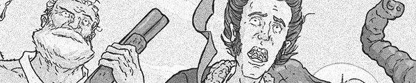
What a downer. Not because of the big reveal at the end, but because of how writer Joshua Hale Fialkov compares the mundanity to normal existence to purgatory. For a while, it seems like The Life After is just a gentle Matrix riff, with some often really good art from Gabo. The art's not always great, but it's always competent and the ambitious stuff makes up for the rest.

    The way Fialkov handles revealing the truth to the reader–and to his protagonist–is to aggressively force the reader to examine everything he or she has read already in the comic. For the protagonist, it's a different experience. Fialkov juggles the two responsibilities–one to the reader, one to the protagonist–well. Even with a surprising guest star at the end, Life After is grounded.

    Without the guest star, the comic could actually just be a one shot. Fialkov's plot construction is very strong.

    B 

    CREDITS

    Writer, Joshua Hale Fialkov; artist and colorist, Gabo; letterer, Crank!; editors, James Lucas Jones and Ari Yarwood; publisher, Oni Press.

  • Lay Over (2013, Jordan Hayes)

    A lot of Lay Over is obnoxious. Loud and obnoxious. It's a Before Sunrise knock-off with Jordan Hayes's Canadian traveller in L.A. for just one night and she meets nice accordion player Noah Reid, who shows her the town. So there are all these montage shots of L.A. set to loud and obnoxious music.

    The short does have its strengths, however, whenever Reid shows Hayes things from his childhood. There–thanks to Reid's fantastic performance and Hayes (who also directs) slowing down for a minute and allowing the viewer presence with the characters–Lay Over gets good.

    As a director, Hayes is fine. It's a short shot at night on DV; there's only so much she can do. There are occasionally pretentious shots and they're annoying, but it's fine. Max Topplin's photography leaves a lot to be desired.

    Unfortunately, the end is predictable and insincere. It kills the short's accumulated good will.

    1/3Not Recommended

    CREDITS

    Edited and directed by Jordan Hayes; written by Hayes and Noah Reid; director of photography, Max Topplin; produced by Hayes and Topplin.

    Starring Jordan Hayes (Sam) and Noah Reid (Owen).


    RELATED

  • The Fury of Firestorm, The Nuclear Man #26Not much happens this issue past cliffhanger resolution, the villains teaming up with the Soviets and Lorraine and her father doing their every issue recap of his career problems. In some ways, it’s impressive how little gets done but how well the Conways and Kayanan do the issue.

    There’s a chase sequence where Firestorm has to fight the Statue of Liberty. It should be cooler than it turns out and then the repercussions of Firestorm destroying it should probably be dealt with too.

    The political stuff with the Soviets is goofy and doesn’t get handled well. The Conways’ villains this issue are Native American activists–admittedly, they’re super-powered terrorists–but it’s still a little odd to see them portrayed with so little sympathy.

    As for character development, there’s zip. It’s a bridging issue and not an interesting one. It’s a good looking one, thanks to Kayanan and Rodriguez, sometimes really good looking.

    B- 

    CREDITS

    Give Me Liberty–Give Me Death; writers, Carla Conway and Gerry Conway; penciller, Rafael Kayanan; inker, Rodin Rodriguez; colorist, Nansi Hoolahan; letterer, Adam Kubert; editors, Janice Race and Gerry Conway; publisher, DC Comics.

  • Star Trek 36 (August 2014)

    Star Trek #36I love how static Shasteen draws all the faces. It looks like he's going through either publicity photos or maybe screen grabs and picking the ones he thinks are closest to the emotions the characters should be feeling.

    Actually, I do not love anything about Shasteen's art. I was being sarcastic in an attempt to feign enthusiasm for talking about this comic book.

    It is barely a Star Trek issue in terms of being about the new movie franchise crew; it's more of a "Star Trek: Deep Space Nine" comic it turns out. Is it a good "Deep Space Nine" comic?

    No.

    As a writer, Johnson continues to confuse concept with imagination. Just because the Paramount rep okayed crossing over with the "Star Trek" shows isn't reason enough to do so.

    Johnson can't even get any mileage out of Bones and Spock banter. It's pedestrian and pointless with lifeless art.

    C- 

    CREDITS

    The Q Gambit, Part Two; writer, Mike Johnson; artist, Tony Shasteen; letterer, Neil Uyetake; editor, Sarah Gaydos; publisher, IDW Publishing.