One of the particularly amazing parts of The Last of the Mohicans is how quietly director Mann lays out big pieces of the film. The relationship between Daniel Day-Lewis, Russell Means and Eric Schweig–Day-Lewis as adopted son to Means and adopted brother to Schweig–is complex and moving and Mann spends almost no time establishing it in dialogue. Certainly not the heavy lifting. The heavy lifting is the choreography of how the men hunt together in the first scene. Later, when they're battling the French or their Native American allies, their movements show the relationship.
For the romance between Day-Lewis and Madeleine Stowe, however, Mann goes the other route. The directness moves Stowe from third tier–behind Steven Waddington as her suitor and Day-Lewis's annoyance–to first. Hers is the film's most difficult role because she's the only one in the film making a huge journey. Mann establishes her character through dialogue in quiet scenes and in louder ones, it's all Stowe. Expressions, movements. It's a phenomenal performance.
And it needs to be to go up against Day-Lewis. He's transfixing.
Great supporting work from Means, Schweig, Wes Studi, Maurice Roëves and Patrice Chéreau. Jodhi May's good too, but doesn't have the same depth of material. Though she handles the implications of hers well.
The editing–from Dov Hoenig and Arthur Schmidt–the music–from Randy Edelman and Trevor Jones–and the photography–from Dante Spinotti–are all magnificent. Spinotti and Mann create expressive moments out of still shots of the scenery.
Mohicans is a truly wondrous piece of work.
 ★★★★
★★★★
CREDITS
Directed by Michael Mann; screenplay by Mann and Christopher Crowe, based on the novel by James Fenimore Cooper and a screenplay by Philip Dunne, John L. Balderston, Paul Perez and Daniel Moore; director of photography, Dante Spinotti; edited by Dov Hoenig and Arthur Schmidt; music by Randy Edelman and Trevor Jones; production designer, Wolf Kroeger; produced by Mann and Hunt Lowry; released by 20th Century Fox.
Starring Daniel Day-Lewis (Hawkeye), Madeleine Stowe (Cora Munro), Russell Means (Chingachgook), Eric Schweig (Uncas), Jodhi May (Alice Munro), Steven Waddington (Maj. Duncan Heyward), Maurice Roëves (Col. Edmund Munro), Patrice Chéreau (Gen Montcalm), Edward Blatchford (Jack Winthrop), Terry Kinney (John Cameron) and Wes Studi (Magua).
RELATED
 If it weren’t for the lousy inks from Akin and Garvey, this issue would be rather strong. It’s not wholly successful, but it does have Conway trying new things with the series. Martin gets his own adventure, far away from Ronnie; Conway isn’t entirely successful with Martin as lead–there are missteps, like an awkward pop culture reference–but he’s trying.
 This issue is the best one Williamson’s written so far. It’s not Magno’s drawn; he’s better than last time but there are still a lot of perspective issues. They make the body proportions look off when they aren’t. It’s too bad.
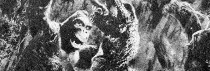
 So after an entirely forward-looking first issue, Chaykin gets around to the flashbacks in the second. In some ways, since the Shadow isn’t the most familiar character, an origin is necessary. But Chaykin goes overboard. He feels the need to rationalize the magical city where the Shadow, back before he was the Shadow, finds himself. There’s too much confusion around the Shadow’s identity too; it’s too dense. The origin takes a whole fourth of the series and there’s got to be some stuff in there Chaykin doesn’t need.
 Soule and Letter bounce back big time with an outstanding issue, both for the President and the astronauts on the Clarke. It’s a rocky start, given Alburquerque’s goofy body armor designs. The President has loosed all the futuristic weaponry to get the troops out of the Middle East and Afghanistan; Alburquerque makes the armor look like golden suits of armor. Knight armor. It’s almost like an “SNL” skit set at a Medieval Times.
 Not a good issue. Joey Cavalieri fills in on writing the main story, which has Ronnie’s nightmares informing his Firestorm adventure. It never gets explained how his nightmares could be so important to a Firestorm adventure, but it involves alien life forms so it shouldn’t be hard.
 Joëlle Jones fills in on art this issue–a flashback to the early oughts when the long distance space shuttle program is getting started up. Her style resembles the regular art, but there’s something different about it. She draws all of her characters the same age; they all look like they’re in their early twenties.
 Howard Chaykin's The Shadow. He takes an interesting approach to bringing back a World War II era costumed adventurer–he lets everyone age while the Shadow is away. Most of the issue has various agents–people in their later years–getting viciously murdered.
 Sejic’s art is a lot better for about half the issue. Instead of doing the CG shading on characters faces, she just colors them. All of a sudden Wildfire looks like animation cels, but it works. Sejic apparently does give her characters expressions, but then the complicated coloring ruins them.
 Whatever magic Kupperberg had been working on the inks is over now. All of a sudden, he’s doing a bad job. The faces in particular. The features aren’t in the right places on faces. It’s an ugly comic, which is a shame because it’s got some great settings and should look amazing.
 Stéphane Perger joins Reis on the art this issue; their styles compliment one another, but are still distinct. The art is both more stylized and emotive over all and it helps the issue immensely.


 John Byrne finds a nice approach for Sensational She-Hulk–it’s a gag. He doesn’t just go for humor, he finds the right balance between humor for the characters and the reader. It’s entertaining, which is the point, but very expertly executed in how he delivers that entertainment.
 Odd issue. Parker splits it in two–with Sandy Jarrell and Richard Case on art for the first part and Shanier on the second. The first part, which is just Flash, Dale and Zarkov in their spaceship trying to get to the next world, has a lot of personality. There’s banter, there’s Ming megalomania. Even with the art change, it feels like the Flash Gordon comic Parker and Shanier have been working towards. Jarrell and Case do well too.
 Conway doesn’t just address Ronnie and Martin’s partnership as Martin has to move for work, he also makes time to give Ronnie’s father both a personality (or hints of one) and a girlfriend. There’s also intrigue at Martin’s new job. Lots of subplots this issue, including two villains.
 G.I. Zombie likes to talk to himself. A lot. He and his partner spend the issue working on separate parts of the same mission; she gets to talk to the bad guys, he gets to kill them and talk to himself. A lot.
 So Groo vs. Conan is already an imaginary story wrapped in the adventures of Sergio Aragonés as he runs around with (presumably) temporary dementia. But then he and co-writer Evanier feel the need to wrap another imaginary element around the finish. The last few pages, where Groo and Conan fight, are all in the imagination of one of the townspeople.
 What an awful comic book. It gets dumber as it goes along, with Jennifer’s dad joining forces with the guy who killed his wife in order to kill She-Hulk. The villain isn’t a regular mobster, he has a huge Bond villain subterranean fortress. It’s not too big, however, since She-Hulk is able to find everyone right after she breaks in.
 The Kupperberg inks continue to give Firestorm all the emotion Conway’s scripts have been lacking. Only this issue has some emotion in the script–Ronnie having a talk with ex-girlfriend Doreen (who he jilted for Firehawk)–and the result, even though Conway cops out for a conclusion, is fantastic. Kayanan’s panel composition and Kupperberg’s details make for a great talking heads scene.
 The bottom falls out this issue. Given nothing compelling to illustrate–unless one counts the various odd jobs Kirk and Spock perform–Woodward is left with talking heads, where he seems to be painting panels directly from pauses of old “Star Trek” episodes. The result? Terrible, static figures. Even worse, he’s rushing, so there’s a lot of loosely rendered, terrible, static figures.
 Well, Kraft certainly doesn’t turn things around this issue. He might make them worse–nothing this issue gets a full breath. The big ending, which should be an exciting fight between She-Hulk and her first superpowered villain, flops because of the setting. A beach house isn’t the place for a visually dynamic brawl.
 Wayward is awful. I wish it weren’t, because Steve Cummings’s art is awesome. With the single exception of the teenage girl protagonist looking about the same age as her mother. But otherwise.
 Kupperberg sticks around this issue to ink Rafael Kayanan and it’s an interesting result. The figures and composition are still Kayanan’s, but–with a couple exceptions–Kupperberg’s really bringing the personality to the faces. While Conway does do a little character development on Ronnie and Martin, the newly expressive faces are what sell the scenes.
 About half of Pop is awesome. The rest of it is rather good, given the gimmick. The gimmick–which the title fits but in no way applies–is the eugenic world of pop stars. Pop stars are grown in tubes by an Illuminati-type organization.
 If only writer David Anthony Kraft had a better artist, his first issue of She-Hulk would've been a lot stronger.
 Fialkov is keeping his cards covered but it certainly appears one possibility for The Life After is the protagonist is Jesus reincarnated in Limbo to free the souls imprisoned due to their earthly suicides. Or he's the anti-Christ and he's doing just about the same thing.
 It's Firestorm versus an undead foe who's getting into the ethereal mix with Martin and trying to take over control. The Phantom Stranger is on hand to help out. Jean-Marc and Randy Lofficier guest write this issue, which feels a lot more supernatural than it turns out to be. The only real supernatural elements–besides a ghost haunting Firestorm–are the strange settings where the possessed Firestorm ends up fighting the Phantom Stranger.
 Events take a somewhat predictable turn in the finish, where Wilson reveals not just how Kamala got her powers–which perhaps more up to date Marvel Comics readers also figured out–but also how she’s part of the bigger world. Wilson goes from having a Wolverine cameo to dragging Kamala into the greater Marvel Universe.
 It's not a good comic, but one's got to admire Stan Lee's ability to get a property established here in the first issue of The Savage She-Hulk. He introduces a new character in Jennifer Walters and manages to change her into She-Hulk before the end of the comic. He doesn't even waste time showing Walters's cousin, Dr. Bruce Banner, hulk out. Banner guest stars, the Hulk doesn't.